Accessibility Improvements in WordPress 7.1

WordPress 7.1 continues to polish accessibilityAccessibility Accessibility (commonly shortened to a11y) refers to the design of products, devices, services, or environments for people with disabilities. The concept of accessible design ensures both “direct access” (i.e. unassisted) and “indirect access” meaning compatibility with a person’s assistive technology (for example, computer screen readers). (https://en.wikipedia.org/wiki/Accessibility) across WordPress CoreCore Core is the set of software required to run WordPress. The Core Development Team builds WordPress. and GutenbergGutenberg The Gutenberg project is the new Editor Interface for WordPress. The editor improves the process and experience of creating new content, making writing rich content much simpler. It uses ‘blocks’ to add richness rather than shortcodes, custom HTML etc. https://wordpress.org/gutenberg/, advancing the goals to meet accessibility standards. In this release, high-impact changes include the new accessible tooltips APIAPI An API or Application Programming Interface is a software intermediary that allows programs to interact with each other and share data in limited, clearly defined ways., improved predictability for screen readers, and improved labeling in many places in the adminadmin (and super admin). The editor ships with new Tab and Playlist blocks and extensive improvements to editor navigation and interaction.

Core

Enhancements to WordPress core include 44 accessibility enhancements and bugbug A bug is an error or unexpected result. Performance improvements, code optimization, and are considered enhancements, not defects. After feature freeze, only bugs are dealt with, with regressions (adverse changes from the previous version) being the highest priority. fixes. Major changes include enhancements to focus states, improvements to screen reader support in post list tables, and the introduction of a tooltip mechanism for exposing accessible names in WordPress core.

Media

WordPress 7.1 delivers an enhanced media experience including refined labels for caption fields to provide clearer usage guidance (#43178). Navigation within theme and media modals was adjusted to prevent single-key arrow interactions from conflicting with screen reader patterns (#63760). Technical fixes address duplicate ID elements in figcaption elements when reusing images (#65315) and ensure accurate visible labeling for untitled items in the grid view (#65438). In the image editor, the width input label was corrected (#65685). Improvements to the Media grid include resolving unlabeled date filters (#65711), styling fixes for bulk editing toolbars (#65732), and ensuring focus indicators remain fully visible (#65755).

Classic Editor

The editing environment is landing with architectural improvements, such as support for invoker command attributes in KSES (#64576) and the autofocus attribute for dialog elements (#65491). Classic editor users will benefit from layout enhancements to the Publish box visibility controls (#65530) and status dropdown menus (#65532).

List Tables

List table structures were updated to identify the post title cell as the row headerHeader The header of your site is typically the first thing people will experience. The masthead or header art located across the top of your page is part of the look and feel of your website. It can influence a visitor’s opinion about your content and you/ your organization’s brand. It may also look different on different screen sizes. instead of the selection checkboxes (#32892, #65743). To assist blind users, subpages in page lists now include proper structural indicators (#64932), while untitled posts can display an excerptExcerpt An excerpt is the description of the blog post or page that will by default show on the blog archive page, in search results (SERPs), and on social media. With an SEO plugin, the excerpt may also be in that plugin’s metabox. of the content in post lists (#65022).

Labeling and Accessible Names

Work continues on semantic clarity, addressing missing plural forms for specific strings (#29299) and adding necessary visible text to responsive preview icons in the CustomizerCustomizer Tool built into WordPress core that hooks into most modern themes. You can use it to preview and modify many of your site’s appearance settings. (#36447). Core now includes a standardized mechanism for accessible tooltips (#51006), which has been applied to metaboxMetabox A post metabox is a draggable box shown on the post editing screen. Its purpose is to allow the user to select or enter information in addition to the main post content. This information should be related to the post in some way. order buttons (#50921) and the “Remember Me” login option (#55343).

Users

The user management flow was improved with better guidance during user deletion (#56914) and clearer identification of links on the login page (#65075). The language switcher now consistently employs visible labels and icons (#65464), and the “Add User” screen no longer forces initial focus onto the password field (#65630).

Administration

Administrative improvements focus on high contrast and consistency. Contrast in admin color schemes was boosted for sidebarSidebar A sidebar in WordPress is referred to a widget-ready area used by WordPress themes to display information that is not a part of the main content. It is not always a vertical column on the side. It can be a horizontal rectangle below or above the content area, footer, header, or any where in the theme. compatibility with the blockBlock Block is the abstract term used to describe units of markup that, composed together, form the content or layout of a webpage using the WordPress editor. The idea combines concepts of what in the past may have achieved with shortcodes, custom HTML, and embed discovery into a single consistent API and user experience. editor (#65382), and active states for buttons and tabs are now properly identified in Windows High Contrast Mode (#65153, #65419). UIUI User interface inconsistencies during tagtag A directory in Subversion. WordPress uses tags to store a single snapshot of a version (3.6, 3.6.1, etc.), the common convention of tags in version control systems. (Not to be confused with post tags.) management (#63372), Quick Draft error handling (#64952), and Settings API section titles (#65027) have been resolved. Further enhancements include toolbar visibility in the Site Editor (#65091), standardized focus indicators of at least 2 CSSCSS Cascading Style Sheets. pixels (#65645), and labeling improvements for data export requests (#65246).

Focus states on the admin bar and the admin menu have been improved (#65765, #65726), enhancing the usability of the now-universal toolbar. Mouse cursor interaction inconsistencies when the admin menu is collapsed have been fixed (#65250). Route-based admin pages now all render appropriate feedback when JavaScriptJavaScript JavaScript or JS is an object-oriented computer programming language commonly used to create interactive effects within web browsers. WordPress makes extensive use of JS for a better user experience. While PHP is executed on the server, JS executes within a user’s browser. https://www.javascript.com rendering is not available or fails (#65690).

The theme browser now has consistent navigation behavior when navigating from the first theme (#65715), and the scrollbar is no longer partially hidden in the pluginPlugin A plugin is a piece of software containing a group of functions that can be added to a WordPress website. They can extend functionality or add new features to your WordPress websites. WordPress plugins are written in the PHP programming language and integrate seamlessly with WordPress. These can be free in the WordPress.org Plugin Directory https://wordpress.org/plugins/ or can be cost-based plugin from a third-party. installer modal (#65334). When performing setup or installation, the language of the page is made available (#65454).

Front-end

On the front end, password-protected content receives styling and usability upgrades (#64569). The RSS widgetWidget A WordPress Widget is a small block that performs a specific function. You can add these widgets in sidebars also known as widget-ready areas on your web page. WordPress widgets were originally created to provide a simple and easy-to-use way of giving design and structure control of the WordPress theme to the user. was updated to prevent accessibility issues when multiple instances are present (#47670), and the comment reply link no longer triggers unexpectedly on touch interactions (#46713).

Editor

The editor includes 43 accessibility enhancements and bug fixes covering screen reader, forced colors, and keyboard navigation improvements, as well as shipping two new front-end blocks for post content. The editor changes in 7.1 greatly improve consistency on a number of fundamental components that should lead to a better experience for all.

Editing Experience

Refinements to the editing interface include fixing keyboard activation for template action previews (#78641) and resolving focus loss issues when dismissing the pattern creation dialog (#78957). Localized aria-live regions were replaced with the more robust speak() function to improve auditory feedback (#79600). The DataForm panel layout now correctly exposes accessible names via tooltips on edit buttons (#77024), and tooltips now also display keyboard shortcuts for block movement (#76992). 

Visual and interaction fixes address cursor instability in the color picker (#80205) and prevent layout shifts by relocating contrast warnings within the color popover (#79512). Advanced contrast checking now extends to viewport and pseudo-states (#80223), while note selections are now preserved across browser tab transitions (#75955).

Additional refinements include adding word-break support to screen reader classes (#75539) to prevent inconsistencies, and an error in spoken messages announced during block insertion was fixed (#79004).

Blocks

Block-level improvements focus on semantic accuracy and control. The Breadcrumbs block now hides decorative separators from assistive technologyAssistive technology Assistive technology is an umbrella term that includes assistive, adaptive, and rehabilitative devices for people with disabilities and also includes the process used in selecting, locating, and using them. Assistive technology promotes greater independence by enabling people to perform tasks that they were formerly unable to accomplish, or had great difficulty accomplishing, by providing enhancements to, or changing methods of interacting with, the technology needed to accomplish such tasks. https://en.wikipedia.org/wiki/Assistive_technology (#78524), while the icon browser provides full labels for better identification (#80256). The Image block introduces a dedicated toggle for marking media as decorative (#78064), and the Cover block gains attributes to restrict video providers, helping prevent inaccessible embeds (#80092). 

In Accordion blocks, navigation shortcuts using arrows and the “home” and “end” keys were removed (#75891) due to conflicting behaviors, and a focus loss in settings was fixed in the Stretchy Text block (#75092).

Admin Screens

Updates to admin screens emphasize readability and standard compliance. Centered text is removed from Connectors to improve scanning (#78125), and Page component headers are promoted to h1 by default to align with core semantic structures (#77617). Focus issues in the Font Library (#78671) and labeling mismatches in the NavigableRegion (#75899) have been addressed.

Admin Components

The component library received numerous technical fixes. Focus traps broken by specific display properties were resolved (#77381), and invalidinvalid A resolution on the bug tracker (and generally common in software development, sometimes also notabug) that indicates the ticket is not a bug, is a support request, or is generally invalid. object-based labels in ValidatedRangeControl were corrected (#77042). Help text associations were improved for ComboboxControl (#76761) and ToggleGroupControl (#76740). RadioControl fieldsets now properly employ the radiogroup role (#76745).

For users in High Contrast mode, focus rings are now consistently rendered on Tab panels and CollapsibleCard headers (#77469, #77468). 

Button states were also refined, addressing focusable defaults when disabled (#78526), loading indicator visibility in forced colors (#78820), and click feedback styling (#76833). Furthermore, label associations in ContentEditableControl were fixed (#80344), Dialog components now prioritize focusing content over the close button (#76910), and screen reader text for DataForm card toggles was standardized (#76039).

Visual RevisionsRevisions The WordPress revisions system stores a record of each saved draft or published update. The revision system allows you to see what changes were made in each revision by dragging a slider (or using the Next/Previous buttons). The display indicates what has changed in each revision.

The Visual Revisions experience received significant updates. Contrast for difference position marker stripes was increased (#78473), and title attributes were replaced with aria-describedby for better annotation support (#80440). The timeline now includes specific labels for autosaves (#79950). Navigation was improved by auto-focusing the revisions slider (#79691) when the editor is activated.

Non-color indicators were added using CSS outlines as secondary indicators for document changes (#78393), and proper pluralization for revision count labels (#78382) was added. The Post Summary sidebar now includes an aria-label for the revisions trigger (#78140) to provide better context for screen reader users.

New blocks

WordPress introduces new interactive elements, including a Playlist Block (#80203) and a Tabs Block (#80163). Both blocks have been tested for accessibility concerns, although feedback is always welcome.

Known Accessibility Regressionregression A software bug that breaks or degrades something that previously worked. Regressions are often treated as critical bugs or blockers. Recent regressions may be given higher priorities. A "3.6 regression" would be a bug in 3.6 that worked as intended in 3.5.

In WordPress 7.1, the default behavior of the media library is being changed from including a load more button to having infinite scroll, a known inaccessible pattern. 

To compensate for this, there is an option in the User Profile allowing individual users to turn it off. You can also use the existing filter media_library_infinite_scrolling to disable it by default, returning the value false.

A feature has been added in the WP Accessibility plugin that inverts the logic, switching the default value to ‘false’ and altering the User Profile option to allow users to turn it on.

You can also try the Gutenberg Experiment to replace the media library. This feature is still in development, and has not had a full accessibility review. The infinite scroll in the updated media library will be governed by an in-modal toggle, and is not currently enabled.

There is also work continuing to try to add a similar toggle to the existing media library in #65775. That work is progressing, but the implementation did not reach consensus in time to land in WordPress 7.1

Reviewed by @annezazu, @amykamala, @sabernhardt

#7-1, #accessibility, #dev-notes, #dev-notes-7-1

Accessibility Improvements in WordPress 7.0

WordPress 7.0 continues to polish accessibilityAccessibility Accessibility (commonly shortened to a11y) refers to the design of products, devices, services, or environments for people with disabilities. The concept of accessible design ensures both “direct access” (i.e. unassisted) and “indirect access” meaning compatibility with a person’s assistive technology (for example, computer screen readers). (https://en.wikipedia.org/wiki/Accessibility) across WordPress CoreCore Core is the set of software required to run WordPress. The Core Development Team builds WordPress. and GutenbergGutenberg The Gutenberg project is the new Editor Interface for WordPress. The editor improves the process and experience of creating new content, making writing rich content much simpler. It uses ‘blocks’ to add richness rather than shortcodes, custom HTML etc. https://wordpress.org/gutenberg/, advancing the goals to meet accessibility standards. WordPress 7.0 includes fixes across the platform, improving media management, usability for voice control, and improvements to color contrast with the new adminadmin (and super admin) color scheme. The editor ships with new blocks and improvements to editor navigation and interaction.

Core

Improvements to WordPress Core include 24 accessibility enhancements and bugbug A bug is an error or unexpected result. Performance improvements, code optimization, and are considered enhancements, not defects. After feature freeze, only bugs are dealt with, with regressions (adverse changes from the previous version) being the highest priority. fixes. Major changes include enhancements to the media library for voice control users and the import of alternative text from image metadata, improvements to control semantics, and fixes to color contrast.

Media

Significant changes to media will improve both the editor and user experience. In WordPress 7.0, using the media library with voice control technology is now possible. Alternative text embedded in photo metaMeta Meta is a term that refers to the inside workings of a group. For us, this is the team that works on internal WordPress sites like WordCamp Central and Make WordPress. data will be imported and automatically set as the image text alternative when available.

  • #23562 – Using Speech Recognition Software with the Add Media Panel
  • #55535 – Pre-populate Image Alt Text field with IPTC Photo Metadata Standard Alt Text
  • #63895 – Accessibility: Alt Text Metadata is not imported but Description is
  • #63984 – Assess if the tabpanels in the media modals should receive focus
  • #64374 – Alt text helper text can be more educational and visual indicator of opening in new tab
  • #63980 – Set featured imageFeatured image A featured image is the main image used on your blog archive page and is pulled when the post or page is shared on social media. The image can be used to display in widget areas on your site or in a summary list of posts. button incorrectly coded as link and missing required ARIA attributes

Admin

Improvements to predictability and verbosity for screen reader users have been made across the admin to provide users with a more consistent and stable interface.

  • #23432 – Review usage of target="_blank" in the admin
  • #33002 – List table: avoid redundant Edit links and reduce noise for screen readers
  • #43084 – dashboard confuses published posts count with all posts
  • #64065 – Dragging theme/pluginPlugin A plugin is a piece of software containing a group of functions that can be added to a WordPress website. They can extend functionality or add new features to your WordPress websites. WordPress plugins are written in the PHP programming language and integrate seamlessly with WordPress. These can be free in the WordPress.org Plugin Directory https://wordpress.org/plugins/ or can be cost-based plugin from a third-party. ZIP outside file input field, downloads file instead of uploading.
  • #64375 – Set word-break property in screen reader only css.
  • #64313 – Color Contrast raises errors in automated tests for WordPress Dashboard
  • #64382 – Post search input “close” (×) button should use cursor: pointer
  • #64811 – Zero comment notification in admin toolbar has insufficient color contrast

Themes

Numerous improvements to theme template functions and core themes.

  • #62835 – Remove title attributes from author link functions
  • #62982 – Twenty Twenty-Five: The Written by pattern on single posts has too low color contrast in some variations
  • #64064 – Twenty Ten: remove auto-focus script from 404 template
  • #64594BlockBlock Block is the abstract term used to describe units of markup that, composed together, form the content or layout of a webpage using the WordPress editor. The idea combines concepts of what in the past may have achieved with shortcodes, custom HTML, and embed discovery into a single consistent API and user experience. Support: Allow serialization skipping for ariaLabel
  • #64361 – Leverage HTMLHTML HyperText Markup Language. The semantic scripting language primarily used for outputting content in web browsers. APIAPI An API or Application Programming Interface is a software intermediary that allows programs to interact with each other and share data in limited, clearly defined ways. to implement block template skip link

Miscellaneous

Improvements in the classic editor, code editing, the CustomizerCustomizer Tool built into WordPress core that hooks into most modern themes. You can use it to preview and modify many of your site’s appearance settings., and login and registration.

  • #63981TaxonomyTaxonomy A taxonomy is a way to group things together. In WordPress, some common taxonomies are category, link, tag, or post format. https://codex.wordpress.org/Taxonomies#Default_Taxonomies. meta box tabs not programmatically identified
  • #42822 – CodeMirror: HTML attributes values hints not fully operable with a keyboard
  • #60726 – The WordPress core password reset needs to pre-populate the username to meet WCAGWCAG WCAG is an acronym for Web Content Accessibility Guidelines. These guidelines are helping make sure the internet is accessible to all people no matter how they would need to access the internet (screen-reader, keyboard only, etc) https://www.w3.org/TR/WCAG21/. 2.2
  • #63861 – Explore removing wpmu activation styles
  • #64013 – Color contrast below WCAG standards for newly-added items in customizer menus

Gutenberg

Changes within Gutenberg include 16 accessibility fixes and enhancements, including the addition of new interactive blocks that have undergone accessibility reviews. Numerous fundamental components have had accessibility improvements to ensure that interfaces across the editor are more consistent and understandable. 

While there are relatively few accessibility fixes and enhancements in the editor for WordPress 7.0, there are many new interfaces that have undergone accessibility review, per the WordPress commitment to meeting WCAG 2.2 at level AA for all new and updated code. These include the Visual Revisions inspector, Gallery lightboxes, and the new Connectors interface.

Bug fixes: 

  • #75165 – RangeControl: support forced-colors mode
  • #66735 – Resize meta box pane without ResizableBox
  • #74387 – Use 12px as minimum font size for warning on fit text (see also #73730)
  • #74205 – add ariaKeyShortcut and shortcutFormats exports
  • #73674 – Fix block toolbar icon CSSCSS Cascading Style Sheets. when using show icon label preference
  • #73245 – Make DataViews table checkbox permanently visible
  • #72997 – DataViews: Add grid keyboard navigation
  • #70787 – Button: update font-weight to 500 
  • #75689 – DataForm: Fix focus loss and refactor Card layout
  • #75271 – Accordion block: Add list view support.
  • #75407 – Gallery: Add list view block support
  • #73823 – Add Heading level variations

New Features:

  • #62906 – Gallery: Add lightbox support
  • #16484 – Add an Icons block
  • #75833 – Add Connectors screen and API
  • #74742 – Add visual revisionsRevisions The WordPress revisions system stores a record of each saved draft or published update. The revision system allows you to see what changes were made in each revision by dragging a slider (or using the Next/Previous buttons). The display indicates what has changed in each revision.

Reviewed by @amykamala, @sabernhardt

#7-0, #accessibility, #dev-notes, #dev-notes-7-0

Accessibility Improvements in WordPress 6.9

WordPress 6.9 brings extensive accessibilityAccessibility Accessibility (commonly shortened to a11y) refers to the design of products, devices, services, or environments for people with disabilities. The concept of accessible design ensures both “direct access” (i.e. unassisted) and “indirect access” meaning compatibility with a person’s assistive technology (for example, computer screen readers). (https://en.wikipedia.org/wiki/Accessibility) improvements across WordPress CoreCore Core is the set of software required to run WordPress. The Core Development Team builds WordPress. and GutenbergGutenberg The Gutenberg project is the new Editor Interface for WordPress. The editor improves the process and experience of creating new content, making writing rich content much simpler. It uses ‘blocks’ to add richness rather than shortcodes, custom HTML etc. https://wordpress.org/gutenberg/, continuing the goals to meet web content accessibility standards throughout WordPress and make it easier to author accessible content. These updates include changes to administration, customization, login and registration, bundled themes, and the blockBlock Block is the abstract term used to describe units of markup that, composed together, form the content or layout of a webpage using the WordPress editor. The idea combines concepts of what in the past may have achieved with shortcodes, custom HTML, and embed discovery into a single consistent API and user experience. editor.

Core

Improvements to WordPress Core include 33 accessibility enhancements and bugbug A bug is an error or unexpected result. Performance improvements, code optimization, and are considered enhancements, not defects. After feature freeze, only bugs are dealt with, with regressions (adverse changes from the previous version) being the highest priority. fixes. Major changes include numerous new or improved screen reader notifications, a complete update of CSSCSS Cascading Style Sheets. generated content to ensure no excess content is spoken, and code changes to ensure proper semantics and improved focus management.

Administration

  • #47101 – Improve accessibility when deleting terms via AJAX: color contrast & spoken message.
  • #48655 – Improve the “Add-item” function in menus (esp. for pages)
  • #63118 – Hide “Skip to Toolbar” shortcut on small screens within adminadmin (and super admin)
  • #63126 – Theme preview model and Media library model having issues with Shift/Ctrl + Shift next and previous arrows.
  • #63449 – Low color contrast for <code> elements in description text on Settings > General page
  • #63546 – Fix unclosed li element in pluginPlugin A plugin is a piece of software containing a group of functions that can be added to a WordPress website. They can extend functionality or add new features to your WordPress websites. WordPress plugins are written in the PHP programming language and integrate seamlessly with WordPress. These can be free in the WordPress.org Plugin Directory https://wordpress.org/plugins/ or can be cost-based plugin from a third-party.-editor.php
  • #63603 – Replace deprecated / non-standard CSS for `speak` and `aural`
  • #63723 – On the Add New plugin page, put the Add Plugins screen description above the filterFilter Filters are one of the two types of Hooks https://codex.wordpress.org/Plugin_API/Hooks. They provide a way for functions to modify data of other functions. They are the counterpart to Actions. Unlike Actions, filters are meant to work in an isolated manner, and should never have side effects such as affecting global variables and output. menu

CustomizerCustomizer Tool built into WordPress core that hooks into most modern themes. You can use it to preview and modify many of your site’s appearance settings.

  • #42078 – Customize: fix the color hue picker HTMLHTML HyperText Markup Language. The semantic scripting language primarily used for outputting content in web browsers. and accessibility
  • #47579 – Customizer “Select logo” and “Select site icon” look like drop areas, but are buttons.
  • #50696UIUI User interface & Accessibility issues in customizer menus section
  • #63011 – Customizer: The back button is not keyboard focusable
  • #63832 – Loss of focus when setting or changing the Site Logo or Site Icon in Customizer

Editing

  • #63460 – Increase color contrast for embed template
  • #61959 – Enhance Support for `popovertarget` and `popover` Attributes in Native Browser Popover APIAPI An API or Application Programming Interface is a software intermediary that allows programs to interact with each other and share data in limited, clearly defined ways.

Login and Registration

  • #63281 – Password field has wrong focus on installations
  • #63286 – User profile first name, last name, nickname and email fields should have autocomplete attributes for accessibility
  • #48345 – Add Caps lock message to login screen

Media

  • #63114 – No screen reader announcements for upload image errors
  • #63238 – Remove `target=”_blank”` from Browser Uploader Link
  • #63239 – Button focus visibility issue in media upload page
  • #63571 – Excessive Spacing Between Right SidebarSidebar A sidebar in WordPress is referred to a widget-ready area used by WordPress themes to display information that is not a part of the main content. It is not always a vertical column on the side. It can be a horizontal rectangle below or above the content area, footer, header, or any where in the theme. Items in Edit Media Screen on Mobile View
  • #63973 – Add Media Button missing aria-haspopup and aria-controls

Miscellaneous

  • #40428 – Introduce best practices to hide CSS generated content from assistive technologies
  • #44267 – Privacy Request List Table: A way to show the time of request when it’s older than 24 hours.
  • #63030 – Update CSS for `::-moz-placeholder` color
  • #63620 – Remove translator comments when hidden text matches visible text
  • #63950 – Tabbing through database upgrade screen shows “WordPress” text over logo

Bundled Themes

  • #10219 – “Older Entries” and “Newer Entries” links are wrong when entries displayed in ascending order
  • #44656 – Multiple themes: Empty site title leaves empty anchor tagtag A directory in Subversion. WordPress uses tags to store a single snapshot of a version (3.6, 3.6.1, etc.), the common convention of tags in version control systems. (Not to be confused with post tags.) in headerHeader The header of your site is typically the first thing people will experience. The masthead or header art located across the top of your page is part of the look and feel of your website. It can influence a visitor’s opinion about your content and you/ your organization’s brand. It may also look different on different screen sizes.
  • #52116 – Twenty Twenty: Menu + Search can cause a scroll jump on close
  • #63875 – Twenty Twenty-Two and Twenty Twenty-Five: <pre> tag overflows container, causing horizontal scroll

Widgets

  • #63531CategoryCategory The 'category' taxonomy lets you group posts / content together that share a common bond. Categories are pre-defined and broad ranging. dropdown does not meet WCAGWCAG WCAG is an acronym for Web Content Accessibility Guidelines. These guidelines are helping make sure the internet is accessible to all people no matter how they would need to access the internet (screen-reader, keyboard only, etc) https://www.w3.org/TR/WCAG21/. 2.2 A on windows and some linux systems

Gutenberg

Changes within Gutenberg include 44 accessibility fixes and enhancements, including the addition of new blocks and the block Notes feature that have undergone accessibility reviews. Numerous fundamental components have had accessibility improvements to ensure that interfaces across the editor are more consistent and understandable. 

Blocks

  • #68662 – Cover: Fix placeholder color options keyboard accessibility
  • #68909 – Site Title: Fix logic for ‘aria-current’ attribute
  • #69628 – Site Title: Prevent saving and rendering a value made of only spaces
  • #69689 – Navigation Link, Navigation Submenu: Remove the title attribute controls
  • #69821 – Social Icons: Remove custom placeholder state
  • #69837 – Navigation block: fix submenu Escape key behavior
  • #70139 – Button Block: Add HTML Element selection in Advanced settings
  • #70192 – Button: Avoid focus loss when unlinking using keyboard
  • #70210  – Columns block: Don’t use ToolsPanelItem for Columns setting
  • #70730a11yAccessibility Accessibility (commonly shortened to a11y) refers to the design of products, devices, services, or environments for people with disabilities. The concept of accessible design ensures both “direct access” (i.e. unassisted) and “indirect access” meaning compatibility with a person’s assistive technology (for example, computer screen readers). (https://en.wikipedia.org/wiki/Accessibility): Comments Pagination Nav Wrapper
  • #64119 – Add Accordions Block
  • #73177 – Fix a11y of descriptions and alerts for “Invalidinvalid A resolution on the bug tracker (and generally common in software development, sometimes also notabug) that indicates the ticket is not a bug, is a support request, or is generally invalid.” Nav Items

Components

  • #67792 – Improve the EntitiesSavedStates modal dialog design and labeling
  • #69011 – Remove non translatable additional info from font size picker visual label and improve labeling
  • #69441 – ARIA: Fix invalid `DropdownMenu` children structure
  • #68633 – Global Styles: Prevent Unwanted ItemGroup List Rendering in Border Panel
  • #68542 – Button: Update hover styles to account for pressed state for `tertiary button`
  • #69609 – ActionModal: Add support for customisable `focusOnMount`
  • #69904 – Add new HTMLElementControl component
  • #70591 – `FormTokenField`: Fix focus lost on tab when `__experimentalExpandOnFocus` is set
  • #70096 – Components: Fix label and placeholder handling in `LinkControlSearchInput`
  • #70660 – Autocomplete: Prevent text cursor position loss when clicking to insert an item
  • #70146 – Color Picker: Improve color picker slider focus styles

Data Views

  • #67874 – Display Checkbox by default in dataviews
  • #69876 – DataViews: Always show primary action for list layout if hover isn’t supported
  • #71561 – DataViews: Custom `empty` elements are no longer wrapped in `<p>` tags to improve accessibility
  • #72417 – DataViews: Use Text-Based Links for Primary Actions
  • #72501 – Dataviews: Make bulk actions text based.

Editor

  • #68481 – Fix CSS classes for the post editor iframeiframe iFrame is an acronym for an inline frame. An iFrame is used inside a webpage to load another HTML document and render it. This HTML document may also contain JavaScript and/or CSS which is loaded at the time when iframe tag is parsed by the user’s browser. body.
  • #68975 – Close patterns modal on insertion and focus on inserted pattern
  • #69305 – Swap fullscreen mode snackbar notice message.
  • #69334 – InputControl: Ensure consistent placeholder color
  • #69378 – Button: Remove fixed width from small and compact buttons with icons
  • #69451 – Editor: Refactor the ‘PostVisibility’ component
  • #69520 – Fix shift+tab from post title
  • #69724 – Post Template Panel: Preserve parent modal when closing template creation dialog
  • #68631 – Global Styles: Fix incorrect usage of ItemGroup in the Background image panel
  • #69813 – Background Image Panel: fix focus loss
  • #70128 – Global Styles: Move `Randomize colors` button to Edit Palette panel
  • #70133 – Editor: Add label in`TextareaControl` in CollabSidebar
  • #69278 – Toolbar: Adjust colors for dark mode support
  • #70451  – feat: clarify label & add help text with link for Link Rel

Miscellaneous

  • #69440 – Make password protected input fields consistent.
  • #70091 – Templates: Add back button & fix focus loss when navigating through template creation flow

Acknowledgements

Props to @jorbin and @jeffpaul for reviewing this post.

#6-9, #accessibility, #dev-notes, #dev-notes-6-9

Accessibility Focused Bug Scrub – 15 May 2025

In celebration of Global Accessibility Awareness Day, a scrub of stagnant Accessibility focused tickets will be held in the #core slack channel at Thursday, May 15, 2025 at 15:30 UTC. The goal of this scrub is to help move tickets towards a resolution (which may include being added to a future milestone or closing).

If you’ve never participated in a bugbug A bug is an error or unexpected result. Performance improvements, code optimization, and are considered enhancements, not defects. After feature freeze, only bugs are dealt with, with regressions (adverse changes from the previous version) being the highest priority. scrub, reading the documentation on leading a bug scrub will help you understand what to expect!

Thanks to @joedolson for pre-publication review

#accessibility, #bug-scrub, #core-accessibility

Hallway Hangout: Recap of working session on consolidating navigation modes

This is a summary of a Hallway Hangout that was wrangled in the #accessibility channel after a prior hallway hangout on improving accessibilityAccessibility Accessibility (commonly shortened to a11y) refers to the design of products, devices, services, or environments for people with disabilities. The concept of accessible design ensures both “direct access” (i.e. unassisted) and “indirect access” meaning compatibility with a person’s assistive technology (for example, computer screen readers). (https://en.wikipedia.org/wiki/Accessibility) in the Site Editor and took the new form of a concrete working session to address a specific problem. It was first announced on October 1st and was open to all.

Attendees:

@alexstine @joedolson @richtabor @annezazu @jerryj @afercia @elblakeo31 @peteringersoll

Video Recording:

Notes/Links:

After some quick intros, we dove into talking about the problem before exploring possible next steps, approaches, and current issues. 

Related issues:

Difference between modes

To kick off, Joe asked Alex to talk through the current pain points and differences between modes. As Alex said, navigation mode is a hackedhacked together feature. The biggest problem we have, the navigation mode is a dynamically updating button. Everytime you press your arrow key or tab key when you’re in navigation mode, it dynamically re-renders. This is a challenging problem to handle with screen readers because it’ll ignore this. For Windows, there’s also a longstanding issue where the arrow keys don’t actually send the keyboard events through the browser so tab is the only viable key. Conversely, List View is much simpler in the way you can navigate with keys and it’s wrapped in a navigation role. You are able to expand rows, have control over what you’re looking at, etc. Another current problem with navigation mode, it’s not entirely clear when there are inner blocks. Alex started to work on this but stopped to focus on list view. 

What are the consequences if we stripped out navigation mode and used list view as the primary way of browsing through blocks?

To date, there has been no modal, tips, etc for keyboard users in the editor. People who are used to this would have no idea it has changed and we need a way to communicate that change, perhaps using a similar approach to the change in template parts to the patterns section. 

Andrea, who helped implement navigation mode, offered some historical context. He shared that if we are going to use navigation mode, we’re going to reintroduce a major issue that existed before introducing the two modes. Imagine that a post contains dozens of blocks. If you want to navigate these blocks in the post content area with the tab key, you are going to have to go through all of the dozens of blocks including the interface of each blockBlock Block is the abstract term used to describe units of markup that, composed together, form the content or layout of a webpage using the WordPress editor. The idea combines concepts of what in the past may have achieved with shortcodes, custom HTML, and embed discovery into a single consistent API and user experience. (dozens of tab stops). Nav mode was originally meant to reduce the number of tab stops when navigating through the blocks in a way that each block was only one tab stop rather than multiple then pressing enter gives the ability to switch the block to edit mode where you can navigate inside the block. This was the original implementation and it made sense when there were no inner blocks. 

Joe noted that List View works the same way where you can go block to block. When you use the tab key you are going through all of these elements. However, there are still a lot fewer elements than going through the blocks themselves. We should be willing to compromise to some degree. Arrow key navigation in List View also does work. It’s 100% accessibility and there are a total of three tabbable elements in list view: tab panel, close button, and list view area itself. 

Alex would like to find a better way to manage focus between block editor and block sidebarSidebar A sidebar in WordPress is referred to a widget-ready area used by WordPress themes to display information that is not a part of the main content. It is not always a vertical column on the side. It can be a horizontal rectangle below or above the content area, footer, header, or any where in the theme. but that’s a broader discussion. Jerry and Alex have worked on this but it’s a long battle. 

Trying List View + Focus Mode for container blocks as an experiment

Anne pitched trying getting rid of navigation mode and use list view + focus mode as an experiment in GutenbergGutenberg The Gutenberg project is the new Editor Interface for WordPress. The editor improves the process and experience of creating new content, making writing rich content much simpler. It uses ‘blocks’ to add richness rather than shortcodes, custom HTML etc. https://wordpress.org/gutenberg/. We could then do a call for testing and get a sense of what the experience might be like more practically. Folks were very much onboard with trying this out, especially since in the long run this would reduce the number of mechanisms to maintain. 

The question of how many people are used to using navigation mode came up though, especially since the feedback folks are worried about is more about non screen reader users. Anne is going to try to get some initial data from WordPress.comWordPress.com An online implementation of WordPress code that lets you immediately access a new WordPress environment to publish your content. WordPress.com is a private company owned by Automattic that hosts the largest multisite in the world. This is arguably the best place to start blogging if you have never touched WordPress before. https://wordpress.com/.

Mobile concerns

Rich chimed in that the current primary use for that view is on mobile devices as this makes it easier to select child first nested blocks so it’s easy to tap onto. We never really got to the bottom of this on the call as we all pulled out our phones to investigate and couldn’t figure out how to even evoke the mode. 

Locked blocks and inert

We discussed how to explain disabled blocks in List View which relates to a broader discussion on alternatives to inert. There’s no good way to explain to a blind user what a template looks like when editing a smaller portion like a page. Anne showed an option to toggle on/off a template preview when editing a page in the Site Editor and we discussed a few ways we could enhance that feature to save it as a preference/have it be persistent in some way. 

Focus mode concerns

We discussed Focus Mode and adding it to Container Blocks. A big piece to figure out is how the back button works and ensuring it returns you to where you’d expect in the Site Editor experience.

Gutenberg as a framework concerns

Alex brought up an excellent point around Gutenberg being used as a framework, like with Blocks Everywhere, and how navigation mode is built into it as a package. We need to consider this in removing the navigation mode and it might be that it remains for third party usage. 

Next steps:

@annezazu will follow up on the following: 

  • Open issue around “show template” rather than “template preview”. 
  • Open issue around persistence of “template preview” option and make it a user setting. 
  • Try to get data around usage for navigation mode from WordPress.com 
  • Open issue around where back button goes after focus mode and returning you exactly to edit button ideally. 
  • Add recap of this discussion to the overall discussion issues, including noting how this might impact gutenberg as a framework. 

Known issues:

Finally, @annezazu will create an issue to pitch this as an experiment to try in the Gutenberg repo as a next step. 

#accessibility, #core-editor-3, #gutenberg, #hallwayhangout

Hallway Hangout: Working session on consolidating various navigation modes

This hallway hangout is a follow-up to our previous discussion about improving the Site Editor’s accessibility. In this session, we’ll work together to explore what streamlining the navigation modes might look like, including considering the use of List View and evolving Focus Mode for container blocks.

To provide context, when navigation and edit mode were initially introduced in GutenbergGutenberg The Gutenberg project is the new Editor Interface for WordPress. The editor improves the process and experience of creating new content, making writing rich content much simpler. It uses ‘blocks’ to add richness rather than shortcodes, custom HTML etc. https://wordpress.org/gutenberg/ 6.3, nested blocks and the Site Editor did not exist. We now face the challenge of finding a more efficient way to navigate between content.

There’s currently an async discussion and open issue on this topic that anyone is welcome to chime in on ahead and after this working group.

How to join

If you’re interested in joining, the Hallway Hangout will happen on 2023-11-15 16:00. A Zoom link will be shared in the #accessibility SlackSlack Slack is a Collaborative Group Chat Platform https://slack.com/. The WordPress community has its own Slack Channel at https://make.wordpress.org/chat/ channel before starting and all are welcome to join, whether to listen or participate, for as long or as little as you’d like.

Agenda

At a high level, we’ll start with some intros to get familiar with who has joined us on the call before diving into the topic in practical terms: How does everything work today? How might deprecation work? What accessibilityAccessibility Accessibility (commonly shortened to a11y) refers to the design of products, devices, services, or environments for people with disabilities. The concept of accessible design ensures both “direct access” (i.e. unassisted) and “indirect access” meaning compatibility with a person’s assistive technology (for example, computer screen readers). (https://en.wikipedia.org/wiki/Accessibility) improvements or fixes are needed for this to be viable?

As a reminder, hallway hangouts are meant to be casual and collaborative so come prepared with a kind, curious mind. Because this will be more of a working session, we’ll be solely focused on the topic prepared so please keep that in mind when considering whether to join.

#accessibility, #hallwayhangout, #site-editor

Hallway Hangout: Improving accessibility in the Site Editor

To ensure the Site Editor can be used by everyone, this hallway hangout aims to dive deep into the current accessibilityAccessibility Accessibility (commonly shortened to a11y) refers to the design of products, devices, services, or environments for people with disabilities. The concept of accessible design ensures both “direct access” (i.e. unassisted) and “indirect access” meaning compatibility with a person’s assistive technology (for example, computer screen readers). (https://en.wikipedia.org/wiki/Accessibility) of this new experience with the aim to iterate and improve.

How to join

If you’re interested in joining, the Hallway Hangout will happen on 2023-09-14 15:00. A Zoom link will be shared in the #accessibility SlackSlack Slack is a Collaborative Group Chat Platform https://slack.com/. The WordPress community has its own Slack Channel at https://make.wordpress.org/chat/ channel before starting and all are welcome to join, whether to listen or participate, for as long or as little as you’d like.

Agenda

At a high level, we’ll go through the following:

  • Quick intros.
  • Discussions around current concerns.
  • Demos of pain points from @alexstine and @joedolson.
  • Discussion about ways to resolve/address current, known issues.

As a reminder, hallway hangouts are meant to be casual and collaborative so come prepared with a kind, curious mind along with any questions or items you want to discuss around this important area of the project. Outside of the time for demos, we’ll intentionally have space for open discussion.

#accessibility, #hallwayhangout, #site-editor

WordPress 6.2 Accessibility Improvements

Thank you to @joedolson and @alexstine for collaborating on this post.

With WordPress 6.2 set to launch on March 28th, this post seeks to provide an overview of the many accessibilityAccessibility Accessibility (commonly shortened to a11y) refers to the design of products, devices, services, or environments for people with disabilities. The concept of accessible design ensures both “direct access” (i.e. unassisted) and “indirect access” meaning compatibility with a person’s assistive technology (for example, computer screen readers). (https://en.wikipedia.org/wiki/Accessibility) improvements and fixes coming to the next major WordPress release. As always, there’s more work to be done with accessibility requiring an ongoing effort and commitment. Outside of the work mentioned below, there have been numerous moments of collaboration around accessibility as features were developed including with splitting tabs in block settings, introducing browse mode, and the additional option to edit the navigation block in the block settings.

If you’re interested in helping with these efforts, please join the #accessibility channel in Make SlackSlack Slack is a Collaborative Group Chat Platform https://slack.com/. The WordPress community has its own Slack Channel at https://make.wordpress.org/chat/ and check out how you can get involved. There are numerous ways to get involved in this important work including testing, giving accessibility feedback, and creating PRs to address feedback.

Navigation blockBlock Block is the abstract term used to describe units of markup that, composed together, form the content or layout of a webpage using the WordPress editor. The idea combines concepts of what in the past may have achieved with shortcodes, custom HTML, and embed discovery into a single consistent API and user experience.

  • Announce when a block is inserted in the Navigation list view. (47034)
  • Fix various off canvas appender accessibility issues. (47047)
  • Better handling of loading states for navigation selector. (43904)

General block editor experience 

  • TabPanel: Support manual tab activation. (46004)
  • Keycodes: Fix tilde (~) character isn’t displayed correctly. (46826)
  • Update text align toolbar control label. (47119)
  • SidebarSidebar A sidebar in WordPress is referred to a widget-ready area used by WordPress themes to display information that is not a part of the main content. It is not always a vertical column on the side. It can be a horizontal rectangle below or above the content area, footer, header, or any where in the theme. Tabs: Set default tab to first available. (45998)
  • Make the inline toolbar navigable by arrow keys. (43645)
  • BlockVariationPicker: Remove Unnecessary ARIA Role. (45916)
  • Esure block labels and titles consider variations. (44250)
  • useNavigateRegions: Use closest to determine the next region to navigate to. (44883)
  • Fix focus return when closing the Post publish panel. (45623)
  • Fix the navigate regions focus style. (45369)
  • Fix navigate regions backwards for macOS Firefox and Safari. (45019)
  • Fix the block toolbar styling when the ‘Show button text labels’ preference is enabled. (44779)
  • Fix the Save buttons labeling and tooltip. (43952)
  • Focus on the first parent block on block removal if no previous block is available (48204). This is underway but not yet merged.

Contrast Checker improvements

  • Limit contrast checker to only blocks that have at least one color defined. (43592)
  • Fix: Contrast checker appears unexpectedly on some blocks. (45639)
  • Fix: Contrast checker does not update properly. (45686)

Site editor

  • Change SpacingSizesControl ARIA from region to group. (46530)
  • Browse mode: Fix aria region navigation in the site editor. (46525)
  • Browse mode: Allow resizing the sidebar in the site editor using keyboard. (47176)
  • Browse mode: Add an aria label to the site save dialog. (47898)
  • Style Book: Focus the Style Book when opened, and enable ESCAPE key to close (48151).
  • Style Book: Allow button text labels for style book icon. (48088)
  • Add role=application to List View to prevent browse mode triggering in NVDA. (44291)
  • Make the template customized info accessible. (48159)

Other: 

  • Add “Testing Instructions for Keyboard” to PR template to encourage accessibility testing. (45957)
  • Constrained tabbing: Fix unstable behavior in FireFox. (42653)
  • TokenInput field: fix screen reader focus issue. (44526)

#6-2, #accessibility

Multisite registration and activation pages have new HTML and CSS

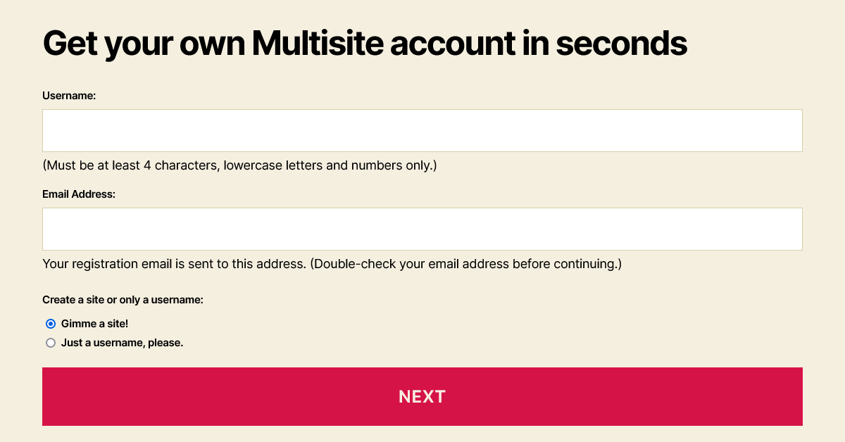
In WordPress 6.1, the forms for the wp-signup.php and wp-activate.php pages have several enhancements to both the markup and the styles.

AccessibilityAccessibility Accessibility (commonly shortened to a11y) refers to the design of products, devices, services, or environments for people with disabilities. The concept of accessible design ensures both “direct access” (i.e. unassisted) and “indirect access” meaning compatibility with a person’s assistive technology (for example, computer screen readers). (https://en.wikipedia.org/wiki/Accessibility)-related improvements

Indicating relationships:

  • Fieldsets, with visible legend text, group the radio buttons.
  • Form field description information connects to its related field with aria-describedby.
  • When present, error messages also connect to their field with aria-describedby. The generic error has an ID in case custom fields should refer to that.

Preventing errors:

  • Required text fields have the required attribute.
  • The Site Name label indicates that users should enter the subdirectory only, and the Site Domain is only the desired subdomain.
  • The Username field’s description text now specifies that letters need to be lowercase.

Color contrast:

  • If the activation page has an error message, its default dark gray text color contrasts against the light background.
  • The default style for links within the registration page’s bordered message (.mu_alert) includes an underline and matches the text color of the rest of the message. For example, Twenty Twenty-One’s dark mode assigns a light link color, so the new style makes it readable and identifiable as a link. If a theme uses a bottom border or box-shadow on links, however, this underline could be inappropriate.
“Options page” link had light gray text in Twenty Twenty-One’s dark mode
Links were sometimes difficult to see
“Options page” link is in the same dark gray text as the rest of the message
Links match the surrounding text color, underlined, in 6.1

New elements and styles for the registration page form

  • The fieldset and legend elements reset margin, padding and border properties.
  • The legend styles are consistent with the default label font size, weight and margins.
  • Radio buttons are inside paragraphs without a top margin, following the legend.
  • Text input fields and the submit button, which were set to 100% width plus padding, are only as wide as their container now.
screenshot of account setup page in WordPress 6.1
New account setup, step 1, allowing both sites and usernames

When people create an account:

  • Descriptive text for the Username and Email Address is inside paragraph tags. Because these immediately follow the input, the paragraphs do not have a top margin.
  • Options for creating a site and/or a username are grouped in a fieldset with a new, visible legend.
  • Elements with the “wp-signup-radio-button” class wrap these options’ radio buttons and their labels, and with “display: block” the options stack vertically.
screenshot of form with Site Name (for subdirectory installations), Site Title, Site Language and Privacy options
Form fields for an administrator (logged in) to create a new site

When an administrator creates a new site:

  • A “wp-signup-blogname” container wraps the Site Name (or Site Domain) input with the domain, so themes could arrange them side-by-side.
  • For right-to-left languages, the domain and its input field remain in the left-to-right direction.
  • The “privacy-introfieldset uses paragraph tags inside it to retain most paragraph styles from the theme.
  • By wrapping “Privacy:” in a “label-headingspan, it appears above the rest of the legend. This text maintains the same default font size and weight given to the legend and label elements.
  • The “Yes” and “No” labels have moved next to the radio buttons, instead of inside them. Without the strong emphasis tags, these can match the default label font weight of 600. If any theme overrides the “.mu_register label.checkbox” selector to block display, that property will need updating to an inline style.
  • In this fieldset, “wp-signup-radio-button” containers remain next to each other, with a small margin between them.

Site activation page styles

screenshot of site activation page with Twenty Twenty theme
  • The activation form’s container is centered, to match the signup page.
  • The input field and submit button cover the full width of the container, with box-sizing: border-box to prevent them from extending beyond 100%.
  • The form and .error selectors now include .wp-activate-container so that the styles do not affect elements in the headerHeader The header of your site is typically the first thing people will experience. The masthead or header art located across the top of your page is part of the look and feel of your website. It can influence a visitor’s opinion about your content and you/ your organization’s brand. It may also look different on different screen sizes. or footer.

BlockBlock Block is the abstract term used to describe units of markup that, composed together, form the content or layout of a webpage using the WordPress editor. The idea combines concepts of what in the past may have achieved with shortcodes, custom HTML, and embed discovery into a single consistent API and user experience. themes

This is not new to 6.1, but block themes should continue to include header.php and footer.php template files for these pages. To make a header template more specific to the networknetwork (versus site, blog) pages, its filename can be header-wp-signup.php or header-wp-activate.php.


For more information about the HTMLHTML HyperText Markup Language. The semantic scripting language primarily used for outputting content in web browsers. and CSSCSS Cascading Style Sheets. changes, view tickets #40361 and #54344.

Props: Thank you, @ironprogrammer, @webcommsat, @audrasjb and @joedolson, for peer review and editing.

#accessibility, #core-multisite, #dev-notes, #dev-notes-6-1, #multisite, #themes

WordPress 6.1 Accessibility Improvements

Thank you to @joedolson and @alexstine for collaborating to write this post.

With WordPress 6.1 around the corner, this post brings together the many accessibilityAccessibility Accessibility (commonly shortened to a11y) refers to the design of products, devices, services, or environments for people with disabilities. The concept of accessible design ensures both “direct access” (i.e. unassisted) and “indirect access” meaning compatibility with a person’s assistive technology (for example, computer screen readers). (https://en.wikipedia.org/wiki/Accessibility) improvements and fixes to look forward to that might be hard to discover amongst the details of 500+ bugs and enhancements. As always, there’s more work to be done with accessibility requiring an ongoing effort and commitment. 

If you’re interested in helping with this work, please join the #accessibility channel in Make SlackSlack Slack is a Collaborative Group Chat Platform https://slack.com/. The WordPress community has its own Slack Channel at https://make.wordpress.org/chat/ (need a slack account to view) and check out how you can get involved. There are numerous ways to get involved in this important work including testing, giving accessibility feedback, and creating PRs to address feedback.

Themes

Most notably, 6.1 will see the introduction of both Twenty Twenty-Two and Twenty Twenty-Three marked as accessibility ready, making them both the first default blockBlock Block is the abstract term used to describe units of markup that, composed together, form the content or layout of a webpage using the WordPress editor. The idea combines concepts of what in the past may have achieved with shortcodes, custom HTML, and embed discovery into a single consistent API and user experience. themes to do so (and only default block themes). This helps open up more folks to the world of block themes and broader site editing features.

WP Adminadmin (and super admin) Screens

Across the many screens in WP Admin, improvements abound. Changes range from improvements in color contrast on the pluginPlugin A plugin is a piece of software containing a group of functions that can be added to a WordPress website. They can extend functionality or add new features to your WordPress websites. WordPress plugins are written in the PHP programming language and integrate seamlessly with WordPress. These can be free in the WordPress.org Plugin Directory https://wordpress.org/plugins/ or can be cost-based plugin from a third-party. screen during recovery mode, to a switch from a text input to a textarea field in the media library, so users are better able to see the content of the field while editing. 

Login and Registration

To better call attention to the many improvements to this form, this section has been pulled out of the WP Admin Screen section. While this is a lesser used interface, the accessibility improvements are quite significant for this release, addressing many longstanding problems. This includes proper labels for required fields, explicitly associating errors with input fields so folks know what actions to take where, improved labels for radio buttons, and more. 

Site Editor/Template Editor

Even though the Site and Template editors both use blocks, there are some specific accessibility challenges for these new interfaces in a site editing world. More work is needed and, if you’re keen to help, please join the FSE Outreach Program where you can go through calls for testing to provide feedback, find bugs, and more. 

Navigation block

The navigation block continues to be a powerful and complex block, especially in the world of block themes. While there are fallbacks and an improved menu management experience to look forward to in this release, there is also a nice set of accessibility related fixes to make this necessary block usable for more people in more situations. 

General Block Editor (other blocks, writing flow, components, etc)

This section covers a wide range of items including everything from improvements to additional blocks, like a focus loss fix for the Table block, and larger improvements to functionality like the Tools Panel. Specifically, the Tools Panel helps power part of the experience of using the numerous design tools present in more blocks for this release. It’s what you’d interact with to interact with more tools or reset changes. Improving the accessibility of this single tool has a cascading impact by improving the experience everywhere it’s used.  

Comments

Comments now include proper contextual attributes for autocomplete fields, proper labels for the visible text describing required fields, and improved accessibility (and translatability) of the logged in as link.

#6-1, #accessibility, #dev-notes, #dev-notes-6-1