Some of you may have seen @kjellr‘s recent post about creating patterns for the new Pattern Directory, which will be in betaBetaA pre-release of software that is given out to a large group of users to trial under real conditions. Beta versions have gone through alpha testing in-house and are generally fairly close in look, feel and function to the final product; however, design changes often occur as part of the process. and then launching later this year. The directory’s still a WIP (for example, front-end submission hasn’t been built yet), but the development team is hoping to launch it with a bunch of high quality, curated patterns already in place on the WordPress.orgWordPress.orgThe community site where WordPress code is created and shared by the users. This is where you can download the source code for WordPress core, plugins and themes as well as the central location for community conversations and organization. https://wordpress.org/ user.
I put together a ~20m video about my process bringing designs into the editor and then submitting them to the GitHubGitHubGitHub is a website that offers online implementation of git repositories that can easily be shared, copied and modified by other developers. Public repositories are free to host, private repositories require a paid subscription. GitHub introduced the concept of the ‘pull request’ where code changes done in branches by contributors can be reviewed and discussed before being merged be the repository owner. https://github.com/ repo. If you’re interested in making patterns for the directory, or making patterns in general for your own usage, please give it a watch!
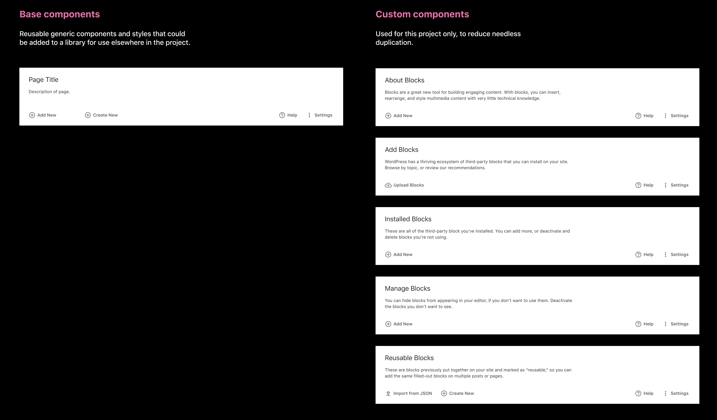
Building the new BlockBlockBlock is the abstract term used to describe units of markup that, composed together, form the content or layout of a webpage using the WordPress editor. The idea combines concepts of what in the past may have achieved with shortcodes, custom HTML, and embed discovery into a single consistent API and user experience. Directory in wp-admin presents us with a couple opportunities to redesign certain existing patterns, and turn them into reusable components. When we revisit future admin pages, we’ll have these components available to replace the older patterns.
Here’s some updated patterns we can turn into components for this project.
Page Headers
There are tons of pages in the WordPress admin. None of them are consistent.
I’d previously explored a consistent headerHeaderThe header of your site is typically the first thing people will experience. The masthead or header art located across the top of your page is part of the look and feel of your website. It can influence a visitor’s opinion about your content and you/ your organization’s brand. It may also look different on different screen sizes. for admin pages, but it still felt subpar:
When I started working on the Block Directory, I wanted to take another stab at a header that could work across the entire admin. These were roughly based off of Material’s headers, then adjusted and improved to fit our use cases.
Page headers consist of the following elements:
The page title.
A short description of what this page is and what it’s for, ideally only a sentence or two long.
Action buttons on the left (add new, upload, etc.).
MetaMetaMeta is a term that refers to the inside workings of a group. For us, this is the team that works on internal WordPress sites like WordCamp Central and Make WordPress. buttons on the right (help, settings).
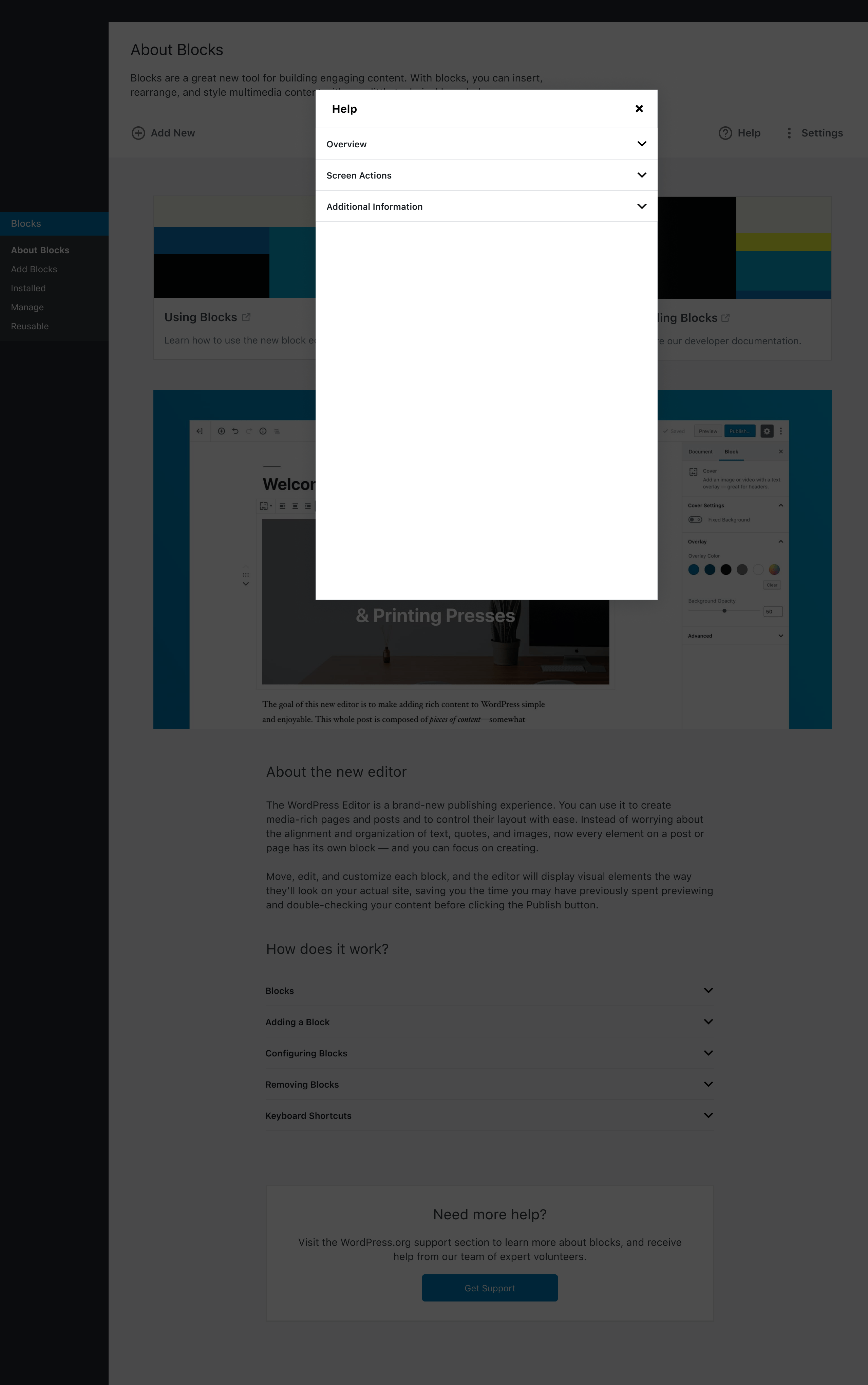
Rather that opening Help and Screen Options (now “Settings”) in tabs, we can use the modal component:
This is a more portable approach than the existing pull-down tabs, and also makes the longform help content much easier to read, since the modal constrains it to a much better line-length for readability.
Note: the modal header and panels don’t line up in the mockups due to some conflicts in the Figma files, but should in real life.
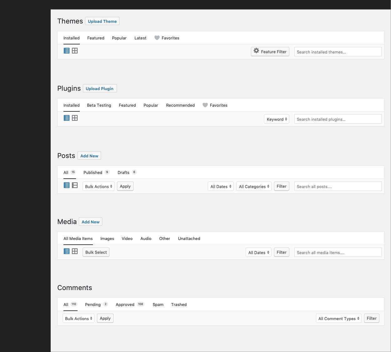
List Tables
Y’all, List Tables are as old as dirt. They’ve done a good job for the past decade and whatever, but they could use some modernization. Lists Tables would be a way to bring all of the list actions together into one single container, rather than floating above and below, disconnected from the table. I’ve kept the table items themselves the same, but made adjustments to the header, footer, and external table elements.
List Tables are composed of the following elements:
A table heading with optional bulk select checkboxes.
Rows, same as the existing list table pattern.
A table footer that instead of repeating the header, has meta information (# of pages, previous/next navigation). When items are selected, bulk actions take the place of the navigation:
This is similar to how we handle bulk deletion in the Media admin screen.
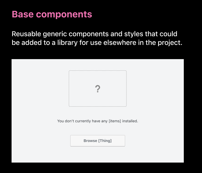
Empty States
There isn’t currently a consistent “Empty” State for admin pages (like when you don’t have any posts, pages, comments, etc.). This new component take a stab at one we can reuse for all pages in the future.
Empty States are composed of three elements:
A “not found” graphic.
Text stating there are no items.
An action, like a button, to help resolve that there are no items.
GutenbergGutenbergThe Gutenberg project is the new Editor Interface for WordPress. The editor improves the process and experience of creating new content, making writing rich content much simpler. It uses ‘blocks’ to add richness rather than shortcodes, custom HTML etc. https://wordpress.org/gutenberg/ is diving deep into customization leading into 2020. With customization, and eventual full site editing, comes new terminology that needs to be defined.
Blocks
Blocks are the smallest, most atomic unit in the WordPress editor. The Paragraph is the default blockBlockBlock is the abstract term used to describe units of markup that, composed together, form the content or layout of a webpage using the WordPress editor. The idea combines concepts of what in the past may have achieved with shortcodes, custom HTML, and embed discovery into a single consistent API and user experience.. Blocks can be static (an image) or dynamic (a list of posts).
Patterns are curated collections of blocks, often organized around a specific section or purpose. They make up common patterns across the web.
For example, a Contact pattern could contain:
A contact information block on one side, with fields for address, phone number, and email address.
A contact form block on the right.
A Team pattern could contain:
A column block
Inside each column, a group block containing:
An image block with a round mask for headshots
A headerHeaderThe header of your site is typically the first thing people will experience. The masthead or header art located across the top of your page is part of the look and feel of your website. It can influence a visitor’s opinion about your content and you/ your organization’s brand. It may also look different on different screen sizes. block for names
A paragraph block for biographies
A social links block
Think of patterns as several LEGO bricks stuck together to make just a castle gate. It’s a feature in itself, but only part of the greater whole of your post or page.
But doesn’t that mean something like Cover or Media & Text are patterns, not layouts?
That’s a great question! It requires more discussion before there’s a definitive answer. Should Cover / Media & Text / etc. be patterns, rather than blocks? What do you think?
Layouts
Layouts are one step up from patterns. They can be groupings of patterns or specific blocks that make up the entire design of your page — including your header, footer, and any additional global or repeating block areas, like sidebars.
Think of layouts as the entire castle — gates, towers, ramparts, catapults, flags, and all.
But isn’t this just a page template?
The short answer is yes, “layout” is a new way of saying page template. Template, however, is a pre-existing term that carries a lot of baggage. Page templates, as they exist in WordPress now, are technical entities with design implications. On the admin side, changing your page template is a pretty poor user experience. Selecting a different template for your page should be a visual process, but instead, we offer different templates in a dropdown. You can’t preview them, so you have to guess what they’ll look like, or search for a theme demo.
(Additionally, there isn’t any sort of native UIUIUI is an acronym for User Interface - the layout of the page the user interacts with. Think ‘how are they doing that’ and less about what they are doing. for selecting different post templates, or any UI at all for post formats.)
By creating layouts as a block-first concept, complete with visual placeholders for filling in content instead of creating pages from scratch, we can start to deprecate templates as a design concept.
This article was originally written by @joen. He has graciously given us permission to repost this here for the community.
You may have heard of Figma recently. It’s a web-app (with a hybrid-native version) that aims to solve the same problem Sketch solves: make it easy and fast to design and prototype software.
When two apps solve the same problem, why would you want to learn to use the new thing when you know how to use the old one? In this article I will go into why, and when, you should consider Figma, even if you already know how to use Sketch.
Why you should think about Figma
The first question we have to tackle is: what does Figma do better than Sketch, and do those aspects matter to you? The answer is that both are solid applications and they each have their pros and cons. So when you evaluate which one to use, we have to look at the strengths and weaknesses of both, and judge them based on your needs.
When it comes to Figma, the key reasons you need to think about boil down to just these two aspects:
It’s free for personal use, which means if you’re working with the open sourceOpen SourceOpen Source denotes software for which the original source code is made freely available and may be redistributed and modified. Open Source **must be** delivered via a licensing model, see GPL. community, this removes a barrier to collaboration.
It’s cross-platform and even works in the browser, which further removes simplifies that collaboration.
There are additional niceties in this vein, such as the ability to share a file with only commenting privileges, or even just for viewing. Just the fact that you don’t have to bounce files and worry about versioning removes a lot of friction. As a result, if you’re working with the community Figma is unbeatable. In fact, if your design work involves anyone not on a Mac with a copy of Sketch, Figma is an inclusive choice.
What you need to know, coming from Sketch
In most ways, Figma and Sketch are incredibly similar. The excellent UIUIUI is an acronym for User Interface - the layout of the page the user interacts with. Think ‘how are they doing that’ and less about what they are doing. Sketch pioneered you’ll find mostly the same in Figma. There’s an infinite canvas, layers are on the left, contextual properties are on the right.
The first thing you’ll want to do to give Figma a proper shake is to install the desktop app.
While it’s not a “true” native app, for actual design work it’s still worlds better than the browser version. In fact, despite the hybrid nature of the app, this mainly manifests itself a different way of handling files and a slightly longer time to start.
Tip: You can set your browser to automatically open Figma links in the app. If the browser doesn’t prompt you to do this, click the menu button, and click “Open in desktop app”.
Artboards & “Frames”
In Sketch, you’ll often use “Artboards” to create mini-canvases to export separately, and with a background color of your choice.
In Figma there are no artboards, and you can customize background colors, and configure options for exporting on any item, even groups. But the closest equivalent Figma has to an artboard is the “Frame”. The frame is meant to act somewhat like a viewport in the browser sense, which means if you resize the frame, items inside will scale themselves according to their constraint and scaling rules.
Frames, by default, “clip” (mask) the content inside, and Figma supports a number of preset dimensions you can set your frames to, to match various devices and screen sizes. For that reason, using a frame will let you accomplish mostly the same that you can with an artboard in Sketch.
If you want to convert a frame to a group, or vice versa, there’s a dropdown menu in the top right corner.
One nice aspect to frames is that you can click items inside a frame directly, whereas you have to double-click a group to “open” it, before you can select items inside.
Key tip: If you want to resize a frame and not have it skew/distort the contents, hold ⌘ while you’re resizing.
Libraries & “Assets”
In Sketch, as soon as you create a symbol, the symbol itself is moved to a separate “Symbols” page, and an instance is is created where you made it.
In Figma, symbols are called “Master Components” and are denoted with an icon showing 4 small diamonds. Symbol instances are called “Components”, and are denoted with a single big diamond shape.
When you create a new master component in Figma, it’s created instantly, and is stored right where you created it. This takes a little getting used to, but it also removes a great deal of friction, which may be good because components are so powerful in Figma. We’ll get to that aspect later in the article.
It can get messy, though, because master components can’t be nested inside other components. If you try and nest one, an instance will be created in its place, and the actual master component will be put somewhere else. One way to clean that up is to store your symbols in one place, just like how Sketch does it, and you can emulate this behavior in Figma:
Create a new “Symbols” page (or call it “Components” to embrace the Figma way).
Convert your item to a component (select it and press ⌥⌘K).
Copy the new component, then paste it in place (⇧⌘V) — the copy is an instance of the component.
Select the master component, right click it, and choose “Move to Page” → Symbols (or “Components”, if you called it that).
Because Figma doesn’t have a standard location for storing all your symbols, it has an alternative tool to help you search for the right item, called “Assets”. This is a tab that sits at the top of the layers panel. This allows you to see a searchable and organized grid view (you can choose a list-view for this too). Team Libraries — “published” Figma files created just to be component libraries — will show up here as well, and it’s a great way to use icon libraries.
Tip: Double-click the icon part of a layer, to center that element in the screen.
File Handling
While Figma has files (File → Save as .fig), the primary way of collaborating and sharing Figma mockups is through links. Click the blue “Share” button in the top right corner. You’ll find that it works almost exactly how it does in Google Docs: set permissions on a per-user basis, or on a per-link basis.
As you go about your day to day, habits from Sketch might not work well here. If you’re used to saving multiple versions of the same Sketch file for a project, incrementing a version number in the file name each time, you can do this in Figma as well: in the file browser, click the ellipsis button for a project and use the “Duplicate” option.
However there’s a better way: save a copy of the current state to version history. Click the Figma menu in the top left corner (⌘/) and choose File → Save to Version History (⌥⌘S). This stores the entire state of the Figma file at that point in history. You can later browse through this history and restore older versions. An old version that gets restored adds a new state to the version history, so you don’t actually overwrite newer versions when restoring. If you just need to to copy an element from the old version, you can right-click the item you want, and choose Duplicate to get a separate file version of that state, because sadly you can’t just select and copy an element from the past version, you can only view/restore/duplicate them.
Note: the free version of Figma only stores 30 days of version history. If you want unlimited version history, you need to be on a paid plan.
You can, as of recent versions, copy and paste from Sketch directly into Figma.
You can copy and paste vectors directly from Illustrator into Figma.
You can drag SVGs or images directly into Figma, just as you could in Sketch.
You can copy PNGs directly from your browser (right-click, copy image) into Figma.
You can copy SVGs from your browser too, but these are converted to bitmaps. If you want to import SVGs, save them to your desktop and drag them into Figma.
Or, you can copy the SVG markup directly, and paste it into Figma and it will become an SVG.
Animated GIFs don’t play in Figma
Symbols & “Component” Overrides
Symbols are called “Components” in Figma, and just like how you can create symbol overrides in Sketch — aspects of a symbol that can be customized on a per-instance basis — so can you in Figma components.
In Sketch there’s a dedicated “Overrides” panel of the properties sidebarSidebarA sidebar in WordPress is referred to a widget-ready area used by WordPress themes to display information that is not a part of the main content. It is not always a vertical column on the side. It can be a horizontal rectangle below or above the content area, footer, header, or any where in the theme.. This allows you to create a very friendly and inviting way to change properties of a symbol, such as the icon used or the text label of a button.
Figma has a very different interface to overrides, which can be confusing if you’re coming from Sketch looking for an overrides panel. You won’t find it, because instead of having a dedicated panel, the way you override properties of a component is to simply edit them directly. Where in Sketch, a symbol instance is “locked in place”, Figma lets you explore all the layers of a component directly, just as if it was a simple group:
Hide or “delete” a layer to override the visibility of that layer in the component instance.
Inversely, you can unhide any layer that is hidden in the master component. For example you might have neutral, hover, and focused states inside a single Button component and hide or unhide each layer in the instance to show the desired state.
Double-click a text field to change the text.
Change any color of a component. You can even change strokes and effects. You can remove them, hide them, modify them. Want a shadow on your button instance but not in the master component? Add it directly to the instance. Or, add it to the master component and hide it by default, then unhide the effect in the instance.
You can change the instance to be that of a different symbol. By default, components of the same dimensions as the instance show up as “Related Components”. This is a great way to swap out icons.
There’s also a button to reset any overrides you created, it’s a little diamond with an arrow in it:
Delicious mystery meat!
Because you can add or remove any compenent style, hide or unhide any layer, in actual practice this makes Figma overrides significantly more powerful than they are in Sketch, where you’re limited to features that are surfaced in the Overrides panel.
The primary limitation of Figma component overrides, though, is that you can’t change the dimensions or position of a nested element. For example if you have a button component nested inside a headerHeaderThe header of your site is typically the first thing people will experience. The masthead or header art located across the top of your page is part of the look and feel of your website. It can influence a visitor’s opinion about your content and you/ your organization’s brand. It may also look different on different screen sizes. component, you can’t change the size or position of the button, it is locked in place and acts according to the scaling constraints that are applied to it. The only exception is that a textfield will expand if you write longer text, unless that conflicts with its constraints.
Those scaling constraints are very powerful, though, and act as a mix of classic responsive design rules, and the constraints you might be used to from iOSiOSThe operating system used on iPhones and iPads. app development. A key aspect of making highly reusable Figma components is mastering these constraints.
One use case is creating an icon that sits at the end of left-aligned text. By applying the right constraints, you can make that text editable, and still be able to make sure the icon sits where it needs to:
Constraints apply to every layer in the hierarchy, and when you combine them right, you can create some incredibly versatile components.
Tip: Right-click a component instance and choose “Go to master component”. This is useful if you need to change an aspect of a reused component and have it apply to all instances, or if you need to adjust the scaling constraints.
Aspects where Figma is still lacking
As you ponder whether the switch from Sketch to Figma will work for you, there are a few aspects of Figma that are still lacking compared to Sketch. Being mindful of these downsides is important for your considerations.
1. There is no official pluginPluginA plugin is a piece of software containing a group of functions that can be added to a WordPress website. They can extend functionality or add new features to your WordPress websites. WordPress plugins are written in the PHP programming language and integrate seamlessly with WordPress. These can be free in the WordPress.org Plugin Directory https://wordpress.org/plugins/ or can be cost-based plugin from a third-party support in Figma. While a third party project exists, you are essentially installing a non-official copy of Figma. As a result, there aren’t that many plugins available.
Figma is responding with a Web API that can hopefully one day accomplish what plugins can in Sketch, but it’s still limited, there’s only a readAPIAPIAn API or Application Programming Interface is a software intermediary that allows programs to interact with each other and share data in limited, clearly defined ways.. So if extensibility is your jam, this is a space to watch.
2. Offline support just works in Sketch because of the local files. To be able to work with files offline in Figma, you have to use the native app, and you have to open the file first, before you go offline. Definitely something you can work around, but it’s also not smooth.
3. The Figma file browser doesn’t support folders. It’s a flat hierarchy, and you have to search to find files that aren’t in the “Recent” section. All files that aren’t published land in the “Drafts” section. It’s something you can get used to, and not that different from how Google Docs works, but it’s also a different way of thinking if you have an existing pattern for organizing your files.
4. You can’t resize nested elements of a component. As mentioned in the overrides section, while you can create very reusable components using nesting and smart constraints, you can’t resize nested elements. This very often bites you when you need to resize a button inside a component to make the text fit. The workaround is to detach the parent instance, which is not the end of the world, but it does make some components slightly less reusable. This is being discussed here.
Other miscellany
Zooming:
Hold z and click to zoom.
Hold z and drag to zoom an area.
Hold z and ⌥ to zoom out.
Hold space to pan.
Color Picker: Click the color swatch then use the arrow keys ↑ and ↓ to brighten or darken the color.
Properties Panel: You can select a fill, stroke or effect by clicking the space around it. Then you can copy it (⌘C) and paste it on any other symbol or shape (⌘V) to paste the copied property.
Groups: If you delete elements in a group, the group disappears. Similarly, if you create a text area and don’t write anything, it’s gone. No empty groups!
Images: When you add a bitmap image, it acts as a fill inside a rectangle (think background-image in CSSCSSCSS is an acronym for cascading style sheets. This is what controls the design or look and feel of a site.). This makes it easy to tile or mask the image by simply resizing the rectangle. Fewer masks!
There are basic prototyping tools built in. Click the “Prototype” tab in the Properties panel to get started.
Drawing vector graphics in Figma creates “networks”, where a single point can have multiple connections, as opposed to just the two you know from Sketch or Illustrator. It takes a little getting used to, but in practice it works quite well, certainly better than Sketch ever did.
You can copy the code for the appearance of any element, by picking the “Code” tab in the properties panel. It’s provides syntax for CSS, iOS and Android, admittedly in a somewhat rudimentary way, but definitely a cool little aspect.
There are quite a few more golden features in Figma, such as tools to help you with layout grids, the ability to add actual color swatches that can be applied to components instead of fills. But I will leave those as an exercise to explore once you’re more comfortable with the basics.
Should you switch?
At the time of writing, one can’t really suggest that Figma is better than Sketch, but also not the inverse. Both have their strengths, both have weaknesses, and the fact that they coexist means there’s healthy competition in the market which will benefit both. In fact, some of the key reasons to use Figma (works in the browser, great for collaboration) are in some shape or form heading to Sketch as well in 2019. Knowing that, should you switch?
You should consider switching to Figma if the strengths (inclusive of communities and non-designers) outweigh the downsides (learning a new tool, lack of plugin support).
You should not switch to Figma if those coreCoreCore is the set of software required to run WordPress. The Core Development Team builds WordPress. strengths aren’t important to you or your team, or if you rely on a specific plugin or an established workflow.
Sketch is a wonderful app, and if it’s working well for you, stay with it. If you do mean to switch to Figma, maybe don’t do it if you need it for a project on a tight deadline, because although the learning curve from Sketch is small, it’s still there. Consider instead some practice projects, or complete a tutorial or two when you have the time. Then, jump in when you’re ready. I hope this write-up was helpful in your choice of design tools!
Rather than jumping straight into a list of blocks, I wanted to explore what an introduction to blocks could look like as a landing page. This page could feature some links to tutorials (that could open either externally, or in a modal), some basic FAQs, and a support link.
You’ll notice the new headerHeaderThe header of your site is typically the first thing people will experience. The masthead or header art located across the top of your page is part of the look and feel of your website. It can influence a visitor’s opinion about your content and you/ your organization’s brand. It may also look different on different screen sizes. style, inspired by the new Health Check screen and built on some concepts from the Design Experiments plugin. This new section provides a good opportunity to expand on this pattern, and to show how it could benefit WordPress users by providing context to each screen.
Add New Blocks
This section is largely inspired by wp-admin pluginPluginA plugin is a piece of software containing a group of functions that can be added to a WordPress website. They can extend functionality or add new features to your WordPress websites. WordPress plugins are written in the PHP programming language and integrate seamlessly with WordPress. These can be free in the WordPress.org Plugin Directory https://wordpress.org/plugins/ or can be cost-based plugin from a third-party cards, and the WordPress.orgWordPress.orgThe community site where WordPress code is created and shared by the users. This is where you can download the source code for WordPress core, plugins and themes as well as the central location for community conversations and organization. https://wordpress.org/ plugin details screen.
I also think we should update across wp-admin as well, since the current modal feels very outdated and doesn’t present information as cleanly or as organized as the .org modals:
WordPress.org
wp-admin
Inside the modal, you’d also be able to demo a blockBlockBlock is the abstract term used to describe units of markup that, composed together, form the content or layout of a webpage using the WordPress editor. The idea combines concepts of what in the past may have achieved with shortcodes, custom HTML, and embed discovery into a single consistent API and user experience. before installing. @ck3lee has figured out how to make this possible 🎉
We’d tap into the Shiny Updates framework to make installation and activation quick & easy.
The upload flow would work the way plugins do — I’ll flesh out some designs around that in future iterations.
Installed Blocks
This screen would be a list of all installed third-party blocks, so you can activate, deactivate, delete, etc. in bulk, using a traditional list table. I’ve added an “instances” link, which would show all posts and pages the third-party block is being used in.
Manage Blocks
This is the screen I’m most “meh” about, which is pretty much a duplication of the block management modal inside the editor. I think we need to have this management available within this section, but I’m not sure if this is the best approach to tackling it.
Reusable Blocks
Currently, the only way to reach the Reusable Blocks screen is through either the block library inside the editor, or a link in the settings dropdown in the editor. Putting it in a new Blocks section gives it an easier-to-find home.
Feedback
These are still early concepts, so it would be good to get some early impressions. Specifically, I’d like everyone’s thoughts on:
Thinking through the flow of managing blocks on your site, does it feel like any important tasks are missing from these concepts?
Would you expect any of these screens to be combined?
Can you think if any stress cases these screens will need to account for?
What would you like to see next for the Block Directory? Are there any other block management features you would benefit from?
I’ve put together a hand-off document on Github so the development team (@tellyworth and @ck3lee) can start building it out. You can follow along and get involved with the development process there.
Call for Testing
We’re going to need some folks to get involved in testing the feature, once the initial version is built out. I’d like to start thinking about that now, so we can prepare a script and start figuring out where we should be testing sooner rather than later. If you’re interested in getting involved in testing this feature, please let me know in the comments.
This is an update to the Block Library project that’s in-progress. Feedback has been taking place on GitHub and in Figma. My thanks to all the folks who have chimed in to help improve these mockups!
Installing a blockBlockBlock is the abstract term used to describe units of markup that, composed together, form the content or layout of a webpage using the WordPress editor. The idea combines concepts of what in the past may have achieved with shortcodes, custom HTML, and embed discovery into a single consistent API and user experience.
Installing a third-party block from the block directory, via the block inserter
Search Results
If you search for a block, but nothing installed in your block library shows up, you’re presented with third-party blocks that show the block icon, title, author, and rating. Pressing on a block brings up more details.
Details
The Details screen is similar to the pluginPluginA plugin is a piece of software containing a group of functions that can be added to a WordPress website. They can extend functionality or add new features to your WordPress websites. WordPress plugins are written in the PHP programming language and integrate seamlessly with WordPress. These can be free in the WordPress.org Plugin Directory https://wordpress.org/plugins/ or can be cost-based plugin from a third-party cards we see in the Plugin Directory. It’s an abridged version of the block information, showing icon, title, author, star rating, and description. (This would ideally use the short description that plugins provide for cards.)
“More Details” would bring you to the full details screen in the Block Directory, and “Add” inserts the block into your content.
Installation
Once the block is inserted into your content, WordPress would ideally start silently installing it in the background while you fill in placeholders and change settings. If you change your mind and decide this block doesn’t work for you, WordPress would deactivate and delete the block when you remove it from your content so you don’t end up with a junk drawer of discarded blocks in your library.
What happens if your installation fails
In some cases, the installation won’t work — for example, if your internet cuts out while trying to install the block. In these cases, WordPress needs a way to recover from that error. This flow explores when a block isn’t able to be silently installed.
Pre-Publish
If you have the pre-publish panel enabled, you’ll see another reminder that you’ve added new blocks to your site, and another Details link that’ll take you into the Block Directory, in case you want to review it again.
Next Steps
The design team will look at creating tests for this (or testing it out themselves) during the WCEU Contributor Day; look for a recap on this p2 afterwards.
Between now and then, the prototype will continue to be open for feedback and iteration. I’d like to have all feedback for round one of testing in by Wednesday, June 19th, so I have time to iterate before WCEU.
You can comment with feedback here, or directly in Figma, if you’re a part of our team account (You can ask for access in #design).
Over in GitHub, contributors have been exploring potentially related “competitors” for inspiration we can apply to the Block Library project. I’ve pulled those out into groupings:
Browsing
I’m not convinced we need a browsing interface within the Editor, but it’s important to explore how it could potentially work if we did decide to go in that direction. It’s especially important for us to look at what other people are doing within our space, like Ghost Kit and the GutenbergGutenbergThe Gutenberg project is the new Editor Interface for WordPress. The editor improves the process and experience of creating new content, making writing rich content much simpler. It uses ‘blocks’ to add richness rather than shortcodes, custom HTML etc. https://wordpress.org/gutenberg/ Blocks Template pluginPluginA plugin is a piece of software containing a group of functions that can be added to a WordPress website. They can extend functionality or add new features to your WordPress websites. WordPress plugins are written in the PHP programming language and integrate seamlessly with WordPress. These can be free in the WordPress.org Plugin Directory https://wordpress.org/plugins/ or can be cost-based plugin from a third-party.
Outside of WordPress, discovery and browsing sections of apps provide interesting ideas for how we can tackle exploration. For example, I really like Medium’s “New from your network,” and can see something like that translating into something like “more blocks from developers you trust.”
Searching
Snapchat and Vine
I think how Snapchat and Vine combine(d) results from people you follow, along with people you don’t follow, is pretty analogous to searching for blocks in your library — and especially useful if you have no results:
The Monday app also makes use of animation when searching, which provides an extra layer of delight.
No Results
Bear and Reddit have cute No Results screens, but none of them make suggestions for what to do next, which I think is going to be the critical hook for suggesting new blocks to install. No one should ever get “stuck.” This is where I think the “Browsing” examples are key — rather than showing an empty screen if there aren’t results, we could showcase downloadable blocks instead.
Details
Headspace
Calm
Path
Having some sort of details screen can provide opportunities to persuade people to install your blockBlockBlock is the abstract term used to describe units of markup that, composed together, form the content or layout of a webpage using the WordPress editor. The idea combines concepts of what in the past may have achieved with shortcodes, custom HTML, and embed discovery into a single consistent API and user experience.. Like plugins, we should consider letting block creators add screenshots, descriptions, and more details to help market blocks.
Path in particular took a really nice approach with their detail dialogue — it’s visually appealing, makes great use of animation, and provides plenty of space for information.
Preview
Jetpack
Jetpack
Jetpack
Jetpack
Khan Academy
Pacemaker
The Jetpack examples are obviously a bit more of a direct comparison. The last two mockups, especially, are a good example of using existing coreCoreCore is the set of software required to run WordPress. The Core Development Team builds WordPress. patterns to preview blocks within the editor. I can easily see this extending to our use case, where “upgrade” is instead “install.”
I think it’s going to be very important for people to preview new blocks in-context — a “try before you buy,” if you will — and so we’ll want to further explore how we can make that a seamless experience.
Based on these explorations, I think it would be good to tackle our next phase, Exploration, by breaking it up into different tasks:
Discovering blocks through searching, or maybe browsing
Previewing a block in-context
Installing a block
And even what happens when loading a page with missing blocks (we already handle this, but it’s not connected to re-installing or re-activating the missing block)
Does this approach make sense?
Does anyone have any other examples that could provide inspiration?


You must be logged in to post a comment.