Dev-squad GitHubGitHubGitHub is a website that offers online implementation of git repositories that can easily be shared, copied and modified by other developers. Public repositories are free to host, private repositories require a paid subscription. GitHub introduced the concept of the ‘pull request’ where code changes done in branches by contributors can be reviewed and discussed before being merged be the repository owner. https://github.com/ triage: Thursdays 07:00 UTC
Choosing accessible/contrasting dark theme colors for online workshops and tutorial videos
This post seeks to define an accessible set of dark theme colors to be used in content creation. Please comment with your thoughts by Friday 18 November 2022.
Sometimes during an online workshop or recorded tutorial on the Site Editor, choosing a different set of theme colors in the Global Styles interface is required to showcase some functionality.
The content creator might want to use colors that are not already in use in other themes or default theme Global Styles variations for various reasons, such as wanting to use a specific set of colors to show how changes are saved to Global Styles in the database or copied/written to the theme.jsonJSONJSON, or JavaScript Object Notation, is a minimal, readable format for structuring data. It is used primarily to transmit data between a server and web application, as an alternative to XML. file in the theme.
To ensure that the colors selected are viewable on all screens, it’s important that these colors are contrasting enough so that they are accessible to everyone.
My first attempt at finding dark colors that meet accessibilityAccessibilityAccessibility (commonly shortened to a11y) refers to the design of products, devices, services, or environments for people with disabilities. The concept of accessible design ensures both “direct access” (i.e. unassisted) and “indirect access” meaning compatibility with a person’s assistive technology (for example, computer screen readers). (https://en.wikipedia.org/wiki/Accessibility) guidelines was made by digging into Google’s Material Design, specifically the dark theme guidelines. From that document I extracted the following colors:
The background color could be used for the theme background, and the primary and secondary colors could be used alternatively for text or links.
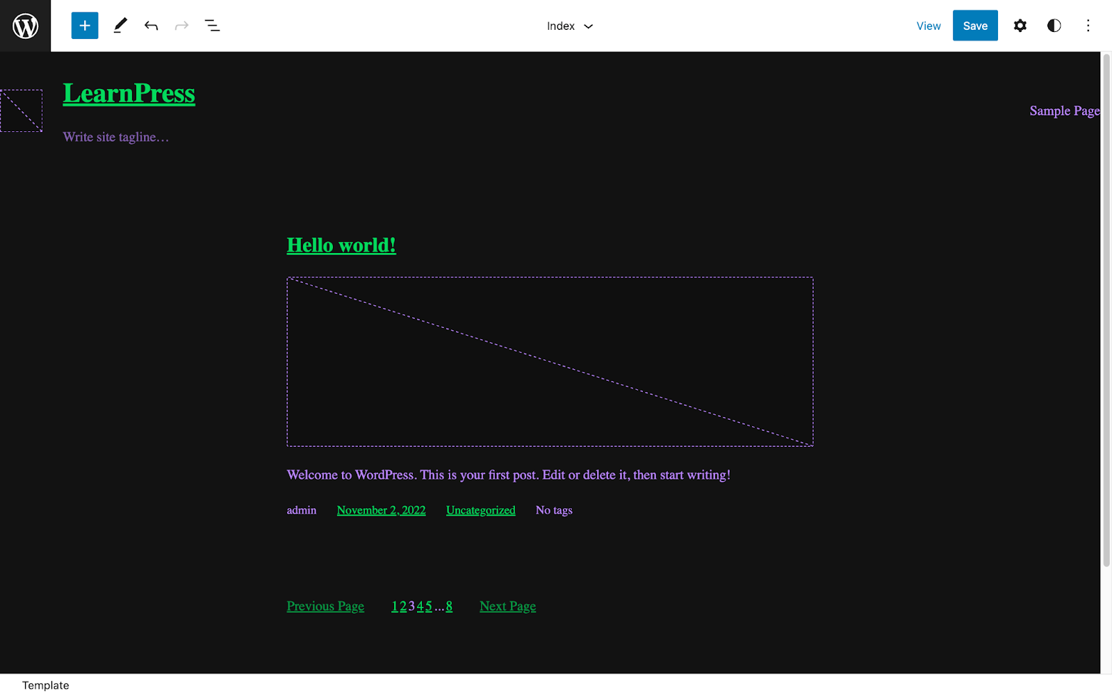
These colors were applied in a recent blockBlockBlock is the abstract term used to describe units of markup that, composed together, form the content or layout of a webpage using the WordPress editor. The idea combines concepts of what in the past may have achieved with shortcodes, custom HTML, and embed discovery into a single consistent API and user experience. theme tutorial video I created. During the review of that tutorial, it was raised that the color contrast in the dark theme example is very low and makes the text very hard to read.
As I am not a color contrast expert, I’d like to take this opportunity to iterate on the colors as laid out above and choose better primary and secondary colors for a dark theme that are more accessible and easier to read for online workshops and tutorials. We can then add these colors to the Training Team handbook, to be used whenever an alternative color scheme is required.
Let’s define high-contrast, accessible, dark theme colors together! What dark theme color palettes would be the most accessible? What have you seen that’s worked well? What should we avoid? Share your thoughts below and we will consolidate them into actionable suggestions by Friday 18 November 2022 to be added to the training team handbook for content creation.