The WordPress coreCoreCore is the set of software required to run WordPress. The Core Development Team builds WordPress. development team builds WordPress! Follow this site for general updates, status reports, and the occasional code debate. There’s lots of ways to contribute:
Found a bugbugA bug is an error or unexpected result. Performance improvements, code optimization, and are considered enhancements, not defects. After feature freeze, only bugs are dealt with, with regressions (adverse changes from the previous version) being the highest priority.?Create a ticket in the bug tracker.
Multisite registration and activation pages have new HTML and CSS
In WordPress 6.1, the forms for the wp-signup.php and wp-activate.php pages have several enhancements to both the markup and the styles.
AccessibilityAccessibilityAccessibility (commonly shortened to a11y) refers to the design of products, devices, services, or environments for people with disabilities. The concept of accessible design ensures both “direct access” (i.e. unassisted) and “indirect access” meaning compatibility with a person’s assistive technology (for example, computer screen readers). (https://en.wikipedia.org/wiki/Accessibility)-related improvements
Indicating relationships:
Fieldsets, with visible legend text, group the radio buttons.
Form field description information connects to its related field with aria-describedby.
When present, error messages also connect to their field with aria-describedby. The generic error has an ID in case custom fields should refer to that.
Preventing errors:
Required text fields have the required attribute.
The Site Name label indicates that users should enter the subdirectory only, and the Site Domain is only the desired subdomain.
The Username field’s description text now specifies that letters need to be lowercase.
Color contrast:
If the activation page has an error message, its default dark gray text color contrasts against the light background.
The default style for links within the registration page’s bordered message (.mu_alert) includes an underline and matches the text color of the rest of the message. For example, Twenty Twenty-One’s dark mode assigns a light link color, so the new style makes it readable and identifiable as a link. If a theme uses a bottom border or box-shadow on links, however, this underline could be inappropriate.
Links were sometimes difficult to see
Links match the surrounding text color, underlined, in 6.1
New elements and styles for the registration page form
The fieldset and legend elements reset margin, padding and border properties.
The legend styles are consistent with the default label font size, weight and margins.
Radio buttons are inside paragraphs without a top margin, following the legend.
Text input fields and the submit button, which were set to 100% width plus padding, are only as wide as their container now.
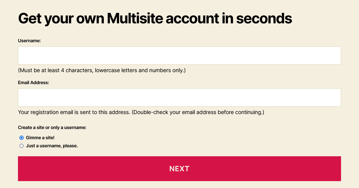
New account setup, step 1, allowing both sites and usernames
When people create an account:
Descriptive text for the Username and Email Address is inside paragraph tags. Because these immediately follow the input, the paragraphs do not have a top margin.
Options for creating a site and/or a username are grouped in a fieldset with a new, visible legend.
Elements with the “wp-signup-radio-button” class wrap these options’ radio buttons and their labels, and with “display: block” the options stack vertically.
Form fields for an administrator (logged in) to create a new site
When an administrator creates a new site:
A “wp-signup-blogname” container wraps the Site Name (or Site Domain) input with the domain, so themes could arrange them side-by-side.
For right-to-left languages, the domain and its input field remain in the left-to-right direction.
The “privacy-intro” fieldset uses paragraph tags inside it to retain most paragraph styles from the theme.
By wrapping “Privacy:” in a “label-heading” span, it appears above the rest of the legend. This text maintains the same default font size and weight given to the legend and label elements.
The “Yes” and “No” labels have moved next to the radio buttons, instead of inside them. Without the strong emphasis tags, these can match the default label font weight of 600. If any theme overrides the “.mu_register label.checkbox” selector to block display, that property will need updating to an inline style.
In this fieldset, “wp-signup-radio-button” containers remain next to each other, with a small margin between them.
Site activation page styles
The activation form’s container is centered, to match the signup page.
The input field and submit button cover the full width of the container, with box-sizing: border-box to prevent them from extending beyond 100%.
The form and .error selectors now include .wp-activate-container so that the styles do not affect elements in the headerHeaderThe header of your site is typically the first thing people will experience. The masthead or header art located across the top of your page is part of the look and feel of your website. It can influence a visitor’s opinion about your content and you/ your organization’s brand. It may also look different on different screen sizes. or footer.
BlockBlockBlock is the abstract term used to describe units of markup that, composed together, form the content or layout of a webpage using the WordPress editor. The idea combines concepts of what in the past may have achieved with shortcodes, custom HTML, and embed discovery into a single consistent API and user experience. themes
This is not new to 6.1, but block themes should continue to include header.php and footer.php template files for these pages. To make a header template more specific to the networknetwork(versus site, blog) pages, its filename can be header-wp-signup.php or header-wp-activate.php.
For more information about the HTMLHTMLHyperText Markup Language. The semantic scripting language primarily used for outputting content in web browsers. and CSSCSSCascading Style Sheets. changes, view tickets #40361 and #54344.


You must be logged in to post a comment.