WP 4.2-RC3-32249 and iOS The operating system used on iPhones and iPads. 8.3.
-

-
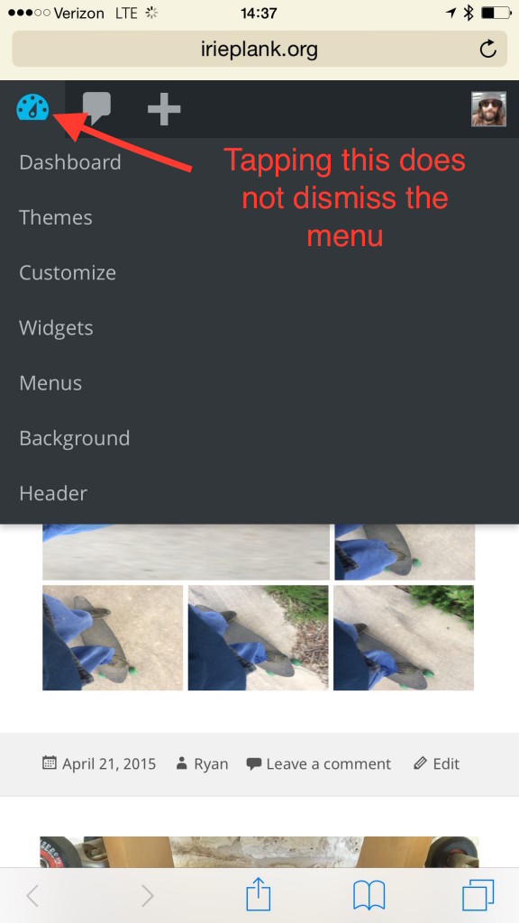
Start on logged in front page. Tap + in the toolbar.
-

-
Tap Post.
-

-
Loading indicator.
-

-
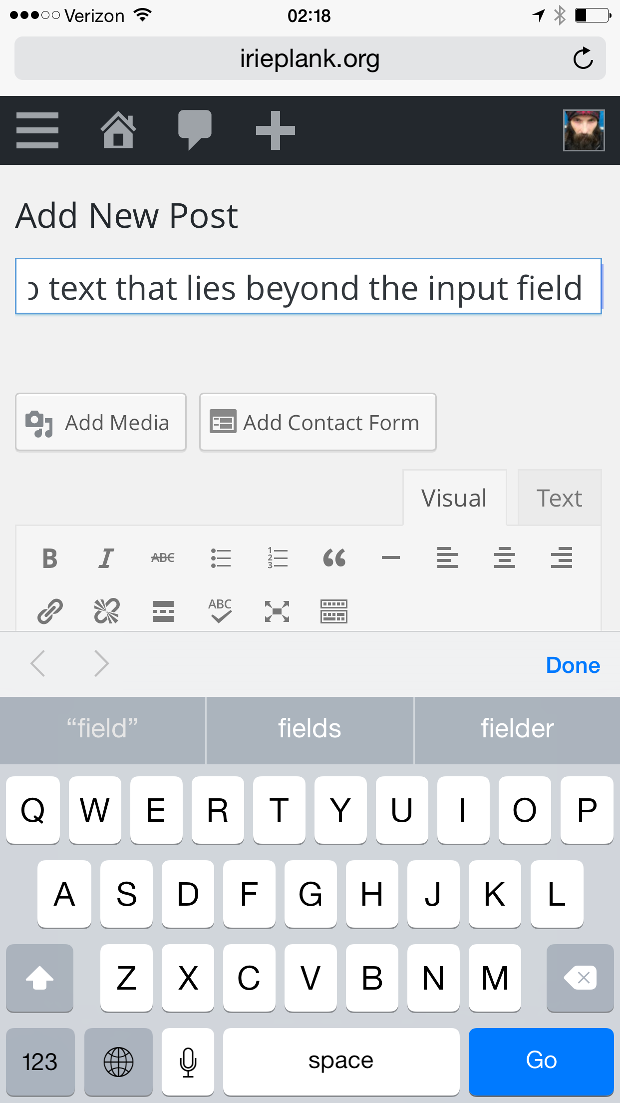
Tap title input.
-

-
Type title in fly up keyboard.
-

-
Tap Done to dismiss the keyboard.
-

-
Tap Add Media.
-

-
Opens in Media lib [2]. The dismiss button is missing [1]. Tap Upload Files.
-

-
The dismiss button is back. Tap Select Files.
-

-
Tap Irie Plank Image Feed.
-

-
Tap images to include in the gallery and then tap Done.
-

-
After a pause where nothing seems to be happening, upload progress is shown. The resulting screen is a known mess [4].
-

-
Tap Insert Media to show the flow Flow is the path of screens and interactions taken to accomplish a task. It’s an experience vector. Flow is also a feeling. It’s being unselfconscious and in the zone. Flow is what happens when difficulties are removed and you are freed to pursue an activity without forming intentions. You just do it.
Flow is the actual user experience, in many ways. If you like, you can think of flow as a really comprehensive set of user stories. When you think about user flow, you’re thinking about exactly how a user will perform the tasks allowed by your product.Flow and Context
selector dropdown. [8]
-

-
Tap Create Gallery.
-

-
Tap Create a new gallery.
-

-
Tap a caption field.
-

-
Cursor wonkiness.
-

-
Get a caption focused, type in caption text.
-

-
Tap around doing more captions.
-

-
Discover cursor bugs.
-

-
Repeat for each image. Curse at bad scrolling, keyboard juggling, and focus panning that burn a lot of taps. [3]
-

-
Captioning done. Tap Insert Gallery.
-

-
Arrive back at the editor with the keyboard up and obscuring the content. At a glance, I can’t confirm the gallery was added correctly. Tap Done to dismiss the keyboard.
-

-
The inserted gallery is now evident. A big cursor blinks along the left side of the gallery. Scroll down to spot check the captions.
-

-
The keyboard oft gets in the way when trying to scroll the editor. Tap Done to dismiss the keyboard and then scroll down some more to find Preview [5].
-

-
Tap Preview.
-

-
A new browser window opens…
-

-
and loads the post. Post looks good. Tap the browser page switcher thingy in the bottom right.
-

-
Find the edit post page from the list of pages. This can be daunting if you have a lot of things open, particularly with multiple WP pages [6]. Tap the edit post page once you find it. Don’t dismiss the preview window.
-

-
You’re back in the edit window. Make some edits. Tap Preview. Nothing happens. Apparently nothing anyway. If you left the preview window open it is being reloaded out of site whenever you click Preview [6]. Sometimes clicking Preview in this state causes a cursor glitch in the region of the publish box disclosure triangle.
-

-
Preview exhibiting the cursor glitch.
-

-
It doesn’t always glitch. Sometimes it quietly noops.
-

-
If the keyboard is in your way after all of that, tap Done to dismiss. Okay, here goes. Tap Publish and see a misaligned progress indicator.
-

-
Editor reloads with a post published notification at the top. Tap View post in the notification.
-

-
Post looks good. Tap the site title to get back to the front page.
-

-
Back at the front page.
Bulleted flow:
- Start on logged in front page.
- Tap + in the toolbar.
- Tap Post.
- Tap title input.
- Type title in fly up keyboard.
- Tap Done to dismiss the keyboard. Page updates with permalink info. [7]
- Tap Add Media
- Opens in Media lib [2]. The dismiss button is missing [1]. Tap Upload Files.
- The dismiss button is back. Tap Select Files.
- Tap Irie Plank Image Feed.
- Tap images to select.
- Tap Done.
- After a pause where nothing seems to be happening, upload progress is shown. The resulting screen is a known mess [4].
- Tap Insert Media to show the flow selector dropdown. [8]
- Tap Create Gallery.
- Tap Create a new gallery.
- Tap a caption field.
- Type in caption text.
- Tap another caption field.
- Type in caption text.
- Repeat for each image. Curse at bad scrolling, keyboard juggling, and focus panning that burn a lot of taps. [3]
- Tap Insert Gallery.
- Arrive back at the editor with the keyboard up and obscuring the content. At a glance, I can’t confirm the gallery was added correctly. Tap Done to dismiss the keyboard.
- The inserted gallery is now evident. A big cursor blinks along the left side of the gallery.
- Scroll down to spot check the captions.
- Scroll down some more to find Preview [5].
- Tap Preview.
- A new browser window opens to the post page.
- Post looks good. Tap the browser page switcher thingy in the bottom right.
- Find the edit post page from the list of pages. This can be daunting if you have a lot of things open, particularly with multiple WP pages [6].
- Tap the edit post page once you find it. Don’t dismiss the preview window.
- You’re back in the edit window. Make some edits. Tap Preview. Nothing happens. Apparently nothing anyway. If you left the preview window open it is being reloaded out of site whenever you click Preview [6]. Sometimes clicking Preview in this state causes a cursor glitch in the region of the publish box disclosure triangle.
- If the keyboard is in your way after all of that, tap Done to dismiss.
- Here goes. Tap Publish.
- Misaligned loading indicator spins. Editor reloads with a post published notification at the top.
- Tap View post in the notification.
- Post looks good. Tap the site title to get back to the front page.
Notes:
[1] The dismiss button is often missing from the media modal. This seems to be particular to the Media Library view. Dismiss never disappears if you stay on Upload Files. Bringing the modal up more than once may be needed to trigger this. Moving from the Media Library view to the Upload Files view restores the dismiss button, but tapping the dismiss button does nothing but hide the dismiss button again.
[2] Media modal scrolling in media lib view often gets stuck. The page beneath the modal seems to be hijacking swipes. I’ve developed the habit of giving a 15 second-ish cooldown when swiping gets stuck. The next swipe after the cooldown typical goes to the modal and normal scrolling is restored for awhile.
[3] Scrolling while editing captions is very awkward. The cursor often detaches from the caption field and seemingly joins the editor lying beneath the modal. The cursor isn’t always in the caption field. Especially with the last row of images, the cursor often shows below the caption field. Typing places the text in correctly in the caption field but the cursor is outside the field. The jittery focus pan that happens when a caption is tapped into is disconcerting. Overall, captioning is irksome and difficult.
[4] The image flow effort will eventually remove that awkward sidebar A sidebar in WordPress is referred to a widget-ready area used by WordPress themes to display information that is not a part of the main content. It is not always a vertical column on the side. It can be a horizontal rectangle below or above the content area, footer, header, or any where in the theme. from mobile. Should we pursue an interim solution that removes the sidebar from the production media modal since image flow is a couple release out?
[5] I often tap View Post just below the title when I want to preview. View Post shows the last published changes, however, not your in editor revisions The WordPress revisions system stores a record of each saved draft or published update. The revision system allows you to see what changes were made in each revision by dragging a slider (or using the Next/Previous buttons). The display indicates what has changed in each revision.. Preview is the button I really want but it is farther from the editor than View Post and often gets forgotten.
[6] Mobile should never open things in new browser windows. This is a desktop bias Patterns and interfaces that work in desktop interfaces don't always work on mobile. UI elements triggered by mouse hover, opening in new windows, dragging into bookmarks bars, drag-and-drop, and auto-focusing search input fields are examples of desktop bias.https://make.wordpress.org/test/tag/desktop-bias/ that falls apart on mobile. Modal preview would be better on mobile.
[7] My permalink has the slug flow-loop The Loop is PHP code used by WordPress to display posts. Using The Loop, WordPress processes each post to be displayed on the current page, and formats it according to how it matches specified criteria within The Loop tags. Any HTML or PHP code in the Loop will be processed on each post. https://codex.wordpress.org/The_Loop.-2 instead of flow-loop because I trashed an earlier draft due to interface frustrations. My frustrated bail out is later met with slug consequences. Ugh.
[8] The flow selector dropdown doesn’t dismiss with outside taps.
#captioned-galleries, #captions, #forked-flow, #galleries, #ios, #media, #mobile, #modal, #new-tab-window, #phablet, #post-flow, #preview, #publish, #vizrec, #web


You must be logged in to post a comment.