The Test Team helps manage testing and triage across the WordPress ecosystem. They focus on user testing of the editing experience and WordPress dashboard, replicating and documenting bug reports, and supporting a culture of review and triage across the project.
Please drop by any time in SlackSlackSlack is a Collaborative Group Chat Platform https://slack.com/. The WordPress community has its own Slack Channel at https://make.wordpress.org/chat/. with questions or to help out.
This post is a summary of the sixteenth call for testing for the FSE outreach program. As always, I want to highlight those who helped to bring others along with them in this latest effort:
@piermario for creating an Italian translation so members of the Italian speaking WordPress community can participate.
InstaWP for allowing the outreach program to use their tooling for free, resulting in a much lower barrier to entry to help test and more room for creativity in coming up with the test itself. The features focused on for this test would have been much harder for individuals to set up without the tooling offered.
High-level summary
Because this call for testing allowed for folks to explore different areas as much or as little as they wanted to, feedback was mainly caught up in the minutiae of larger features and experiences. Throughout each of these individual points, it’s very clear that an effort to take a step back and stabilize the following would go a long way in particular:
Better organization for block transforms so the options presented feel logical and relevant without accidental dead ends where you can’t switch back to the original blockBlockBlock is the abstract term used to describe units of markup that, composed together, form the content or layout of a webpage using the WordPress editor. The idea combines concepts of what in the past may have achieved with shortcodes, custom HTML, and embed discovery into a single consistent API and user experience..
Outside of the above, Patterns and Document Settings both received very little if any critical feedback, reflecting the strength of the current experience. For any designers and developers who want to see someone walk through the experience, I want to also mention the following videos from @paaljoachim to check out as you see fit:
The transforms all worked as expected, however some of the transforms were not super intuitive at first but I think made sense after I understood what they were doing. The transform to columns on multiple clicks of it ended up creating many many columns blocks wrapped inside each other. It was not clear why columns was an option to transform to, but now I am assuming it is so that you can quickly wrap an element into a columns block.
Another time, when I was looking to transform a heading, the “preview” would sometimes be cut off. You can see this in the below video, especially the preview for transforming it to a paragraph. What’s odd is that hovering up and down over the different options, it sometimes displayed correctly and sometimes not.
It is a mystery to me when or why this happens. It seems to happen more when I drop to the end of the post, but it also happens when I drop the row between two paragraphs.
At a high level, most feature requests related to better organization for block transforms as folks ran into various dead ends and clunky steps to switch between blocks:
For the final item around having a way to revert to an original image, this stands out as particularly important to consider when one looks ahead at the various options potentially added to image alterations in the future, from duotone to object fit options.
Changing a paragraph into any blocks can easily be reverted back into a Paragraph Block, except when it is changed to a Code Block. While one can easily unwrap a quote back to a paragraph, or revert a pullquote, a preformatted, a verse, a heading, or a list back to paragraph block. The same effortlessness is gone once the paragraph is transformed to a Code Block. Here one is faced with unintuitive options to operate on the Code Block (quote, preformatted, group, columns, custom HTMLHTMLHTML is an acronym for Hyper Text Markup Language. It is a markup language that is used in the development of web pages and websites.). To transform the Code Block into a paragraph, it needs to be changed into a Preformatted Block first.
I cannot remove a crop on an image, only replace it with the original from the media library. I would like to be told a new image was created. It would be nice if the image block would be smart enough to have a “revert to original” button and know which image in the media library to revert to.
As mentioned in the high level overview, both drag & drop and block transforms were key items that recurred throughout this call for testing. This was particularly true when thinking about usability since, at times, transforms felt smooth and obvious whereas at other points it led you through what one described as a “labyrinth”. Drag and drop felt similarly inconsistent with the ability to both easily move a large collection of blocks in one moment and the next being unable to add a block to an empty Columns block.
Text transforms generally worked fine, but feels a bit like a labyrinth. As there are different transforms based on what the current block is. It feels a bit random.
The transform to columns on multiple clicks of it ended up creating many many columns blocks wrapped inside each other. It was not clear why columns was an option to transform to, but now I am assuming it is so that you can quickly wrap an element into a columns block…Changing blocks to another type and eventually not being able to change back to the original type was somewhat frustrating, but not a big deal.
It is sometimes strange when you want to move a section somewhere else in the list view with the mouse. The positioning is not always cleanly possible.
One thing I noticed was the cover block gave me an option to convert it to an image block (which made sense). The other options were column block or group block. When I tried the group block, it didn’t actually transform into a group block. It created a group block on top of (or around? not sure what the right terminology) the existing cover block. This actually seemed useful. But isn’t what I would have thought by “transform.”
Moving images is done successfully both by drag & drop the blocks in the List View, and by using the move up/down chevrons in the image’s Block Toolbar. But the image movement is failed when I use the Move to option in the image’s Block Toolbar. Or perhaps my expectation isn’t inline with its designated usage.
This post is a summary of the fifteenth call for testing for the FSE outreach program. As always, I want to highlight those who helped to bring others along with them in this latest effort:
@courane01 for running a group testing session and reporting feedback.
InstaWP for allowing the outreach program to use their tooling for free, resulting in a much lower barrier to entry to help test and more room for creativity in coming up with the test itself. The features focused on for this test would have been much harder for individuals to set up without the tooling offered.
As with prior calls for testing that centered on using the Query LoopLoopThe Loop is PHP code used by WordPress to display posts. Using The Loop, WordPress processes each post to be displayed on the current page, and formats it according to how it matches specified criteria within The Loop tags. Any HTML or PHP code in the Loop will be processed on each post. https://codex.wordpress.org/The_Loop.blockBlockBlock is the abstract term used to describe units of markup that, composed together, form the content or layout of a webpage using the WordPress editor. The idea combines concepts of what in the past may have achieved with shortcodes, custom HTML, and embed discovery into a single consistent API and user experience., the current experience remains equal parts magical and clunky to configure exactly as one wants. When combined with the fact that when creating a new template, you’re met with an empty view, this call for testing mainly weights towards feature requests to ease the experience rather than outright bugs. Of all of what’s shared here, these are the most repeated items of feedback: unclear UX for how to get out of a locked block with headings & paragraph blocks, improve the verbiage around the Query Block settings and revise Query Block controls, edit site link should open the current template, and add fallback template content on creation.
The addition of starter patterns with locked blocks when creating a new post offered a peak at how streamlined and curated the experience can be while also revealing that more visual cues are needed to better understand what exactly is happening, particularly with locked blocks and layout controls. Most of what was discussed matches what has been previously found which underscores the impact resolving these repeated key problems will have.
For any designers and developers who want to see someone walk through the experience, I want to also mention the following videos to check out to see the call for testing in action:
To help ground the following feedback, here are some quotes about the overall experience to keep in mind:
It’s so smooth and easy. The fact that you can create template overrides for specific categories is brilliant. I can’t wait to use that on a custom theme with custom blocks. Post patterns are also great!
So cool to see how far FSE has come and all of the improvements related to templates. We’re getting closer to the power of the template hierarchy of traditional themes!
Selecting “categoryCategoryThe 'category' taxonomy lets you group posts / content together that share a common bond. Categories are pre-defined and broad ranging.” from the “Add new” template menu was unintuitive for me. That UXUXUX is an acronym for User Experience - the way the user uses the UI. Think ‘what they are doing’ and less about how they do it. implies to me that I could add many “category” templates, which is not true. That confused me as to whether I would be creating a “category” template for every type of category, or choosing which categories to assign the template to. When I realized I couldn’t add another “category” I figured out what was going on…I enjoyed playing around with the featured imageFeatured imageA featured image is the main image used on your blog archive page and is pulled when the post or page is shared on social media. The image can be used to display in widget areas on your site or in a summary list of posts. / cover interaction and the “inner blocks use full width” feature. At the end of the test it was also cool to see the category template in use.
Maybe I am too used to classic WordPress themes with headerHeaderThe header of your site is typically the first thing people will experience. The masthead or header art located across the top of your page is part of the look and feel of your website. It can influence a visitor’s opinion about your content and you/ your organization’s brand. It may also look different on different screen sizes. and footer pretty much always there. But it was very easy to create the template without a footer or header. Which obviously is cool that you can do that, but for whatever reason my brain was expecting header and footer to be auto included by default.
Typo in the category template creation (coming in GutenbergGutenbergThe Gutenberg project is the new Editor Interface for WordPress. The editor improves the process and experience of creating new content, making writing rich content much simpler. It uses ‘blocks’ to add richness rather than shortcodes, custom HTML etc. https://wordpress.org/gutenberg/ 13.8).
Locked heading blocks in the provided templates were super, duper frustrating. With normal heading blocks, if I press “return” at the end of a heading I get a paragraph block. With the locked headings I got stuck in the heading blocks. This felt like a major departure from typical interactions in the block editor.
As reflected in the high level summary, most feature requests have been mentioned before with a particular focus on various refinements, like adding a “view site” link in the editor or renaming “default template” in the template panel to match what one would see in the template list. While these are listed as feature requests, the lack of each adds up quickly creating an experience that accomplishes what you want but not without repeated moments of confusion.
It sometimes feels like I am “trapped” in the site editor without an easy way to get back to the dashboard. One suggestion would be having a dropdown to select whether I want to go back to the dashboard vs. see Site/Template/Template part editor. Similarly, I sometimes wish there was a “view site” option from the site editor. Again, I feel trapped.
I would prefer to have the same experience each time. It’s confusing to suddenly see patterns when I was expecting blocks. I would like to always see blocks first with a button or such to switch to the patterns.
I found that a different role will have a slightly different saving experience. Under administrator role, after I clicked publish for a new event or a new event recap, a suggestion menu to assign a category appeared. But this didn’t happen under an author role. So, author will have to go back to post tab, if she just remembered that she hasn’t assigned an event category to the post.
It works very well, as long as you remember to select “Inherit query from template” when you add the Query Loop. (I forget sometimes.) So I had different templates for one category over all the others.
So I would prefer if it said “Template Single” instead of “Template Default Template”. Or maybe “Template Single (Default)”, though I don’t see how being shown Single is the default is really helpful at that moment.
Feedback from this experience centered heavily on the Query Loop block and template creation experiences, rather than using block locking or post patterns or the featured image in the Cover block, despite those being newer features. As with every call for testing where a new template is being created, the experience of being dropped into an empty template to build from scratch is underwhelming. Determining when and how to use various settings for controlling both layout and query options continues to be a major pain pointPain pointPain points are “places where you know from research or analytics that users are currently getting hung up and have to ask questions, or are likely to abandon the site or app.” — Design for Real Life. This will likely be eased when better defaults are available (Query loop block automatically added with “inherit query by default” set to true) rather than needing to create more from scratch, even with patterns.
Please ensure to read the quotes below as they help give context to what’s shared below as simple issues.
Improve Image Blocks Placeholders specifically in the context of using the featured image in a cover block, when the featured image hasn’t yet been added to a post, to make it clearer what action to take.
I really liked the “Inner blocks use full width” option, but I could not figure out what the “Wide” setting did. Changing the value didn’t do anything, and both the icon and description were unclear.
When using the query loop block, it isn’t immediately obvious how to view other design options. One suggestion would be to have the grid view displayed by default and allow someone to choose the single view as an option.
I don’t mind curated blocks or locked blocks at all… I only wish that the visual editor will prepare me (or the common user as the intended user of a bespoke theme) when dealing with curated blocks…Perhaps giving the curated block a different color? Or any sign that it is not your usual kind of block?
When selecting an “Event Recap” pattern, the caption was not visible in the preview because the pattern was too long vertically, and had to scroll to confirm it.
Editing the layout of a group is a little tricky. I think getting more comfortable with the UIUIUI is an acronym for User Interface - the layout of the page the user interacts with. Think ‘how are they doing that’ and less about what they are doing. would help, but having additional feedback around what is selected and where I can move things would be helpful.
This post is a summary of the fourteenth call for testing for the experimental FSE outreach program. As always, I want to highlight those who helped to bring others along with them in this latest effort:
Shout out to @alixnotes for being the sole first-time contributor for this call for testing. Get excited – you will soon have a testing contributor badge on your WordPress profile!
High-level summary
Across many of the responses to this call for testing, it was quickly clear that folks found the Template Editor via the Post Editor uniquely confusing, especially after growing used to the Site Editor. Because of how the Template Editor interacts or doesn’t with the Post Editor, a few folks struggled to understand when they were editing the template vs the post itself. In terms of the next editions of the List and Quote blockBlockBlock is the abstract term used to describe units of markup that, composed together, form the content or layout of a webpage using the WordPress editor. The idea combines concepts of what in the past may have achieved with shortcodes, custom HTML, and embed discovery into a single consistent API and user experience., there was general excitement around the new capabilities, especially once some refinements and bugs are addressed around keyboard controls for the List block.
To help ground the following feedback, here are some quotes about the overall experience to keep in mind:
The new Quote block worked well. It is now possible to add nested blocks inside it, one of the features I have long needed as a writer here at the Tavern when quoting from third-party resources…Overall, I am eager to see the finalized versions of these blocks. They will bring back some of the missing functionality from the classic editor and give users the flexibility to do even more.
I only got halfway through the FSE #14 because I got too frustrated with the comments part of the challenge. I spent 40 minutes on it, and here’s my biggest takeaway. The slightly different variations of the template editing screen were just too confusing for me. As someone who has been trying to work in the FSE for a few months now, I was completely thrown off by the slightly different screen you got when you launch the template editor directly from a post vs the template editor you get when you go to edit site, and then select a template to edit.
I really prefer not to use the Post Editor template system and instead keep all templates in the Site Editor. As it creates a consistency in how templates are created. The Post Editor template system is very different compared to the Site Editor template system. It creates a confusion in how templates are created. I look forward to being able to create multiple Post and Page templates in the Site Editor and have a simple system to where I can choose which posts and pages to attach any template to.
For any designers and developers who want to see someone walk through the experience, I want to also mention the following videos to check out and skip around to see the call for testing in action:
Here’s an example of what was created from @greenshady for this call for testing (he went above and beyond per usual):
Here’s another example of what was created with a lovely color palette by @alixnotes:
Confirmed Bugs
One of the testers for @courane01’s session experienced the editor crash when testing list view and attempting to modify a color but I was unable to replicate this across a few different attempts. Outside of that, the following bugs were found:
I assumed that the Add citation would be an inner block. I also assumed that I would be able to add padding/margin to the block. Both things are missing.
A new template can only be created by going to a post and clicking on “New” in the settings under Template on the right. It would be much more intuitive if you could create a new template directly in the editor.
Markdown-based lists are also not transformed into a List block when pasted into the editor. The formatting is lost, and each item gets absorbed into a Paragraph block.
As lightly mentioned in the high level overview, much of the feedback fell into this categoryCategoryThe 'category' taxonomy lets you group posts / content together that share a common bond. Categories are pre-defined and broad ranging. with folks confused by the Template editor via the Post Editor, unsure of when they were editing the post vs template, and struggling to get layouts to cooperate (especially when it came to width controls). Sometimes these issues all combined with folks editing post content rather than the template and unable to adjust the width as they wanted as a result. Additional quotes are added below to better provide context:
Desire for consistent dimension controls across blocks since it’s currently commonplace for some blocks to have controls and options that others do not (ex: Post Author block vs AvatarAvatarAn avatar is an image or illustration that specifically refers to a character that represents an online user. It’s usually a square box that appears next to the user’s name. block).
Simplify the layout concept in order to make the controls easier to use to better ensure that when creating a new template the widths aren’t drastically different from the rest of the Post Content block. Tied to this, there needs to be a way to make it clear that a Group block needs to be added at all to have the widths be consistent.
For this final item, here’s a quick video demonstrating the problem so folks can better understand this specific pain pointPain pointPain points are “places where you know from research or analytics that users are currently getting hung up and have to ask questions, or are likely to abandon the site or app.” — Design for Real Life in the template creation process:
I also had difficulty making the Comments section the same width as the Content Group. If I used a Group Block to contain the Comment Query LoopLoopThe Loop is PHP code used by WordPress to display posts. Using The Loop, WordPress processes each post to be displayed on the current page, and formats it according to how it matches specified criteria within The Loop tags. Any HTML or PHP code in the Loop will be processed on each post. https://codex.wordpress.org/The_Loop., then the comments themselves could be reduced in width (using the Inherit Layout option) , but the borders were still the full width.
Still trying to get “edge space” – ie margin from edge to orange borders I tried toggling on the “inherit default layout” This didnt make any different to the margin. It just changed the padding. I also added a zero to the block spacing field. Nothing changed. I tried changing the layout toggle to 80 % wide. This changed the internal padding of the block and didnt move the block away from the edges…Why are some settings in the block toolbar and some in the inspector? Why arn’t the same settings (where appropriate) in all similar blocks – ie padding, margins, width available in both groups, and columns?
Still in the template editor I went to view the post. Then trying to get back to the template editor I got the page editor which informed me that there was a saved version that contained changes. (I have been caught by this before – on my own site when making changes in the templates and then going to the page editor, if I had clicked on the revert to saved I potentially might have lost all the changes that I had just tried to make. This is confusing!).
The slightly different variations of the template editing screen were just too confusing for me. As someone who has been trying to work in the FSE for a few months now, I was completely thrown off by the slightly different screen you got when you launch the template editor directly from a post vs the template editor you get when you go to edit site, and then select a template to edit.
The different controls for different blocks makes it really hard to make something that is consistent and nice. I decided it would be cool to make the user pictures a little bit bigger, like that might make the comments more inviting. Since I made the commenters pictures so big, I said, let’s add in a Post Author block so that the post author’s picture will be shown too! Wait, the Avatar block in the Comments Query loop and the Post Author have completely different control? I can make the avatar any size, but the post author I have a dropdown with 3 choices? I can but a border radius on the avatar block, but not the post author block? If it’s a picture, I should have all the same tools available to me as any other block that uses a picture.
This post is a summary of the thirteenth call for testing for the experimental FSE outreach program. As always, I want to highlight those who helped to bring others along with them in this latest effort:
Shout out to @hage, @antigone7, @robglidden, @azhiyadev as first-time contributors. Get excited – you now have a testing contributor badge on your WordPress profile!
High-level summary
To help ground the following feedback, here are some quotes about the overall experience to keep in mind:
The most frustrating thing to me is still, hands down, the lack of a clear, consistent visual cue or affordance to insert a new blockBlockBlock is the abstract term used to describe units of markup that, composed together, form the content or layout of a webpage using the WordPress editor. The idea combines concepts of what in the past may have achieved with shortcodes, custom HTML, and embed discovery into a single consistent API and user experience. on a new parent level after an existing block. Most of the time, when adding a block using the [+] square, the new one is inserted right there, still as a “child” block. List view often comes to the rescue and helps a lot. Without it, everything would be much, much harder to build..This, and the current lack of consistency in styling and spacing options between blocks (some have margins, some don’t, some have colors, some don’t, etc.) is still, in my opinion, one of the main factors keeping users from jumping ship from site builders.
Outside of the user-experience issues noted below, everything went well. No editor crashes. No problems saving. And the front-end matched what I was seeing in the editor.
Offer the option to link to an author’s archive with the current Post Author block. This will be available in future releases when the Post Name Author block is released, which includes this feature.
Most requests in this section touch on items that would improve the experience of an option (quick inserter prioritizing patterns) or block (No results block) rather than a list of desired new functionality. This reflects the fact that much of what folks wanted to do in this call for testing they could reasonably accomplish compared to prior calls.
I did not know about the “No Results block”. That was interesting to learn about. Perhaps it should automatically be added with the default text if there are no author posts to show.
The Post ExcerptExcerptAn excerpt is the description of the blog post or page that will by default show on the blog archive page, in search results (SERPs), and on social media. With an SEO plugin, the excerpt may also be in that plugin’s metabox. block under the Query LoopLoopThe Loop is PHP code used by WordPress to display posts. Using The Loop, WordPress processes each post to be displayed on the current page, and formats it according to how it matches specified criteria within The Loop tags. Any HTML or PHP code in the Loop will be processed on each post. https://codex.wordpress.org/The_Loop. doesn’t have an option to adjust the excerpt length. (The Latest Posts block does have this option.)
Working with the block felt odd at first. Where does it go? After the Post Template? Before?…It was also odd to visually edit a feature that is conditionally displayed. There should be an indicator that its contents may or may not be shown on the front end…Overall, the No Results block is a welcome addition to the theme-blocks toolset. I would like to see the UIUIUI is an acronym for User Interface - the layout of the page the user interacts with. Think ‘how are they doing that’ and less about what they are doing. fleshed out a bit. Theme authors will likely start using this more when 6.0 lands, and I could see users inadvertently trying to delete it, thinking it is part of the default output.
Once more, this call for testing showed the desire to avoid starting from scratch, more consistency across the experience (especially with what options are available to customize blocks), and more connection points between new options. In particular, the inability to link to the Author Template one customized in this call for testing using the Post Author block was repeated numerous times as a pain pointPain pointPain points are “places where you know from research or analytics that users are currently getting hung up and have to ask questions, or are likely to abandon the site or app.” — Design for Real Life. The missing connection there lowers the impact the new author template could have. While this won’t be available for WordPress 6.0, expect to see the option to do so included when the new Post Author Name block is included in a future WordPress release:
The most immediate issue when creating a new author template is that it was devoid of default blocks. Where was the—at minimum—headerHeaderThe header of your site is typically the first thing people will experience. The masthead or header art located across the top of your page is part of the look and feel of your website. It can influence a visitor’s opinion about your content and you/ your organization’s brand. It may also look different on different screen sizes. and footer? The empty template would make sense if I was building something from scratch. However, this is not a from-scratch project. It was built from a theme with existing archive.htmlHTMLHTML is an acronym for Hyper Text Markup Language. It is a markup language that is used in the development of web pages and websites. and index.html files, ancestors in the template hierarchy…Users will most likely want to make modifications rather than start from scratch. Using an ancestor template as a base means that they are less likely to unnecessarily deviate from the existing layout, especially with more complex designs.
I feel that menus were a lot more intuitive and easier to manage with the previous system. I wish there were a way to basically tie back the new blocks to a similar interface, which had become familiar and was easy to use even for non-experts.
I had expected that after locking the group block at the header, the cover block contained in it (for example) could also not be moved. But that was possible without any problems. In my opinion, another option would make sense here: Lock all blocks contained in the block. If a group block contains several other blocks, it would be very time-consuming to lock all of them.
This post is a summary of the twelfth call for testing for the experimental FSE outreach program. As always, I want to highlight those who helped to bring others along with them in this latest effort:
Shout out to @itsjustdj as the sole first-time contributor for this call for testing. Get excited – you now have a testing contributor badge on your WordPress profile!
High-level summary
The feedback this time around focused on the edges of the experience, especially in terms of design tools, and on some key problem areas that have repeatedly come up around navigating the entirety of the experience, like knowing what templates are used where. On the whole though, there were no deal breakers, big crashes, or show stopping problems found. Here’s what a few people had to say about the experience that can help frame the following more specific feedback:
On the whole, this went surprisingly well. In a year, the site editor has become far more powerful…Without responsive controls on layout-type containers like the Columns blockBlockBlock is the abstract term used to describe units of markup that, composed together, form the content or layout of a webpage using the WordPress editor. The idea combines concepts of what in the past may have achieved with shortcodes, custom HTML, and embed discovery into a single consistent API and user experience., designing anything complex with the site editor can sometimes feel like one giant hack…There are tons of improvements with block design tools in comparison to last year…I hit no spacing-related problems in this experiment. That feels gratifying to say after over a year of testing FSE features. The experience of designing from within the site and template editors feels pretty smooth these days. The holdups are more about missing capabilities than anything.
The Typography settings are particularly satisfying to play around with. It’s nice to have lots of design options before having to use custom CSSCSSCSS is an acronym for cascading style sheets. This is what controls the design or look and feel of a site..
Most of these things are editable in FSE, but it feels like it is up to the creator to explore and it feels a little like a scavenger hunt. I wish there was a way to surface the most important decisions in a linear way. Some kind of “Start Here” guided walkthrough that pros would ignore, but help casual users understand the capabilities of Full Site Editor.
The ease of laying out the headerHeaderThe header of your site is typically the first thing people will experience. The masthead or header art located across the top of your page is part of the look and feel of your website. It can influence a visitor’s opinion about your content and you/ your organization’s brand. It may also look different on different screen sizes. with rows/columns and dropping in site elements (logo/site title/navigation) was awesome.
Of note, since most feedback fell into the usability and feature request categories, the format of this post breaks down by feature more than recent ones that tend to stick with Bugs, Feature Requests, and General Usability headings to make it easier for those working on specific features to follow.
Potential bug
For the first time in this program’s history, zero bugs were found that could be replicated. However, there was one report that I was unable to replicate or find similar reports for that I’ll share below in case someone else can:
I added a spacer block below the navigation menuNavigation MenuA theme feature introduced with Version 3.0. WordPress includes an easy to use mechanism for giving various control options to get users to click from one place to another on a site. and later went to delete it. It moved the content of my site around and my navigation menu was gone, so I reloaded which lost anything that wasn’t saved. It also crashed when I was adding Header Dark Small to the Blank template.
@courane01 in this comment. Check out the comment for more details.
Templates and template parts
With more options available for templates and template parts, there’s an increasing need for better organization and more clarity in the interface to understand the impact of changes, big or small (adding a new template vs editing a template part). This is compounded by the fact that most folks don’t have a strong grasp on the template hierarchy built into WordPress. With newer modes like the focus template part mode, there was also some confusion around why this should be used. This is partially due to lack of awareness around how it can be used in the future as a gradual adoption pathway and due to those pathways not yet existing visually in the editor.
The subtle differences between the FSE screen and the “Focus Mode” screen are a little confusing. Specifically, I really LOVE the new “Replace” button to choose between an existing template or a Pattern. But I wish I could “Replace” with a Pattern even in focus mode. If I came to this screen to really work on my header, why would I have less options here than I have when looking at the full site?
Trying to select the correct group, row, or block in the layout can be hit or miss. When I think I’ve selected the correct one, I accidentally edit something else.
There was a small dot in an accent color under the “Added by” column on the Template Parts screen that (I think) indicated the original template part had been edited. Something a little more obvious there would be nice (for instance, under “Added by” maybe it says [Theme Name], edited by [user]).
The Navigation block may be my least favorite thing about the site editor. I have yet to see how it will offer a universal system that plays well with the 1,000s of design variations that theme authors will want to employ. Classic nav menus are still vastly superior for custom design.
With patterns being increasingly integrated into the site building experience, new pieces of feedback are arising around pattern management. This includes everything from naming best practices to when options should appear to swap between patterns and more.
Since I had changed the default color scheme on my site, I was confused at first looking at the pattern names. For example, I had set my primary color as Blue, so “Text-only header with green background” was confusing to me at first because it was blue.
Cutting across the entire experience, familiar feedback came in that touches on some key pain points in the current version of site editing. All of these items have been previously reported:
Increase parity with CustomizerCustomizerTool built into WordPress core that hooks into most modern themes. You can use it to preview and modify many of your site’s appearance settings. including homepage settings and custom CSS.
Of note, it feels important to call out recent work in progress in the dedicated UI for navigation structure, since this both improves the information architecture by grouping site wide tools and implements a form of browse mode many have asked for to make it easier to see more parts of your site as you create.
Clicking Header or any template section is somewhat difficult, as it easily selects blocks inside of it.
I miss some of the common controls that were part of every WordPress Customize screen. I wanted to edit my site to have a static homepage and a blogroll elsewhere. I feel like homepage settings, custom css, menus should be somewhere in the FSE experience.
This post is a summary of the All Things Media exploration for the FSE Outreach Program. Coming out of a pause from 5.9, it was so encouraging and wonderful to see the wider community help out with this exploration in the following ways:
@aurooba for running a live stream of the exploration and sharing feedback.
Shout out to the following folks as first-time contributors to a call for testing: @patrick-b, @ndiego, @beckej, @lidialab. Get excited – you now have a testing contributor badge on your WordPress profile!
High-level summary
While normally, there are some overall sentiments to share, this exploration was so wide ranging it’s hard to pull out a few quotes to ground the following feedback in. Instead, here are some patterns seen across the varying areas below that help bring together the feedback more cohesively:
Emphases on making attribution easy while also allowing for the ability to filterFilterFilters are one of the two types of Hooks https://codex.wordpress.org/Plugin_API/Hooks. They provide a way for functions to modify data of other functions. They are the counterpart to Actions. Unlike Actions, filters are meant to work in an isolated manner, and should never have side effects such as affecting global variables and output. out images that require it, as few seem keen to use images that would.
Inconsistency with tooling, whether using duotone to select a custom color or trying to crop an image in a gallery blockBlockBlock is the abstract term used to describe units of markup that, composed together, form the content or layout of a webpage using the WordPress editor. The idea combines concepts of what in the past may have achieved with shortcodes, custom HTML, and embed discovery into a single consistent API and user experience..
Desire for more expansive options, including featured images and adding YouTube videos as a background.
Simplifying layout controls and increase in patterns to make it easier to place your content exactly as you’d like in a HeaderHeaderThe header of your site is typically the first thing people will experience. The masthead or header art located across the top of your page is part of the look and feel of your website. It can influence a visitor’s opinion about your content and you/ your organization’s brand. It may also look different on different screen sizes. or as a full width visual.
In each section, the items are divided when appropriate into previously reported vs new categories in order to better understand what was underscored as part of this exploration compared to what was found.
Confirmed bugs
Listed below are confirmed bugs that break expected functionality or the experience of different features.
The default dimension is highlighted as 100% but in-fact if clicking on 100% again usually modifies the image size on the editor. It is a bit confusing.
Throughout each of these feature requests, there’s a clear desire for better and more consistent tooling, from background support in Group blocks to having a focal point picker for a featured imageFeatured imageA featured image is the main image used on your blog archive page and is pulled when the post or page is shared on social media. The image can be used to display in widget areas on your site or in a summary list of posts.. It’s obvious there’s a dance to get right in adding more features while also creating a more consistent and intuitive experience in handling media in the Site Editor.
Where one can define specifics on upload. Is it a bmp or other none web format have it be converted to a jpg. Have larger images downscaled to a kind of max image size. Etc.
Having a way to include Featured images in a variety of blocks, such as Cover, would be amazing. This is in scope for 6.0, but it’s the biggest thing I would like to see regarding media and would enable a lot of interesting patterns.
However, I would like to see a range of filters available to users. If this is too much for coreCoreCore is the set of software required to run WordPress. The Core Development Team builds WordPress., perhaps a standard filter-registration system for developers might be in order.
As seen in other calls for testing, the experience of easily manipulating a Header proved difficult, whether trying to add a background image, trying to get alignments exactly right with your Site Logo, or in using various aspects of duotone. Tied to this, confusion continues around Layout controls with simple tasks like making a Cover block full width proving to be frustrating and further underscoring the need to simplify these concepts.
Simplify layout controls with multiple examples around how the complexity of Layout controls causing confusing experiences with alignment options feeling like they are missing or not working.
Implement “Site Brand” patterns as a way to help resolve issues with layout and row block configuration since it can be tricky to get things to line up as you want.
I went down a weird rabbit hole where I couldn’t figure out why we had the header block and the header template parts. I mean, what if I wanted to have two different headers with wildly different information in them? Whenever I changed the main header block (anything living inside it), it changed it in all the header template parts, and I found that very confusing and frustrating. I ended up removing the header block inside the header templates and keeping things just in groups. That made way more sense to me.
I had trouble making my cover image full width. It’s still a bit odd to me that some controls only show up in certain situations, and in this case, because my cover was part of a group, I couldn’t make the cover full width. I’ve been teaching people to use that list view to try to get around that.
This is tricky and I bet is the hardest step. “Header” is not clearly defined. I bet most folks would go into the Site Editor and try to add a background image to the Header template part block. Also most block-themes have a Group block wrapping the inner content of the Header part, and Group blocks also do not support image backgrounds (yet). So you have to modify the content in your Header by placing it inside of a Cover block and then add a background image to the Cover block. This takes a LOT of in depth knowledge of the Site Editor to accomplish.
Say I’m editing the padding dimension, then goes to modify the duotone, the entire right sidebarSidebarA sidebar in WordPress is referred to a widget-ready area used by WordPress themes to display information that is not a part of the main content. It is not always a vertical column on the side. It can be a horizontal rectangle below or above the content area, footer, header, or any where in the theme. goes to the top(back to media settings) and opens all the closed settings, which affects the user workflow. This also happens when changing the ‘alignment’ to ‘none’ or ‘full width’.
We chatted about this on the hallway hangout for this exploration (starting at 16:00 and again around 26:58) with thoughts on how to learn from tools like Pressbooks, how to make attributions more magical by reusing theme styles when adding them, and how to encourage best practices for folks. In general, folks were not keen to use images that required attribution as one can see in the quotes below.
This question evoked a strong negative reaction for me. I don’t know it means that attribution info wouldn’t be removable? Would it be watermarked on the image? Are we talking about metadata. Either way, if you can’t remove attribution from an image visually, I would never use such an image or images from such a resource.
As long as we gave end users a few options, I really like the idea of making it easy for others to utilize the open-licensed images, and help guide them to do best practices.
It’d be great to have a way from the media library or block settings to append any attribution required AND define where that displayed in templates. I’d like to display the attribution before post comments and after post content.
General insights/questionson other photo libraries
We chatted about this on the hallway hangout for this exploration (starting around 24:41) mainly discussing how important it is that an open sourceOpen SourceOpen Source denotes software for which the original source code is made freely available and may be redistributed and modified. Open Source **must be** delivered via a licensing model, see GPL. solution rivals a paid one. Generally speaking, folks mentioned the following external image libraries outside of Openverse: Unsplash, Rawpixel, Pexels. Some questions remain as you can see in the quote below:
How might this work for other media types, such as audio and video? Would we want to hotlink it/embed from the source? What’s the risk if the media later is no longer hosted there? But also: hosting many audio and video files within most hosting environments is not ideal. If we make it easier to move mixed media from Openverse to the Media Library, what are the trade-offs?
A longstanding conversation in the WordPress project is around having better media management from folders to better filtering and more. This desire held up with a discussion around whether Openverse might be able to solve some of these issues as a media hub. Here’s a video from @paaljoachim expanding on the idea:
This has been a longstanding request in the WordPress community, but better media management in the Media Library (i.e. folders) would be extremely helpful, especially for site with 100s of images.
Folks were kind enough to record videos of themselves walking through the experience that I wanted to reshare below as it’s neat to see folks in a great bandwidth medium share their thoughts:
ExcerptExcerptAn excerpt is the description of the blog post or page that will by default show on the blog archive page, in search results (SERPs), and on social media. With an SEO plugin, the excerpt may also be in that plugin’s metabox. from @aurooba stream.
This post is a summary of the eleventh call for testing for the experimental FSE outreach program. Once again, I want to highlight the fantastic broader contributions surrounding this call for testing that enabled even more people to be a part of this work:
@courane01 ran a lovely group testing session with GoDaddy.
Shout out to the following folks as first-time contributors to a call for testing: @colorful-tones@anjchang@mburridge@paulbigai@luminuu. Get excited – you now have a testing contributor badge on your WordPress profile! Thank you too to @piyopiyofox for kindly reviewing this post.
High-level summary
Here’s what a few folks had to say about the experience that can help frame the following more specific feedback. Overall, folks found the exploration to be easy enough to use with some minor enhancements and a few surprises. However, once most folks got beyond the basics, they found pitfalls in understanding how things might work together and how to accomplish different, slightly more complex tasks. This included everything from wanting more granular control of different link states with the Styles system (hover, active, etc) to confusion around how to change the width settings for new templates. This was the first time the Styles system was explored in a call for testing as well and, beyond a UXUXUX is an acronym for User Experience - the way the user uses the UI. Think ‘what they are doing’ and less about how they do it. issue mentioned by four folks and some feature requests, the feedback was generally uneventful and positive.
This very much feels like where the state of the blockBlockBlock is the abstract term used to describe units of markup that, composed together, form the content or layout of a webpage using the WordPress editor. The idea combines concepts of what in the past may have achieved with shortcodes, custom HTML, and embed discovery into a single consistent API and user experience. and site editing is overall. Many pieces are exceptional, but after digging beneath the surface, you find that you need workarounds for some essential design needs.
As usual, with WordPress, also with bleeding edge experiments, it seems there is almost always a way to achieve the same result using different paths…Not had any crash or unattended interruption, so the current developing stage is showing a robust application. The improvements on each area done so far are impressive, sure we have tons of things and features to come.
Listed below are confirmed bugs that break expected functionality or the experience of different features. Thanks to this test running during the betaBetaA pre-release of software that is given out to a large group of users to trial under real conditions. Beta versions have gone through alpha testing in-house and are generally fairly close in look, feel and function to the final product; however, design changes often occur as part of the process. cycle for 5.9, many of these are already fixed. Fixed
Consolidate two dimension panels for Post Featured ImageFeatured imageA featured image is the main image used on your blog archive page and is pulled when the post or page is shared on social media. The image can be used to display in widget areas on your site or in a summary list of posts. block (fixed in 12.1 and backported).
This resulted in the entire background of the posts list to change the background color. I was expecting that only the actual lists blocks would change when adjusting this setting, instead the entire page background of the query block changed.
The biggest, ahem, hiccup that I ran into wiped all of my progress when editing my headerHeaderThe header of your site is typically the first thing people will experience. The masthead or header art located across the top of your page is part of the look and feel of your website. It can influence a visitor’s opinion about your content and you/ your organization’s brand. It may also look different on different screen sizes.. I tried to transform one of the outer Group blocks into a Cover to give it a background. It wiped everything in the header area clean, and the “undo” button did not seem to work. I just started over.
As folks dug in, there were numerous enhancements that quickly came to mind as awesome nice to haves. These desired enhancements not only underscores the potential of various full site editing pieces when put together, but also highlights the frustration around the current limitations:
Change excerpt length for the Post ExcerptExcerptAn excerpt is the description of the blog post or page that will by default show on the blog archive page, in search results (SERPs), and on social media. With an SEO plugin, the excerpt may also be in that plugin’s metabox. block.
I started by removing the Page List block from the Navigation menuNavigation MenuA theme feature introduced with Version 3.0. WordPress includes an easy to use mechanism for giving various control options to get users to click from one place to another on a site. in the header. I have 90+ pages on my install, and it is always irritating when themes list them all by default.
I miss a way for Global Styles to have more granular control over the links states, for color and the style in general. We have only one setting for link color, nothing for hover, active and visited state, neither the possibility to change the style applied, with TT1 Blocks we have the theme default text-decoration-style: dotted; for instance.
Thanks to videos from a few folks as part of this call for testing, I’m including less issues and quotes and more descriptions in order to capture the great feedback that was shared.
In @courane01‘s wonderful testing session, the Navigation block placeholder proved to be quite confusing when it comes to WYSIWG (what you see is what you getWhat You See Is What You GetWhat You See Is What You Get. Most commonly used in relation to editors, where changes made in edit mode reflect exactly as they will translate to the published page.), especially if you haven’t yet set a menu. There are improvements to this placeholder setup that are being iterated upon as I write this. Tied to this, switching which menu is shown after selecting one also felt tricky, likely because there were a number of empty menus. Thankfully, this is a likely rare occurrence with a limited number of likely switches. Regardless of the rarity, an issue was opened to refine the language from “Select Menu” to “Switch Menu” or “Replace”.
In @paaljoachim’s video, he touched on confusion around Styles and how best to both communicate global changes as you’re editing and when you’re saving with multi-entity saving lacking granular options. While there is a welcome guide to help with explaining Styles customization, it very much brings to the forefront how these new concepts will take some getting used to for WordPress users and how much needs to be done in the UIUIUI is an acronym for User Interface - the layout of the page the user interacts with. Think ‘how are they doing that’ and less about what they are doing. to clearly communicate what is happening.
Beyond these high level themes, there were some specific issues raised:
I actually missed that I needed to add a name to the color at all. Since there’s no placeholder text in the area where the color name should be added, I completely overlooked it and assumed I would just add the color, click Done, and voilà! However, it looks like not adding a color name at all means the colors won’t get saved. Adding some directive placeholder text next to the colors – or even an error message after clicking Done – might have helped me move past that.
After applying the template to my post, it didn’t look like those changes or settings were applied, since everything appeared at max width, and I wasn’t really sure of how or where to fix that.
I found it a bit strange adding a featured image block and a duotone filterFilterFilters are one of the two types of Hooks https://codex.wordpress.org/Plugin_API/Hooks. They provide a way for functions to modify data of other functions. They are the counterpart to Actions. Unlike Actions, filters are meant to work in an isolated manner, and should never have side effects such as affecting global variables and output. without seeing what the result would look like.
Adding a suggest a second button, is showing it is not using the format of the already present one, which should be more logical. The differences are in the “Border Radius: 50%”” and “Width settings: 50%”” not applied on the new one. Of course this is not an issue, and if you need the same button its easy to achieve this duplicating the existing one.
The biggest issue I hit was with the Group block. By default, the Twenty Twenty-Two theme adds an 8rem (that’s pretty big) bottom margin to one of the Groups within the header area.
This post is a summary of the tenth (!) call for testing for the FSE outreach program. Per usual, I love an excuse to celebrate so here are some fun stats to continue the party:
There have been Italian translations for nearly every single call for testing thanks to @piermario. This consistent hard work has allowed folks from the Italian community to better stay up to date and involved in these efforts.
There have been numerous Japanese translations and group calls for testing through WordCampWordCampWordCamps are casual, locally-organized conferences covering everything related to WordPress. They're one of the places where the WordPress community comes together to teach one another what they’ve learned throughout the year and share the joy. Learn more. Japan thanks to @mimitips@ippei-sumida@atachibana (and likely others!). Similar to the Italian translations, it’s wonderful to see a pathway created here for the Japanese community to be involved.
@paaljoachim has responded to every single call for testing with comprehensive feedback each time! It’s wildly helpful to have someone be so consistent in exploring each test over time.
There have been 69 badges given to folks who have responded to the various calls for testing with an average of 1.6 replies per person (meaning most folks don’t just contribute once).
Thank you to every single person who has come along for the first ten calls for testing. Here’s to at least ten more (Twenty more? Thirty more?).
Here’s what a few folks had to say about the overall experience that can help frame the following more specific feedback. Generally speaking, most folks found problems with more of the details of the experience rather than running into any major blockers with UXUXUX is an acronym for User Experience - the way the user uses the UI. Think ‘what they are doing’ and less about how they do it., crashing, bugs, etc that prevented them from doing what they wanted to do. Tied to this, much of the feedback centered around the desire to be able to go even further than what’s currently possible, which is reflected in the robust Feature Requests section.
While some things are still not totally intuitive to new users, I feel that GutenbergGutenbergThe Gutenberg project is the new Editor Interface for WordPress. The editor improves the process and experience of creating new content, making writing rich content much simpler. It uses ‘blocks’ to add richness rather than shortcodes, custom HTML etc. https://wordpress.org/gutenberg/ made more big steps ahead in just a few months. I enjoy creating content in it and some of the things I have in mind are easier to achieve.
@piermario
It’s been fun testing out the ‘query loopLoopThe Loop is PHP code used by WordPress to display posts. Using The Loop, WordPress processes each post to be displayed on the current page, and formats it according to how it matches specified criteria within The Loop tags. Any HTML or PHP code in the Loop will be processed on each post. https://codex.wordpress.org/The_Loop.’ blockBlockBlock is the abstract term used to describe units of markup that, composed together, form the content or layout of a webpage using the WordPress editor. The idea combines concepts of what in the past may have achieved with shortcodes, custom HTML, and embed discovery into a single consistent API and user experience. in FSE. No crashes or bugs. The saving worked properly.
@mikes41720
Confirmed bugs
What follows are confirmed bugs that break expected functionality or the experience of different features. Thankfully, there were only a few of these items!
Overall, most of the feedback for this section surrounded taking very specific actions or insights around how pieces fit together rather than a massive gap in the experience or a blocker to accomplishing a task. As a result, I’ve included more quotes than usual below to help give more context to what was shared. Of note, some are repeat items from previous tests and are labeled as such below.
It’s not clear when you are adding a theme block outside of the Query Loop vs within. In this case, it was confusing when the Post Comment Count block wasn’t properly displaying the number of comments and it wasn’t clear the issue was that it needed to be within the loop. There’s an open issue to discuss this general phenomenon.
Frustration around the two step saving process and feeling like it is slowing the process down. There are designs in progress to improve this experience to make it easier, at a glance to know what’s happening.
The W menu item proves to be a point of confusion, especially when trying to go back to the dashboard. This was brought up by four folks very recently if you include the comments on this additional design post (repeat).
The “create new post” in the description for Query Loop block feels like it runs the risk of breaking someone out of the site editing experience.
Desire for a revamp of the Query Loop block settings in general as there is repeated confusion around where settings are (block toolbar vs sidebarSidebarA sidebar in WordPress is referred to a widget-ready area used by WordPress themes to display information that is not a part of the main content. It is not always a vertical column on the side. It can be a horizontal rectangle below or above the content area, footer, header, or any where in the theme., improving the settings language). Some design ideas around a Query Loop builder were shared to address this as this test continued.
Every nested block takes on the styles set in theme.jsonJSONJSON, or JavaScript Object Notation, is a minimal, readable format for structuring data. It is used primarily to transmit data between a server and web application, as an alternative to XML., which felt unexpected and lacking nuance (no issue created).
For the Query Block specifically, I’m not sure if this is expected, but I didn’t find a way to get back to the initial layout options if I wanted to change.
@evarlese
I had to open a new tab and go to Posts -> Categories and check out the names of the categories. It would be very useful with the multi select so that we can easily choose various categories from a drop down.
@paaljoachim
It makes sense that ‘Post Categories’ and ‘Post Tags’ blocks can only work within the Query Loop block and when editing a Post and each would display categories and tags associated with that post. However, when someone tries to insert those blocks on the Page outside the Query loop block would just drop the spinning icon. Probably, because as we know Page has no categoryCategoryThe 'category' taxonomy lets you group posts / content together that share a common bond. Categories are pre-defined and broad ranging. and outside the Query Loop, it can’t query the category. ‘Categories’ block would however work.
@suascat_wp
Query Loop – the anchor link of ‘create a new post’ leads to creating a new post or page (depending on the post type chosen in the settings), but I felt like it would break interaction with full site editing since it leads you to create a totally new post or page using the block editor.
@mikes41720
Post ExcerptExcerptAn excerpt is the description of the blog post or page that will by default show on the blog archive page, in search results (SERPs), and on social media. With an SEO plugin, the excerpt may also be in that plugin’s metabox. – there’s a section to ‘add “read more” link text‘ (which I’m not sure what it means?) that if you click on, it doesn’t show the blinking “|” which signifies that you can add text to it (although it does work and you can add text). If you click directly right after it, it’ll then show the blinking “|” and that acts as more of a sign that you can modify and add text. It might be a bit confusing for some users from a visual cue standpoint.
@mikes41720
I’m having a hard time adding the columns within the Query Loop block unless have to do it via the help of list view.
@iamyvonne
I was playing with the theme.json and added under the styles section on the file a font size for coreCoreCore is the set of software required to run WordPress. The Core Development Team builds WordPress./post-title for the page, that syle is applyed at the root level so every nested core/post-title will inherit this stile and it’s ok abviously, it’s a css behavior, this is something to pay attention because now with blocks we must take into account much more kind of indentation of blocks than before where we had well-defined structures.
@overclokk
I’m still misled by the WordPress button in the top left corner of the Site Editor. I know that its function toggles a menu open/close, but being the WordPress logo such a familiar affordance, I often click on it in auto-mode expecting to come back to the dashboard…way too many clicks if I just want to “escape” to the dashboard or the live site.
@piermario
I often feel the “double” saving step slows me down and in 99% of the cases, the options provided in “Select the changes you want to save” are something I don’t want to check off.
@piermario
Feature Requests
Generally speaking, at a high level, most feature requests in this section come down to two things: more design tool options and more settings for blocks. As with the previous section, some are repeat items from previous tests and are labeled as such below.
Allow using featured image as background for a group block in order to add the post title on top of featured imageFeatured imageA featured image is the main image used on your blog archive page and is pulled when the post or page is shared on social media. The image can be used to display in widget areas on your site or in a summary list of posts. (repeat).
I was also initially surprised by 1 item per page as the default, and it took me a moment to find the settings again to change it.
@evarlese
When selecting ‘Display settings’ one can set the number of items per page. But actually you pick the number of items in the column if you choose a layout with multiple columns. May be easier to understand if ‘items per page’ would be renamed to ‘items per column’ or something similar.
@nynkedeblaauw
Site Logo – has a Rounded style but no border radius control. It would be helpful to add the various new controls also to the Site Logo block. Dimensions panel etc.
@paaljoachim
I wish I had a margin and padding setting on the Columns block level.
This post is a summary of blockBlockBlock is the abstract term used to describe units of markup that, composed together, form the content or layout of a webpage using the WordPress editor. The idea combines concepts of what in the past may have achieved with shortcodes, custom HTML, and embed discovery into a single consistent API and user experience. theme switching exploration for the FSE outreach program. This was the first of its kind, enabling folks to share very early feedback on something that has yet to be robustly defined. Thank you to everyone who participated, whether through sharing feedback directly or sharing the exploration with others.
Shout out to @richtabor@elmastudio@anariel-design who officially got badges for responding, despite having engaged with surveys the program has done in the past.
Overall, the current experience proves to be frustrating and inconsistent, especially when taking into account custom block styles, keeping customized templates, etc. Thinking long term about what folks would want to be able to have across themes, there was mass consensus around being able to retain templates, template parts, and menus. There was somewhat mixed feedback around whether Global Styles should persist as some saw those as differentiating a theme. When it came to ideas for how to best manage the switching process, it quickly became clear that there’s a balance to strike between not adding too much friction to the process while also offering users options to pick and choose what can come with them when they switch. Ideally, there can be a simple and visual way to intuitively guide users and help them take advantage of the power of what block themes unlock without discouraging them with too many options.
On templates and template parts
There was mass agreement around the desire to keep customized templates and template parts across themes, with many expressing surprise and frustration at the current experience. This was previously documented and discussed here as part of an earlier call for testing.
I’m very surprised that any templates I’ve created are tied to the theme that was active when I created them. I’d expect that my custom templates should remain applied to pages when the new theme is active, instead of being disregarded. I’m not sure why templates are omitted when a theme is changed.
I would like to be able to use templates and templates that I have created and saved, no matter which theme that is active. I know that I can view them under appearance templates/template parts, open them, copy the code and paste it into a new template, but I don’t think that is a good experience. It should be easier.
Similar to templates and template parts, this was another area that folks inherently expected would persist across changing block themes.
An issue I’ve ran into now a few times when trying out different Full Site Editing themes is that losing menu data is frustrating. I think as a non-technical user it would be confusing, because you are prompted to “Add an existing menu”, which I would think would be my menu from the last theme I was using.
I think it is important that navigation blocks that I have set up remains. The “Add existing menu” feature in the navigation block assumes that I have already created a menu in the navigation screen. If I only setup the navigation block as part of a headerHeaderThe header of your site is typically the first thing people will experience. The masthead or header art located across the top of your page is part of the look and feel of your website. It can influence a visitor’s opinion about your content and you/ your organization’s brand. It may also look different on different screen sizes. template part in the previous theme, then I can’t re-apply or reuse that navigation block. Perhaps navigation blocks should also work the other way around? I mean why can’t I select a name for my navigation block as I create it in the editor, save that in isolation like I can save the site blocks in isolation, and have that navigation menuNavigation MenuA theme feature introduced with Version 3.0. WordPress includes an easy to use mechanism for giving various control options to get users to click from one place to another on a site. present on the navigation screen?
Understandably global styles settings would adapt when a theme is changed (just like the customizerCustomizerTool built into WordPress core that hooks into most modern themes. You can use it to preview and modify many of your site’s appearance settings.) – and I like how my custom GS settings persist when I change back to a theme (just like the customizer as well).
When you export the demo and import it to the other installation, theme.jsonJSONJSON, or JavaScript Object Notation, is a minimal, readable format for structuring data. It is used primarily to transmit data between a server and web application, as an alternative to XML. file styles are not imported. As a theme developer, I would love to develop one theme with different demos for example. When I export the demo file I would love that global and block type styles are exported too and imported to other installations.
Have the option to keep Global styles modifications. Perhaps a kind of dialog box that shows up when entering the Site Editor listing adjustments I made to the previous theme, asking if I wanted to keep these adjustments or to start anew.
One question that keeps me up at night is how cross-theme compatibility will work on the content level. Default block output should translate from one theme to the next with little or no issues. However, custom block styles, font sizes, colors, and the full range of presets are already a problem area.
Outside of a desire for the experience to be overall easier and more seamless, the following ideas were shared with a split in terms of folks who wanted decisions upfront vs after switching:
Offer an option to pick and choose what you want to keep before switching themes.
Make switching easy upfront but, after switching, offer an option to import various items from the previous theme.
Offer a side by side visual comparison of various parts of a theme before switching (templates, patterns, etc).
Offer a way to import a color palette or template into your current theme so you don’t have to switch fully but can take advantage of different pieces.
I have experimented with one theme but figured out along the way that it does not have the patterns or finished templates or something else I had hoped for. Instead of creating the patterns and templates myself I switch themes. When I click to switch a theme I get a warning message saying that switching themes will remove the adjustments I made to the current active theme, but I have an option to save these adjustments in a kind of twilight zone between one theme and another. I select to save changes I made, and notice that these carry over to the new theme that I activate. I check and notice that the changes do carry over. I am relieved that I am able to create adjustments in one theme and have these with me to the next time…In the Site Editor I can check out what the new theme offers and when I feel ready for it I can either say yes to bringing over the changes or no because I notice that the new theme has what I need.
I actually don’t want to be prompted with having to make several decisionsas soon as I activate a new theme. I would find that stressful. I want to take my time. I want to understand what the differences are between the themes, and what changes I need to make. Perhaps there would be a side-by-side comparison of common page templateslike page, single post, home? Like a revision?
It could also be awesome to pull a color palette and drop it into an existing theme. Sort of like having a Colour Lovers directory to pick color schemes from but keep all the other bits. This could be fun for people who can recognize a palette that they like but would never be able to handpick all those colors. I’ve often seen color schemes that I’d love to use from other themes but didn’t like other things about them.
Of the various questions folks could answer, some touched on both reasons for switching and the current experience. I’ve listed each response below since only a few folks addressed this area specifically. I’m also including images from @greenshady’s post where he took a simple blog post with some custom block styles, gradient colors, and font sizes and compared the output across three different themes highlighting current problems with theme switching.
To see prebuilt template layouts (could be done in a template mosaic view to where I can choose various prebuilt layouts instead of switching themes). To have a base that I want to start from. A design that I would like to use and modify.
I think the most common scenario is a missing functionality in one theme like WooCommerce support. Next would be outdated design and lack of updates and support from the theme author.
When I switched to the Quadrat I mostly lost everything that I set up in the Clove theme. That means, About page doesn’t look anything similar, colors, fonts are now from the Quadrat theme and button style too. From the user’s side, this is very confusing. If u ever used Elementor for example, and many are using it they are used to the similar overflow. If I create a template and change the look and styles and switch to any other theme this template will look the same and it will remain available.
I am not one for switching themes. Since I learned how to design for WordPress well over a decade ago, I have never moved from one theme to the next. At least not in the same way that the average user would. Instead, every time I have added a new coat of paint on my websites, I have simply switched over the foundation to whatever I had been working on at the given moment. WordPress themes, for me, were always just an iteration upon the last project…The first thing I do when testing any theme is to load a demo post. Lately, this has been the “Welcome to the GutenbergGutenbergThe Gutenberg project is the new Editor Interface for WordPress. The editor improves the process and experience of creating new content, making writing rich content much simpler. It uses ‘blocks’ to add richness rather than shortcodes, custom HTML etc. https://wordpress.org/gutenberg/ Editor” test post. The primary question: Can I read the content comfortably? If I do not get past this stage, I simply deactivate the theme.
@critterverse is exploring how to approach these flows from a design perspective and has been following along as feedback has come in. You can expect to see a more in depth design exploration shared soon enough with some of these pieces of feedback and ideas integrated in! I’ll flag this in the outreach program channel when the time comes and will see how we can explore these experiences in future calls for testing.
This post is a summary of the ninth call for testing for the experimental FSE outreach program. During this call for testing, we surpassed 400 members in the channel! I love an excuse to celebrate so please pat yourselves on the back, treat yourself to a favorite dessert, listen to your favorite song, etc to celebrate this neat milestone of community contributions. While we reached this milestone, I do want to note that contributions were lower for this last round than usual so, if you’re sitting back thinking that others have it covered, please instead jump into the next round if you can!
Shout out to @utz119@wazeter@alanjacobmathew as first time contributors to a call for testing. Get excited – you now have a testing contributor badge on your WordPress profile!
How far can one go?
Check out @greenshady’s approach (keep in mind he self admittedly “cheated” to get the final look):
Here’s what a few folks had to say about the overall experience that can help frame the following detail oriented feedback. Across all of the feedback, the desire for a lighter navigation experience as well as more advanced tools around spacing, bulk adding items, etc. stood out.
I didn’t run into too many issues getting the headerHeaderThe header of your site is typically the first thing people will experience. The masthead or header art located across the top of your page is part of the look and feel of your website. It can influence a visitor’s opinion about your content and you/ your organization’s brand. It may also look different on different screen sizes. to display decently, but I also know a bunch of tricks to get the editor to do what I need it to do. The end result is ok — but the experience getting there needs a lot of refining yet.
This was an interesting challenge…I didn’t make anything “beautiful,” however I did find a couple of things while I was trying to do most of this via keyboard-only navigation.
Using the Navigation blockBlockBlock is the abstract term used to describe units of markup that, composed together, form the content or layout of a webpage using the WordPress editor. The idea combines concepts of what in the past may have achieved with shortcodes, custom HTML, and embed discovery into a single consistent API and user experience. still seems the most troublesome area of site editing. I know how much work the development team has put behind the user experience for this feature but cannot help but wonder if there is a point where users can opt into managing its content (the links) via the traditional Nav Menus screen in WordPress. The site editor works fine for the design aspect, but I have yet to feel comfortable using it to manage links.
After delving deeply into the ins and outs of the navbar – the primary issues all revolve around responsiveness. The coreCoreCore is the set of software required to run WordPress. The Core Development Team builds WordPress. issue came down to the navigation bar operating as a separate element (which makes sense for a block) than the rest of what you’d normally consider a complete header. This means that in order to properly size and place the navbar, you have to use a container block like group or columns – which is where alignment starts to get into trouble.
Thanks to clear patterns in feedback due to a larger focus on the navigation block, this is a dedication section to just bugs that were found or confirmed in this test. Those that have been resolved thanks to a release mid-test have been noted below.
At the core of this test, the feedback centered around a combination of small, specific issues and larger problems with the overall settings of different blocks. This made the experience feel less refined and intuitive leading to general confusion when trying to accomplish sometimes simple things, like changing the width of the Search block. In some cases, work is underway actively to address these concerns, as is the case with adding a gap block feature to make it easier to manage the spacing between navigation block items. Some were repeat items and are noted as such below.
Confusion with the Search Block, including what the “Use button with icon” option does, the lack of impact of changing the button on inside/outside, and more.
I am not able to see any visual difference between Wide width or Full width. Because my browser screen is not wide enough to see the difference. When I widen the browser window then I am able to see the difference. Should the Wide width alignment be response in relation to the browser size window? So the user will be able to see a visual difference in the backend when testing Wide or Full width.
For example, adding search to the navbar, and then wanting the search bar to display differently (larger, smaller) with a potentially different background doesn’t work. Individual menu items can’t easily change the background color of a link (e.g. an active color) to align properly with the container element and there are no hover effects (extremely common use cases) without diving into CSSCSSCSS is an acronym for cascading style sheets. This is what controls the design or look and feel of a site. code.
When the first block is extremely near to the editor header, some parts of the block content gets hidden, while the viewport adjusts automatically on both left and right side, the top part remains fixed.
AccessibilityAccessibilityAccessibility (commonly shortened to a11y) refers to the design of products, devices, services, or environments for people with disabilities. The concept of accessible design ensures both “direct access” (i.e. unassisted) and “indirect access” meaning compatibility with a person’s assistive technology (for example, computer screen readers). (https://en.wikipedia.org/wiki/Accessibility) feedback
Thanks to some folks focusing in on what could be done with this test using just keyboard controls, there’s a lovely list of accessibility focused items:
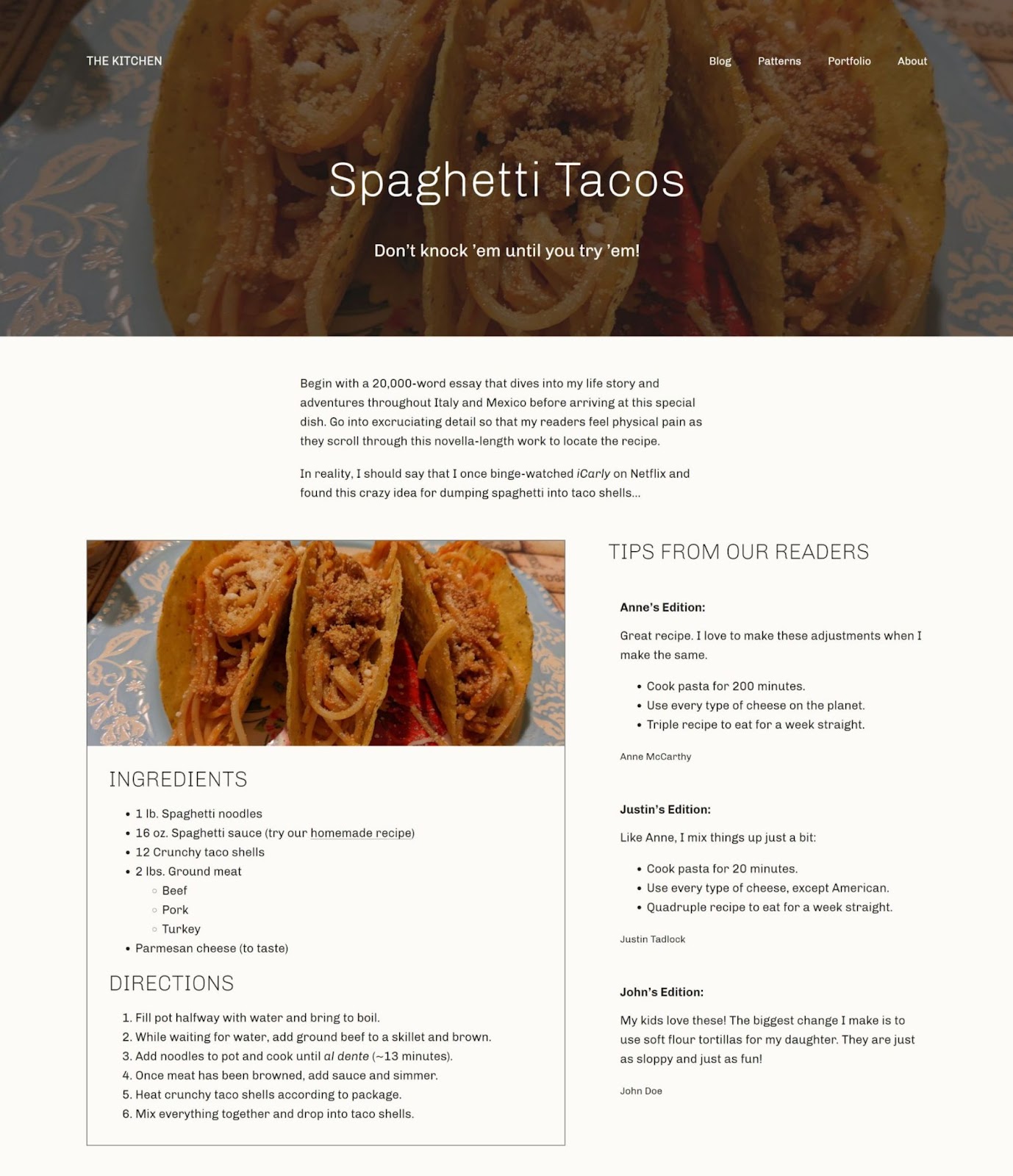


You must be logged in to post a comment.