Toolbar flow: Delete a post, Create and chain edit a post, iPhone 6+

Here are a couple of toolbar flowFlow Flow is the path of screens and interactions taken to accomplish a task. It’s an experience vector. Flow is also a feeling. It’s being unselfconscious and in the zone. Flow is what happens when difficulties are removed and you are freed to pursue an activity without forming intentions. You just do it.

Flow is the actual user experience, in many ways. If you like, you can think of flow as a really comprehensive set of user stories. When you think about user flow, you’re thinking about exactly how a user will perform the tasks allowed by your product.Flow and Context
vizrecs I had laying around. These were done with 4.3 alpha, before the Customize icon landed in the toolbar.

Delete a post. Exercises Edit and Home in the toolbar.

Create a post and then chain edit it. Exercises + and Edit in the toolbar. Uses View Post in the publish/save notices to link from back to front, rather than the toolbar.

#32947, #4-3, #beta, #editor, #ios, #phone, #toolbar, #web

Today in the Nightly: Inline link toolbar and Press This split button

Here are two cool things that recently landed in trunk and are available right now in the nightly build. Install the nightly. Try them.

Inline Link Toolbar

Being able to visit links straight from the editor means no more copy paste into the browser’s location bar. Nice. Also nice is being able to see the link without popping up the link modal.

Screen Shot 2015-06-26 at 1.04.59 AM

One time I tapped X thinking it would dismiss the toolbar.

One time I tapped X thinking it would dismiss the toolbar.

To test, visit the editor and click/tap into a link. The link toolbar will appear. If it does not, try forcing a browser refresh (Shift+Reload in Chrome on Mac OS). Provide feedack on  #32604 or in #core-customize or in reply to this post. Check out this make/flow post for more visuals.

Press This split button

Draft, preview, and standard editor are now in a split button with Publish.

Screen Shot 2015-06-26 at 1.39.13 AMpress_this_with_split_button_on_iphone_6_


To test, go to the Tools menu and check out the Press This section at the top. Provide feedback on #32757 or in #core-pressthis or in reply to this post.

#4-3, #editor, #link-toolbar, #links, #press-this, #today-in-the-nightly, #visual-comparison

Inline link toolbar, Mac and Chrome, iPhone 6+

With 4.3-alpha-32949. For #32604.

Being able to visit links from within the editor means no more cut-and-paste. Love it. Seeing the link without having to pop up the modal is also nice.

Mac and chrome:

iPhone 6+:

#32604, #4-3, #beta, #chrome, #editor, #ios, #link-toolbar, #links, #macos, #safari, #visual-survey, #web

The Top 5 Impediments to Flow on Touch Devices

Behold, a listicle.

1. The Media Modal

mobile-media-modal

The media modal has a number of issues on touch devices, particularly phones, including the use of tabs and sidebars. For details see The Media Modal and Sidebars on Phones.

#30154 – Improve Media Modal UI at small-screen sizes

2. The Editor

Update: #31247, Scrolling and zooming is frustrating on iOSiOS The operating system used on iPhones and iPads., was fixed on July 1st of 2015.

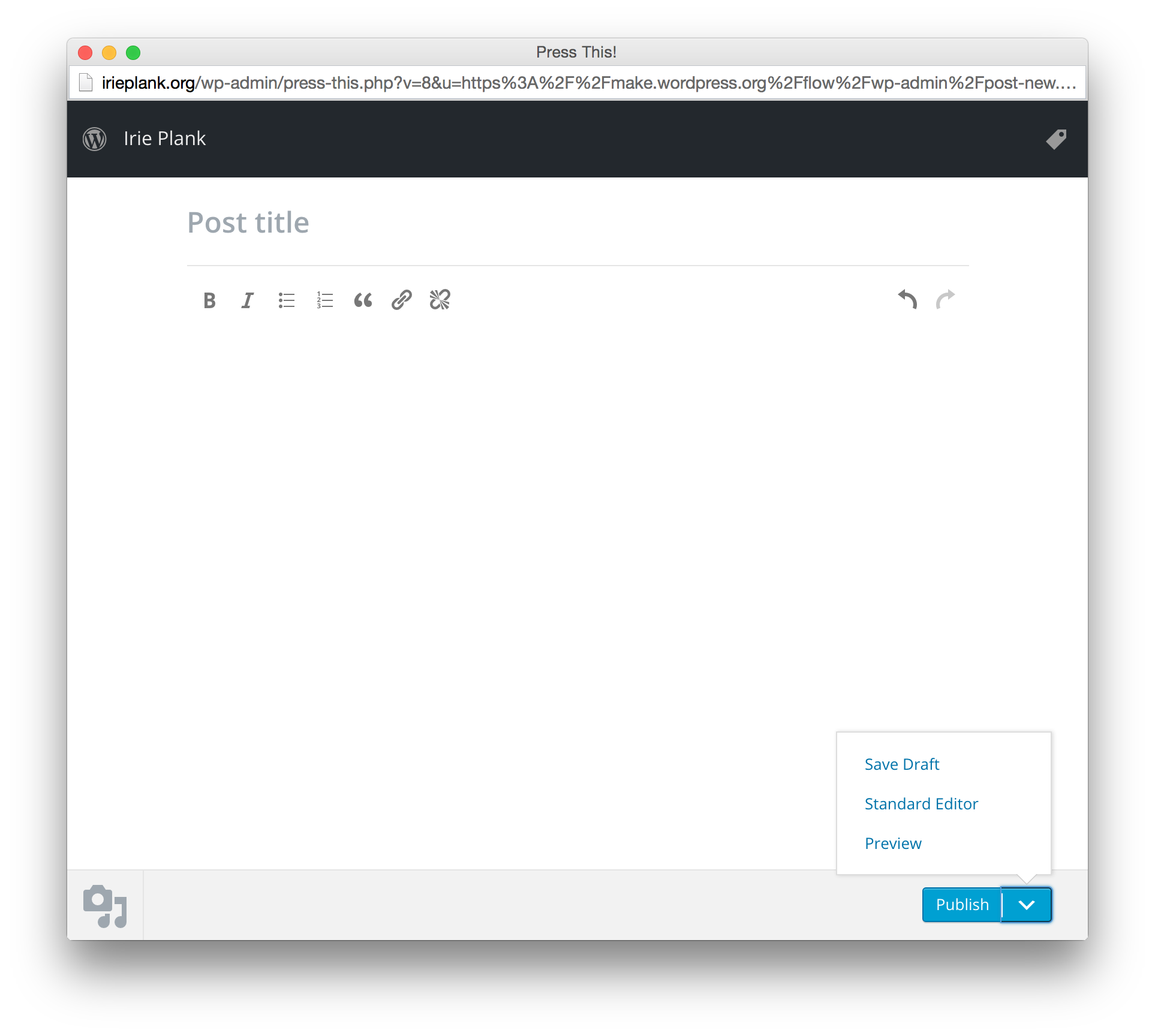
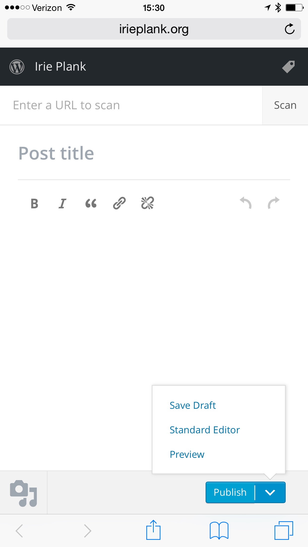
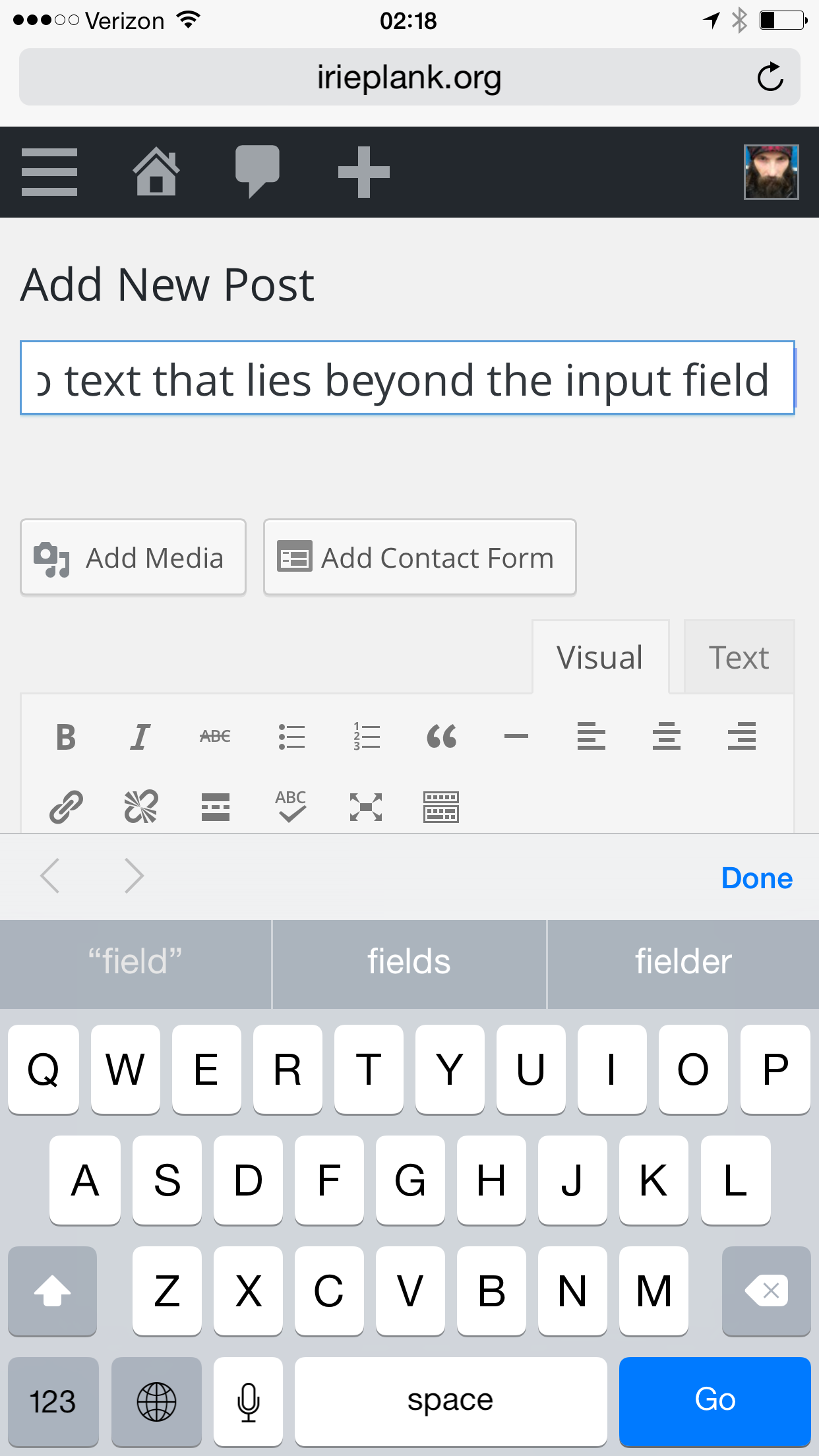
Scroll up to add media. Scroll down to preview, save, publish. Up and down. Up and down. Press This addressed this with its redesign in 4.2. Lessons learned there could be applied to post-new.php.

The Location of Add Media on Phones

#29989 – Hide Media Buttons on small screens

Fixed: The editor has a very annoying scrolling problem on iOS. Fixing that would go a long way toward improving usability on iOS devices.

#31247 -Scrolling and zooming is frustrating on iOS

image40-576x1024

Update: This was fixed on July 3rd of 2015.

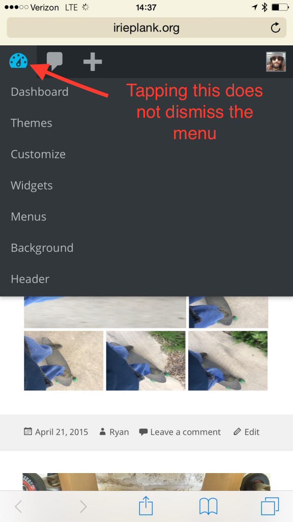
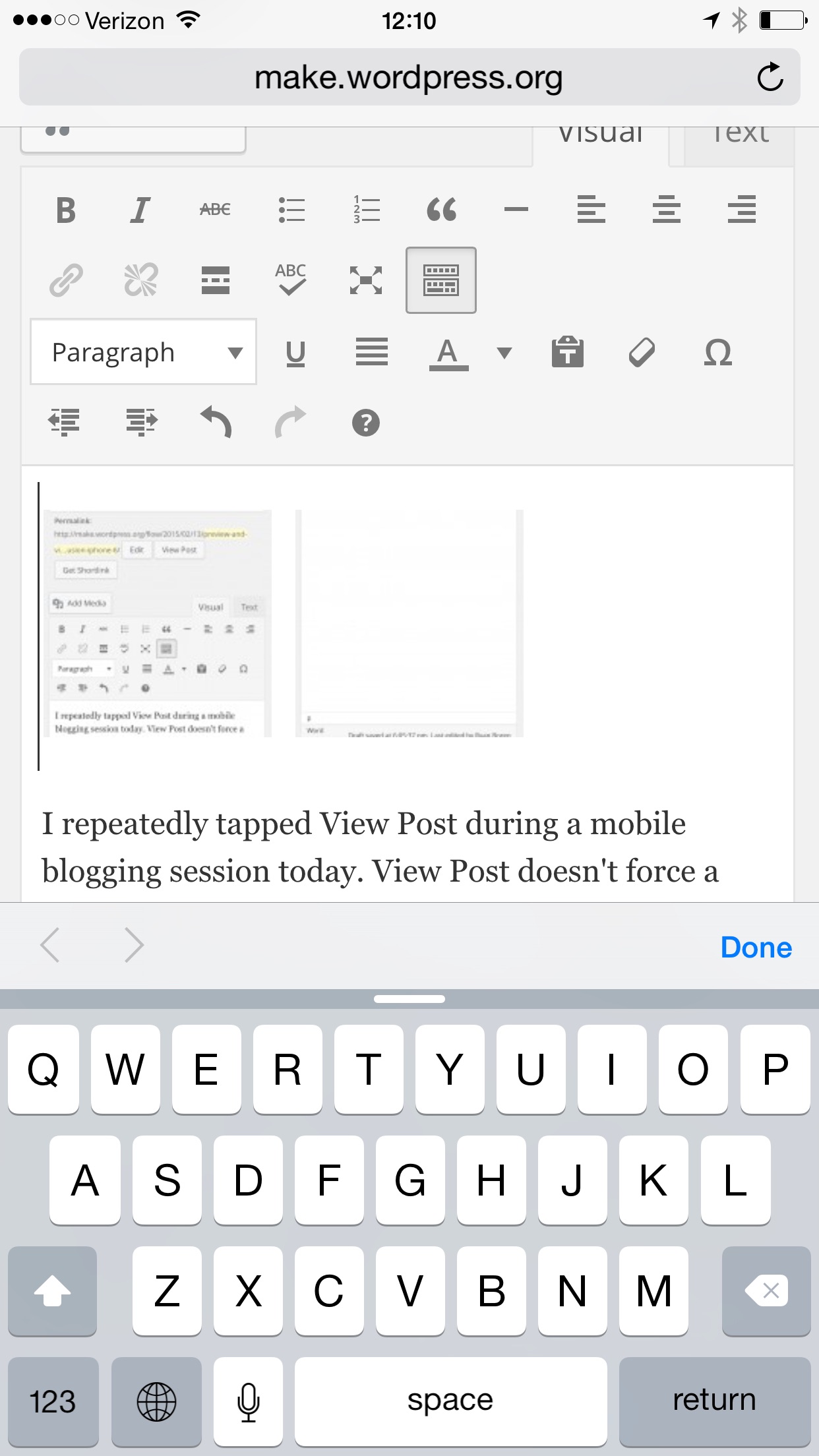
I like the toolbar on phones better than on desktop, except for the lingering desktop biasDesktop bias Patterns and interfaces that work in desktop interfaces don't always work on mobile. UI elements triggered by mouse hover, opening in new windows, dragging into bookmarks bars, drag-and-drop, and auto-focusing search input fields are examples of desktop bias.https://make.wordpress.org/test/tag/desktop-bias/ that defies touch expectations when tapping menu icons. In the image above, tapping the dashboard icon traverses a link to the dashboard instead of dismissing the menu.

#29906 – Submenus can’t be dismissed on mobile.

Submenus are awkward on touch devices. The expectation on touch is that tapping a menu item takes you to the tapped thing and closes the menu. With WP, tapping in the admin menu subtly opens a submenu. The menu remains open. I often don’t notice the submenu open because I’ve already shifted my gaze to look at the right side of the screen. Losing submenus would benefit touch navigation. Further, losing them on desktop (like wordpress.comWordPress.com An online implementation of WordPress code that lets you immediately access a new WordPress environment to publish your content. WordPress.com is a private company owned by Automattic that hosts the largest multisite in the world. This is arguably the best place to start blogging if you have never touched WordPress before. https://wordpress.com/ does) reduces the overwhelming feeling new user experience when first confronting wp-admin. This is something I’d like to experiment with in a feature pluginFeature Plugin A plugin that was created with the intention of eventually being proposed for inclusion in WordPress Core. See Features as Plugins..

Site Switching on the Make Network

5. Column truncation

IMG_2919


Update: This was fixed on July 9th of 2015.

Our current strategy for dealing with list tables on narrow screens is to just chop off columns. Not good.

#32395 – Truncation is not a good strategy for responsive list tables

#29991 – Comment action links are quite cramped on small screens

#29995 – Username is cut off on the user list table on small screens

#editor, #media, #modal, #toolbar, #touch, #web

The location of Add Media on phones

CoreCore Core is the set of software required to run WordPress. The Core Development Team builds WordPress. post-new.php puts Add Media above the editor and Preview, Save, and Publish below the editor. This is a desktop design that requires a lot of scrolling on mobile. Scroll up to Add Media. Scroll down to Preview and Publish. None of the buttons stay on screen persistently. There’s no joy here.

The My Sites editor on wordpress.comWordPress.com An online implementation of WordPress code that lets you immediately access a new WordPress environment to publish your content. WordPress.com is a private company owned by Automattic that hosts the largest multisite in the world. This is arguably the best place to start blogging if you have never touched WordPress before. https://wordpress.com/ also puts Add Media above the editor and Preview, Save, and Publish below the editor in a semi-fixed bar. This bar often goes offscreen for me. Although not nearly as bad as post-new.php, this requires up and down scrolling.

Press This puts Add Media, Save, Preview, and Publish all in a fixed bar at the bottom. It is truly fixed and stays visible even when the browser’s bottom bar displays.

The iOSiOS The operating system used on iPhones and iPads. app puts add media in the editor bar attached to the keyboard. This requires tapping into the content area before adding an image. Tapping the image icon with the editor unfocused is a noop. This tripped me up often, at first. When I’m single image blogging, I’m not adding text content and don’t usually tap into the editor. I still occasionally get tripped, but I’ve gotten used to it and have come to appreciate having add media available even when the keyboard is up.

#app, #editor, #ios, #media, #mobile, #phablet

Advancing the cursor through input fields on iOS

On iOSiOS The operating system used on iPhones and iPads. devices, I can’t advance the cursor through text that lies beyond the bounds of the Title input. The cursor stops advancing through text once it hits the left or right border of the input field. This causes me to abandon my mobile session and pick up editing when I get to a laptop. Mobile abandonmentMobile abandonment Bugs that terminally block flow on mobile cause mobile abandonment. Users must do a huge context switch from mobile to desktop to resume flow, which usually means postponing an action until the next time a laptop is available.https://make.wordpress.org/test/glossary/#mobile-abandonment of edit flowFlow Flow is the path of screens and interactions taken to accomplish a task. It’s an experience vector. Flow is also a feeling. It’s being unselfconscious and in the zone. Flow is what happens when difficulties are removed and you are freed to pursue an activity without forming intentions. You just do it.

Flow is the actual user experience, in many ways. If you like, you can think of flow as a really comprehensive set of user stories. When you think about user flow, you’re thinking about exactly how a user will perform the tasks allowed by your product.Flow and Context
is not good.

This happens on all my iOS devices. Android looks good. We could use an audit of all input fields for iOS.


cursor sometimes breaks out of the box


I can’t cursor left


Can’t cursor right


#boxed-input-scrolling, #editor, #input-scrolling, #ios, #mobile-abandonment, #phone, #safari, #web

Gallery edit bar doesn’t show, iPhone 6+

The gallery edit toolbar doesn’t show when the gallery is tapped.

Tapping, but nothing.

Tapping, but nothing.

Also, the image edit toolbar has visual glitches and is hard to tap. On first tap I usually get the copy menu. Second or third tap brings up the edit modal.

#editor, #galleries, #ios, #media, #phablet, #web

Caption changes are not reflected in the editor, Macnchrome, 4.2-alpha-31332

When you edit a caption, the edits are not reflected in the editor’s gallery embed. This induces distrust and anxiety. With every caption change, I either Update or Preview the post to verify the changes. Both require scrolling and losing my place. Because I don’t trust changes that don’t show in the editor, I’ll preview again before publish so I can scrutinize the captions. This is a worry pattern.

#captions, #chrome, #desktop, #editor, #galleries, #macos, #media, #web

Focus and elastic bounce back, Macnchrome

When I ballistic scroll to the bottom of the editor while focused, the editor scrolls up once I hit bottom, evidently to make room for showing any metaMeta Meta is a term that refers to the inside workings of a group. For us, this is the team that works on internal WordPress sites like WordCamp Central and Make WordPress. boxes beneath the editor in the event of an unfocus. The mouse ends up exiting and reentering the editor when the elastic bounce back animation does its thing. This causes an unfocus/focus flicker. It’s pretty annoying when you’re moving up and down a document a lot. Perhaps not a common flowFlow Flow is the path of screens and interactions taken to accomplish a task. It’s an experience vector. Flow is also a feeling. It’s being unselfconscious and in the zone. Flow is what happens when difficulties are removed and you are freed to pursue an activity without forming intentions. You just do it.

Flow is the actual user experience, in many ways. If you like, you can think of flow as a really comprehensive set of user stories. When you think about user flow, you’re thinking about exactly how a user will perform the tasks allowed by your product.Flow and Context
, but one I get into all the time when doing live note taking for the dev meetings.

Note also that the editor controls shift down a bit when scroll reaches the bottom, leaving a strip of white space above the controls.

#chrome, #desktop, #editor, #elastic-bounceback, #focus, #macos

post-new.php, Nexus 5, Android 4.4.3

Lots of buttons, lots of scrolling.

#android, #editor, #phone, #web