The Test Team helps manage testing and triage across the WordPress ecosystem. They focus on user testing of the editing experience and WordPress dashboard, replicating and documenting bug reports, and supporting a culture of review and triage across the project.
Please drop by any time in SlackSlackSlack is a Collaborative Group Chat Platform https://slack.com/. The WordPress community has its own Slack Channel at https://make.wordpress.org/chat/. with questions or to help out.
With each major WordPress release, there are more people who are likely to be in the position of switching to a blockBlockBlock is the abstract term used to describe units of markup that, composed together, form the content or layout of a webpage using the WordPress editor. The idea combines concepts of what in the past may have achieved with shortcodes, custom HTML, and embed discovery into a single consistent API and user experience. theme world from a classic theme. With 6.1 approaching in November, this call for testing is rooted in exploring that experience. The form of this test is going to be both prescriptive with steps to take in order to ensure certain features are covered and, at points, open ended so you can explore and think of areas to improve.
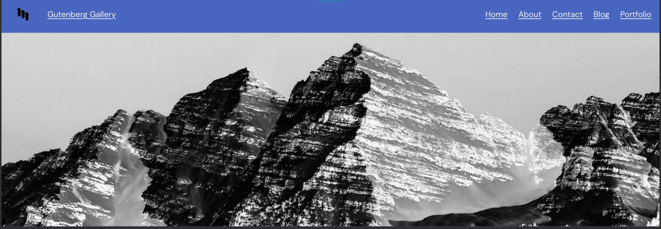
To make it more fun, you’re going to step into the shoes as the owner of the GutenbergGutenbergThe Gutenberg project is the new Editor Interface for WordPress. The editor improves the process and experience of creating new content, making writing rich content much simpler. It uses ‘blocks’ to add richness rather than shortcodes, custom HTML etc. https://wordpress.org/gutenberg/ Gallery website. A simple site focused on sharing information about exhibits, current calls for submissions, and ways to stay in touch. After hearing about full site editing features for a while now, you’re deciding to take the plunge and switch from the trusty Twenty Twenty theme to Twenty Twenty-Two. Along the way, you’ll interact with the following and more:
Theme switching
As we’ve explored previously with switching between block themes, there are a lot of both quick wins and overarching decisions to be made. The same is true for switching from classic to block themes. For example, right now there’s not a clear pathway for widgets. Ultimately, the more insights around how to ease this experience and make it feel magical, the more relevant block themes become.
Improved fallbacks and menu management with the navigation block
To offer a better “out of the box” experience with the navigation block, various fallback options have been implemented so the menu you are most likely to want to use is available. This test seeks to explore that and ensure it does truly provide a better default experience. Separately, the interface for menu selection and management has been moved to a dedicated section in the block settings to make it more prominent and easier to work with. You can also pick from a set of icons to better personalize your mobile menu.
New HeaderHeaderThe header of your site is typically the first thing people will experience. The masthead or header art located across the top of your page is part of the look and feel of your website. It can influence a visitor’s opinion about your content and you/ your organization’s brand. It may also look different on different screen sizes. and Footer Patterns
Coming to 6.1, these carefully designed block patterns represent a consolidation of recurring headers and footers, simplified in order to work well across themes.When it comes to embracing a block theme, these should help folks quickly find the basics of what they might need to make a site their own in a few clicks.
Zoomed out mode
This experimental tool allows you to focus more on site building than on editing granular blocks by both allowing you to see the entire layout a bit more and always selecting the top level block (often container blocks like Groups or Template Parts). If you use the Quick Inserter, you’re met with patterns instead of blocks to continue the emphasis on more high level actions one might take to customize.
CategoryCategoryThe 'category' taxonomy lets you group posts / content together that share a common bond. Categories are pre-defined and broad ranging. Templates
This test once more explores creating a category specific template in order to offer a more tailored experience of looking at specific folks. This aligns nicely with the Gutenberg Gallery where you might want to emphasize different things depending on whether someone is looking at the posts about submissions or exhibit recaps.
Design tools galore
It’s hard to miss how many design tools have been added to even more blocks. Because there are so many new options, this test doesn’t necessarily dive into the details like they have in the past. Instead, please note and explore the various additional options unlocking new possibilities as you go.
Testing Instructions
Note on InstaWP
As noted previously, the folks behind InstaWP have granted the outreach program an account that we can use for these calls for testing. This means if you want to skip setting up your own test site and instead use a temporary one, you can do so. When you set up a site with InstaWP, no email addresses will be collected which means you’ll need to save the link to access the site again. Big thank you to the InstaWP team for making it even easier for folks to participate in the future of WordPress.
Please do not repeatedly open this link as it creates a new site each time and there’s a limit of 50 sites that can be created.
This will launch a site for you to use for up to 24 hours. Select “Access Now” to log in to the wp-admin dashboard.
Save the link to your site so you can access it again during the test.
To set up your own test site:
Have a test site using the latest version of WordPress. It’s important this is not a production/live site.
Install and activate the Twenty Twenty theme by going to Appearances > Themes.
Install and activate the latest version of Gutenberg by going to Plugins > Add New > Searching Gutenberg.
Head to Tools > Import and import this file to have access to the same posts as above.
Get familiar with your current site
View the front end of your site and click through various pages linked to from the menu.
Head to Appearance > CustomizerCustomizerTool built into WordPress core that hooks into most modern themes. You can use it to preview and modify many of your site’s appearance settings. and change any settings you’d like or just review what’s there (for example, check which menu is set to each location).
After activating, view the front end of your site to get a sense of the changes.
From there, head to Appearance > Editor.
Use Styles and the zoomed out view to design your site
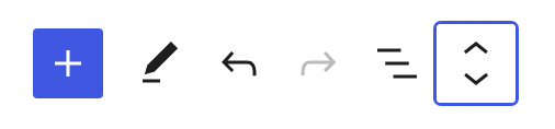
In the top toolbar, select the zoomed out view option (the option furthest on the right). This will place you in a zoomed out mode where you can focus more on building and creating with patterns rather than individual blocks.
While in this mode, explore the various sections of your site and feel free to reorganize as you’d like. For example, you can try using the quick inserter to add various patterns.
Once done, with the zoomed out mode still on, open the Styles sidebarSidebarA sidebar in WordPress is referred to a widget-ready area used by WordPress themes to display information that is not a part of the main content. It is not always a vertical column on the side. It can be a horizontal rectangle below or above the content area, footer, header, or any where in the theme..
Select the option to browse styles and notice how your site changes as you switch between. Feel free to toggle on and off the zoomed out mode as you see fit for the rest of this test.
As you’d like, feel free to customize the Style options further on a more granular basis or just stick with one of the built in Style variations.
Customize your navigation
Ensure you’ve exited out of the zoomed out mode and select the navigation block, either by using List View or by clicking on it directly.
Once selected, click on “Edit” in the block toolbar and follow the steps to convert to links in the pop up.
Add two submenu items under Blog for both Submissions and Exhibits to match the original site. Note: Intentionally not sharing the various ways to do this.
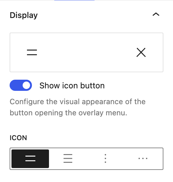
Open the block settings for the navigation block and, under Display, click on the visual below to open up more options for the mobile menu icon. Select whichever one you want.
Change further aspects of the navigation block as you see fit. For example, you can change the colors under Color, spacing between navigation items under Dimensions, or various typography options.
With the block settings open, under “Menu” explore the process to create a new menu by clicking on the name of the current menu > selecting “Create new menu”.
Add some items to this new menu.
With the block settings open, switch between different menu options, including the option to import a classic menu. Select whichever menu you’d like to use.
Explore new headers or footers
Using List View, select the header or footer.
Open the three dot menu and click “Replace”.
Try searching for different options, scrolling, and selecting a new one. Repeat this as much as you’d like!
Save your changes and note how the multi-entity saving feels.
Create a category specific
Click on the W menu and select “Templates” to reach the template list.
Select “Add New” and choose “Category”.
Choose the “Category: For a specific item” option and choose “Submissions Opportunities”.
This will create a new template that you can customize to your liking. For example, perhaps you want to change the emphasis on images in the Query LoopLoopThe Loop is PHP code used by WordPress to display posts. Using The Loop, WordPress processes each post to be displayed on the current page, and formats it according to how it matches specified criteria within The Loop tags. Any HTML or PHP code in the Loop will be processed on each post. https://codex.wordpress.org/The_Loop. block, add or remove different blocks, change the design, etc.
Save changes and view the Submission Opportunities category. Note: Intentionally not sharing the various ways to do this.
Customize your site further – here are some ideas:
You’ll notice the Blog page doesn’t have any content now after switching. You can either add a Query Loop block or change the Settings > Reading to set the Posts Page as the Blog page. Note: this has been filed as an enhancement issue.
Explore adding the Comments block to different templates and what might make the experience better.
Try locking parts of your site in various ways as you are happy with the design.
Use the many new design tools to change padding, margin, typography, color, border, and more.
What to notice:
Did the experience crash at any point?
Did the saving experience work properly?
What did you find particularly confusing or frustrating about the experience?
What did you especially enjoy or appreciate about the experience?
What would have made this experience easier?
Did you find that what you created matched what you saw on your site?
You must be logged in to post a comment.