Hi, all! Here are a few projects the Design Team has contributed to over the past couple of weeks.
Additional search views
In Openverse, we designed additional search views for sources, creators, and tags. Soon will be possible to land on a sharable landing page that allows users to browse content under any of these content groups.
Metasearch
As part of the UIUIUI is an acronym for User Interface - the layout of the page the user interacts with. Think ‘how are they doing that’ and less about what they are doing. improvement project, we designed a cleaner metasearch to allow users searching in external sources in a new modal instead of a popover.
Showcase
A refined take on the Showcase refresh, to hopefully be implemented soon. Issue.
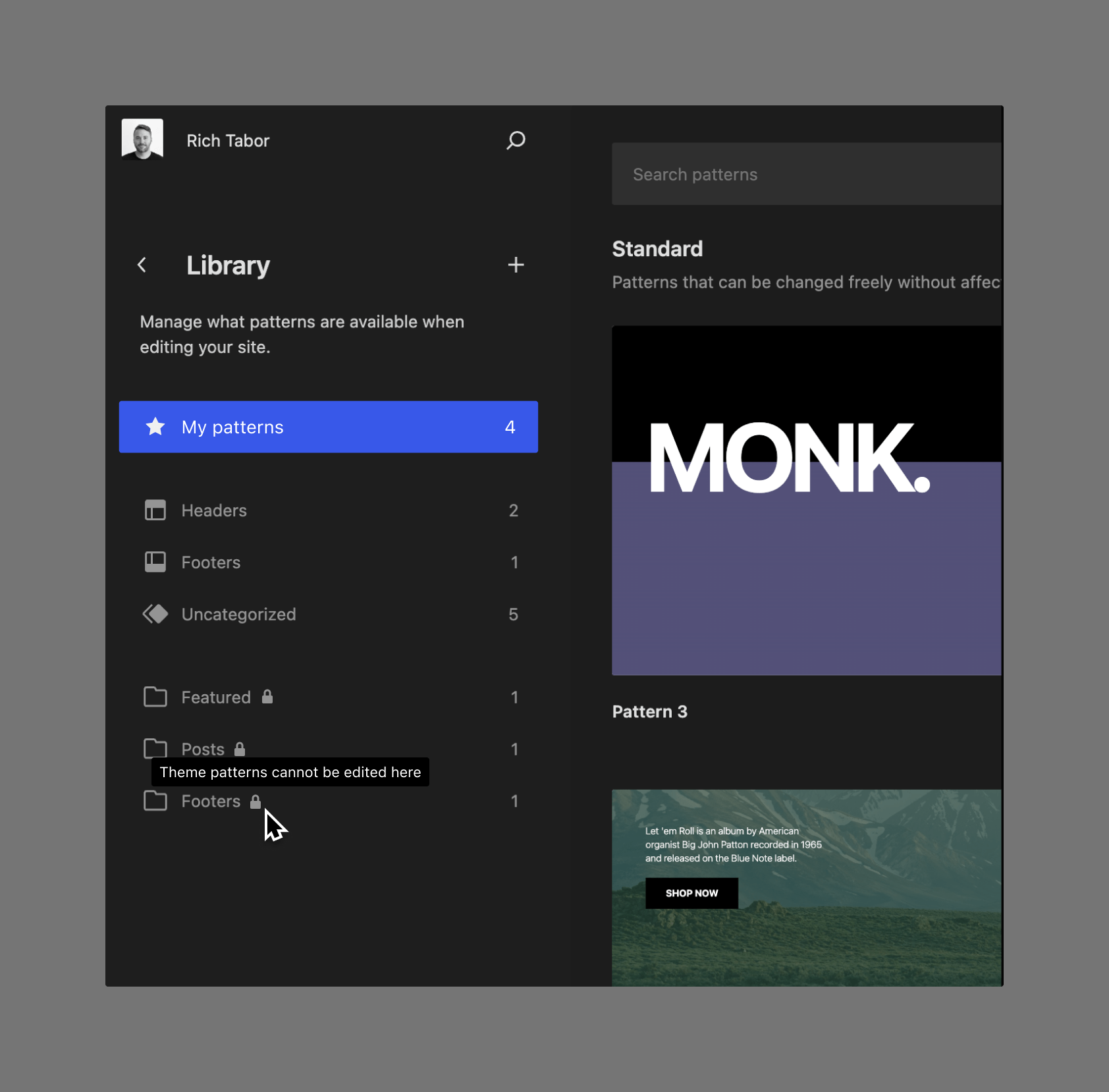
FilterFilterFilters are one of the two types of Hooks https://codex.wordpress.org/Plugin_API/Hooks. They provide a way for functions to modify data of other functions. They are the counterpart to Actions. Unlike Actions, filters are meant to work in an isolated manner, and should never have side effects such as affecting global variables and output. component
As part of the WordPress.orgWordPress.orgThe community site where WordPress code is created and shared by the users. This is where you can download the source code for WordPress core, plugins and themes as well as the central location for community conversations and organization. https://wordpress.org/ redesign, we’ve been designing a Filter component to reuse it in all sections and ease the content browse.
WordPress.org Design Library
In parallel to the WordPress.org redesign, we are cleaning up the Design Library by blending components, adding new ones per site section, and introducing variables to ease the mockup creating and dev hands-off.
Command palette border fix
Before/After
From the department of details matter, a 2px border was changed into a 1px border in the command palette. PR.
Top toolbar button fix
Before/After
PR to fix an issue with the new top toolbar when a pluginPluginA plugin is a piece of software containing a group of functions that can be added to a WordPress website. They can extend functionality or add new features to your WordPress websites. WordPress plugins are written in the PHP programming language and integrate seamlessly with WordPress. These can be free in the WordPress.org Plugin Directory https://wordpress.org/plugins/ or can be cost-based plugin from a third-party added a button to the top toolbar.
More details to Template Parts
Before/After
PR to add more information in the detail view of template parts.
List View description
PR to add a description to the list view, making its use case clearer.
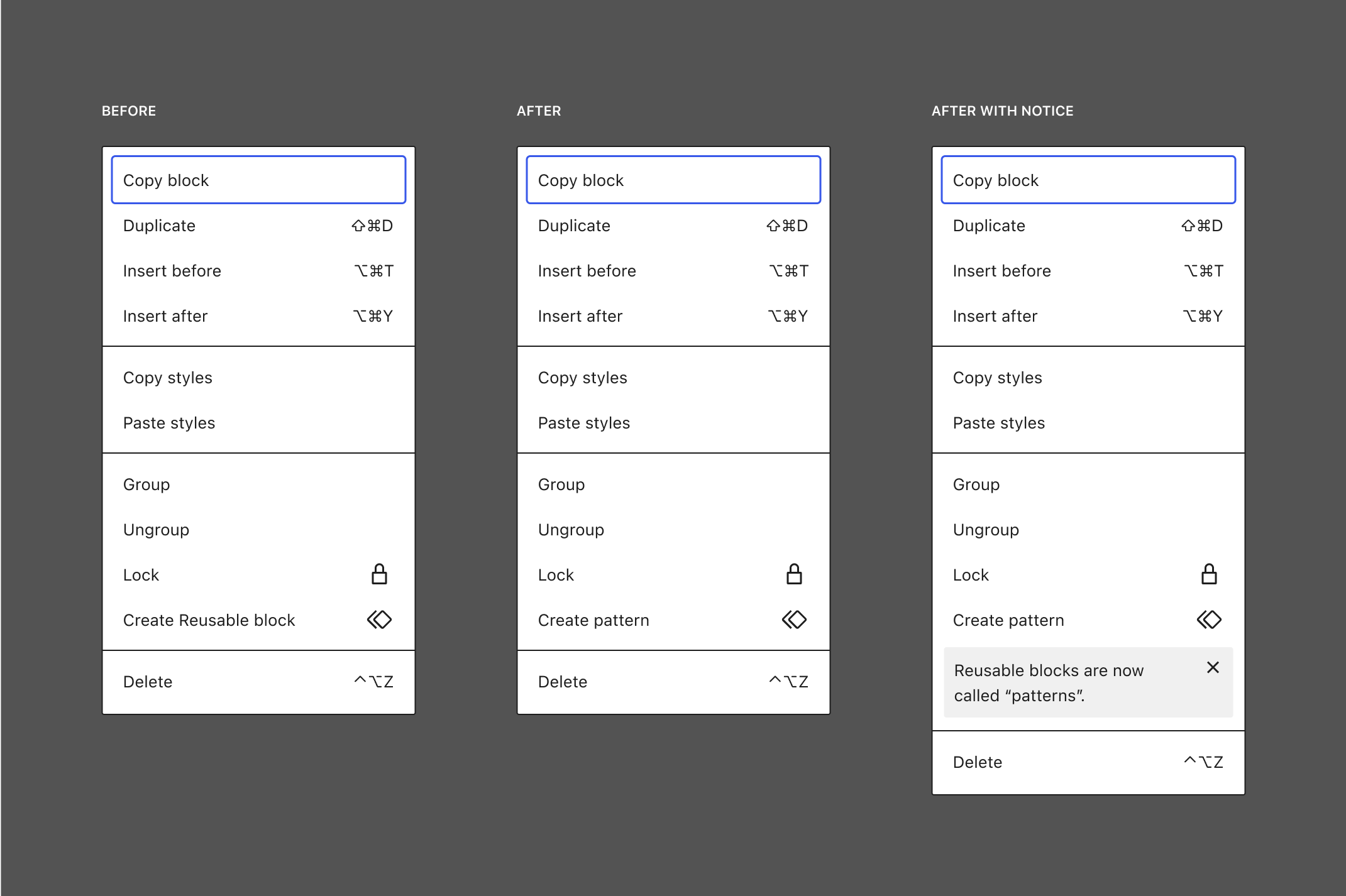
Confirm dialog improvements
Before/After/Also
PR to simplify, reduce, and bring consistency to our modal confirm dialogs.
Patterns section column improvements
Before (always 2 columns)/After (2-4 columns depending on screen)
Two PRs (one, two) to improve the display of patterns in the new Patterns section, wrapping to 3 or 4 columns when space allows it, rather than be locked to two.
Patterns section detail view improvements
Before/After
PR to add context and distinguish between patterns and template parts.
Pattern creation icon updates
Before/After
PR to update the icons shown when you create new patterns. These go generic reserving the location-based icons for headers and footers.
Frontpage Template Details
Issue with a design take on what the detail view for the Front Page template could look like.
If you have updates you’d like to include in the next Design Share, please drop a note in the Design channel on the Making WordPress SlackSlackSlack is a Collaborative Group Chat Platform https://slack.com/. The WordPress community has its own Slack Channel at https://make.wordpress.org/chat/..
Hi, all! Here are a few projects the Design Team has contributed to over the past couple of weeks.
Site Editor Legends
A small set of “legend” style pictograms depicting various UIUIUI is an acronym for User Interface - the layout of the page the user interacts with. Think ‘how are they doing that’ and less about what they are doing. elements of the blockBlockBlock is the abstract term used to describe units of markup that, composed together, form the content or layout of a webpage using the WordPress editor. The idea combines concepts of what in the past may have achieved with shortcodes, custom HTML, and embed discovery into a single consistent API and user experience. editor.
Navigation “focus mode”
Menus can be edited in isolation, just their content and none of their style. If you want to edit their styles, you have to edit the menu in context of a template or template part. On its own, this differentiation can be a little confusing, but the split is similar to how blocks in the Style Book are styled. For that same reason, this mockup leans into an incoming Style Book refresh to add in-canvas controls for orientation and otherwise. Issue.
Reusable Blocks, Library, “Patterns”
In 6.3, you will be able to create and edit your own custom patterns. Since the underlying tech is similar to that of reusable blocks, a rename is being considered, so reusable blocks will simply become “Synced patterns”. Here are some related mockups. Issue, Issue 2.
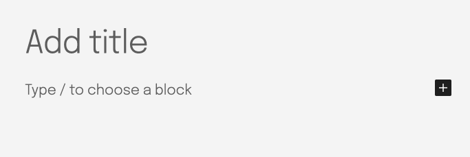
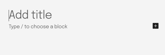
Editing prompt layout shift fix
Before/After
Small PR to fix a layout shift between the default appender — the first prompt to “Type / to choose a block” — and the empty paragraph thats added there on click.
If you have updates you’d like to include in the next Design Share, please drop a note in the Design channel on the Making WordPress SlackSlackSlack is a Collaborative Group Chat Platform https://slack.com/. The WordPress community has its own Slack Channel at https://make.wordpress.org/chat/..


You must be logged in to post a comment.