Hey all 👋 I’m sharing a handful of “snapshot” style updates from the Design team from the past couple of weeks. I’d like to try sharing these updates for a couple of months and see if it’s useful!
Here are a few things that have been worked on recently:
Advanced template creation
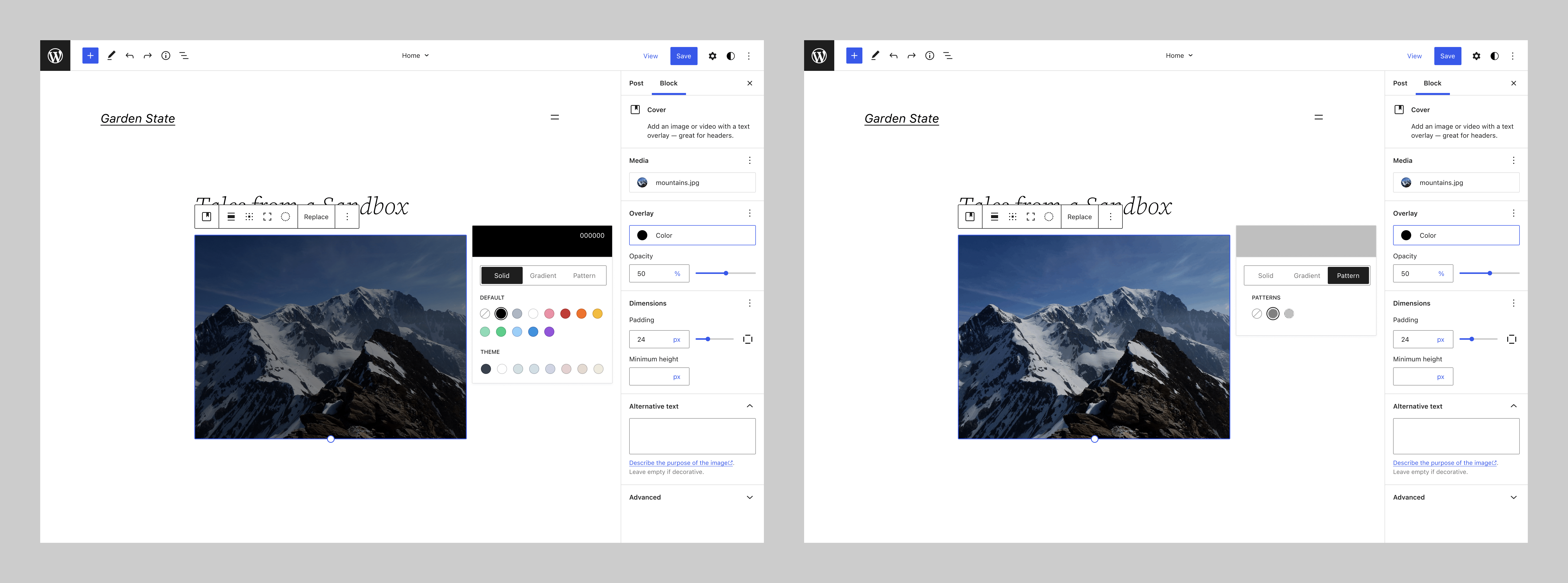
@jameskoster explored how we might expand the template creation UIUIUI is an acronym for User Interface - the layout of the page the user interacts with. Think ‘how are they doing that’ and less about what they are doing. to accommodate more advanced templates. Discussion is ongoing in GitHubGitHubGitHub is a website that offers online implementation of git repositories that can easily be shared, copied and modified by other developers. Public repositories are free to host, private repositories require a paid subscription. GitHub introduced the concept of the ‘pull request’ where code changes done in branches by contributors can be reviewed and discussed before being merged be the repository owner. https://github.com/ issue #37407.
Designing the State of the WordState of the WordThis is the annual report given by Matt Mullenweg, founder of WordPress at WordCamp US. It looks at what we’ve done, what we’re doing, and the future of WordPress. https://wordpress.tv/tag/state-of-the-word/.
Openverse — New headerHeaderThe header of your site is typically the first thing people will experience. The masthead or header art located across the top of your page is part of the look and feel of your website. It can influence a visitor’s opinion about your content and you/ your organization’s brand. It may also look different on different screen sizes. design
@fcoveram explored a new header idea to solve usability, internationalization, and consistency problems, and also designed a new version of reporting content popover considering usability and a11yAccessibilityAccessibility (commonly shortened to a11y) refers to the design of products, devices, services, or environments for people with disabilities. The concept of accessible design ensures both “direct access” (i.e. unassisted) and “indirect access” meaning compatibility with a person’s assistive technology (for example, computer screen readers). (https://en.wikipedia.org/wiki/Accessibility) concerns.
These projects are just a small sample of recent design work happening in the WordPress community. Have you contributed to the Design team lately? The Make blog is a great place to share process and updates! Feel free to use the comments section below to share your work ⬇️

You must be logged in to post a comment.