Jazz should be recognised as music of the people, based in a lot of accents and melodies. What is jazz but music that people danced to? Jazz has the dynamic thing.
Al Jarreau
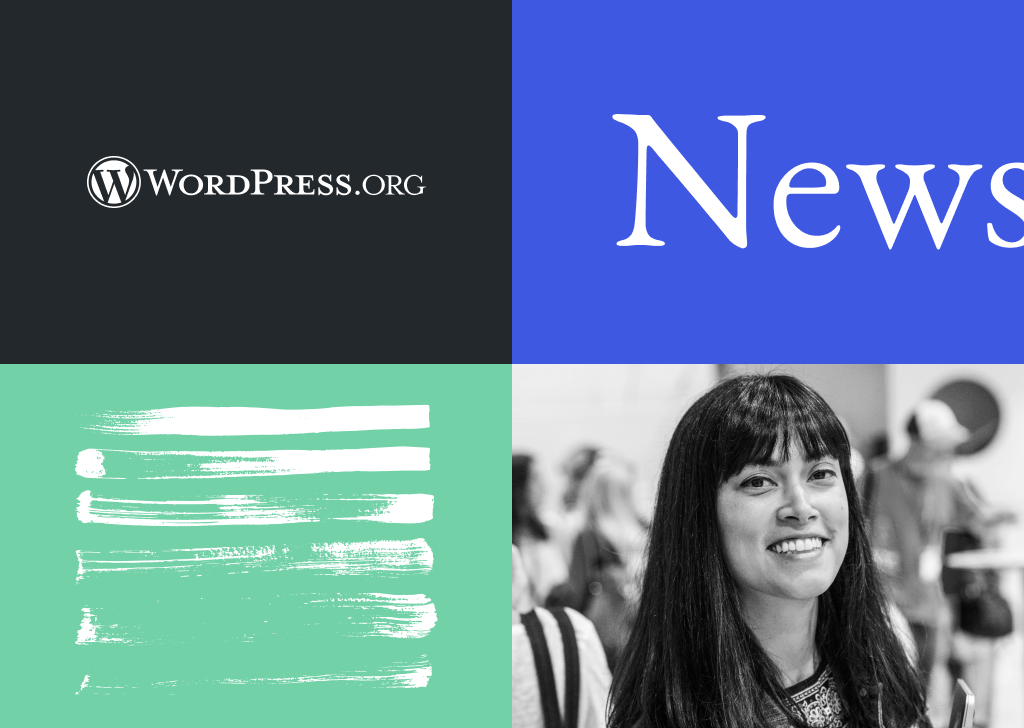
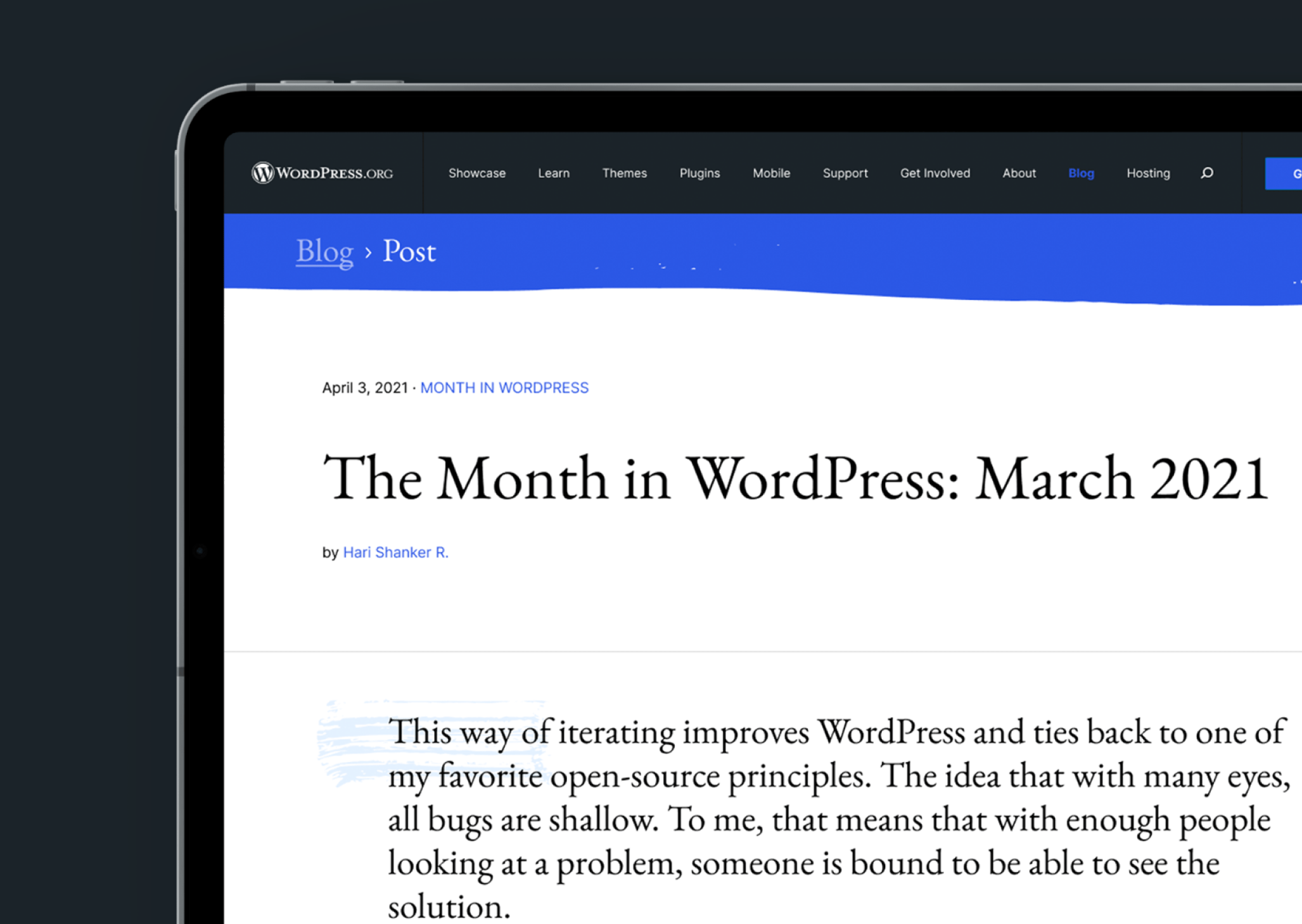
The blog page of WordPress.orgWordPress.orgThe community site where WordPress code is created and shared by the users. This is where you can download the source code for WordPress core, plugins and themes as well as the central location for community conversations and organization. https://wordpress.org/ has stayed the same for a very long time and it could benefit from a careful rethinking and visual attention to detail. There are things we can do to improve the reader’s experience, to make it less visually constrained, and introduce an improved design language. After a request from Matt Mullenweg, I’ve spent some time thinking through a possible redesign, and I’d like to share some directional ideas below.
Making It Jazzy
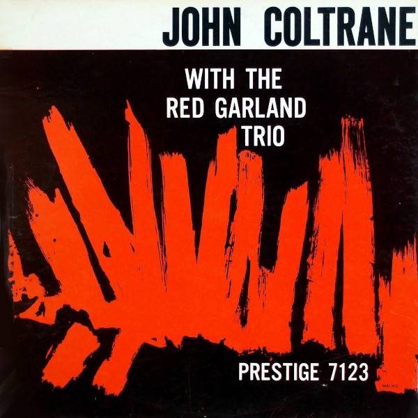
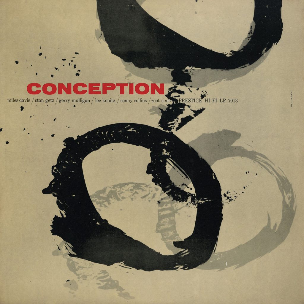
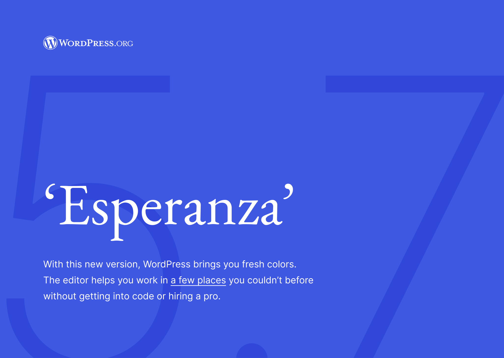
Some of WordPress’s visual materials have been influenced by jazz aesthetics, which immediately translated into a clear visual direction. Although subtly, I’d like to express the playfulness of jazz, as in the album artworks you can see above.
Imagery in the blog is often sparse, so I explored elements such as stroke shapes, typography, layout and colors, to achieve a timeless result.
Leaving Space for Content
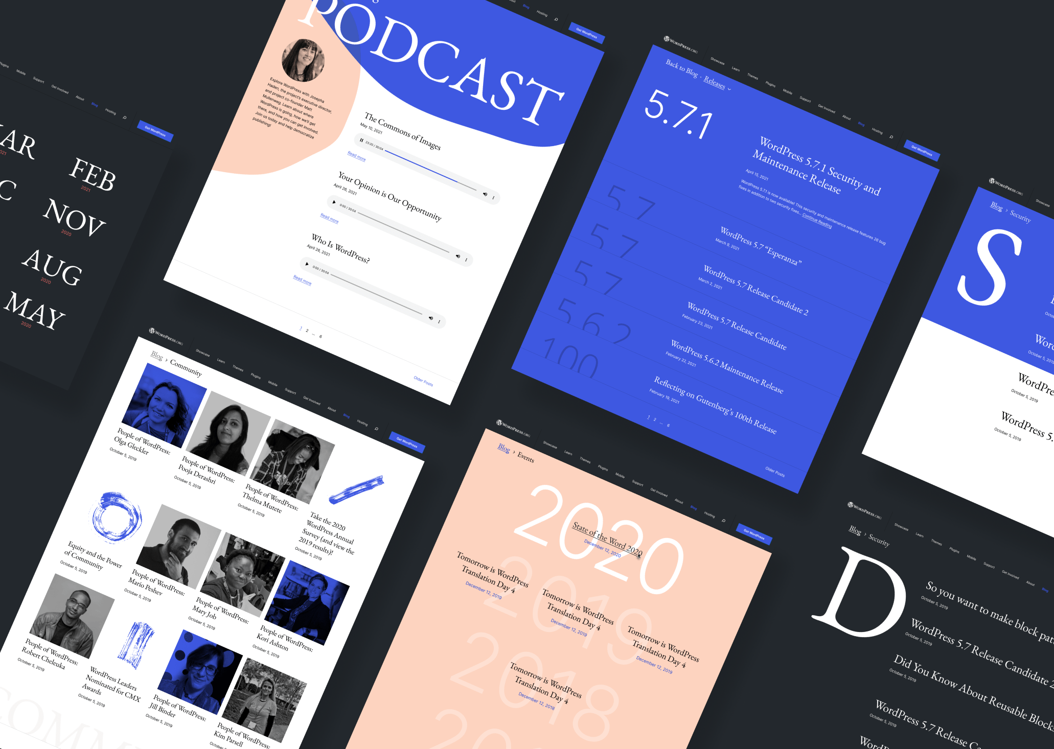
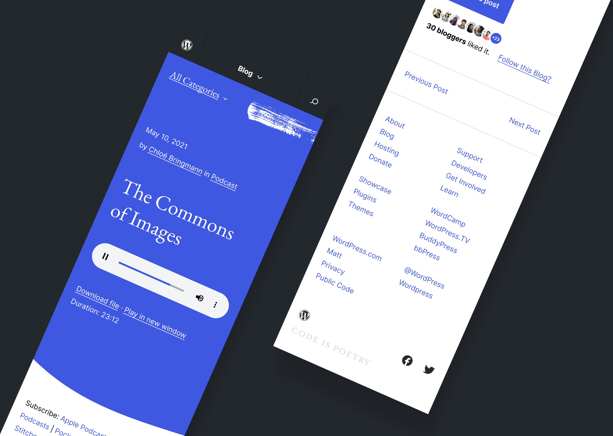
The current layout and typographic styles lack space. Opening up the canvas, rethinking spacings, placements and line heights could make it feel less boxed and improve readability.
I have also explored variations between categories, while maintaining coherence within the same section of the website, taking content in consideration and playing with it.
Rethinking Typefaces
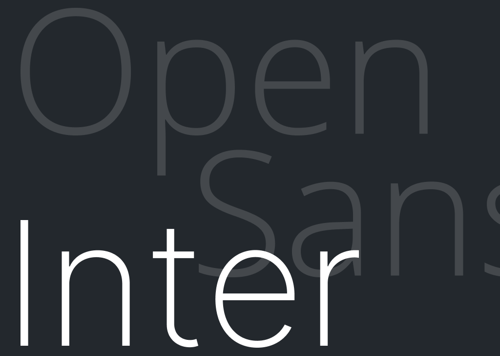
Open Sans is widely used in the current site, and while there’s nothing wrong with it, its quirkiness wasn’t propelling improvement or helping readability, so I suggest we replace it with Inter, an open sourceOpen SourceOpen Source denotes software for which the original source code is made freely available and may be redistributed and modified. Open Source **must be** delivered via a licensing model, see GPL. font, which I’m using for paragraphs and functional text. It works well for screens and reading and it has a timeless feel that fits universally with any type of content it’s used with.
EB Garamond, equally open source, is used in headings, bringing elegance and delicacy to the blog.
Continuously Iterating
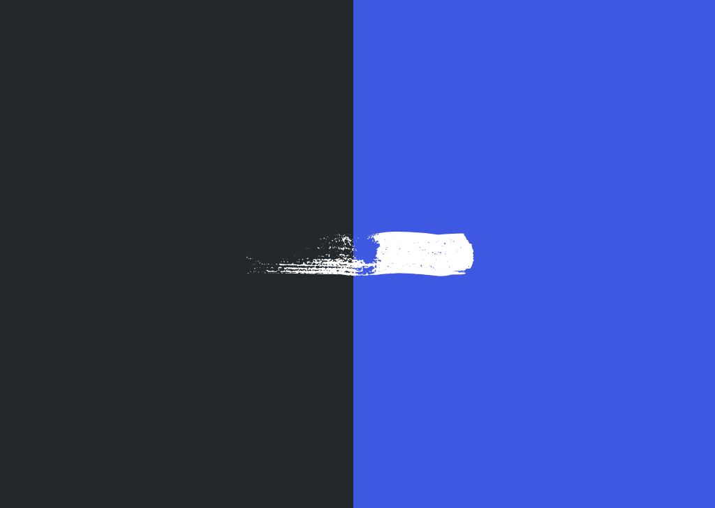
Certain pieces are still in progress of refinement, such as the blog’s “home” page, text styles and the balance in the usage of paint strokes (some of the ones used here aren’t as polished). Colors are still being iterated on, but the vibrant blue seems to associate well with the evolving GutenbergGutenbergThe Gutenberg project is the new Editor Interface for WordPress. The editor improves the process and experience of creating new content, making writing rich content much simpler. It uses ‘blocks’ to add richness rather than shortcodes, custom HTML etc. https://wordpress.org/gutenberg/ language.
Higher Level Concept
I’ve also spent some time thinking about simplifying the nav bar and footer for the site, which ultimately contribute to its visual consistency. Beyond that, I have found potential in the concept of recreating different “languages” of jazz throughout the site, in a way that’s coherent and balanced enough that isn’t confusing or misleading for people.
A huge thank you to @pablohoneyhoney for the continuous help and guidance in these iterations. I’m very happy to share bits of this work in progress, which is all available in this Figma link, and will try to post updates as regularly as possible.
I hope you’re as excited as I am about this, and I can’t wait to know what you think in comments below!
Editorial postscript – The design above is early, but has already gone through multiple iterations. As with so many open source things, all feedback is welcome and anything that can be changed will be. 🙂 ~josepha


You must be logged in to post a comment.