Two weeks ago, a group of WordPress design researchers conducted seven usability tests with a combination of beginner or casual WordPress users (5), and power users (2). Most of them hadn’t used GutenbergGutenbergThe Gutenberg project is the new Editor Interface for WordPress. The editor improves the process and experience of creating new content, making writing rich content much simpler. It uses ‘blocks’ to add richness rather than shortcodes, custom HTML etc. https://wordpress.org/gutenberg/ yet.
The goal was to learn more broadly about how people use navigation menus, and about their mental models related to navigation for a website. We also wanted to validate whether the proposed solution was on the right track.
The team selected moderated usability testing for two reasons:
The prototype being tested was rough and limited in functionality; without moderation, testers could easily get stuck or confused.
There were a number of broad questions to answer.
The usability testing script comprised of a short exploratory interview, followed by a task-based evaluation of the prototype. This allowed the team to ask exploratory questions when the participant expressed moments of delight or confusion, or to pause and uncover more qualitative insights. It also allowed the team to better test the prototype, which had limited functionality.
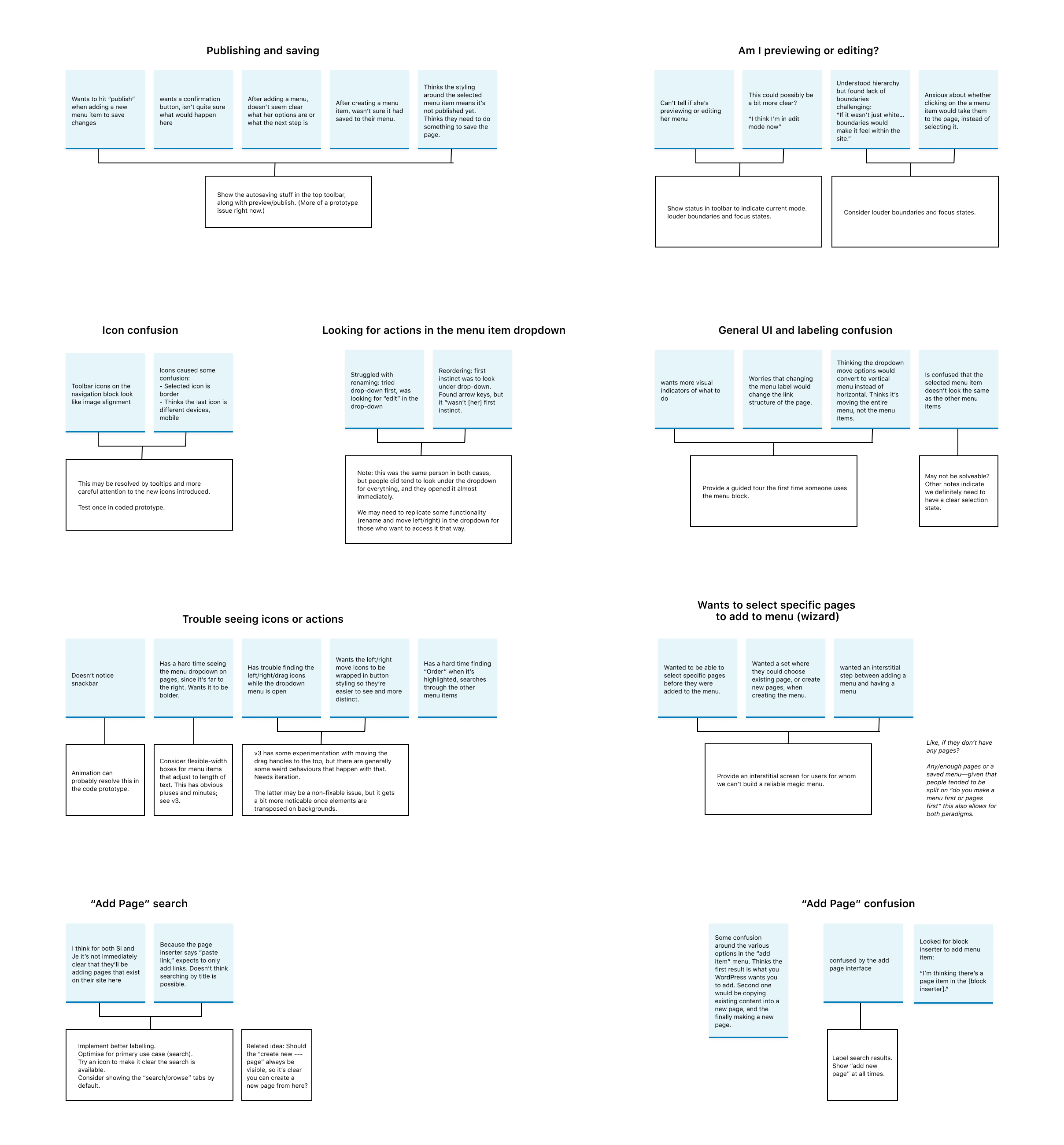
Some of the issues were inherent to how the prototype worked, or are related to Gutenberg as a whole, so we separated those out from the actionable items:
Overall? Our testing went way better than I was expecting for such a complex blockBlockBlock is the abstract term used to describe units of markup that, composed together, form the content or layout of a webpage using the WordPress editor. The idea combines concepts of what in the past may have achieved with shortcodes, custom HTML, and embed discovery into a single consistent API and user experience..
The biggest barrier our power users had to overcome was doing things the “WordPress way.” When the team asked them to add a menu, they hunted around for a wp-admin link—which didn’t exist in our prototype.
Once the testers figured out they could add the menu directly from the front-end screen, they were delighted.
Beginners struggled the most with learning the fundamental Gutenberg patterns. Some of the icons and labelling were especially confusing — we’ll be looking at improving both in our next iteration. Many of our testers weren’t sure if they were previewing their page, or editing it. Many wanted to press a “publish” button after making changes. Because many people encountered the menu item dropdown early, they kept returning to it when looking to complete a task. In many cases, they glossed over new UIUIUI is an acronym for User Interface - the layout of the page the user interacts with. Think ‘how are they doing that’ and less about what they are doing. to return to what they’d already used. We’ll want to account for this in future iterations.
Of the various steps, people struggled the most with adding pages to their menu. Most figured out how to add a menu, and then add a new page okay, but the search interface tripped up a lot of our testers. We’ll need to focus on improving this UI.
By the end, pretty much everyone seemed comfortable with the general concepts, and had learned about the “add” icon, the menu item dropdown, and how to move pages around.
“I like this, I wish mine did this!”
A navigation menuNavigation MenuA theme feature introduced with Version 3.0. WordPress includes an easy to use mechanism for giving various control options to get users to click from one place to another on a site. tester
Most of our testers were really excited to see WordPress heading in a more visual direction, and found our new UI way easier than the only ones they’d used in wp-admin and the CustomizerCustomizerTool built into WordPress core that hooks into most modern themes. You can use it to preview and modify many of your site’s appearance settings..
Next Steps
@tinkerbelly and I are compiling a list of all of the changes we need to make to the prototype. @tinkerbelly is working on implementing those changes in an iteration on the prototype, which we’ll then walk through with @lukepettway later today to get his insights on any accessibilityAccessibilityAccessibility (commonly shortened to a11y) refers to the design of products, devices, services, or environments for people with disabilities. The concept of accessible design ensures both “direct access” (i.e. unassisted) and “indirect access” meaning compatibility with a person’s assistive technology (for example, computer screen readers). (https://en.wikipedia.org/wiki/Accessibility) issues we might run into.
After implementing any changes @lukepettway suggests, either @tinkerbelly or I will write up a design handoff on the GitHub issue and chat through the prototype with the developer who’ll be working on this block, @jorgefilipecosta.
Once the team has a working PR of the Navigation Menu block, the next step will be another round of testing. Stay tuned for more information on that in the coming weeks.

You must be logged in to post a comment.