The next site-building app I’m exploring is Webflow, which markets itself as a visual code tool for building and launching responsive websites. Seems like a good tool for us to look at for phase 2 of GutenbergGutenbergThe Gutenberg project is the new Editor Interface for WordPress. The editor improves the process and experience of creating new content, making writing rich content much simpler. It uses ‘blocks’ to add richness rather than shortcodes, custom HTML etc. https://wordpress.org/gutenberg/!
(fun story — at the end of my session, I went to turn off my recording only to discover that my screen recording app had silently crashed some time while I was recording. Fun! So, no recording for this one 😢However, if you want to see what I ended up with, you can here)
Pros
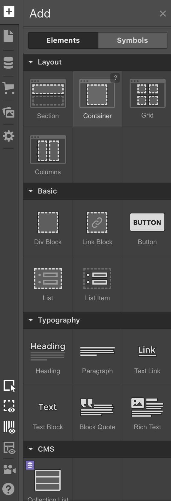
“Add” panel
Anyone familiar with coding a website with HTMLHTMLHTML is an acronym for Hyper Text Markup Language. It is a markup language that is used in the development of web pages and websites. and CSSCSSCSS is an acronym for cascading style sheets. This is what controls the design or look and feel of a site. will instantly see a lot of familiar tools. Webflow is absolutely a tool for visual coding, down to the box model diagrams and the technical language straight from CSS.
This is a tool that feels absolutely native to the responsive web. It feels like the present and the future.
Built-in support for flex and grid layouts 🚀
They have an “add” panel reminiscent of Gutenberg’s, with lots of common site-building elements, many of which we have in Gutenberg.
Webflow’s “preview” tool doesn’t open the page in a new tab, but instead, shows the preview within your current browser. It keeps the top bar, which allows you to toggle between different responsive sizes. It’s easy to go back to editing — just untoggle the preview icon. Plus, the preview felt fast.
I was a little worried I was generating terrible CSS while using the tool, but the actual markup and styles it output weren’t that bad, especially compared to other web builders I’ve used. And, you can even clean it up if you’d like by renaming or chaining classes.
You can add and manage pages directly from the editor — makes it easy to knock out a bunch of pages at once.
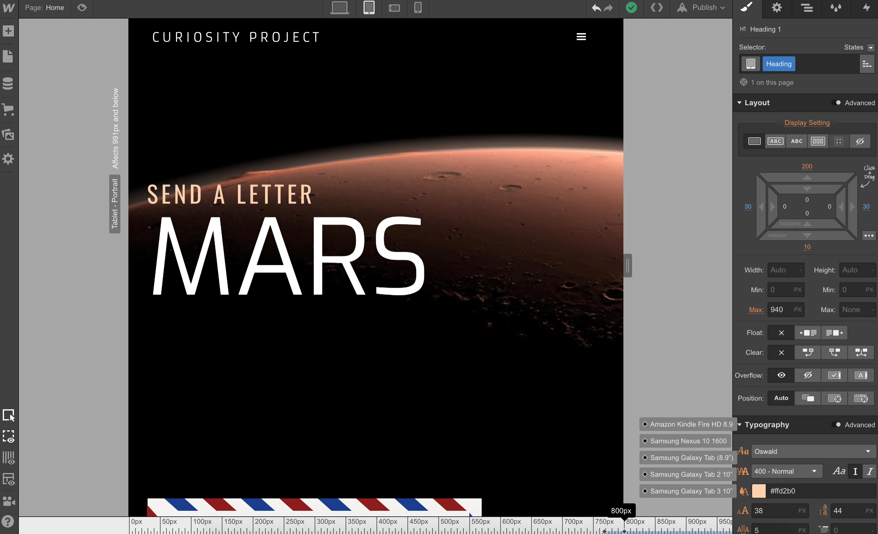
When you’re in responsive mode, you can drag the preview wider and a ruler appears underneath the viewport, showing you which major devices match that width:
Responsive Device Ruler
Cons
It really is visually coding. Nothing was configured for you — it was like I was writing CSS the entire time.
I’m bad at in-browser design, and this felt like a step beyond that — a step which I expected to bridge that gap, but instead just made the gap wider. I was trying to think visually, and I was trying to think about writing CSS, but without actually writing the CSS, I couldn’t visualize it.If you aren’t already a front-end developerFront-end developerFront-end web development is the practice of producing HTML, CSS and JavaScript for a website or a web application which a user can view and interact directly. you’re stuck. Which, that’s fine — that’s who this tool is aimed at. But it’s not something we as WordPress can emulate.
It looked like a visual editor where you can drag & drop, but that wasn’t the case for anything outside of text. The site preview was more like an inspector. I kept trying to directly manipulate the layout and was frustrated when I couldn’t.
For some reason I couldn’t scroll down in the site preview, which made continuing to work on the site impossible. I have no idea why it wouldn’t work.
I uploaded an SVG for my logo, and while it rendered in the site preview, it didn’t show up when I published my page.
Webflow has even more icon-based navigation than even Guternberg.
What can we learn?
It could be really nice to editor and preview in the same frame, like two different modes. I kind of hate the update → preview → new tab → back to other tab dance.
There’s something to be said about a tool that feels native to the web. Most site builder try to obscure that fact, but Webflow embraces it entirely. Is there a way we can embrace the inherent webbiness of websites, while still making a tool easy for non-technical folks?
Having a grid overlaying your editor really does make a big difference in making you feel like you’re building something.
Maybe child blocks should have dashed borders, while their parent remains solid?
Idea for blockBlockBlock is the abstract term used to describe units of markup that, composed together, form the content or layout of a webpage using the WordPress editor. The idea combines concepts of what in the past may have achieved with shortcodes, custom HTML, and embed discovery into a single consistent API and user experience. hovers: clicking the block name in the top right corner selected the block.
Block idea: Media + Text block where the image is floated inline, instead of its own column.

You must be logged in to post a comment.