The WordPress coreCoreCore is the set of software required to run WordPress. The Core Development Team builds WordPress. development team builds WordPress! Follow this site for general updates, status reports, and the occasional code debate. There’s lots of ways to contribute:
Found a bugbugA bug is an error or unexpected result. Performance improvements, code optimization, and are considered enhancements, not defects. After feature freeze, only bugs are dealt with, with regressions (adverse changes from the previous version) being the highest priority.?Create a ticket in the bug tracker.
WordPress 6.1 brings a number of new hooksHooksIn WordPress theme and development, hooks are functions that can be applied to an action or a Filter in WordPress. Actions are functions performed when a certain event occurs in WordPress. Filters allow you to modify certain functions. Arguments used to hook both filters and actions look the same. and functions, which developers should be aware of.
New functions
is_term_publicly_viewable()
TaxonomyTaxonomyA taxonomy is a way to group things together. In WordPress, some common taxonomies are category, link, tag, or post format. https://codex.wordpress.org/Taxonomies#Default_Taxonomies. component gets counterpart to the is_post_publicly_viewable() in a form of is_term_publicly_viewable() function. It will centralise and reduce the logic needed to validate a term and determine if it’s publicly viewable.
Another counterpart comes to Plugins component: did_filter() retrieves the number of times a filterFilterFilters are one of the two types of Hooks https://codex.wordpress.org/Plugin_API/Hooks. They provide a way for functions to modify data of other functions. They are the counterpart to Actions. Unlike Actions, filters are meant to work in an isolated manner, and should never have side effects such as affecting global variables and output. has been applied during the current request, bringing parity with did_action().
Allow to wrap settings sections with custom HTMLHTMLHyperText Markup Language. The semantic scripting language primarily used for outputting content in web browsers. in add_settings_section()
WP 6.1 improves the add_settings_section() function to allow developers to pass extra HTML mark-up to be rendered before and after the settings section. Extra argument $args can now be passed to the function, and is an array that can contain the following items:
before_section: HTML content to prepend to the section’s HTML output. Receives the section’s class name provided with the section_class argument via an optional %s placeholder. Default empty.
after_section: HTML content to append to the section’s HTML output. Default empty.
section_class: The class name to use for the section. Used by before_section if a %s placeholder is present. Default empty.
The HTML passed using these extra arguments is escaped using wp_kses_post() just before rendering. This changeset also provides a set of unit tests for this new feature.
In #56048 error logging was added to WP-Cron to indicate when an event fails to get rescheduled or unscheduled. The actions cron_reschedule_event_error and cron_unschedule_event_error have been introduced to allow developers to run custom tracking on these errors.
Non blocking wp-cron.php with LSAPI
In #54668 requests to wp-cron.php were made non-blocking for the LSAPI PHPPHPThe web scripting language in which WordPress is primarily architected. WordPress requires PHP 5.6.20 or higher implementation. Networknetwork(versus site, blog) requests for wp-cron.php will close prior to the processing of events inline with the behaviour for sites using PHP FPM.
New filters
wp_read_audio_metadata
Next to wp_read_image_metadata (added 15 years ago) and wp_read_video_metadata (added 5 years ago), Media component gets another metadata hook, wp_read_audio_metadata, which will allow filtering data extracted from uploaded audio file. Read more in #55828.
pre_option
Although a pre_option_{$option} filter already exists, this change adds a more general pre_option filter that will run on every get_option call. This brings the control flow into similar flow as update_option. Read more in #37930.
ajax_term_search_results
Taxonomy component get another addition in ajax_term_search_results hook, which can be used to filter the term search results returned by the AJAX term query. Read more in #55606.
get_header_image
Themes that support HeaderHeaderThe header of your site is typically the first thing people will experience. The masthead or header art located across the top of your page is part of the look and feel of your website. It can influence a visitor’s opinion about your content and you/ your organization’s brand. It may also look different on different screen sizes. Image feature can now modify header image URLURLA specific web address of a website or web page on the Internet, such as a website’s URL www.wordpress.org returned by get_header_image() using the new get_header_image filter. Read more in #56180.
wp_list_table_class_name
As list tables are very widely used by extenders, a new filter wp_list_table_class_name will allow them to modify the list table returned for custom screens. Next to this, the private delegation is removed from the following classes and function:
On the login page, the “Register” link for new users has been filterable for some time. Now, with lost_password_html_link hook, we have the ability to filter the “Lost your password?” link as well. Read more in #55388.
New filters in Users component allow conditional suppression of the email notifications that are sent when a new user account is registered. Read more in #54874.
Pass $action to nonce_life filter
WP 6.1 contextualizes the usage of nonce_life filter by passing the $action parameter. It allows to alterate the default lifespan of nonces on a case by case basis. Read more in #35188.
New filters for wp_list_authors()and wp_list_users()
The following three filters allow to customize the wp_list_authors() and wp_list_users() output:
wp_list_authors_args: Filters the query arguments for the list of all authors of the site.
pre_wp_list_authors_post_counts_query: Filters whether to short-circuit performing the query for author post counts. This may be useful to account for custom post types or post statuses.
wp_list_users_args: Filters the query arguments for the list of all users of the site.
New set of fine-grained filters for the feed_links() function
The previously available set of filters in the feed_links() function to enable or disable display of various feed links was quite limited:
feed_links_show_posts_feed to control the main feed
feed_links_show_comments_feed to control both the global comments feed and the comment feed for singular posts.
In order to disable the other feeds (post type archive, categoryCategoryThe 'category' taxonomy lets you group posts / content together that share a common bond. Categories are pre-defined and broad ranging., tagtagA directory in Subversion. WordPress uses tags to store a single snapshot of a version (3.6, 3.6.1, etc.), the common convention of tags in version control systems. (Not to be confused with post tags.), custom taxonomy, author archive, search results), one would have to unhook feed_links_extra() from wp_head, but that would completely remove all of those feeds, as well as the single post comments feed.
To allow for more flexibility, this commit introduces a full set of filters in the feed_links_extra() function to control each one of the feeds independently, including a way to enable/disable the single post comments feed when the global comments feed is disabled/enabled:
feed_links_extra_show_post_comments_feed
feed_links_extra_show_post_type_archive_feed
feed_links_extra_show_category_feed
feed_links_extra_show_tag_feed
feed_links_extra_show_tax_feed
feed_links_extra_show_author_feed
feed_links_extra_show_search_feed
All of them default to true, except for feed_links_extra_show_post_comments_feed which defaults to the result of feed_links_show_comments_feed to ensure backward compatibility.
Ability to filter arguments to the_posts_pagination()
A new the_posts_pagination_args filter has been added that allows developers to modify the arguments passed to the_posts_pagination().
A typical case where this new filter can be helpful is creating a child themeChild themeA Child Theme is a customized theme based upon a Parent Theme. It’s considered best practice to create a child theme if you want to modify the CSS of your theme. https://developer.wordpress.org/themes/advanced-topics/child-themes/.. Suppose a template in a parent theme contains something like (such as in Twentyseventeen) :
When the author of a child theme wants to use something other than the parent theme’s SVGs for the next/previous links, for example, simple text links so that they can style them similar to other next/previous that are used in the child theme.
Prior to WordPress 6.1, child theme authors needed to copy the parent theme’s template into their child theme and change the arguments passed to the_posts_pagination().
With this new filter, child theme authors can simply do:
Pocket Casts is a podcast player with apps for several platforms. The oEmbed APIAPIAn API or Application Programming Interface is a software intermediary that allows programs to interact with each other and share data in limited, clearly defined ways. provides rich HTML to embed any audio or video episode onto a website. URLs on the pca.st domain can now be embedded automatically.
Thanks to @audrasjb,@pbiron, @johnbillionand @peterwilsoncc for contributing to this Dev notedev noteEach important change in WordPress Core is documented in a developers note, (usually called dev note). Good dev notes generally include a description of the change, the decision that led to this change, and a description of how developers are supposed to work with that change. Dev notes are published on Make/Core blog during the beta phase of WordPress release cycle. Publishing dev notes is particularly important when plugin/theme authors and WordPress developers need to be aware of those changes.In general, all dev notes are compiled into a Field Guide at the beginning of the release candidate phase..
When forms contain multiple required fields, their labels might have an asterisk with a legend to explain that those fields are required. To reduce code duplication and to help maintain globally consistent markup, WordPress has two new functions: wp_required_field_indicator() and wp_required_field_message(). Themes and plugins could employ these functions, too, if they require at least WordPress 6.1.
Labels for required fields use the wp_required_field_indicator() function, which gives a symbol wrapped in a spantagtagA directory in Subversion. WordPress uses tags to store a single snapshot of a version (3.6, 3.6.1, etc.), the common convention of tags in version control systems. (Not to be confused with post tags.) with the “required” class. Translators can now replace the asterisk with a more appropriate glyph in their language.
For the legend, wp_required_field_message() wraps “Required fields are marked *” in a span element as well, with the “required-field-message” class. The symbol matches the markup produced by the wp_required_field_indicator() function.
In WordPress 5.9 and 6.0, screen readers would not read the asterisks or the required fields message text of the comments form because they are visual cues. In 6.1, a revision restores these items so screen reader users who see the text also hear it.
Filtering markup
Both of these functions have hooksHooksIn WordPress theme and development, hooks are functions that can be applied to an action or a Filter in WordPress. Actions are functions performed when a certain event occurs in WordPress. Filters allow you to modify certain functions. Arguments used to hook both filters and actions look the same. to edit their output, and the filterFilterFilters are one of the two types of Hooks https://codex.wordpress.org/Plugin_API/Hooks. They provide a way for functions to modify data of other functions. They are the counterpart to Actions. Unlike Actions, filters are meant to work in an isolated manner, and should never have side effects such as affecting global variables and output. names match the related function.
Indicator example
If the language keeps the single asterisk, but that already means something else on a site, the filter could add more stars:
Replace the space before the indicator in the message with a non-breaking space so the symbol does not wrap to the next line, separated from the rest of the message.
WordPress 6.1 brings considerable more flexibility to the layout controls and features to the blockBlockBlock is the abstract term used to describe units of markup that, composed together, form the content or layout of a webpage using the WordPress editor. The idea combines concepts of what in the past may have achieved with shortcodes, custom HTML, and embed discovery into a single consistent API and user experience. editor. A new layout type, “constrained”, was added to the already available Flow and Flex layouts types. In addition, layout refactor efforts bring new layout styles, new block level spacing, more semantic class name for layouts, root padding and a method to disable all layout styles all together for themes.
New “constrained” layout type
The new “constrained” layout type has been split out from the “flow” layout. This means that the “flow” now corresponds only to the base layout configuration. This change moves the content width logic to a new layout type, called “constrained” which makes it easier to set blocks to use content width by default.
What styles does each layout type output?
Flow layout
Spacing between child blocks with margin-block-start, margin-block-end;
Left, right and center alignments for child blocks.
Constrained layout
Spacing between child blocks with margin-block-start, margin-block-end;
Left, right and center alignments for child blocks;
Width constraints for child blocks (based on settings > layout > contentSize and settings > layout > wideSize from theme.jsonJSONJSON, or JavaScript Object Notation, is a minimal, readable format for structuring data. It is used primarily to transmit data between a server and web application, as an alternative to XML.);
Base flex display rules, defaulting to a horizontal orientation;
Spacing between child blocks with gap;
Optionally, left/right/center/space-between justification and horizontal/vertical orientation.
Layout block support refactor
In 6.1, the Layout block support, which powers layout styles for blocks such as Group, Buttons, Social icons, and Columns, has been refactored. Prior to this release, the layout block support would output layout styles at render time for each, and every instance of a block stored in post content or in templates, resulting in redundant styles being output on a site’s frontend as reported in this Gutenberg issue #41434.
To address this, the refactor added the concept of base layout styles by storing a set of layout definitions in the coreCoreCore is the set of software required to run WordPress. The Core Development Team builds WordPress. WordPress theme.json file, that contain the default rules for each of the current layout types. These base layout styles are attached to each of the layout types via a semantic class name with the prefix is-layout-, resulting in the following class name-based rules:
is-layout-flow (base layout rules associated with the Flow layout used in the Group and other container block)
is-layout-constrained (base layout rules associated with the Constrained layout type used in Group and other container blocks that set content and wide sizes)
is-layout-flex (base layout rules associated with the Flex layout type, used in the Buttons, Social Icons, and Columns blocks)
Now, when a block that uses the layout support is rendered, one of the above class names will be injected into the block’s output, attaching the base layout styles to that block. The result is that the layout support will now only output a wp-container-123 classname (where 123 is a semi-random number), and associated styles when a block uses non-default layout attributes. This means a substantial reduction in redundant CSSCSSCascading Style Sheets. rules for posts or pages containing many Group blocks using the default layout settings.
In addition, when the Layout support outputs the wp-container-123 rules, they are enqueued via the newly added style engine functions, so that all the rules are grouped together in the one styletagtagA directory in Subversion. WordPress uses tags to store a single snapshot of a version (3.6, 3.6.1, etc.), the common convention of tags in version control systems. (Not to be confused with post tags.) for output. This further tidies up the CSS output.
Block spacing enabled at the block level in theme.json
A byproduct of the layout refactor is that blockGap can now be set at the block level in theme.json and via the global styles UIUIUser interface, as gap styles are now also output via the above layout type class names, using direct CSS values, instead of the blockGap CSS variable --wp--style--block-gap. For backwards compatibility with themes and blocks that rely on the CSS variable, the value defined for the root styles.spacing.blockGap style is also output as a CSS property.
Note: The Gallery block currently does not support blockGap styles in theme.json as it relies on an ad-hoc approach to gap spacing to factor in widths of the image blocks.
Semantic class names in Layout support
Since WordPress 6.0, the Layout support outputs semantic class names for the layout properties orientation, justifyContent, and flexWrap, resulting in class names such as is-vertical, is-content-justification-left, and is-nowrap.
With the changes in WordPress 6.1, combined with layout type-based class names, it is now possible to target a particular configuration of the Group block, e.g., the Stack variation via a rule such as .wp-block-group.is-layout-flex.is-vertical.
These semantic class names are only output for Layout properties that have been explicitly set.
Root padding
By default, root padding, which can be set in Styles > Layout > Padding, is applied to the outermost wrapper element. On the front end that’s wp-site-blocks; in the editor it’s editor-styles-wrapper.
The problem with this approach is that it doesn’t allow for blocks to expand to full viewport width.
useRootPaddingAwareAlignments changes where left and right padding are applied, so that blocks set to full width can actually span the full viewport width.
How does it work?
Instead of the wrapper, left and right padding are added to the outermost container block that has a constrained layout set. Then, negative margins of the same value are added to any full width children of that block. Additionally, non-full width children of those full width blocks will also have left and right padding applied to them. This is so that the contents of a full width container block don’t bump against the sides of the viewport.
To enable this setting, in theme.json, add "useRootPaddingAwareAlignments": true inside the settings object.
By default, WordPress outputs structural layout styles for blocks such as Group, Columns, Social icons and Buttons, as part of the layout block support. Until this point, some themes have been opting out of the generated base layout styles by using an undocumented approach of overriding or removing the render_layout_support_flag callback on the render_block filter.
In WordPress 6.1, base layout styles have been consolidated as part of global styles output, so the existing approach of opting out of generated layout styles will no longer work. In its place, themes can now use a new theme support flag, called disable-layout-styles. Themes can opt-in to this feature using the following code:
// Opt in to remove layout styles.

add_theme_support( 'disable-layout-styles' );
Using this new theme support flag ensures that the expected behavior is handled explicitly in code. It also allows themes that use this flag to still make use of semantic class names that are injected into layout blocks at render time, such as content justification classes.
Note: Opting into this feature will remove required styles for blocks such as Group, Columns, Social icons and Buttons, so themes that use this feature will need to supply their own structural layout styles in order for these blocks to render correctly in the editor and on the site’s frontend. In most cases, particularly for blocks-based themes, the generated layout styles are preferable for ensuring the correct rendering of core blocks. For themes that are looking to adjust block spacing, view the handbook entry for “What is blockGap and how can I use it?”.
For more detail: Documentation > Block Editor > Explanation > Architecture > Layout styles
This dev notedev noteEach important change in WordPress Core is documented in a developers note, (usually called dev note). Good dev notes generally include a description of the change, the decision that led to this change, and a description of how developers are supposed to work with that change. Dev notes are published on Make/Core blog during the beta phase of WordPress release cycle. Publishing dev notes is particularly important when plugin/theme authors and WordPress developers need to be aware of those changes.In general, all dev notes are compiled into a Field Guide at the beginning of the release candidate phase. covers miscellaneous updates and changes made to the blockBlockBlock is the abstract term used to describe units of markup that, composed together, form the content or layout of a webpage using the WordPress editor. The idea combines concepts of what in the past may have achieved with shortcodes, custom HTML, and embed discovery into a single consistent API and user experience. editor for WordPress 6.1.
removed useDisabled as it was already revamped and
removed “Dropping Enzyme” as it’s slated for 6.2
Added New withIllustration option for Placeholder component
Table of Contents
Allow defining an aria-label in group blocks
When there are multiple landmarks of the same type (for instance <nav>, <aside>, <section>) added to a template, assistive technologies cannot differentiate between them. Group blocks allow users to select the HTMLHTMLHyperText Markup Language. The semantic scripting language primarily used for outputting content in web browsers. element they need, but in doing so, introduce an a11yAccessibilityAccessibility (commonly shortened to a11y) refers to the design of products, devices, services, or environments for people with disabilities. The concept of accessible design ensures both “direct access” (i.e. unassisted) and “indirect access” meaning compatibility with a person’s assistive technology (for example, computer screen readers). (https://en.wikipedia.org/wiki/Accessibility) issue.
With this update in WordPress 6.1, developer can add ARIA labels in their templates and blocks.
With WordPress 6.0, developers were able to add patterns that appear in a modal each time a new page was created, thus allowing the user to start from a set of pre-made patterns instead of a blank state. In WordPress 6.1, this feature is expanded to all the post types. To use this feature, one should include core/post-content in the blockTypes array (same as what happened for pages) and include the desired postTypes where the modal should appear in a newly introduced postTypes property. If postTypes are specified, the pattern is only available on the post types that were set. Example:
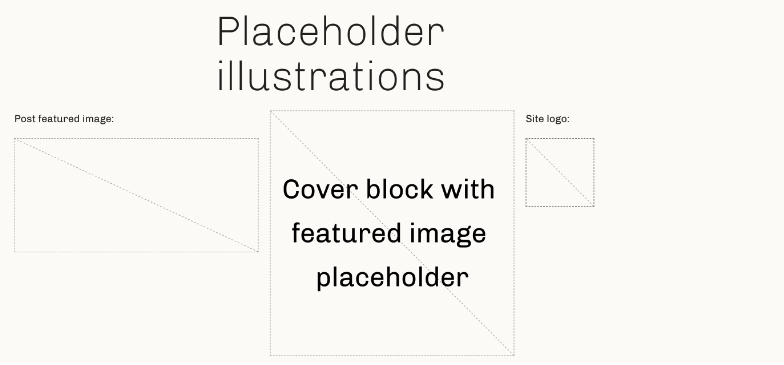
New option for Placeholder component supports illustrations
In WordPress 6.1 the Placeholder component used by blocks like Image or Cover supports a new property called withIllustration. When true this property will instruct the Placeholder component to display an outline SVG illustration when there is no content.
Navigation Block Menu Items filterFilterFilters are one of the two types of Hooks https://codex.wordpress.org/Plugin_API/Hooks. They provide a way for functions to modify data of other functions. They are the counterpart to Actions. Unlike Actions, filters are meant to work in an isolated manner, and should never have side effects such as affecting global variables and output.
This update added a filter to navigation.php to provide the ability to modify navigation block menu items with code. Developers now can programmatically access the navigation block menu items of a block theme similar to the existing wp_nav_menu_items filter does for traditional themes.
A new filter, block_core_navigation_render_inner_blocks, passes WP_Block_List::$inner_blocks to the developer.
Props to @afragen for the code contribution and dev note.
Improvement of Cover Block
Markup changes
The markup has been changed to resolve the issue that duotone doesn’t work with fixed background. Previously, the background image was applied to the root of the block, but it is now applied to the inner div with the img role and .wp-block-cover__image-background class.
Keep the same position for both LTR and RTL languages
In the cover block, the content inside can be changed the content position, such as “Top Left” or “Center Right”. But when changed to RTL languages, the content position flips left to right as compared to the LTR language. However, content position determines “physical” placement and should not be affected by language direction.
To solve this problem, the same position is now kept for both LTR and RTL languages. Because of this change, the content within the existing cover block in RTL languages is flipped left to right (i.e., in its original position), but if this is not what you are looking for, you can re-position it.
Props to @wildworks for the code contribution and dev note.
Moving block CSSCSSCascading Style Sheets. to JSONJSONJSON, or JavaScript Object Notation, is a minimal, readable format for structuring data. It is used primarily to transmit data between a server and web application, as an alternative to XML.
Previous to WordPress 6.1, when themes developers wanted to override default blocks CSS styles using theme.json, a few issues arose due to higher specificity, convoluted selector choices or just quirky behavior.
With WordPress 6.1, it is now possible to express styles in the block.json file, using the same properties as a theme.json file. These styles are merged with the Global Styles settings, together with the theme and user style settings, with theme and user style settings taking priority over block styles. The background processing of all Styles (default, block, theme, and user) via the Style Engine also comes with a performance advantage.
Note: This feature is still experimental and therefore subject to change.
Developers can now add an __experimentalStyle property to their block.json file which defines style for the block. For example, the Pullquote block sets the following:
PR #34180GutenbergGutenbergThe Gutenberg project is the new Editor Interface for WordPress. The editor improves the process and experience of creating new content, making writing rich content much simpler. It uses ‘blocks’ to add richness rather than shortcodes, custom HTML etc. https://wordpress.org/gutenberg/ Repo
WordPress 6.1 will deprecate the BlockColorsStyleSelector block editor component. Instead, use Supports APIAPIAn API or Application Programming Interface is a software intermediary that allows programs to interact with each other and share data in limited, clearly defined ways. to signal that the block supports color-related properties. Visit pull request #40502.
As of WordPress 6.1, the send_headers hook has been moved to slightly later in the WordPress loading routine (ticket). Historically, all the is_ functions (like is_singular) wouldn’t work when you were determining which headers to send. With this change, moving `send_headers` to after WordPress parses the query, those functions now work properly.
People can now have more control over things like:
Managing caching behavior
Preloading assets with HTTPHTTPHTTP is an acronym for Hyper Text Transfer Protocol. HTTP is the underlying protocol used by the World Wide Web and this protocol defines how messages are formatted and transmitted, and what actions Web servers and browsers should take in response to various commands.rel=preload headers
Conditionally executing redirects, and managing other non-200 status scenarios
Currently, these types of scenarios are often filtered in late actions like template_redirect; which is semantically confusing, and inefficient.
There’s a good example of code that becomes easier with this. In fact, it has already been changed in this ticketticketCreated for both bug reports and feature development on the bug tracker.: the X-Pingback HTTP headerHeaderThe header of your site is typically the first thing people will experience. The masthead or header art located across the top of your page is part of the look and feel of your website. It can influence a visitor’s opinion about your content and you/ your organization’s brand. It may also look different on different screen sizes. only needs to be sent for posts, and can now be sent at the right time (commit).
Let’s see what it means in terms of load order:
Action sequence before this change
wp_loaded
parse_request
send_headers
parse_query
pre_get_posts — WP main query.
Action sequence after this change
wp_loaded
parse_request
parse_query
pre_get_posts — WP main query.
send_headers
This should not affect any of your existing code negatively unless you were using send_headers to do things that really should have been happening on wp_loaded or parse_request. So please check your code for that! If you were doing that, just changing to an earlier hook should fix your problem.
For new code, you can now happily use all the is_ functions.
WordPress 6.1 introduces a new system for managing preferences in blockBlockBlock is the abstract term used to describe units of markup that, composed together, form the content or layout of a webpage using the WordPress editor. The idea combines concepts of what in the past may have achieved with shortcodes, custom HTML, and embed discovery into a single consistent API and user experience. editors. Prior to 6.1, user preferences (like Top toolbar or Fullscreen mode) were only persisted via browser local storage. This resulted in users losing their preferences when they cleared browser data, with their preferences confined to the individual browser instance.
With 6.1, WordPress is adopting a new system for editor preferences. They will be stored server side in user metaMetaMeta is a term that refers to the inside workings of a group. For us, this is the team that works on internal WordPress sites like WordCamp Central and Make WordPress. in addition to the browser’s local storage. This change means they will now be retained when clearing local storage, and can be used across multiple browsers or computers.
Continuing to use local storage as a secondary way to persist preferences adds a layer of redundancy for situations where a user is offline, or the networknetwork(versus site, blog) request to save preferences in user meta is interrupted.
The previous preferences implementation
WordPress previously used a @wordpress/data persistence plugin for the purpose of persisting its preference data. From 6.1 on, WordPress will no longer use this preferences system and will switch to a new system.
Plugins were also able to use the data pluginPluginA plugin is a piece of software containing a group of functions that can be added to a WordPress website. They can extend functionality or add new features to your WordPress websites. WordPress plugins are written in the PHP programming language and integrate seamlessly with WordPress. These can be free in the WordPress.org Plugin Directory https://wordpress.org/plugins/ or can be cost-based plugin from a third-party for persisting any plugin related preferences. This will continue to work as before, but will still only use browser local storage.
The new preferences system
The new system is implemented in the @wordpress/preferences package. This package implements a centralized store for any preference data, and can be used by plugins.
The APIs that are relevant to plugins are straightforward to use:
// Set defaults for any preferences on initialization.
// A new user's preferences will have these values.
// Default values are not persisted.
wp.preferences.setDefaults( 'my-plugin', {
    preferenceA: 1,
    preferenceB: false,
} );

// Update preference values. These values will be persisted.
wp.preferences.set( 'my-plugin', 'preferenceA', 2 );
wp.preferences.toggle( 'my-plugin', 'preferenceB' );

// Read preference values.
wp.preferences.get( 'my-plugin', 'preferenceA' ); // 2
wp.preferences.get( 'my-plugin', 'preferenceB' ); // true
The 'my-plugin' value is called a scope, and the preferences system uses this to partition data.
Extenders needed a way to present bespoke versions of the Query LoopLoopThe Loop is PHP code used by WordPress to display posts. Using The Loop, WordPress processes each post to be displayed on the current page, and formats it according to how it matches specified criteria within The Loop tags. Any HTML or PHP code in the Loop will be processed on each post. https://codex.wordpress.org/The_Loop.blockBlockBlock is the abstract term used to describe units of markup that, composed together, form the content or layout of a webpage using the WordPress editor. The idea combines concepts of what in the past may have achieved with shortcodes, custom HTML, and embed discovery into a single consistent API and user experience., with their presets, additional settings and disabled customization options when irrelevant to their use-case. With WordPress 6.1, the Query Loop block offers mighty ways to create such versions, through Block Variations.
To make WordPress recognize your variation you need to set the isActive block variation property. For providing an easy and consistent way for extenders to recognize and scope their variation a new namespace property has been introduced in Query Loop block.
Through the Query Loop block’s allowedControls property, you can control which features are presented to the user to simplify content creation.
You now also have a way to customize the query executed to fetch the desired posts setting extra arguments to the query attribute of the block, and you can do the same for the front end by using the query_loop_block_query_varsfilterFilterFilters are one of the two types of Hooks https://codex.wordpress.org/Plugin_API/Hooks. They provide a way for functions to modify data of other functions. They are the counterpart to Actions. Unlike Actions, filters are meant to work in an isolated manner, and should never have side effects such as affecting global variables and output..
Customizing Query Block layout
To customize your variation’s layout you can use the `innerBlocks` attribute to set the blocks that are available at the start, bypassing the set-up stage. You can also create specific Query Loop variation patterns to be suggested in the setup, and replace flows of the block. To connect a block pattern to a Query Loop variation, add the name of your variation prefixed with the Query Loop name (e.g. core/query/$variation_name) to the pattern’s blockTypes property.
WordPress 6.1 has introduced some server-side filters to hook into the theme.json data provided at the different data layers:
wp_theme_json_data_default: hooksHooksIn WordPress theme and development, hooks are functions that can be applied to an action or a Filter in WordPress. Actions are functions performed when a certain event occurs in WordPress. Filters allow you to modify certain functions. Arguments used to hook both filters and actions look the same. into the default data provided by WordPress
wp_theme_json_data_blocks: hooks into the data provided by the blocks
wp_theme_json_data_theme: hooks into the data provided by the theme
wp_theme_json_data_user: hooks into the data provided by the user
Each filterFilterFilters are one of the two types of Hooks https://codex.wordpress.org/Plugin_API/Hooks. They provide a way for functions to modify data of other functions. They are the counterpart to Actions. Unlike Actions, filters are meant to work in an isolated manner, and should never have side effects such as affecting global variables and output. receives an instance of the WP_Theme_JSON_Data class with the data for the respective layer. To provide new data, the filter callback needs to use the update_with( $new_data ) method, where $new_data is a valid theme.json-like structure.
As with any theme.json, the new data needs to declare which version of the theme.jsonJSONJSON, or JavaScript Object Notation, is a minimal, readable format for structuring data. It is used primarily to transmit data between a server and web application, as an alternative to XML. is using, so it can correctly be migrated to the runtime one if it’s different.
Example: add a new color palette
For example, this is how to pass a new color palette for the theme and disable the text color UIUIUser interface:
By declaring what data they want to override, 3rd parties have more control without having to worry about migrating their code when or if there’s an update to the theme.json shape. By using this mechanism as suggested, coreCoreCore is the set of software required to run WordPress. The Core Development Team builds WordPress. will always make sure their data gets migrated to the latest.
deleted the statement about the anchorRef, anchorRect, getAnchorRect and __unstableShift props being scheduled for removal in the Popover component. The related deprecation messaged will be updated in the WordPress 6.1.1 release;
deleted the statement about the useAnchorRef hook being scheduled for removal. The related deprecation messaged will be updated in the WordPress 6.1.1 release;
added a statement about the removal of the range prop in the Popover component.
Changes to the Popover component
The Popover component from the @wordpress/components package has been almost entirely rewritten, in an effort to make it more stable, more reliable and more performant.
Below is a list with the main APIAPIAn API or Application Programming Interface is a software intermediary that allows programs to interact with each other and share data in limited, clearly defined ways. changes:
a new placement prop has been introduced. This prop is meant to replace the legacy position prop (which will be marked as deprecated in the near future);
a new anchor prop has been introduced. This prop is meant to replace all previous anchor-related props (anchorRef, anchorRect, getAnchorRect). These older anchor-related props are now marked as deprecated;
the __unstableForcePosition prop has been marked as deprecated, in favor of new flip and resize props. The __unstableForcePosition is currently scheduled for removal in WordPress 6.3;
the __unstableObserveElement prop has been removed, since it’s not necessary anymore after the recent updates to the Popover;
the range prop has been removed, as it hasn’t been having any effects on the component for a while.
The changes to the Popover component also affected the @wordpress/rich-text package, where a new useAnchor hook was introduced. The older useAnchorRef hook has been marked as deprecated.
Preparing CustomSelectControl to take up the entire width of its parent.
To improve consistency with SelectControl, the CSSCSSCascading Style Sheets. styles for CustomSelectControl will be changed to take up the full width available, regardless of how short the option strings are. To start opting into these new unconstrained width styles, set the __nextUnconstrainedWidth prop to true. These styles will become the default in 6.4.
To keep your CustomSelectControl similar to the previous styling, add width constraints to a wrapper div.
Props to @0mirka00 for writing this dev notedev noteEach important change in WordPress Core is documented in a developers note, (usually called dev note). Good dev notes generally include a description of the change, the decision that led to this change, and a description of how developers are supposed to work with that change. Dev notes are published on Make/Core blog during the beta phase of WordPress release cycle. Publishing dev notes is particularly important when plugin/theme authors and WordPress developers need to be aware of those changes.In general, all dev notes are compiled into a Field Guide at the beginning of the release candidate phase..(top)
Components with deprecated margin styles.
Several UIUIUser interface components currently ship with styles that give them top and/or bottom margins. This can make it hard to reuse them in arbitrary layouts, where you want different amounts of gap or margin between components.
To better suit modern layout needs, we will gradually deprecate these outer margins. A deprecation will begin with an opt-in period where you can choose to apply the new margin-free styles on a given component instance. Eventually in a future version, the margins will be completely removed.
In WordPress 6.1, the outer margins on the following components have been deprecated.
AnglePickerControl
FontSizePicker
GradientPicker
CustomGradientPicker
To start opting into the new margin-free styles, set the __nextHasNoMarginBottom prop to true.
WordPress 6.1 introduces some new elements to Styles to give blockBlockBlock is the abstract term used to describe units of markup that, composed together, form the content or layout of a webpage using the WordPress editor. The idea combines concepts of what in the past may have achieved with shortcodes, custom HTML, and embed discovery into a single consistent API and user experience. theme developers consistent styles across similar elements, and control those in the theme.jsonJSONJSON, or JavaScript Object Notation, is a minimal, readable format for structuring data. It is used primarily to transmit data between a server and web application, as an alternative to XML. file.
One of the biggest challenges for block themes has been to have consistent styles across similar elements. For example, many blocks display buttons (e.g., Button block, Search block, File block etc.). It has been necessary to include custom CSSCSSCascading Style Sheets. with the theme to ensure all these button look the same. This CSS approach is no longer necessary in many cases with the 6.1 release.
Prior to the this release, users could style the link and individual heading elements. With 6.1, it is now possible to style the following elements:
button
caption
cite
heading
To target these elements in a block theme, simply add them to the theme.json file in your theme:
This example only specifies the colors for these elements, but it is possible to specify all the same properties for elements as for blocks.
The heading element will apply to all heading level elements (H1, H2, H3, H4, H5, H6).
Interactive states
Another challenge for block themes has been to control interactive states for elements and blocks, for example changing the color of links when they are hovered. To help with this WordPress 6.1 adds three new “pseudo-selectors” to Styles:
:active
:focus
:hover
These selectors can be applied in theme.json like this:
Again, this example only specifies the colors for these states. It is possible to specify all the same properties for elements as for blocks.
Elements within blocks
This functions similarly at a block level, the only difference being that the rules should be applied to the elements nested within the block you wish to target:
In this case <a> elements within a core/group block will have red text on :hover – this results in the following CSS (actual output may vary):
.wp-block-group a:hover {
    color: red;
}
At the current time support for this feature is intentionally limited to only link (i.e. <a>) and button elements to avoid accessibilityAccessibilityAccessibility (commonly shortened to a11y) refers to the design of products, devices, services, or environments for people with disabilities. The concept of accessible design ensures both “direct access” (i.e. unassisted) and “indirect access” meaning compatibility with a person’s assistive technology (for example, computer screen readers). (https://en.wikipedia.org/wiki/Accessibility) and usability concerns. It may be extended in the future.
Block developers
Another challenge for block themes is integration with third-party blocks. Even if a theme can target all the buttons in coreCoreCore is the set of software required to run WordPress. The Core Development Team builds WordPress. blocks, there could be any number of third-party blocks that output buttons. It’s not sustainable to expect themes to list all possible button selectors to try to have consistent button styles.
This change provides a solution to this issue, by creating opportunities for block developers to better integrate their blocks with block themes. Now block developers can add the class wp-element-button to any buttons they want to match the theme button styles and the settings from theme.json will be applied. Or wp-element-caption to use for caption, and so on.
Next steps
There are still more elements that can be enabled in Styles to continue improving block themes, particularly form elements like input fields, checkbox, radio buttons and textarea elements. There is a tracking issue for this work.
You must be logged in to post a comment.