The WordPress coreCoreCore is the set of software required to run WordPress. The Core Development Team builds WordPress. development team builds WordPress! Follow this site for general updates, status reports, and the occasional code debate. There’s lots of ways to contribute:
Found a bugbugA bug is an error or unexpected result. Performance improvements, code optimization, and are considered enhancements, not defects. After feature freeze, only bugs are dealt with, with regressions (adverse changes from the previous version) being the highest priority.?Create a ticket in the bug tracker.
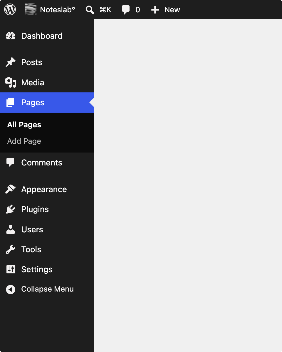
A patch has been in progress since June that replaces Dashicons in the adminadmin(and super admin) bar and the sidebarSidebarA sidebar in WordPress is referred to a widget-ready area used by WordPress themes to display information that is not a part of the main content. It is not always a vertical column on the side. It can be a horizontal rectangle below or above the content area, footer, header, or any where in the theme. with WordPress icons, using the wp_get_icon() function that was introduced in WordPress 7.1. Props to @fushar, @wildworks, and @lucasmdo for moving this forward. Because the change being proposed is very visible, it deserves a wider audience than it has had so far.
The change can be boiled down to the following before/after:
Note: the “After” image is a mockup, and font smoothing makes it look slightly different, but no font changes are being proposed.
Why replace them
Dashicons has served WordPress well for a long time. But it is an icon font, which intrinsically comes with some downsides worth addressing as part of any new icon efforts.
Icon fonts are announced unpredictably. Icon fonts map glyphs to Unicode private-use-area code points, which have no defined meaning. Screen readers handle them inconsistently, sometimes with silence, sometimes with a nonsense character or a piece of punctuation read aloud mid-sentence. An SVG with an explicit aria-label, or explicitly hidden, is predictable in a way a glyph cannot be.
Icon fonts break under user colour overrides. Windows High Contrast Mode and other forced-colours settings routinely make font-based icons vanish or misrender, because the icon is text as far as the OS is concerned. An SVG drawn with currentColor follows the user’s chosen colours.
When a webfont fails, the failure is confusing. A blocked or slow font file leaves tofu boxes or wrong glyphs, visible garbage that looks like a broken site. An SVG either renders or is absent.
Unifying on a single icon set, rather than two, simplifies the visual language. Although a small visual change, it can be meaningful for people with perception and information-processing differences.
Feedback
Your feedback on the change is welcome. For example, there are some still-open questions:
The search icon faces the opposite direction from the dashicon it replaces. If this is a meaningful change, we can add an additional variant.
The Posts icon could change from a pin. In the ticketticketCreated for both bug reports and feature development on the bug tracker., a few options are discussed. The before and after shown in this post suggests using the quill pen icon.
Beyond those, the mapping as a whole is worth a look. It’s easy to add icons if the ones chosen are not quite there yet.
Feedback is best left on the Trac ticket, so that it stays in one place. The pull request is open for code review, with discussion kept on the ticket.


You must be logged in to post a comment.