The WordPress coreCoreCore is the set of software required to run WordPress. The Core Development Team builds WordPress. development team builds WordPress! Follow this site for general updates, status reports, and the occasional code debate. There’s lots of ways to contribute:
Found a bugbugA bug is an error or unexpected result. Performance improvements, code optimization, and are considered enhancements, not defects. After feature freeze, only bugs are dealt with, with regressions (adverse changes from the previous version) being the highest priority.?Create a ticket in the bug tracker.
Core Editor Improvement: Catalyst for creativity and control
These “CoreCoreCore is the set of software required to run WordPress. The Core Development Team builds WordPress. Editor Improvement…” posts (labeled with the #core-editor-improvementtagtagA directory in Subversion. WordPress uses tags to store a single snapshot of a version (3.6, 3.6.1, etc.), the common convention of tags in version control systems. (Not to be confused with post tags.)) are a series dedicated to highlighting various new features, improvements, and more from Core Editor related projects.
Alongside the addition of more blocks to edit more parts of your site, more design tools are being added across all blocks to both ensure consistency in the experience and to allow folks to customize their site even more, without needing to use CSSCSSCascading Style Sheets.. This post goes through each categoryCategoryThe 'category' taxonomy lets you group posts / content together that share a common bond. Categories are pre-defined and broad ranging. of design tools, what blocks they are available in, the progress made, and some fun examples showing off what you can now do. The result is a catalyst for creativity, with more to come on the horizon.
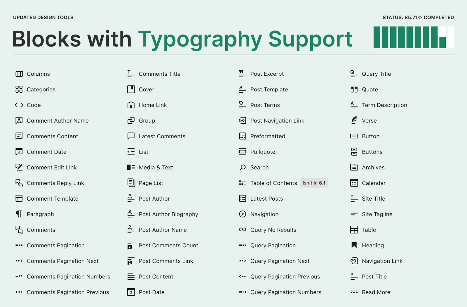
Typography BlockBlockBlock is the abstract term used to describe units of markup that, composed together, form the content or layout of a webpage using the WordPress editor. The idea combines concepts of what in the past may have achieved with shortcodes, custom HTML, and embed discovery into a single consistent API and user experience. Support
These settings include font size, line height, font style, font weight, text transform, letter spacing, font family, and text decoration. When combined, these allow you to have new ways to differentiate your content, whether by making something stand out more or less. At a high level, various combinations of these options are available in the following blocks with many added for the 6.1 release cycle:
Column/Columns
Categories
Code
Comment Author Name
Comments Content
Comment Date
Comment Edit Link
Comments Reply Link
Comment Template
Paragraph
Comments
Comments Pagination
Comments Pagination Next
Comments Pagination Numbers
Comments Pagination Previous
Comments Title
Cover
Home Link
Group
Latest Comments
List
Media & Text
Page List
Post Author
Post Author Biography
Post Author Name
Post Comments Count
Post Comments Link
Post Content
Post Date
Post ExcerptExcerptAn excerpt is the description of the blog post or page that will by default show on the blog archive page, in search results (SERPs), and on social media. With an SEO plugin, the excerpt may also be in that plugin’s metabox.
Post Template
Post Terms
Post Navigation Link
Preformatted
Pullquote
Search
Table of Contents – not available in 6.1
Latest Posts
Navigation
Query No Results
Query Pagination
Query Pagination Next
Query Pagination Numbers
Query Pagination Previous
Query Title
Quote
Term Description
Verse
Button/Buttons
Archives
Calendar
Site Title
Site Tagline
Table
Heading
Navigation Link
Read More
To see the power of these supports in action, here’s an example of using them to personalize a button:
The audit for this set of design tools is 85.71% complete. To follow further efforts and see more details about the support added to each block, please review this tracking issue.
Dimensions and Spacing Block Support
These supports include padding, margin, block gap, height, width, and min height. As the name suggests, they give you exact control over the layout of blocks both in relation to inner blocks (like the layout of a List or Gallery) and in relation to blocks nearby. At a high level, various combinations of these options are available in the following blocks with many added for the 6.1 release cycle:
Archives
Audio
Tag Cloud
Table of contents – not available in 6.1
Table
Term Description
Spacer
Post Date
Heading
Paragraph
Query Title
Post Title
Video
List
Media & Text
Verse
Categories
Comment Edit Link
Comment Date
Comment Reply Link
AvatarAvatarAn avatar is an image or illustration that specifically refers to a character that represents an online user. It’s usually a square box that appears next to the user’s name.
Site Logo
Social Links
Gallery
Button/Buttons
Code
Column/Columns
Comment Author Name
Comment Content
Comments Title
Cover
Group
Heading
Navigation
Post Author
Post Author Biography
Post Author Name
Post Excerpt
Post Featured ImageFeatured imageA featured image is the main image used on your blog archive page and is pulled when the post or page is shared on social media. The image can be used to display in widget areas on your site or in a summary list of posts.
Read More
Separator
Site Tagline
Site Title
To show how you can use these tools to refine your work, here’s an example of just using the block gap option to manage the layout of social links:
The audit for this set of design tools is 54.76% complete. To follow further efforts and see more details about the support added to each block, please review this tracking issue.
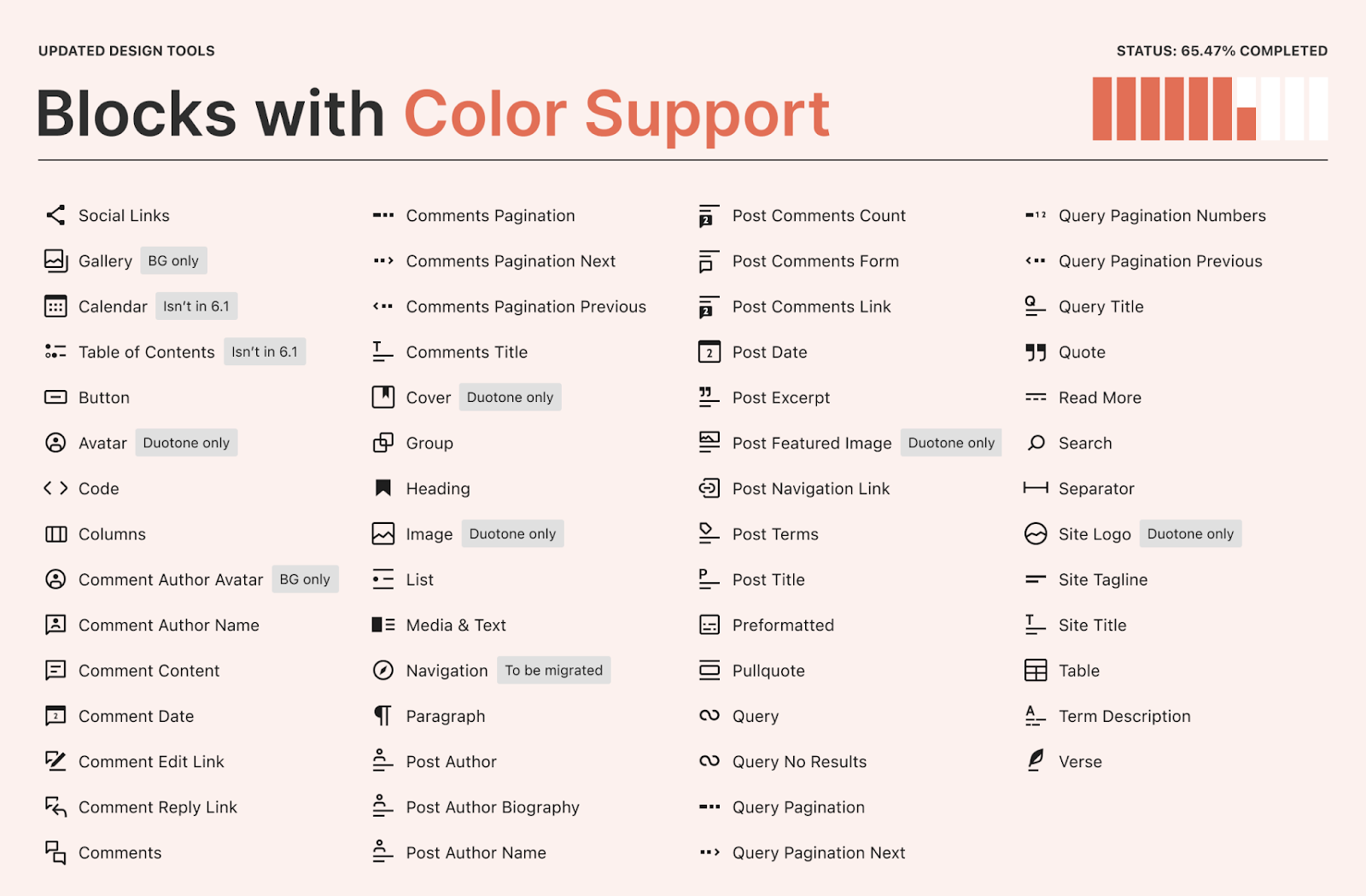
Colors Block Support
This includes text color, background color, link color, gradient options, and duotone filters. These options allow you to do everything from add a custom duotone filterFilterFilters are one of the two types of Hooks https://codex.wordpress.org/Plugin_API/Hooks. They provide a way for functions to modify data of other functions. They are the counterpart to Actions. Unlike Actions, filters are meant to work in an isolated manner, and should never have side effects such as affecting global variables and output. to all featured images in a display of posts to picking unique color combinations for your social links. At a high level, various combinations of these options are available in the following blocks with various ones added for the 6.1 release cycle:
Social Links
Gallery
Calendar
Table of Contents – not available in 6.1
Social Links
Button
Avatar – Duotone only
Code
Column/Columns
Comment Author Avatar – Background only
Comment Author Name
Comment Content
Comment Date
Comment Edit Link
Comment Reply Link
Comments
Comments Pagination
Comments Pagination Next
Comments Pagination Previous
Comments Title
Cover – Duotone only
Gallery – Background only
Group
Heading
Image – Duotone only
List
Media & Text
Navigation
Paragraph
Post Author
Post Author Biography
Post Author Name
Post Comments Count
Post Comments Form
Post Comments Link
Post Date
Post Excerpt
Post Featured Image – Duotone only
Post Navigation Link
Post Terms
Post Title
Preformatted
Pullquote
Query
Query No Results
Query Pagination
Query Pagination Next
Query Pagination Numbers
Query Pagination Previous
Query Title
Quote
Read More
Search
Separator
Site Logo – Duotone only
Site Tagline
Site Title
Social Links
Table
Table of Contents
Term Description
Verse
To see these supports in action, here’s an example of providing your own colors for social link icons that match with the branding on your site:
The audit for this set of design tools is 65.47% complete. To follow further efforts and see more details about the support added to each block, please review this tracking issue.
Layout Block Support
Of note, this support only applies to container blocks (buttons, columns, gallery, etc) since it impacts the layout of blocks within each. At a high level, various combinations of these options are available in the following blocks. Note that no new supports were added for the 6.1 cycle:
Buttons
Column
Columns
Comments Pagination
Gallery
Group
Navigation
Post Content
Post Template
Query
Query Pagination
Social Links
To see these specific container related options in play, here’s an example with the navigation block where you can quickly switch between different configurations as you find which best fits with the headerHeaderThe header of your site is typically the first thing people will experience. The masthead or header art located across the top of your page is part of the look and feel of your website. It can influence a visitor’s opinion about your content and you/ your organization’s brand. It may also look different on different screen sizes. of your choosing:
The audit for this set of design tools is 52.17% complete. To follow further efforts and see more details about the support added to each block, please review this tracking issue.
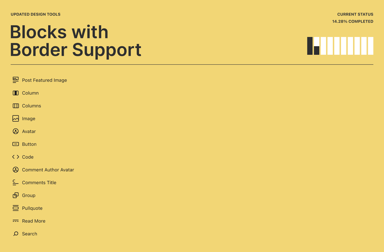
Border Block Support
Thisincludes the ability to control color, radius, style, and width on each side of the border. These powerful set of tools allows for some neat ways to decorate everything from individual images to overall columns of content. At a high level, various combinations of these options are available in the following blocks with a few added for the 6.1 release cycle:
Post Featured Image
Column/Columns
Image
Avatar
Button
Code
Column/Columns
Comment Author Avatar
Comments Title
Group
Pullquote
Read More
Search
To see how borders can transform a block, here’s an example showing how a theme author can customize a featured image block to make it stand out even more:
The audit for this set of design tools is 14.28% complete. To follow further efforts and see more details about the support added to each block, please review this tracking issue.
The power of combining tools
While this post sectioned out the various design tools to make it easy to catch up on all that’s happened, remember that the true power in these tools comes when they are combined altogether. For a simple yet powerful and common example, here’s a video showing how with some very quick changes you can make a paragraph pop to better call attention to a part of your post:
For a more complex example, here’s a video showing how you can customize your featured image block with various borders and a duotone filter, long before you select the image of your choosing:
More to come
The above simply captures the initial set of work to create consistency across blocks, with tons more planned to offer an increasingly intuitive default experience for all blocks and to stabilize the underlying block support APIs. This has been a massive effort involving a flurry of PRs across multiple different GutenbergGutenbergThe Gutenberg project is the new Editor Interface for WordPress. The editor improves the process and experience of creating new content, making writing rich content much simpler. It uses ‘blocks’ to add richness rather than shortcodes, custom HTML etc. https://wordpress.org/gutenberg/ releases ahead of 6.1. As these tools grow, the question of how best to scale the interface becomes more important, with explorations already underway for a better way to reset valuesand clarify inherited styles. Tied to this, it’s also important that any omission of support is deliberate in order to ensure a more cohesive experience.
Props to @markoserb for the design help with the visuals you see above and @beafialho for help with the video demos!