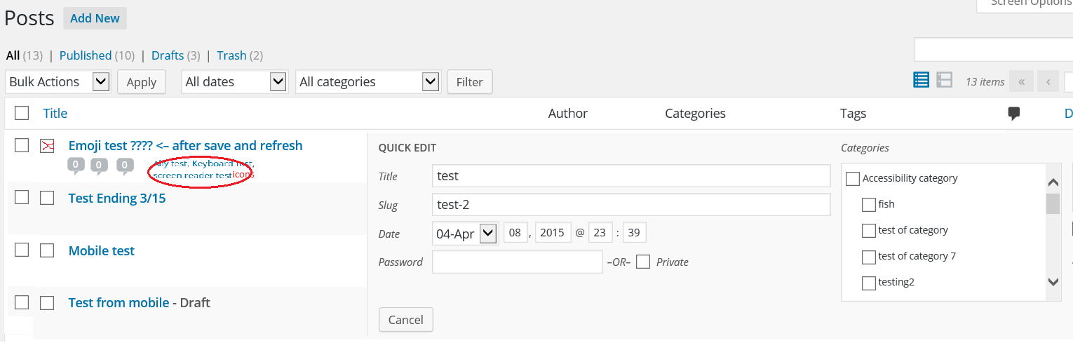
The AccessibilityAccessibilityAccessibility (commonly shortened to a11y) refers to the design of products, devices, services, or environments for people with disabilities. The concept of accessible design ensures both “direct access” (i.e. unassisted) and “indirect access” meaning compatibility with a person’s assistive technology (for example, computer screen readers). (https://en.wikipedia.org/wiki/Accessibility) Team shares accessibility expertise across the project to improve the accessibility of WordPress coreCoreCore is the set of software required to run WordPress. The Core Development Team builds WordPress. and resources.
You can also ask questions during Accessibility Team Office Hours every Wednesday at 14:00 UTC in the accessibility channel in SlackSlackSlack is a Collaborative Group Chat Platform https://slack.com/. The WordPress community has its own Slack Channel at https://make.wordpress.org/chat/..
How accessible is GutenbergGutenbergThe Gutenberg project is the new Editor Interface for WordPress. The editor improves the process and experience of creating new content, making writing rich content much simpler. It uses ‘blocks’ to add richness rather than shortcodes, custom HTML etc. https://wordpress.org/gutenberg/ in its current state (version 2.4)? To answer this the AccessibilityAccessibilityAccessibility (commonly shortened to a11y) refers to the design of products, devices, services, or environments for people with disabilities. The concept of accessible design ensures both “direct access” (i.e. unassisted) and “indirect access” meaning compatibility with a person’s assistive technology (for example, computer screen readers). (https://en.wikipedia.org/wiki/Accessibility) team set up a list of minimum requirement, did code reviews and research, gave recommendations and set up user tests.
The short answer is:
Gutenberg still needs extensive work to meet basic standards, like keyboard accessibility and semantics
Especially for screen reader users, Gutenberg as it stands right now is a dramatic step back in usability
We need to write a manual/documentation for assistive technologyAssistive technologyAssistive technology is an umbrella term that includes assistive, adaptive, and rehabilitative devices for people with disabilities and also includes the process used in selecting, locating, and using them. Assistive technology promotes greater independence by enabling people to perform tasks that they were formerly unable to accomplish, or had great difficulty accomplishing, by providing enhancements to, or changing methods of interacting with, the technology needed to accomplish such tasks.
https://en.wikipedia.org/wiki/Assistive_technology users
From the start
During development, almost from the start, Andrea Fercia (@afercia) did extensive a11yAccessibilityAccessibility (commonly shortened to a11y) refers to the design of products, devices, services, or environments for people with disabilities. The concept of accessible design ensures both “direct access” (i.e. unassisted) and “indirect access” meaning compatibility with a person’s assistive technology (for example, computer screen readers). (https://en.wikipedia.org/wiki/Accessibility) (accessibility) testing and research. He and others created issues labeled accessibility on GitHubGitHubGitHub is a website that offers online implementation of git repositories that can easily be shared, copied and modified by other developers. Public repositories are free to host, private repositories require a paid subscription. GitHub introduced the concept of the ‘pull request’ where code changes done in branches by contributors can be reviewed and discussed before being merged be the repository owner. https://github.com/ to address the issues found (Andrea created more than 50 of them).
At the moment 70 a11y issues are open, 166 are closed. A lot has been addressed, but there are still very important issues open (like for keyboard accessibility, tab order and navigation).
User testing
When Gutenberg 2.3 was released, Tammie Lister (@karmatosed) considered it ready enough for a complete accessibility test.
We wrote a user test, that includes the basic functionality needed to publish a post. Like add a title, headings, paragraphs, a list, a table an image and a video, use the blockBlockBlock is the abstract term used to describe units of markup that, composed together, form the content or layout of a webpage using the WordPress editor. The idea combines concepts of what in the past may have achieved with shortcodes, custom HTML, and embed discovery into a single consistent API and user experience. options and publish.
On our testserver wpaccess.org we installed the pluginPluginA plugin is a piece of software containing a group of functions that can be added to a WordPress website. They can extend functionality or add new features to your WordPress websites. WordPress plugins are written in the PHP programming language and integrate seamlessly with WordPress. These can be free in the WordPress.org Plugin Directory https://wordpress.org/plugins/ or can be cost-based plugin from a third-party, version 2.3, and gave our a11y test team access. Joe Dolson also recruited accessibility experts for a test of version 2.4 at the CSUN conference. All results are reported in the Google spreadsheet Gutenberg a11y test results.
So far we’ve got good quality test results for
Keyboard only
Dragon Naturally Speaking
VoiceOver / Safari
NVDA / Firefox
Andrea created new GitHub issues from the reported problems or added extra information with the already reported ones.
Videos with user tests
Note: These users (Eric Wright and Sina Bahram) are leading accessibility experts, using their assistive technology on a daily basis and using WordPress for their work.
Minimum requirements before merge
To set a baseline, what should be fixed before merge we set up a list of requirements:
Keyboard navigation through blocks needs to be greatly simplified and streamlined
For some components, there’s the need to constrain tabbing within the component (i.e. they should behave like “modals”)
The publishing flow needs to be simplified, currently its accessibility is terrible
Everything needs to live inside the landmark regions
Text mode: a simple textarea is the only guarantee to enable users to publish content, regardless of the device / technology they use
Write documentation for keyboard and screen reader users.
Consider a mechanism to customize shortcuts, e.g. Cmd/Ctrl + backtick, see issue #3218
Block toolbars position counter intuitive for keyboard users, see issue #3976
The Date picker must be keyboard accessible
Severe issues
One of the most severe issue is the keyboard accessibility. The keyboard tab order is unpredictable. The tab order for and backwards is not the same. Publishing a post is a puzzle and the date picker is unreachable with a keyboard only.
Another issue is the need for quick navigation tools, like shortcuts and better use of landmarks and headings. There are so much more actions to take for adding or modifying a block. Compared to the current classic editor, publishing a post with a screen reader takes much more time and effort.
Because the extensive use of icons, voice recognition users have to guess the accessible names for buttons to activate them. This needs a design decision.
Actions to take
Fixing the keyboard accessibility and screen reader navigation is a high priority. Andrea opened issues for this and we need to prioritize these
At WordCampWordCampWordCamps are casual, locally-organized conferences covering everything related to WordPress. They're one of the places where the WordPress community comes together to teach one another what they’ve learned throughout the year and share the joy. Learn more. London and Europe we will do extra user testing with assistive technology and discuss the results with Tammie Lister and the Gutenberg developers present
The accessibility team needs to take responsibility for the manuals and documentation. This documents only can be written after the minimum requirements as listed above are met
In this post we gathered testing results for the new text editor GutenbergGutenbergThe Gutenberg project is the new Editor Interface for WordPress. The editor improves the process and experience of creating new content, making writing rich content much simpler. It uses ‘blocks’ to add richness rather than shortcodes, custom HTML etc. https://wordpress.org/gutenberg/.
As the functionality is work in progress, we will use these test results to create issues and add to the discussion on GitHub.
If you wrote a blogpost about this or published test results in another way, please add this as comment to this post, or tweet it to WPAccessibility. Then we’ll add it to the list of blog posts with testdata.
In this post:
Results WPa11y test team
Blogposts with test data and research
Call to action
Results WPa11y test team July 6th 2017
Thanks to: Janki Moradiya, Riddhi Mehta, Shah Rishi, Geof Collis, Gabriela Nino de Rivera, Reagan Lynch, Shaun Everiss
We asked the accessibilityAccessibilityAccessibility (commonly shortened to a11y) refers to the design of products, devices, services, or environments for people with disabilities. The concept of accessible design ensures both “direct access” (i.e. unassisted) and “indirect access” meaning compatibility with a person’s assistive technology (for example, computer screen readers). (https://en.wikipedia.org/wiki/Accessibility) test team to look at the pluginPluginA plugin is a piece of software containing a group of functions that can be added to a WordPress website. They can extend functionality or add new features to your WordPress websites. WordPress plugins are written in the PHP programming language and integrate seamlessly with WordPress. These can be free in the WordPress.org Plugin Directory https://wordpress.org/plugins/ or can be cost-based plugin from a third-party. Below are the reported a11yAccessibilityAccessibility (commonly shortened to a11y) refers to the design of products, devices, services, or environments for people with disabilities. The concept of accessible design ensures both “direct access” (i.e. unassisted) and “indirect access” meaning compatibility with a person’s assistive technology (for example, computer screen readers). (https://en.wikipedia.org/wiki/Accessibility) related experiences and issues:
General opinion:
Reagan: My first and initial impression, and yes I understand this is early testing, is that Gutenberg is a major change and major step backward in WP accessibility. I strongly encourage the WordPress development team to NOT put this as the default editor. If you want to force it then do so on wordpress.comWordPress.comAn online implementation of WordPress code that lets you immediately access a new WordPress environment to publish your content. WordPress.com is a private company owned by Automattic that hosts the largest multisite in the world. This is arguably the best place to start blogging if you have never touched WordPress before. https://wordpress.com/, but give us a choice with the .org (self-hosted) version. Gutenberg as it currently stands will force me to consider other platforms. In fact, after giving up on the second blog post I opened a Ghost account for the first time ever and began learning how their system works. If Gutenberg becomes the default Ghost will be the more accessible platform. (Using Windows 10 with Firefox and JAWS for Windows.)
Geof: To put it mildly, I don’t like it, it is too complicated and busy. I found it easier to add an image and move it around with in the main body if necessary, using a screen reader there are too many actions to deal with, I hope they drop the idea. (Using IE 11.096, JAWS 11 with latest updates, Windows 7.)
Shaun: I think in general, as long as you never need to change styles, add lists of media or ever interact with the button panels, then you should be fine. So what if you have to? You just can’t [Editor: mild translation of the original text]. (Using Win7 Pro, NVDA, Firefox)
What is a better experience
Without assistive technologyAssistive technologyAssistive technology is an umbrella term that includes assistive, adaptive, and rehabilitative devices for people with disabilities and also includes the process used in selecting, locating, and using them. Assistive technology promotes greater independence by enabling people to perform tasks that they were formerly unable to accomplish, or had great difficulty accomplishing, by providing enhancements to, or changing methods of interacting with, the technology needed to accomplish such tasks.
https://en.wikipedia.org/wiki/Assistive_technology:
BlockBlockBlock is the abstract term used to describe units of markup that, composed together, form the content or layout of a webpage using the WordPress editor. The idea combines concepts of what in the past may have achieved with shortcodes, custom HTML, and embed discovery into a single consistent API and user experience. arrangement and easily adding blocks on the post
Embedded any video or clip is too easy.So, now add media it’s not tedious anymore
The main part is code option is we can add the shortcodes and other PHPPHPPHP (recursive acronym for PHP: Hypertext Preprocessor) is a widely-used open source general-purpose scripting language that is especially suited for web development and can be embedded into HTML. http://php.net/manual/en/intro-whatis.php. code directly. It’s so cool
Display latest post via Widgets is too easy
Add all HTMLHTMLHTML is an acronym for Hyper Text Markup Language. It is a markup language that is used in the development of web pages and websites. element easily and mainly add and other tags which are very interesting.
Easily move blocks with the up-down errors is too useful
The look and feel of the visual editor are good and it is very easy to manage content and I think it’s time-saving for development.
What is worse
Without assistive technology:
Aligning blocks and makes clicking into content areas are problematic.
Having a whole section for Embeds of only tangential use seems clumsy.
When I publish the post there is not a “VIEW” button available for that post edit screen of Gutenberg.
If writing something in the text block and click on undo button it was removing the whole section instead of new word or sentence.
If I select any text from the content block then it’s selected the whole block for delete so, it’s considered my selection as deleting a block. For batter understanding, I have captured a video for the same.
With VoiceOver + Safari:
It was very difficult to navigate between blocks and options for formatting. If I have more than 2 blocks moving from one block to the other is a long way. I need to pass through each menu and button associated to the block. It is very tiring. Also, accessing options in the menus don’t respond well to VoiceOver commands. I was often redirected to other places in the page like “post settings” or “skip to main content” link.
The insert button it was not intuitive, it took me a while before finding how to insert a block image.
Insert link options buttons (enter, edit and erase) does not seem to have labels. VoiceOver announces them only like “button”.
When inserting a link, if I don’t type a URL address beginning with http://, Voiceover announces that the data is invalid. The insert link object keeps announcing “Enter a URL” like if any text were already typed. There is not a proper message to explain the user why the data is invalid or a placeholder (or something else) to show the expected input format.
What is impossible to do
Without assistive technology:
I think in current version changing the post format is impossible.
Not able to move “Separator” when blocks structure are typical. For better understanding, I have captured a video for the same.
There is always a placeholder “Write…” with text box it’s become confusing to add new block and it consumes one block space as well. For better understanding, I have captured a video for the same.
I have created a table and added data into it. Later I add the table in the same post the table will create with old table data automatically. If I delete the table from the post and later I add the table it will comes with the last data of the table.
With VoiceOver + Safari:
When editing text in a block, it is better to select an option in a menu before writing content. If text is already in the block, it is not possible to select it and then select an option in the menu to apply a format (like for example select a list, or bold or italic). I think it would be nice to have shortcuts for applying format without quitting the block. Something like selecting text and then using a shortcut for applying the desired format without having to navigate all the elements between the block and the menus.
Settings button does nothing when clicking on it.
With Windows 10 with Firefox and JAWS for Windows.
The post screen does not have a very intuitive layout. In visual mode the buttons to edit do not appear until after I begin to add content. I’m unclear on how or if I can change the level one heading for the title.
When I tab from the title field to what should be the content area I think I was adding a line of content. Upon pressing enter to start a new paragraph I was taken out of forms mode and completely lost on the page for a few minutes. I should not be taken out of forms mode in a content body text area type field.
I changed to the text mode, and while typing content was easier when I attempted to select text to make a link I saw no field to add a link like is currently present with the editor in 4.8.
At one point when I selected text to make a link and then pressed enter on the link button in text mode text I had entered disappeared. From reviews I’ve read it seems there are buttons that appear when I first enter a “block”, but using a screen reader I don’t know what those are.
I like to write blog posts and page content outside of WordPress using an editor like Jarte. When I copied text out of Jarte in this test and went to paste it the experience was terrible. I cannot paste without losing all formatting. I also don’t understand “blocks”. Using TinyMCE I feel like I’m in a very accessible environment. With Gutenberg I want to stop blogging.
ON the Gutenberg page it says, “The goal of the block editor is to make adding rich content to WordPress simple and enjoyable.” Well I hate to say it, but as a power user of WordPress it makes adding rich content more complex for me.
I wrote two blog posts, or tried. With the first I used my normal copy editing process and had the post done and ready to go within an hour. WithGutenberg I was still trying to format the text correctly two hours later and had missing content that just disappeared. I gave up in frustration over the process
What don’t you understand
Without assistive technology:
I did not understand the work or use of the first button in post settings panel.
I found that in text editor all top buttons/tags are not working properly and when I click on them or out site the text editor “” and “” added automatically and it looks very confusing for me.
I did not find how to add the new row or new column in table format.
Blogposts with test data and research
If you wrote a blogpost about this or published test results in another way, please add this as comment to this post, or tweet it to WPAccessibility.
June 2017
This test is for users of Speech Recognition Software, like Dragon Naturally Speaking.
We would like to know how well adding images works in WordPress, what the issues are, what works and what not. So then we know what to fix.
If you know how to use such software like Dragon Naturally Speaking could you please do the next 3 test for us.
Please report what problems you encountered, what was hard or impossible to do and also what was easy.
Please login to your WordPress website and try the following 3 tests.
Test 1:
Go to All Posts
Edit a post
Put the cursor somewhere in the content where you want to add an image
Click the button “Add Media”
Select an image from the Media Library
On the right there are attachment details showing now
Change the title
Change the caption
Change the alt text
Change the description
Change the alignment
Change the link to option
Change the size
And click the blue button “Insert into post”
Note: Are you seeing scrollbars for the grit with images and/or the attachment detail? Can you scroll down?
Test 2:
Go to All Posts
Edit a post
Put the cursor somewhere in the content where you want to add an image
Click the button “Add Media”
Select Upload files
Try to upload an image from your computer
And click the blue button “Insert into post”
Test 3:
Go to All Posts
Edit a post (doesn’t matter which one)
Put the cursor somewhere in the content where you want to add a gallery
Click the button “Add Media”
Select from the option left “Create Gallery”
Select now 4 images
Click the blue button “Create Gallery”
Try to reorder the images by drag and drop
Change the caption on one image
Change the Gallery Settings
And click the blue button “Insert gallery”
Please add to your findings which assistive technologyAssistive technologyAssistive technology is an umbrella term that includes assistive, adaptive, and rehabilitative devices for people with disabilities and also includes the process used in selecting, locating, and using them. Assistive technology promotes greater independence by enabling people to perform tasks that they were formerly unable to accomplish, or had great difficulty accomplishing, by providing enhancements to, or changing methods of interacting with, the technology needed to accomplish such tasks.
https://en.wikipedia.org/wiki/Assistive_technology and which version of it you used for this test and also which browser and operating system.
If you want to read more about the discussions on this, read the related ticket: #23562
Report your findings as a comment with this post, you can also refer here to a link to a document with your test results.
If you need help to set up this test, please email to wpa11ytest@gmail.com
All results of the tests will be posted in this blog later.
In WordPress version 4.5 there will be a new way of adding links in the content: create and edit links inline. The URLURLA specific web address of a website or web page on the Internet, such as a website’s URL www.wordpress.org input and the search field are now one and the same.
This is similar to what Google Docs does. Search results are shown as an autocomplete dropdown.
Related ticket: #33301.
The test are done from Februari 18 until Februari 24 2016.
Conclusions are at the bottom of this post.
To test this for accessibilityAccessibilityAccessibility (commonly shortened to a11y) refers to the design of products, devices, services, or environments for people with disabilities. The concept of accessible design ensures both “direct access” (i.e. unassisted) and “indirect access” meaning compatibility with a person’s assistive technology (for example, computer screen readers). (https://en.wikipedia.org/wiki/Accessibility) we set up a WordPress 4.5-alpha nightly install.
And asked our testers:
Can you access the little window with the input field for the link
Can you understand how to add a link using this inline window
Can you understand how to search for a page using a search word using this inline window
Is this usable with your assistive technologyAssistive technologyAssistive technology is an umbrella term that includes assistive, adaptive, and rehabilitative devices for people with disabilities and also includes the process used in selecting, locating, and using them. Assistive technology promotes greater independence by enabling people to perform tasks that they were formerly unable to accomplish, or had great difficulty accomplishing, by providing enhancements to, or changing methods of interacting with, the technology needed to accomplish such tasks.
https://en.wikipedia.org/wiki/Assistive_technology?
If you use a screen reader: can you hear the search result if you enter a search word instead of an URL
Are you missing functionality to make this work for you
Which browser and operating system did you use (for example Safari on Mac)
Which assistive technology did you use for this test
Testers who joined: Jeff de Wit, Geoff Collis, Tobias Clemens Hacker, Reagan Lynch, Ruth Niesenbaum, Gabriela Nino, Michele DeYoung, Sirisha Gubba, Wim Moons and Marco Zehe.
Test results for keyboard
Wim Moons: Windows7 & FireFox with loupes.
If you type a word, a list appears. If you walk through the list with the arrow keys the text in the search field disappears. I found this confusing.
Geoff Collis: JAWS 14.5 IE 11
A bit confusing at first but I managed to do it. I wasn’t sure what happened, all I heard was “apply” after doing it so moved around and found out I could type the url, needs some work to let me know where I was after the keystroke command.
Of note:, when I first typed in the url and used tab to go to the apply button it didn’t work, took me right out of the edit box, when I came back I was able to get to it by tabbing this time.
Jeff de Wit: In Firefox, with just a keyboard:
You specifically have to tab to the submit button to add the link without issues. If you press Enter on the input field, it will also add a linebreak where the cursor is when you opened the link dialog (in addition to adding the link). Here’s a video of that:
What I’m doing in the video:
Select some text
Hit Ctrl + K to open the link dialog
Type in the URL for Google
Press Enter
Press Ctrl + Z to “revert” the random line break that appears
Also not super clear how to remove the link this way, since you can’t actually get to the pencil / remove icons. It’s not impossible to remove links though, but not sure how “obvious” it is that you can also remove the URL text and hit apply to remove the link.
Michele DeYoung: Firefox 44.0.2 and Windows 10.
Using the spacebar instead of Enter when creating a link using the keyboard will make it so a line break does not occur after the text link.
Test results for screen reader
Jeff de Wit: In Firefox, with NVDA enabled:
It seems to announce really well. It even makes it clear when you’re moving your cursor to a link. Not sure if it’s a good idea here to also announce what URL it’s linking to (Not what links usually do, and it may add too much noise, but it’s editing content and it may help with spotting broken/mistyped links).
One thing I did notice though, is when I hit the “Advanced” button NVDA only announced “alert” for me. It doesn’t say anything about the text field I have focus on (even though it’s supposed to, and I do see it in the NVDA speech log, so it may be related to my NVDA settings).
Gabriela Nino: Mac + Safari + VoiceOver
After using cmd + k to open the window: The window opens but Voice Over does not announce it. So is not clear for a non sighted user what exactly is happening.
Right after the window is opened, the focus is supposed to be on the URL input text. But this behavior is not consistent, the focus is sometimes on the input text and sometimes not. When is not on the input text, I managed to give it focus using the tab key. But a non sighted user might not be able to figure this out.
Voice Over is sometimes announcing the input text placeholder, but mostly of the times it does not.
On the advanced window, when searching for existing content, Voice Over does not announce the results found.
It was impossible to access to pencil / remove icons, tried using cmd+k but instead of allowing me to access the pencil and remove icons, it opens the little window with the input field for the link. Without mouse or when using Voice Over, I’m not able to select those icons.
Michele DeYoung: Firefox 44.0.2 and Windows 10.
I can understand how to add a link using this inline window, but only if the focus is in the url input field. After adding multiple links, when other text is selected to create a link, the inline window focus was on the last element in the window that was used, for example – the Advanced button. This will be confusing for screen reader users when the window launches and it voices “Advanced” or “Apply.”
Note: When the inline window opens and the last focus was on the Advanced button or Apply button, and Advanced is selected, the pop-up for the Advanced selection will open, however, the keyboard focus remains in the window behind it. Keyboard focus is correctly in the pop-up when the starting focus point in the inline window is in the input field.
The pop-up is not announced as a dialog, and a heading should be announced with it.
Advanced Pop-up: When the search is entered, if I tabbed I would go to the results container, however, NVDA would just voice that number of items in the list. It would be helpful to know that it is the results list. When arrowing through the list each item was voiced.
Another way: when using the down arrow to move from the search entry, I can move into the search results list (still not clear that it is the results list), but when I arrow to each item in the list I just hear the search entry repeated for each one.
Tobias Clemens Hacker: Chrome Vox/ Chrome on Windows 7
The buttons have no distinguished voice output. I don’t know which one is “Apply” and which one is “Advanced”. For some reason the aria-label in the containing div is not being output.
I miss distinguished voice output for the buttons.
Reagan Lynch: Windows 7 running IE 11 with JAWS 17.
If I paste a link into the text field the raw link appears in the text of the post, but the word I highlighted is a link with the link pointing to <a href=”http://example.com”>highlited text</a>
I was unable to insert a link using the new method. I was able to get into the advanced dialog like we currently have, but only after pressing ctrl+k and then arrowing right and exiting forms mode, and then my text highlight was gone.
Sirisha Gubba: IE and FireFox with NVDA
I can access the window with keyboard in FF but not in IE. AT with short cut keys provided
I can’t understand with NVDA as it announces “Toolbar” and focus is taken to the apply button.
I can see the placeholder in FF. With NVDA it is not announcing as soon as the small window gets opened but if user uses back arrow it reads the instruction.
Ruth Niesenbaum: Chrome and NVDA with Windows 10.
It was not clear how to enter data: I started entering a word and it did not tell me that it found options, when I went down to the options it did not read them loud so it does not say the When I press the down arrow and enter the list of urls it says : unknown 2 of 7 and it does not read the name of the post
Conclusions
Some issues are already fixed in the current version, using these test results.
The issues that remain are according to @afercia (Andrea Fercia)
Reagan Lynch Using Windows 7 running IE 11 with JAWS 17:
If I paste a link into the text field the raw link appears in the text of the post, but the word I highlighted is a link with the linnk pointing to highlited text
Andrea: after last changes I’m not even able to insert a link with IE 11
Jeff de Wit:
If you press Enter on the input field, it will also add a linebreak
Andrea: maybe fixed, but I’m pretty sure it still happens when *pasting* a link in the input field and then pressing Enter
Also not super clear how to remove the link
Andrea: totally agree
Michele DeYoung: NVDA Firefox 44.0.2 and Windows 10.
Using the spacebar instead of Enter when creating a link using the keyboard will make it so a line break
Andrea: it’s a legitimate expectation since it’s announced as “Button” it should work also with spacebar
Jeff de Wit: In Firefox, with NVDA enabled:
when I hit the “Advanced” button… (it’s about the Advanced modal dialog)
Andrea: yeah, the link modal dialog still needs some a11yAccessibilityAccessibility (commonly shortened to a11y) refers to the design of products, devices, services, or environments for people with disabilities. The concept of accessible design ensures both “direct access” (i.e. unassisted) and “indirect access” meaning compatibility with a person’s assistive technology (for example, computer screen readers). (https://en.wikipedia.org/wiki/Accessibility) treatment. We should fix that but it’s a bit unrelated
Gabriela Nino: Mac + Safari + VoiceOver
It was impossible to access to pencil / remove icons, tried using cmd+k but instead of allowing me to access the pencil and remove icons, it opens the little window with the input field for the link. Without mouse or when using Voice Over, I’m not able to select those icons.
Andrea: we should make more clear the Alt+F8 shortcut, maybe it’s a bit confusing now
Gabriela Nino: Mac + Safari + VoiceOver
After using cmd + k to open the window: The window opens but Voice Over does not announce it. So is not clear for a non sighted user what exactly is happening.
Right after the window is opened, the focus is supposed to be on the URL input text. But this behavior is not consistent, the focus is sometimes on the input text and sometimes not. When is not on the input text, I managed to give it focus using the tab key. But a non sighted user might not be able to figure this out.
Voice Over is sometimes announcing the input text placeholder, but mostly of the times it does not.
Michele DeYoung: NVDA Firefox 44.0.2 and Windows 10.
I can understand how to add a link using this inline window, but only if the focus is in the url input field. After adding multiple links, when other text is selected to create a link, the inline window focus was on the last element in the window that was used, for example – the Advanced button. This will be confusing for screen reader users when the window launches and it voices “Advanced” or “Apply.”
Andrea: totally agree, already in my list
When using the down arrow to move from the search entry, I can move into the search results list (still not clear that it is the results list), but when I arrow to each item in the list I just hear the search entry repeated for each one.
Andrea: works for me using Firefox + NVDA
Andrea: additionally:
after 36703 in IE 11 can’t insert a link
we’d recommend to add an audible confirmation message when a link is successfully inserted from the inline toolbar; also, when a link is successfully selected in the advanced modal dialog; of course messages need to be different since in the modal the link is inserted only after users press the “Update” button
And further: For next tests we will ask the test team not to test with ChromeVox anymore. This screen reader is too limited in functionality. And if a tester uses NVDA: the preferred browser to use with this screen reader is FireFox.
Update March 2, 2016: additional tests
Marco Zehe: Safari and Chrome on OS X with VoiceOver. That is, Chrome + VoiceOver, not ChromeVox.
I can confirm the brokenness of the search results when arrowing up and down. I do get the focus into the combobox consistently, though. And here’s the thing: In Chrome, while that has a nasty bug with no text being read out when typing or arrowing, the search result widgetWidgetA WordPress Widget is a small block that performs a specific function. You can add these widgets in sidebars also known as widget-ready areas on your web page. WordPress widgets were originally created to provide a simple and easy-to-use way of giving design and structure control of the WordPress theme to the user. works. So whatever is going wrong has something to do specifically with Safari’s interpretation of WAI-ARIA.
A few ideas:
I assume you are using aria-activedescendant when pointing at the various search results when arrowing up and down, right? Are you also adding tabindex=”-1″ to these role “option” items to make them focusable, but not include them in the tab order? If not, add them ad see if that makes a difference.
Are you using aria-owns? If so, that may be interfering somehow, see if you can do without that.
Or are the items spoken via a live region? I do not know the code, so these are just some things that popped into my mind as possible reasons.
The new default theme Twenty Sixteen is close to release, so we gave it to our accessibilityAccessibilityAccessibility (commonly shortened to a11y) refers to the design of products, devices, services, or environments for people with disabilities. The concept of accessible design ensures both “direct access” (i.e. unassisted) and “indirect access” meaning compatibility with a person’s assistive technology (for example, computer screen readers). (https://en.wikipedia.org/wiki/Accessibility) testers to check it.
Testes who joined: Michelle DeYoung, Gabriela Nino de Rivera Torres, Jeffrey de Wit, Sirisha Gubba, Heather Migliorisi, Tobias Clemens Häcker, Kim van Iersel, Geof Collis, Shaun Everiss, and Rian Rietveld.
Some remarks where not related to Twenty Sixteen but related to WordPress coreCoreCore is the set of software required to run WordPress. The Core Development Team builds WordPress.. Those remarks where not included into this report, like the comment form issues. We will open tickets on them later.
Summary is at the bottom of this post.
Test results
Jeffrey de Wit
Firefox and NVDA
Focusing the featured imageFeatured imageA featured image is the main image used on your blog archive page and is pulled when the post or page is shared on social media. The image can be used to display in widget areas on your site or in a summary list of posts. makes NVDA go “blank”
It may just be me, but the author, categoryCategoryThe 'category' taxonomy lets you group posts / content together that share a common bond. Categories are pre-defined and broad ranging., and tag links in the post metaMetaMeta is a term that refers to the inside workings of a group. For us, this is the team that works on internal WordPress sites like WordCamp Central and Make WordPress. simply state just that. That is, “themedemos”. Or “Uncategorized”. Nothing else, no context. (Same happens with the widgets, but that’s probably a core issue :))
I like how the search button is hidden with screen reader text, but it should probably appear when focused.
When focusing links, it sometimes happens that the page scrolls and makes the link go behind the black border around the page. This usually happens when the link that is to be focused is not in sight when tab is pressed.
That last one seems to be specific to Firefox and IE Edge, I don’t notice it with Chrome because it seems to make an effort to center focused links.
It can be reproduced with the second post – there’s a link under the h6 where you can see this issue, and then from there it goes back up to the author link in the post meta, which is also “hidden”. I’ll have some videos ready shortly.
Firefox:
Chrome:
Michelle DeYoung
Windows 8.1 / Firefox 40.0.3 / Window-Eyes 9.2
Landmarks: Landmarks are voiced. The W3c validator does indicate that the additional role=”specificlandmarkname’ is not needed on the html5 elements (headerHeaderThe header of your site is typically the first thing people will experience. The masthead or header art located across the top of your page is part of the look and feel of your website. It can influence a visitor’s opinion about your content and you/ your organization’s brand. It may also look different on different screen sizes., form, nav, main, aside, and footer). The questions – has screen reader and browser support grown enough to utilize HTML5 semantics, sans aria landmark roles, to convey the various regions on the screen? In my opinion, I feel aria landmark roles should still be used with the new HTML5 semantics, and I continue to add them to my markup until I hear otherwise. 🙂
Menu navigation: Users should be able to select ‘ESC’ to close a drop-down menu, and then when tabbing or arrowing again they are taken to the next main menu item. This will make it easier to navigate the menu without it being necessary to tab through many items to get to the needed item.
I would recommend making the asterisk on the form labels the same size that it is in the instructional text so it will be easier for low vision users to detect.
Input fields: The color contrast for the border or background colors could be increased. They are difficult to discern. This is part of the minimalistic flat design, however, the light gray can impact users with low vision and they can also look disabled. Note: The input fields look great when they get keyboard focus.
Gabriela Nino
I have taken a look to the front-end with VoiceOver. In overall it was easy to navigate and the elements were well recognized. Opening the sublevels of the main menu was simple too. I was able to access the links and buttons and I did not get stuck.
Something that caught my attention was that images like the post “this is a sticky post” are ignored by the screen reader. I step directly from thetitle of the post to post content.
The images of the Markup: Image alignment worked well with VoicOver.
Rian
Safari, keyboard only
Menu in responsive mode: If the menu is expanded, it is not clear when the menu button gets focus, for example if you want to close it again. The dropdown toggle arrows do not have a clear focus (only change of color, no dotted outline)
Is it a feature, that the menu repeats itself in the footer in responsive mode (I actually quite like that).
Normal menu: Only color change on hover. Active menu item is bold : ok
Page navigation: No indicator current page number for a screen reader. Color is not enough to indicate this is the current page number.
Sirisha Gubba
NVDA/FF
Roles are used without aria label (more than one navigation is used)
Search button is not visible on the page.
Two search fields with role=search are there on the 404 page
Screen reader user have to go through all submenu items in order to get to another tab item
Also I see color contrast issues with the input fields which would be issue for low vision users.
Note Rian: except for the 5th item these are all extra’s but not required for WCAGWCAGWCAG is an acronym for Web Content Accessibility Guidelines. These guidelines are helping make sure the internet is accessible to all people no matter how they would need to access the internet (screen-reader, keyboard only, etc) https://www.w3.org/TR/WCAG21/. 2 AA.
Heather Migliorisi
This theme tested pretty well!
Tested with VO and Chrome.
the main nav with sub items could be easier to navigate. Currently, if you want to navigate to “Page B,” you have to tab through the entire main nav, sub items included. I like how Adobe’s Accessible Mega Menu tabs through the top level list items. It also provides the expanded/collapsed state to the VO user.
Search field – VO reads “search for” twice
Might be nice to be able to skip the list of keywords added to an article
Summary
The main opinion: This theme tested pretty well!
No drastic errors. Yay!
First: can someone reproduce Jeff’s error?
Missing context for sighted users (maybe also a usability issue): The author, category, and tag links in the post meta simply state just that. That is, “themedemos”. Or “Uncategorized”. Nothing else, no context. For screen reader usres there is extra text to give context.
Landmarks: A lot of the remarks where about landmarks. W3CW3CThe World Wide Web Consortium (W3C) is an international community where Member organizations, a full-time staff, and the public work together to develop Web standards.https://www.w3.org/. and VAWE now mark elements with the same role as warnings (not errors). Like: Element nav does not need a role attribute role=nav.
Note Rian: We discussed this in the team chat and decided that the roles should stay for now, for backwards compatibility with old assistive technologyAssistive technologyAssistive technology is an umbrella term that includes assistive, adaptive, and rehabilitative devices for people with disabilities and also includes the process used in selecting, locating, and using them. Assistive technology promotes greater independence by enabling people to perform tasks that they were formerly unable to accomplish, or had great difficulty accomplishing, by providing enhancements to, or changing methods of interacting with, the technology needed to accomplish such tasks.
https://en.wikipedia.org/wiki/Assistive_technology.
Navigation: three the same remarks:
Users should be able to select ‘ESC’ to close a drop-down menu, and then when tabbing or arrowing again they are taken to the next main menu item.
Screen reader user have to go through all submenu items in order to get to another tab item
Currently, if you want to navigate to “Page B,” you have to tab through the entire main nav, sub items included.
Note Rian: this is not an accessibility error, but a keyboard user usability issue. Might be worth to find a solution for this.
Featured image: There was confusion about the featured image with the link being skipped. This is on purpose to prevent extr noise for screen readers by adding an aria-hidden=”true” to the link.
Input fields: The color contrast for the border or background colors could be increased.
Focus errors:
search button should show up on focus
inconsistent focus for responsive Menu toggle button
submenu toggle responsive menu should have an outline
Page navigation
no ARIA indicator current page number for a screen reader
color is not enough to indicate this is the current page number
We wondered if people, using assistive technologyAssistive technologyAssistive technology is an umbrella term that includes assistive, adaptive, and rehabilitative devices for people with disabilities and also includes the process used in selecting, locating, and using them. Assistive technology promotes greater independence by enabling people to perform tasks that they were formerly unable to accomplish, or had great difficulty accomplishing, by providing enhancements to, or changing methods of interacting with, the technology needed to accomplish such tasks.
https://en.wikipedia.org/wiki/Assistive_technology, could understand the structure of selecting a range of posts or page in the export option with Tools/Export in the Admin.
Related ticket: #33046
Tests done on WordPress 4.3 betaBetaA pre-release of software that is given out to a large group of users to trial under real conditions. Beta versions have gone through alpha testing in-house and are generally fairly close in look, feel and function to the final product; however, design changes often occur as part of the process. 4 Nightly build from Juli 23 up to July 30 2015
We asked the testers:
Log into the test WordPress install and go to: Dashboard / Tools / Export
Or directly to [..]/wp-admin/export.php
Here you can download an export file with the content of the website.
Select posts with:
CategoryCategoryThe 'category' taxonomy lets you group posts / content together that share a common bond. Categories are pre-defined and broad ranging. “Uncategorized”
Authors: mwa
Start date: April 2013
End date: Januari 2020
Status: Publish
And download the Export file.
We want to know:
Can you do it? Or did you get stuck somewhere?
Did you understand how to select the posts and how to access the selection fields?
If there was anything you didn’t understand, please share.
The testers who joined:
Stephanie Watts, Heather Migliorisi, Daniel Montalvo Charameli, Cyncy Otty, Ruth Nisenbaum, John Sexton, Geof Collis, Shaun Everiss, Tobias Clemens Häcker, Michelle DeYoung
Results
No assistive technoloy
Ruth: No problems at all
Keyboard only
Heather:
Chrome/Mac: worked well
Chrome/Mac: worked well
Safari/mac: worked well
FireFox/Mac: it is impossible to see what the focus is (the highlighting I see in the main menu in Chrome is not visible in FF)
Michelle: Window 8/ FireFox: Works
VoiceOver
Heather:
Chrome/Mac – there’s no connection between ”All content” and the description below it (maybe add aria-describedby to link them)
Safari/Mac – The selects (categories, authors, ect) do not have labels linked (missing the for=“id”), so you have no idea what the drop downs are for.
Cyndy: Safari – No problems navigating through and downloading the XML.
SuperNova
John: Windows 7 64bit PC using IE11 & Supernova 14.05
I found it easy to use and select the options from the dropdown boxes. I have attached the downloaded file just for reference. You may also be pleased to hear using the same setup I have previously been able to use the import feature again with no difficulty
Jaws
Geof: JAWS 14.9/IE 11
No problems at all, usually when I try to download all content my browser chokes.
NVDA
Shaun: NVDA latest version, Firefox, internet explorer latest builds and windows 7.
Ok I was able to download the file no problem, everything worked.
Michelle: Windows 8.1 /Firefox. I am getting inconsistencies when moving through the radio button and the fields under each other. Coming into the screen initially in virtual mode the radio buttons are announced as unchecked when navigating through them. When using the spacebar to select Pages or Posts, the number of items that unfold under them are announced when arrowing. I am unable to tab to them without being jumped to the Help button. If I tab again after the Help button, the focus is taken to the radio button and I hear a tone that signifies it is now in forms mode and I can then tab to the items in the section.
When I navigate back to the Page or Post radio button it will say that it is selected, however I cannot arrow to the content for that section, but I can tab to the fields (poses a problem if you don’t know those items exist in the section). The arrowing will just take me through the radio button selections.
Chrome Vox
Tobias: Windows 7/ Chrome/Chrome Vox
Worked perfectly, no issues at all.
Window-Eyes
Stephanie: Window-Eyes v. 9.2 screen reader along with ZoomText v. 9.0.
I was able to complete the test. For Window-Eyes, selecting combo box items requires users to move to the desired selection, press Enter to “activate” the combination (combo) box, use the arrow keys to move to the desired choice, then press Enter on that choice. Once I made my first choice, I tabbbed to the next option and repeated the process through completion of the task.
Although I understood the directions, I am fairly proficient with Window-Eyes and a little less proficient with the NVDA screen reader. That said, I believe a “proficient” screen reader user would approach this task in a different manner than someone less proficient with screen reader applications. The more proficient user, for example, will try different strategies to achieve the goal whereas a novice screen reader user might conclude the WordPress application is not accessible if he/she fails to achieve the goal on the first or second attempt. Consider creating instructional materials that specify to the screen reader the goal (e.g., select posts, uncategorized, dated from April 1, 2015 through April 30, 2015). Then you can specify that the method for selecting options depends on your specific screen reader application. This will free WordPress from the challenges associated with creating keystrokes specific to a particular screen reader application.
Code reviews
Daniel: In general it is easy to follow but I’ve got concerns regarding the way “Date range” combos are labeled. I think both <select> should have labels (the first being “Start date and the other being “End date”).
Since “Date range” has been utilised as both visual and screen reader label, this is good. This gives a basic understanding of both lists, but I would deep a little bit on this by labelling both lists and hiding the complementary label information via the .screen-reader-text class or whatever is the method of your choice.
I personally would not use “start date” and “end date” as the first selectable options, but as the complementary tags for screen reader users mentioned above.
Summary test results
Most testers had no severe problems.
The issues that where mentioned:
FireFox/Mac: it is impossible to see what the focus is (the highlighting I see in the main menu in Chrome is not visible in FF)
Missing missing the for=“id” with the label for the select dropdowns <label>Categories:</label> <select name=”cat” id=”cat” class=”postform”>[..]</select>
One label “Data range” for both select <select name=”post_start_date”> and <select name=”post_end_date”>
Tab order in NVDA is messed up (Michelle)
Recommandations
Check the visual focus on the radiobuttons
Add a for= to the labels to link them to the select field
Find a different label structure for the data rage select fields
Try if Michelle’s NDVA navigate issues can be reproduced, and why this happens.
Update June 20, results from Michelle DeYoung (NVDA/ChromeVox, after integration into coreCoreCore is the set of software required to run WordPress. The Core Development Team builds WordPress.)
Update June 23, results form Tobias Clemens Häcker (ChromVov, after integration into core)
Questions for the test team
Can you:
can you add a menu
can you fill it with menu items
can you remove a menu item
can you reorder a menu item
can you access the menu options
can you access the menu help
Test results
Shaun Everiss
Testing using NVDA latest version, Firefox and Internet Explorer latest builds and windows 7
Just did some tests on the menus.
And I found them hard to navigate stuff all over the place.
I think I reordered a menu successfully but no feadback.
I can edit various items but I couldn’t find where to add one.
I was able to find a menu button at the bottem of the page to add but didn’t manage to edit and add it.
The structure was quite confusing.
Reagan Lynch
Testing using Windows 8.1, IE 11, and JAWS 16.
First, to actually get into editing the menu is a lot of clicks and
reading buttons that need to be expanded. by the time I was able to
locate where to edit the actual menu in terms of the menu items
themselves I felt kind of lost.
The text on the button reads Add Links. It might be better to read
something like Add Menue Item/Links or Add menu Item.
I was able to add a menu and add links. However, I was *not* able to
move any of the menu items. The move options are not clickable by
screen readers.
From a usability/accessibilityAccessibilityAccessibility (commonly shortened to a11y) refers to the design of products, devices, services, or environments for people with disabilities. The concept of accessible design ensures both “direct access” (i.e. unassisted) and “indirect access” meaning compatibility with a person’s assistive technology (for example, computer screen readers). (https://en.wikipedia.org/wiki/Accessibility) standpoint the menu customizerCustomizerTool built into WordPress core that hooks into most modern themes. You can use it to preview and modify many of your site’s appearance settings. is slow
and cluncky to use. It took me a good 15 minutes to add a menu which
using the current menu tool would have taken me about 2 minutes.
Granted I had to figure my way around the UIUIUI is an acronym for User Interface - the layout of the page the user interacts with. Think ‘how are they doing that’ and less about what they are doing., so there’s that.
I know the current proposal is to remove this feature from the menu in
4.3 and place the menu creation function inside the customizer. I
think I like the concept, but think we should punt it to 4.5 to ensure
accessibility of the feature is strong. I think other parts of the
customizer need a lot of accessibility work as well.
Geof Collis
Testing using JAWS 14.5 IE 11
When I click on a sub heading I’m not sure where I am, took me a bit to realize so I would like the focus to be on the heading I clicked on and not the back button after the heading.
Focus works well when I edit a menu item but I get dead air when I arrow through edit boxes , navigation and title attribute for example
There are way too many sections here, I would like to see it set up the way the other menu section:
1 area for all options
list pages, categories etc without having to click on a heading.
be able to change all attributes of a menu item in the same place, with this setup I have to go to another section to reorder, this is just to time consuming and annoying way they have it.
Conclusion: If they are going to do away with the Menus section then just move it to the Customize section just the way it is.
John Sexton
On the whole I was able to do basic tasks, like select which menu is active for which location, add/remove links, reorder links and add new menus. It took a little while to figure out how it all worked but once I understood this, was able to use it. The issues are listed below, some are down to limitations of ARIA support in Supernova.
Testing with Supernova V14 on Win7 64bit & IE11
When using the reorder feature, there is no screen reader feedback to indicate the menus level, perhaps a level indicator can be added after the page title that says something like “top”, “level 1”, “level 2”, etc to show how far down the tree each menu item is. As this is only really to benefit screen reader users, it could be visually hidden using the CSSCSSCSS is an acronym for cascading style sheets. This is what controls the design or look and feel of a site. clip method.
When adding new menu items, the overlay appears at the end of the page, which is not imediately obvious, perhaps moving focus to the top of this overlay on the click event of the add links button will help alternatively insert the overlay in the dom tree at the point where the add links button was clicked or where the link will be inserted.
The level 4 headings in the add new menu items overlay are not declared as links, so is not obvious that they need to be clicked to show/hide content. Either use regular htmlHTMLHTML is an acronym for Hyper Text Markup Language. It is a markup language that is used in the development of web pages and websites. anchors or add ARIA attributes to indicate these headings have a click action.
Testing with NVDA V2015.1 on Win7 64bit & IE11
The click events to select the menus tab or any section/menu within the tab, with NVDA you need to press enter twice, the first press appears to put NVDA into a form edit mode and the second press makes the selection and exits the form edit mode. Not sure why this is.
When reordering menu items, NVDA anounces “menu is now a submenu item” or “menu item moved out of submenu”, which is useful, However, when reviewing the list while reordering, there is no indication at what level any given menu item is currently set to.
When adding new menu items, the overlay is placed at the end of the dom tree, it will be better if placed either after the add links button or at the point where the links are inserted.
The level 4 headings in NVDA also anounce “toggle”, to indicate the click action is required to show/hide options. This probably don’t work in Supernova V14, due to very limited ARIA support.
Also the toggle state for collapse/expand menus in the preview panel, work in NVDA, were as Supernova doesn’t work so well, giving the same output for both states.
Gabriela Nino de Rivera Torres
VoiceOver and Safari.
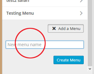
Adding a new menu
Add a menu button: when the user select the button she hears “add a menu button press return or enter to open”. When clicking on on the button, a new menu name field and button appears, but the user is not aware of it.
When the user clicks on “Create menu” the user hears that the menu was created. The new menu has a blue color that differentiates it of the rest, but when I try moving to another element in the page it gets berserk.
I not sure if this weird behavior is due to using Safari, but when the interface gets crazy it is very difficult to find the way back to anything. At some point, a lot of elements that are hidden gets focus and it is very confusing to know were I am. After it gets berserk I need to refresh the page and start anew.
It was difficult too to add an item to the menu. There is a lot happening on the screen that is not necessary told to the user.
I will agree with previous comments, adding menus or items requires a lot of clicking and the way that page elements are organized makes very hard to understand the elements order with the screen reader.
I prepared a video to show the strange behavior after clicking on the “Create menu” button.
Michelle deYoung (June 14)
Creating Menus, Keyboard only testing
Tested in Windows 8.1 using FireFox, Chrome and Internet Explorer 9 with Keyboard only.
Issue: Once a new menu is created, the keyboard focus is moved to the content area. Suggested: Keyboard focus should remain in the left sidebarSidebarA sidebar in WordPress is referred to a widget-ready area used by WordPress themes to display information that is not a part of the main content. It is not always a vertical column on the side. It can be a horizontal rectangle below or above the content area, footer, header, or any where in the theme. menu section so the user can add items, reorder, delete menu, etc.
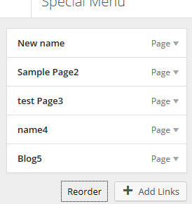
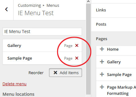
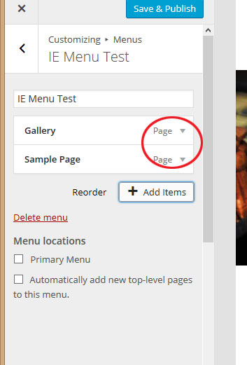
Issue: The Reorder link receives focus, but does not reorder menu items when selected. The “Add Links” button might be more understandable if it is renamed. Suggested: Rename “Add Links” button to “Add Menu Item”.
Issue: When adding a Menu item, the item is added twice to the Menu sidebar.
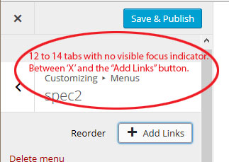
Issue: When tabbing from the ‘X’ to the “Add Links” button, there are 12 to 14 tabs that have no visible focus indicators. The number of tabs vary. I assume this is from hidden items that it is hitting.
If ‘Enter is selected, it unfolds a blank area above the Customizing > Menus item.
‘X’ and “Save and Publish” only appear to get focus when the user tabs in reverse tab order. Suggested: Remove extraneous tabbing to reach focusable elements on the screen, so user can easily identify where they are at on the screen.
Issue: No visible focus indicator for the help icon. Suggested: Make it gray like the Properties (gear) icon, then blue when it receives focus. Or add a border around it when it receives focus.
Firefox: No visible focus indicator for the help icon.
This is how it looks in IE: Visual focus on the help button
Issue: Access to menu item – reverse tab order: Once user has added a menu item, if they choose to navigate/move backwards in the tab order to customize the added item, the items in to expandable. The user has to navigate back to top of the browser and start from there.
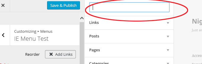
Issue: In Internet Explorer 9. When the “Add Links” button is selected and the right side section is expanded, the user focus is dropped into the Search field which is fine, however, the user is not able to see the placeholder text unless they don’t enter a search criteria and tab out of the field. Suggested: Allow the placeholder text to be visible when the field receives focus.
Place tab on the expanding section, and allow the user to tab into the Search field.
Kim van Iersel (June 18)
On Jaws 16 Pro.
I did all the tests and could answer everything with: Yes I could do that (add a menu. fill it with menu items, remove a menu, reorder a menu, access menu options, access menu help).
Michelle deYoung (June 20, after integration into core)
Tested in Windows 8.1 using Chrome + ChromeVox and FireFox + NVDA
can you add a menu (YES)
can you fill it with menu items (Yes – as far as functionally with the screen reader and keyboard. No – The extraneous text voice by ChromeVox and NVDA will be confusing to user and could very well impact their ability to accomplish their task.)
can you remove a menu item (YES)
can you reorder a menu item items (Yes – as far as functionally with the screen reader and keyboard. No – it is not very understandable for a non-sighted user to hear “Reorder” and “Done” without knowing they have to navigate back to the menu itself, and without instruction of what and how to reorder. Once back in the menu the reorder buttons are nicely done and announced clearly as to what the action is.
can you access the menu options (YES)
can you access the menu help (YES)
Issue: Add Menu button:
Once the user has selected ‘Add a Menu’ the focus stays on that item.
Before selecting ‘Enter’ or ‘Return’:
ChromeVox and NVDA:“Add a menu press return or enter to open.
After selecting ‘Enter’ or ‘Return’:
ChromeVox:“Add a menu press return or enter to open”.
NVDA: only announced after user as moved away from the button and then back to it:“Add a menu press return or enter to open.”>
Remediation suggested: Once the user has selected ‘Add a Menu’ it might make it easier to have the cursor focus dropped into the ‘New menu name’ field.
When the button changes to the ‘X Add a Menu’ it should say something like
“Add a menu press return or enter to collapse or close.”
<span class="screen-reader-text">Press return or enter to collapse or close </span>
</button>
Issue ChromeVox: >Add Menu button
Once the menu name is added and the ‘Create Menu’ button is selected,
Screen reader voices:
“Menu create”
“Status create menu button”
“List items widgets press return or enter to open this panel heading 3”
“List item static front pageStatic Front PageA WordPress website can have a dynamic blog-like front page, or a “static front page” which is used to show customized content. Typically this is the first page you see when you visit a site url, like wordpress.org for example. press return or enter to open heading 3”
“Collapse internal link”
“Search widgetWidgetA WordPress Widget is a small block that performs a specific function. You can add these widgets in sidebars also known as widget-ready areas on your web page. WordPress widgets were originally created to provide a simple and easy-to-use way of giving design and structure control of the WordPress theme to the user. within search widgets edit test search entry”
“Archives heading 4”
“A monthly archive of your sites posts”
“Calendar heading 4”
… (and so on)
Issue NVDA: Add Menu Field
Form field is voiced as “List with two items edit has auto complete”
The input element needs a label relationship defined.
Placeholder is only read with NVDA if user accesses the field via forms mode. If the user is arrowing to the item in virtual mode no label will be announced.
<label><input class="menu-name-field" type="text" data-customize-setting-link="new_menu_name" value="" placeholder="New menu name"></label>
Remediation suggested:
Place holders should not be used for labeling. Use explicit or implicit labeling. When using implicit labeling ensure that the for and id attributes are used to create a data relationship between the label and form field since some AT’s don’t support implicit labeling well.
If you do not want the label to show hide it from view using css, but allow AT’s to still access the label name.
Note: If aria-label is used on the input for a label, it will only be read by screen readers when tabbed to.
<label for="menuname">
<span class="hidefromview>Enter new menu name</span> (hide label text from view with css, but allow it to be read by screen readers.)
<input id="menuname" class="menu-name-field" type="text" data-customize-setting-link="new_menu_name" value="" placeholder="New menu name">
</label>
Issue: Adding a Menu Item
Add button is just announced as “Add”. The item name is read prior to the button, but it might be more understandable for it to be voiced with the item name.
< Remediation suggested: Ex: “Add a Gallery Page menu item”
Issue: When user selects ‘Enter’ to add a menu item it is duplicated in the left panel.
Issue NVDA/FireFox: Reorder/Done button
Once the user as selected “Reorder” the focus remains on the button that then has changed to “Done”. Note: “Done” is only announced is the user navigates away from the element and then back to it. Remediation suggested:
Reorder should have some more information associated with it for non-visual users. Perhaps taking user focus to the top of the list of menu items along with additional instruction on what to do now the reorder button has been selected would be beneficial and more understandable
Issue NVDA: Removing Menu Items
When the add menu item window pane is open, the “X” for removing the item is available, but once the user closes the pane and moves to the window pane where they can edit the menu item, the remove “X” is moved down toward the bottom of the expanding collapsing accordion items for editing.
Tobias Clemens Häcker (June 23, after integration into core)
Windows 7, Chrome, ChromeVox
Except for menu items being added twice everything works well. Was surprised how easy it was to use.
We would like you to investigate the links and link texts on wp-admin/edit.php page and suggest better solutions for the link texts, how to make them understandable and unique, without overloading a screen reader user with a huge amount of extra text. Hidden text suggestions (screen reader only) are welcome and also visual text suggestions.
We hope to make this list of posts (and pages) understandable for everyone.
Test results
Geof Collis
Sort of like they’ve done in the media section I’d like to be able to select the posts/pages in a list with just a link and checkbox for bulk edit an nothing else.
I’d also like a heading at the beginning.
Tobias Clemens Häcker
Tested with: Windows7, Chrome Browser, ChromeVox
Analysis
The link texts for the link itself the control box and the sublinks (edit, quickedit, trashTrashTrash in WordPress is like the Recycle Bin on your PC or Trash in your Macintosh computer. Users with the proper permission level (administrators and editors) have the ability to delete a post, page, and/or comments. When you delete the item, it is moved to the trash folder where it will remain for 30 days. and view) are well-done. The voice output is clear. However author, categoryCategoryThe 'category' taxonomy lets you group posts / content together that share a common bond. Categories are pre-defined and broad ranging. and comments are only announced as link.
Suggestion
Links to author, categories and comments should add the type. Announcing “author mwa”, “category uncategorized” and “zero comments” instead of just “mwa”, “uncategorized” and “zero”.
YouTube demo
Jeffrey de Wit
NVDA (default settings, so includes reading out title) goes entirely nuts on this stuff. I’ll see if I can get a recording of it. Something that may be useful to change are the All/Published/Drafts/Trash links. These could probably use some screen reader text.
Something like this (Maybe use List instead of Display? Not sure):
[Display] All (13) [posts] / [Display only] Published (10) [posts] / [Display only post] Drafts (3) / [Display posts in] Trash (1)
Right now it gets read out by NVDA as:
“All 13 link”, “Published 10 link”, “Drafts 3 link”, “Trash 1 link”.
On a similar note, the column headers for sorting could probably use the same treatment. It just announces the link (“Title link”, “Comments link”, “Date link”).
Should probably be something like:
“[Sort ascending/descending by] Title link”
“[Sort ascending/descending by pending] Comments link”
“[Sort ascending/descending by] Date link”
Ascending is the “default” link for title and comments, that is, when you get on the page and you trigger one of these sort links the order will be ascending (A->Z, or 0->x).
For Date the default is descending, which means the newest comment will appear on top.
Neither the current sort order (if any), nor what the sort order will be when the link is used is conveyed by the screen reader. The suggested text in the list above would take care of what the link will do, but not what sort order is currently active.
I’m worried that adding additional text for what sort order is active may be too much, nor do I know of an elegant way to word what the current sort order is. Or even where the most appropriate place to put it is.
NB. NVDA + Chrome doesn’t announce the Comments headerHeaderThe header of your site is typically the first thing people will experience. The masthead or header art located across the top of your page is part of the look and feel of your website. It can influence a visitor’s opinion about your content and you/ your organization’s brand. It may also look different on different screen sizes. at all. Could possibly be because the screen reader text span is wrapped in two other spans.
Seems the craziness only happens with Chrome and NVDA. Firefox is a bit more sane.
Demo in Firefox + NVDA:
Demo in Chrome + NVDA:
John Sexton
I’ve done a quick check with Supernova V14 on a Win7 PC with IE11 and have the following comments:
When tabbing through links with supernova on all posts (starting from the h2) you get:
“Forms mode select bulk action Bulk Actions pull down list box”, “Apply button”, “Forms mode FilterFilterFilters are one of the two types of Hooks https://codex.wordpress.org/Plugin_API/Hooks. They provide a way for functions to modify data of other functions. They are the counterpart to Actions. Unlike Actions, filters are meant to work in an isolated manner, and should never have side effects such as affecting global variables and output. by date All dates pull down list box”, “Forms mode Filter by category All categories pull down list box”, “Filter button”,
“visited link”, “link”, “Forms mode select page 1 edit”, “link”, “link”, “List View link”, “ExcerptExcerptAn excerpt is the description of the blog post or page that will by default show on the blog archive page, in search results (SERPs), and on social media. With an SEO plugin, the excerpt may also be in that plugin’s metabox. View link”,
“select no title unchecked checkbox”, “no title link”, “mwa link”, “uncategorized link”, “0 link”
Note: as the above is just using the tab navigation it skips over the empty tags and date columns. However, if using the Supernova table navigation controls the empty tags cell is just read out as “column 5 row 2”. This is because by default Supernova doesn’t read all punctuation.
Pagination links:
the symbols are not often read out by default and their purpose may not be immediately obvious.
add ” First”, ” Back”, ” Next” & ” Last” as screen reader text inside the link text.
alternatively add ” First Page”, ” Previous Page”, ” Next Page” & ” Last Page” as screen reader text inside the link text.
or ” Page 1″, ” Page n”, ” Page n” & Page n” where “n” is the page number that the link will go to.
Personally I prefer the first option as is short and to the point.
Data links in table:
It may be an idea to add ” tag” & “0 pending of 1 comments” (where 0 are the number of pending comments and 1 is the total comments), as screen reader text inside the link text after the displayed value.
It would also make it more usable if the pending & comments are shown as 0/1 or 0of1 or just add another column for pending just before the comments column. This way both values are visible without the need for title attributes.
For when there are no tags, adding ” no tags” as screen reader text inside the link after the – symbol may help for cases when the – is not read out by default.
You could add “author ” as screen reader text inside the link text before the authors name.
It may be an idea to add “Edit ” to the link text as screen reader text before the title link text.
The “Edit | Quick Edit | Trash | View” menu is not accessible without a mouse in list view. However, in excerpt view, the following works from a keyboard.
The “Edit | Quick Edit | Trash | View” links are not immediately obvious, to gain access with Supernova, first you have to switch to excerpt view then you have to use cursor navigation to find the post excerpt text and press space while over this text.
Options could be to add a show/hide link for these four links this can have the same action of as you show one it hides previously shown menus. This way there’s only one “Edit | Quick Edit | Trash | View” menu visible at any one time.
When these links are visible you can tab through them. It may be an idea to add the post title as screen reader text to the end of each of the four menu links, so it reads “Edit post title | Quick Edit post title | Trash post title | view post title” (where post title is the name of the post that is being acted upon.
It is probably worth considering removing either the “Edit |” link or the title edit link. As these are duplicated links one following the other. Perhaps while in excerpt view, the title link could be used to show/hide the menu links instead of performing the Edit link.
Another interesting thing I noticed is when using Supernova’s list links function while in excerpt view with one “Edit | Quick Edit | Trash | View” menu visible you get:
The pagination links are shown with the title text “Go to the first page «”, “Go to the previous page ‹”, “Go to the next page ›”, “Go to the last page »”.
The comments link has “c o m m e n t s”, would be better as “Comments”
The post titles have “Edit ” preceding the title text.
The post comment fields have “0 pending 1” (where 0 are the number of pending comments and 1 are the total comments).
The menu “Edit | Quick Edit | Trash | View” is only listed once for the currently visible menu and the links are listed as:
Edit this item “Edit” (where “Edit” is the actual link text and the first part is the title text).
Edit this item inline “Quick Edit” (where “Quick Edit” is the actual link text and the first part is the title text).
Move this item to the trash “Trash”, (where “Trash” is the actual link text and the first part is the title text).
View [post title] (where [post title] is the post title to view.
Gabriela
I used VoiceOver and Safari.
Comments:
All/Published/Draft/Trash links
I agreed with Jeffrey’s idea of adding a “post” word to links to provide a better context to the user. In my opinion, the context for this group of links for a sighted user is more than clear, so maybe only adding this information for the screen reader should be better.
Column headers for sorting
I agreed with Jeffrey’s suggestion to add extra info to let the user know the sort ascending/descending order. To tell you the truth, if Jeffrey did not mentioned that those links are to change the sorting order, they had gone unnoticed for me. I suggest to show by default the black triangle instead of only making it visible when the user does a mouse over or a click on the object.
First, previous, next, last page links
The title for these links already contain the information describing the action of each one of the links, is a shame that that browsers don’t announce it.
So to make them accessible, I see two options:
Add the information in a span same technique than the one used for list view and excerpt view;
Converting the symbols and background color to images and adding the information with the ALT attribute.
Edit | Quick Edit | Trash | View links
In my case, it was not difficult to access these links only using the TAB key. I tried on list view and excerpt view.
Since edit/quick/trash/view are all in the same cell as the title of the post I think the user gets a good idea that those actions apply to the current post.
My only concern with these links is that they appear only when the post title gets the focus. VoiceOver and NDVA let the user to open a window dialog containing a list with all links available on the page. But these links won’t appear on the list because the title post don’t have the focus on. So the user won’t be able to use these links from the link list window.
Tags information
I would suggest to add a text for the screen reader so instead of listening to a “end dash” the user will hear something like “not tags for this post”.
Data table
The table used for the posts is a data table type. But not all the data cells are associated with their corresponding head (th) cells. This could create confusion for the screen readers and affect the way the cells are read to the user.
Shaun Everiss,
NVDA latest version, firefox and internet explorer latest builds and windows7.
I have looked at the links having the title of the posts and the date on when it was posted works for me thats how it has been in 4.1 what is the issue of keeping it that way.
Reagan Lynch
Test Environment: Windows 7 64 bit, Internet Explorer 11, JAWS 16
I did this test on just the main listing you first go to when you click on All Posts. This focus is on links and what feedback you get with a screen reader.
After the bulk action combo box you get the unlabled links.
The first is links that I think are for navigating back and forward among the posts. In JAWS 16 these are not labled. I know that one is two left double angle brackets, but that is because I did a jaws command (insert+up arrow twice quickly) The next thing I see as I arrow down is a unlabled link that I cannot even determine because nothing is labled and JAWS cannot read the character that is there.
These links are repeated in opposite after the edit field to select the page. For these unlabled links it would be nice to here prev and next for the links that move you page to page, and maybe first page and last page for the links that go to the first and last page. Just labeling these page nav links would make the all posts/pages pages more usable with a screen reder.
In the table of posts I don’t really know what you can do to make the links that are numbers that take you to comments more accessible. Since we now have the wp speak function how hard would it be to use that function to tell a screen reader when it sees that link to report 1 comments or 0 comments. I know if you use I think a title attribute you can read that with a say line command twice quickly, but screen reader users are not really going to take the extra time to issue that command. Using WP speak or something else might be the best solution especially if you don’t want to impact the sighted experience.
Sebastien Massy
Use of title attribute
Not all browser/screen-reader combinations will convey the title attribute to the user. For instance, Firefox/Orca/Linux conveys the
title attribute, but Chrome/ChromeVox/Linux does not. What this means is that the user might wind up having or not having the information
depending on his A-T choice. (Example, if there are comments pending moderation for a post, Firefox/Orca might say “7 pending” while Chrome/ChromeVox would just say
“7”.)
The screen-reader-text class
In Firefox/Orca/Linux all text belonging to this class winds up being stretched out to one letter per line of the virtual buffer, presumably
in an attempt to represent the text as it would appear if formatted according to the class. The end result is that using down or up arrow to
scroll rapidly through a list of posts (or any other list employing this class) is at best tedious and at worst impossible. Chrome/ChromeVox,
which tends to promote structural navigation over layout reproduction does not exhibit this problem. I would be curious to hear whether other
firefox users on other platforms are experiencing this issue.
Not all information is displayed
Using either browsers, I ran into the simple fact that not all information would be spoken reliably. In particular, such things as
publication dates and attached taxonomies were not always spoken. For example, in Chrome/ChromeVox, I found that navigating forward would
speak the quick action links but omit the information mentioned, whilst navigating backwards would speak the whole information but the action
links were not there. I am wondering whether this has to do with the fact that the action links appear on hover, i.e when focused (for us):
could it be that they mask some information when they appear?
All in all, I found that neither browser/A-T combination provided a good experience when attempting to scroll rapidly through a list of posts.
Tina Tedesco
Jaws 15
After arrowing down past the #13 it said “link left double bracket.” It did not indicate the type of link. Arrowed down again and it just said “link” no type of link or no dataspoken. Arrowed after #2 after select page and there is a blank link; arrowed down again and another blank link.
Some sort of data link or labeled tags need to be added.
The table was very confusing for someone using a screen reader. To much text is being spoken in each column.
As a user of a screen reader, I was able to go into table navigation mode which enabled me to navigate through the table. However, even using that, it was confusing.
Amy Li
I have some suggestions and they may not related to AccessibilityAccessibilityAccessibility (commonly shortened to a11y) refers to the design of products, devices, services, or environments for people with disabilities. The concept of accessible design ensures both “direct access” (i.e. unassisted) and “indirect access” meaning compatibility with a person’s assistive technology (for example, computer screen readers). (https://en.wikipedia.org/wiki/Accessibility) but usuability issues. Hope it helps. Please see below:
Too much links and caused confusion
Remove non-important information on default, remove “Author”, “Categories”, “TagTagTag is one of the pre-defined taxonomies in WordPress. Users can add tags to their WordPress posts along with categories. However, while a category may cover a broad range of topics, tags are smaller in scope and focused to specific topics. Think of them as keywords used for topics discussed in a particular post.” and “Date” since those items are in Filter list.
Add icon-style for Tagging, add alt-text for tagging and other icons
Links button need be less, combining View with Edit. Quick Edit should be default, adding “More” to extend functions like “Edit”
“Trash” is better to be selectable in the front so that admin can bulk-select and delete together, instead of one by one clicking.
Mocked screenshot in default page with removed extra links:
Issues and actions:
Overall impression
For screen reader users this page is overwhelmed with links and hard to get an overview of.
There is a need for a quick overview with links to all posts (or pages).
A lot more screen reader text should be added to explain what the links are about.
Page navigation
The page navigation should have a heading to make clear what it is about: ticket @afercia
The page navigation is missing decent screen reader labeling: ticket @afercia
The previous links are still links on the first page , and the next links on the last page. They should not be links. Also the colour contrast of the >> and > is to low for these “inactive” links. Ticket @rianrietveld
Post filter
The links like Published, Sticky etc. are missing decent screen reader labeling: ticket @Cheffheid#31965 and #31966
Comments
The amount of pending comments are included in the title attribute of the comments link and only visible on hovering, this is not clear for screen reader users but also not clear for sighted users. Ticket @rianrietveld
Tags
A “—” ( “end dash”) for no tags needs screen reader labeling or a better explanation. Ticket @rianrietveld
Post link and row-actions
Below the link for the post title there are action like: Edit, Quick Edit, Trash and View.
The link to the post title and the Edit link are double.
Some screen reader have difficulties entering the row-actions, we should review the way this is done now.
The | seperator could be included into the css or made invisible for screen readers by ARIA
Remove the explaining text out of the title attribute and add screen reader text
The quick edit link should be a button is now href=”#”
Screen reader text needs to reset word-wrap
In Firefox/Orca/Linux all text belonging to this class winds up being stretched out to one letter per line of the virtual buffer. This is due to the word-wrap: break-word; applied on an element Ticket @afrecia
No feedback on sort order of a column
The way a column is sorted should be added for screen readers
The only way you can see if a column is sortable is by the colour of the table header text and by hovering over the link
To consider
How to decrease the number of links and make a post quicker selectable for a screen reader user
One more thing to consider
Edit by Andrea. We missed the format links: when a post has a specific format set, a small icon is prepended to the post title, see screenshot:
the image is linked to a screen with all the post belonging to that post format. Read out by screen readers as: “video link video”.
We like you to test the search function options in the WordPress Admin.
We know there are accessibilityAccessibilityAccessibility (commonly shortened to a11y) refers to the design of products, devices, services, or environments for people with disabilities. The concept of accessible design ensures both “direct access” (i.e. unassisted) and “indirect access” meaning compatibility with a person’s assistive technology (for example, computer screen readers). (https://en.wikipedia.org/wiki/Accessibility) issues here, we would like your expert opinion about this.
Test on WordPress 4.2-alpha
Try the search function in:
Posts > All posts
Posts > Categories
Posts > Tags
Media
Pages > All pages
Comments
Appearance > Themes
Plugins > Installed Plugins
Plugins > Add New (try different options, like featured, favorites, etc.)
Users > All users
And if you still have time: Pages > Add new > Add Media > search an image or file in the Media Library, try different options, like kind of media item and date
Experiment:
Try with search words you know give results
Try an empty search
Try with nonsence words
Can you tell us if:
it’s easy to do a search or do you get stuck
you get what you expected
you can read the results well
you get good feedback when there are no results
you miss something to make it work for you
you have suggestions for improvement (keep it short please)
Shaun Everiss
I just did the test with NVDA, search worked as expected. I didn’t see any issues.
Gabriella
Tools: Safari + VoiceOver
Posts > All posts: The function worked perfectly, however I think that the missing part is telling the user how many results he obtained with his search. Also if is possible, make the focus stays on the main content after the page is refreshed would be nice.
Posts > Categories: Same comment than Post > All posts.
Posts > Tags: Same comment than Post > All posts.
Pages > All pages: Same comment than Post > All posts.
Comments: Same comment than Post > All posts.
Appearance > Themes: See missing search button comment.
Plugins > Installed Plugins: Same comment than Post > All posts
Plugins > Add New: Same comment than Post > All posts.
Users > All users: Same comment than Post > All posts.
Media
Media: The function worked perfectly.
Missing search button: I noticed that in this page, the search function is a little bit different than search functions in the other pages. In the media page the button “search for XX” at the right side of the search input text is missing. Since in most of the pages we found a label + input text + button search, the user is used to this pattern. I propose to modify the search function to be consistent with the rest of the functions.
Media: Select class=”attachment-filters” missing label
The select option for type of media (images, audio, etc) does not have a label so the select context is not clear since the user only listen to “All (4)”.
Pages > Add new > Add Media: Here we have a similar case to the search function on Themes page. This is an interactive search. The problem here is that there is nothing that tells the screen readers what is happening while the user is performing the search.
Themes
Search Placeholder in Themes: The themes search function is the only one where the input text has a placeholder. Listening to it is a little confusing because the same word is repeated two or tree times:
“Search installed themes, clickable, Search installed themes, Search installed themes search text field”.
Since this function is the only with a placeholder, what do you think about removing the placeholder from the code to keep consistency with the other search functions?
Search function inside the H2: The search function for the themes page is grouped inside the H2. With VoiceOver, the user won’t be able to write in the input text unless she goes inside (control+option+shift+down arrow) the group to interact with it.
Blocked search input text; There is a bug when writing some text in the input text and clicking enter to execute the search. The focus is blocked and the text can not be erased. One solution is to move to another element on the page and come back to the input text to regain the functionality. The search function in Themes is different because is an interactive search, the user write something and at the same time results appears. The problem here is that there is nothing that tells the screen readers what is happening while the user is performing the search. Clicking on enter to execute a search is a normal behaviour because all the other pages offer the same pattern. I think if the user get trapped in this bug won’t be able to find a way out.
Missing search button: In this page, the button “search for XX” at the right side of the search input text is missing. Since in most of the pages we found a label + input text + button search, the user is used to this pattern. I propose to modify the search function to be consistent with the rest of the functions.
Also missing in this page is the text “Search results for “XX”” that appears inside the H2. Most of the pages added it when the page is refreshed after doing a search.
Amy Li
Posts > All posts
Focus should set to search input box when first enter all posts page
Screen reader read “Search Posts” button as “Disabled”
Search Posts color contrast radio is not higher than 4.5:1
Posts->Categories
Focus should set to search input box when first enter
When Enter space into Name input it should read out warning in Screen Reader
After input empty into Name, nothing shows and focus is gone and removed
Appearance->Themes
After enter input text it should read results when there’s results found
Focus should set to first search result after click Enter into search box
Plugins > Installed Plugins
Focus should set to first search result after click Enter into search box or set back to search input box
Plugins > Add New
When enter “Jet” text which there’s search result, the the typeselector select field has no text/label
Focus should set to search input box when first enter all posts page
Focus should set to first search result after click Enter into search box
Resize window:
Search box should be on top when screen size is smaller than <320 like mobile version.
Tina Tedesco
I use JAWS 15.
When I search for something, and whether it found it or not, my results did not appear until the end. I had to use the arrow key to go down to see where the actual results were.
It did say out loud searching but did not bring me right to the search results. Can you put in something where the screen reader will read out how many results after searching?
Besides that I thought the search worked well. Definitely doable with a screen reader.
John Sexton
Test on Win7 64bit, IE11 & Supernova14
Search in categories:
Focus is placed in the new categoryCategoryThe 'category' taxonomy lets you group posts / content together that share a common bond. Categories are pre-defined and broad ranging. name field on page load
Search in tags:
Focus is placed in the new tag name field on page load
Search in media library
While in grid view, this search works differently it appears to filterFilterFilters are one of the two types of Hooks https://codex.wordpress.org/Plugin_API/Hooks. They provide a way for functions to modify data of other functions. They are the counterpart to Actions. Unlike Actions, filters are meant to work in an isolated manner, and should never have side effects such as affecting global variables and output. items as you type but from a screen reader point of view clicking the search button gives no feedback that any search has been performed. Perhaps on pressing the search button focus can be moved to the first search result or if a total of items found message is added, like in posts, categories and tags focus can be moved to that.
While in list view, it works more like the posts, categories and tags search.
Search on all pages
Search on “(no title)” and “mwa” both return no items
It doesn’t seem possible to search for all pages with no titles
Search on themes
Empty search returns all six themes
Search on “four” returns two items: twenty fourteen and twenty ten
Search on “ten” returns four items: twenty fifteen, twenty eleven, twenty fourteen and twenty ten
There is no search button and pressing enter in the search field gives no indication to the screen reader of any changes and the search results are a little odd.
On the whole quite reasonable. However, themes gave the most odd results. Not having any screen reader friendly feedback a search has been done is a little off putting as is placing the focus on a form field on page load.
The searches appear to be limited to the first column of the results table and it may be nice to be able to search or filter on file type in the media library. IE jpeg, png, gif, mp3, mp4, doc, docx, pdf etc.
Another nice to have may being able to search or filter by user who created/uploaded the item.
Geof Collis,
Tools: IE 11, JAWS 14.5
search post, pages, comments, plugins and media/library
no problem with search function initially but I dont like trying to find the results, there needs to be a heading for the results, as it is right now I’ve got to tab through all of the regular stuff before I find a table with results if any, very annoying and time consuming, also, I’d like the focus to be taken to the results after a search if possible
On another note a heading before all posts, pages, categories etc would be nice.
I noticed that when I do a second search that the previous text is still in the edit box, this should be removed after the initial search.
Tags and categories
This is better, they have a heading and the search term used but the focus gets taken past the heading, I have to move backwards, this might be more of a problem for a keyboard user.
Still the issue of previous search term in edit box.
Themes
Something wrong with the edit box, as I start typing it is reading off the url and search term and when I hit enter it doesn’t go out of forms mode, I have to do it manually and again a heading with the results would be better than tabbing through the regular stuff.
Plugins add new, all criteria
This worked great, a heading for each pluginPluginA plugin is a piece of software containing a group of functions that can be added to a WordPress website. They can extend functionality or add new features to your WordPress websites. WordPress plugins are written in the PHP programming language and integrate seamlessly with WordPress. These can be free in the WordPress.org Plugin Directory https://wordpress.org/plugins/ or can be cost-based plugin from a third-party made it easier to sift through them but still the issue of text in edit box after search.
Add new
Posts and pages work fine as long as the disable the visual editor checkbox is selected in Profile.
Add media
Uploading from my computer has become a whole lot better but do have issues with adding alt text etc, trying to add one from the media library is non existent, perhaps a test for another day.
Summary:
Give screen reader feedback for search results and what’s happening with the interactive search in themes.php and upload.php
Give better screen reader feed back about the amount of search results
Set the focus on search the results after search submit (and not for example at New category)
Add a (hidden) submit button and remove the placeholder for search in upload.php (at least for list mode), plugin-install.php and themes.php (see ticket #26600)
In themes the search input text gets blocked after clicking enter to execute the search.
Bug: Plugins > Add New: typeselector select field has no text/label (see ticket #26601 )
It is not possible to search for posts/pages with no title
Search installed themes gives to much results?
Remove search function for the themes.php outside the H2 (see ticket #26601 )
Search input no submit button, no live search (need to press Enter) in Media Library list mode
Search input no submit button, live search fires “as you type” in Media Library grid mode, Themes (add new, wp.org APIAPIAn API or Application Programming Interface is a software intermediary that allows programs to interact with each other and share data in limited, clearly defined ways.), Network Themes (add new, wp.org API)
Search input no submit button, live search fires “as you type” (more a “filter current collection” than a search), Themes (installed themes), CustomizerCustomizerTool built into WordPress core that hooks into most modern themes. You can use it to preview and modify many of your site’s appearance settings. add widgetWidgetA WordPress Widget is a small block that performs a specific function. You can add these widgets in sidebars also known as widget-ready areas on your web page. WordPress widgets were originally created to provide a simple and easy-to-use way of giving design and structure control of the WordPress theme to the user., Plugins (installed plugins)
Search input with hidden submit button, press Enter or tab and submit the hidden button (after the search, the “typeselector” select appears) in , Plugins (add new), Network Plugins (add new)
“Classic” search: search input with submit button, press Enter or submit button, in Posts, Categories, Tags, Pages, Comments, Users, Network index: search users, Network index: search sites, Network Sites, Network Users, Network Themes (installed), Network Plugins (installed)
We recommend only 2 forms of search:
the classic one, the same for every search, with visible submit button
the dynamic one: adding wp.a11y.speak to show the results count, and making sure focus doesn’t change dynamically
Actions:
Open ticket for the missing label for the typeselector select field – @rianrietveld
Open ticket on a unified search form display: 2 types – @cheffheid
Send to the test team March 26, 2015
For WordPress 4.2-beta2
Question
We would like you to test the “Press This” categories selection in
You can access Press This directly in WordPress, at: /wp-admin/press-this.php
After the editor, you will find a “Post Options” area where you can set the Post format, Categories and Tags.
About Categories, it’s made with a list of DIV elements with role=checkbox, for several reasons developers choose to implement them this way so switching back to native checkboxes is not an option 🙂
You should be able to check them as you usually do with native checkboxes, by the way screen readers won’t automatically switch to “forms mode”.
To force the switch we added role=application to the list container.
This has pros and cons and, generally, it’s recommended to use role=application sparingly and wisely.
See for example this post by Mr. Zehe:
Since any recommendation and best practice should be always tested in a real world experience, we would like you to test what’s best for you.
with no role=application, users will have to manually switch to “forms mode”
with role=application, the switch should automatically happen but you will lose the native behaviour and other things like the number of items in the list being automatically announced, not mentioning arrowing won’t work.
Results so far:
Bram Duvigneau
After a quick look, I come to the following conclusions:
NVDA shows an application region and you need to press space bar/enter to interact with it. Please note this is not necessary if the user just navigates by pressing tab
The application region contains just a bunch of elements that behave like checkboxes
Given the fact that this is not a real application, but just a list of checkboxes, I recommend against using role=”application” here.
By putting the checkboxes in an <ul> or an element that has the corresponding aria role (list from the top of my head), you wil just make it clear that these checkboxes belong together. As a bonus I would suggest using the new wp.a11y.speak to announce the number of results when a user types in the search field, e.g.: “4 categories displayed” or similar.
Susan R Grossman
On JAWS
This doesn’t work for me even when using tab/shift/tab.
It skips some of the choices when trying to tab/arrow/space/navigate in any method through them. Does every other “radio button”.
Geof Collis
On JAWS 14.5 IE11
I dont like it one bit and it should not be implemented, it goes against everything I know about radio buttons and checkboxes.
Not sure if this is relevant but when ever I see a form I go through the whole form without going into forms mode to give my self an idea what it looks like, then I will fill in the first edit box/ button etc, go out of forms mode go to the next field fill it in then go out of forms mode again, I do this for all forms because I dont trust them to cycle properly.
Michelle DeYoung
FF/NVDA/Win7: Once the screen readers announces “application” and throws me into forms mode, the next tab takes me back to the CategoryCategoryThe 'category' taxonomy lets you group posts / content together that share a common bond. Categories are pre-defined and broad ranging. tab and “Back to Post Options Button” is voiced. Then I have to tab through the other items in the tab order to access the categories I would like to check/not check.
Each category item name is voiced with checkbox not checked.
IE/JAWS/Win7: Once the screen readers announces “application” and throws me into forms mode, the next tab takes me back to the Category tab and “Back to Post Options Button” is voiced. Then I have to tab through the other items in the tab order to access the categories I would like to check/not check.
Each category item name is voiced with checkbox not checked, to check press spacebar.
Chrome/ChromeVox/Win7: Once the screen readers announces “application” and throws me into forms mode, the next tab takes me back to the Category tab and “Back to Post Options Button” is voiced. Then I have to tab through the other items in the tab order to access the categories I would like to check/not check.
Each category item name is voiced with checkbox not checked item.
Keyboard only: Another accessibilityAccessibilityAccessibility (commonly shortened to a11y) refers to the design of products, devices, services, or environments for people with disabilities. The concept of accessible design ensures both “direct access” (i.e. unassisted) and “indirect access” meaning compatibility with a person’s assistive technology (for example, computer screen readers). (https://en.wikipedia.org/wiki/Accessibility) impact would be for keyboard users. Tabbing to the category item highlights it but they have no idea that the item is selected and operational via a checkbox. If you do not want the checkbox displayed then add some verbiage to let visual keyboard users know how and what they are supposed to do so they don’t have to guess that if they use a spacebar that it will check the category item.
I would recommend not using the role=”application” in this case, and focus on getting this to work for screen reader users and keyboard only users. Perhaps a tab/accordian widgetWidgetA WordPress Widget is a small block that performs a specific function. You can add these widgets in sidebars also known as widget-ready areas on your web page. WordPress widgets were originally created to provide a simple and easy-to-use way of giving design and structure control of the WordPress theme to the user.. Here is a link to an example, but it also is using role=”application” which impacts access via different screen readers, so in this example I would remove it as well, but it still shows a different widget option. Example 37 – Tab Panel: Accordian using ARIA CSS selectors
I think the role=”application” will only frustrate users more and impact how they access those content items.
Anna Natorilla,
Trunk: This custom checkbox implementation allows the user to activate the checkbox with spacebar key only. The user has no problem checking the custom checkboxes. If the user reads the checkbox via virtual cursor mode and they press the enter key to select a checkbox, the screen reader will tell the users to press the spacebar key to check or uncheck a checkbox. Once the users check or uncheck a checkbox with the spacebar key, the user was switched to forms mode.
It is a fact that switching to forms mode on the checkboxes will cause the screen reader to not announce the number of items in the list. The user has to use virtual cursor mode to hear the list items numbering and levels.
Nightly: This native checkbox implementation allows the users to activates the checkbox with both the spacebar and enter key on via virtual cursor or forms mode. The users have no problem checking the forms control whether they are in forms mode or virtual cursor mode.
Gabriela Nino de Rivera Torres
Tools: Safari 8.0.4 + VoiceOver
I found very easy moving between the categories list. It’s a great improvement compared with the old situation. In the old version, first I need to go inside the group to interact with the items inside. When moving from one category to the next VoiceOver was speaking twice each item, one for the button ratio and the second for the text inside the button ratio, which was very annoying.
In the new version I don’t need to go inside the group to interact with its items. Selecting the ratio buttons it is also very easy to do.
Points not so good:
I noticed that when adding a new category, the user is not notified of the action. There is not a message confirmation to tell the user if the category was successfully created.
Also, when adding a new category, the category is selected by default (the ratio button is selected). The user won’t not know until she moves from one category to the next.
The categories are added at the beginning of the list under their parent category. It is funny, I was expecting to be added at the end instead. This has nothing to do with accessibility issues. 😀
When moving in the list of categories, there is nothing that announce the user if a category is a parent or a children. This information is being transmitted only visually.
For some reason all the sub-categories inside the testing category are announced by VoiceOver like “list of X items”. I added categories in other parent categories, but this behaviour only happened with the testing parent category. I looked in the code, I could not find any differences between the parent categories. So, I’m very puzzled about this.
Tina Tedesco
Using JAWS 15
Not sure I did this correctly but I concentrated on the list starting whith the checkboxes. I was able to check and uncheck with any problems.
When arrowing down it said, “Entering Categories Application.” Then arrowed down and came to accessibility, it indicated “list of 6 items.” When I arrowed passed accessibility it indicated “list of 4 items nesting level 1.” When I got to the end of that list it indicated “list end nesting level 1.)
I heard no more beginning or ending of levels until I arrowed passed JDFh checkbox. it indicated “list of 2 items nesting level 1.” When I got to the end of the list it said “end of list nesting level 1.”
I arrowed to Testing (did not mention a new listing) and when I arrowed again it said “list of 5 items nesting level 1 as well as end of list nesting level1. ”
Came to Uncategorized (nothing to indicate any listing before the word) arrowed down once indicating “list of 2 items nesting level 1.” Once I arrowed past the 2 items it said “list end nesting level 1.”
At the end of this list it said “Categories applications end.”
Should there have been some sort of message for all listings?
Hope this is not too confusing.
Malgorzata Mlynarczyk
Tested with NVDA in Firefox
As I’ve said before I’m not a native screen reader user, so I’m probably not the best person to test it (it would be better to test it with actual screen reader users). However, I personally prefer the solution with role=”application”. First of all, screen readers are expected to switch to application mode when in the form, so this is an expected behaviour. Once in the form, the users are used to navigate using Tab key, rather than by moving the virtual cursor using the arrow keys, so I don’t think this is a problem. The fake checkboxes work well – the change in state (checked / unchecked) and the ‘checkbox’ label are announced to the user. And although the screen reader doesn’t inform the user how many items the list contains, I don’t think this is particularly important here, and sighted users don’t know it either (unless they decide to manually count them…).
 I found that in text editor all top buttons/tags are not working properly and when I click on them or out site the text editor “” and “” added automatically and it looks very confusing for me.
I did not find how to add the new row or new column in table format.
I found that in text editor all top buttons/tags are not working properly and when I click on them or out site the text editor “” and “” added automatically and it looks very confusing for me.
I did not find how to add the new row or new column in table format.