Along the lines of this post from @helen, and in relation to the Plugin Directory IA, I’m sharing some flows from other popular web store experiences. This is exploratory research for the Plugin A plugin is a piece of software containing a group of functions that can be added to a WordPress website. They can extend functionality or add new features to your WordPress websites. WordPress plugins are written in the PHP programming language and integrate seamlessly with WordPress. These can be free in the WordPress.org Plugin Directory https://wordpress.org/plugins/ or can be cost-based plugin from a third-party Directory.
FLOWS
Code Canyon (https://cloudup.com/cbQSIYi5jUf)
Sketch App Resources (https://cloudup.com/cEq1yIwY5NM)
Steam (https://cloudup.com/cHiTsgm1U9R) via @markjaquith
XBOX Store (https://cloudup.com/cUcVXIynaPa)
Playstation Store (https://cloudup.com/cyK7tf-YlcC)
Amazon App Store (https://cloudup.com/cng1vG1MzhT)
Mac App Store (https://cloudup.com/c-annTJSdGh)
Windows App Store (https://cloudup.com/cBLTp69gtv4) via @michael-arestad
Google Play Store (https://cloudup.com/cpwbEDBa94v) via @ryan
NPM Packages (https://cloudup.com/cX2qE9HThDs)
Atom Package Manager (https://cloudup.com/cA073Aae_FU) via @michael-arestad
Chrome Extensions (https://cloudup.com/ck-GUY0sjoO)
Firefox Plugins (https://cloudup.com/cbHEKKMxY36)
Safari Plugins (https://cloudup.com/ch_bI5-Cajd)
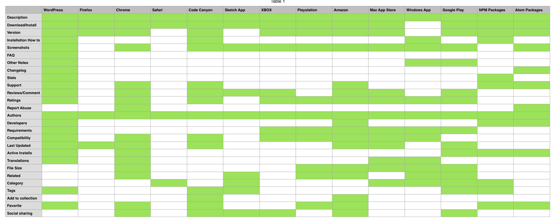
FEATURE COMPARISON

Web Store Feature Comparisons
TOP COMMONALITIES
- Description (Often times this ONE section contained the description/FAQs/Other Notes, etc.)
- Author
- Download/Install Button
- Screenshots
- Reviews
- Ratings
FEEDBACK
What are your likes and dislikes between these? Are there popular design patterns that would be useful for our Plugin Directory? Please leave feedback below.
If you have other flows that you think would be helpful, please link to those as well.


You must be logged in to post a comment.