Components and design
As Mark pointed out earlier, this task includes several different components:
“WP Heartbeat” API An API or Application Programming Interface is a software intermediary that allows programs to interact with each other and share data in limited, clearly defined ways., #23216. This will do polling or long-polling so the server is able to send data and notifications to the browser. The primary use will be for setting, monitoring or taking over a post lock. Additionally it will be used to send autosave data to the server. It looks like we won’t need long-polling for now as post locks are not that time sensitive. A “standard” polling every 15 seconds would be sufficient.
Post locking. How exactly to lock a post and how a user can take over the lock? Best would be to prevent user B from being able to edit the post while user A is still writing or editing. Some ideas discussed at the IRC meetup yesterday are to overlay a transparent div over the editor and/or set the form fields to read-only. There will be a button for user B to take over the lock, clicking it will prompt user A to save the post and close the browser tab. While user B is waiting to take over, we could show a non-editable “preview” of the content (even inside the editor) updated with every “heartbeat”.
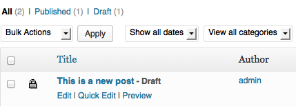
In addition we would show whether a post is being edited on the Posts screen (list table) , perhaps with the same type of button to request taking over. Other ideas welcome.
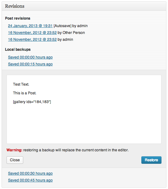
Autosave to the browser’s local storage, #23220. Keep several revisions The WordPress revisions system stores a record of each saved draft or published update. The revision system allows you to see what changes were made in each revision by dragging a slider (or using the Next/Previous buttons). The display indicates what has changed in each revision. of the content on the user’s hard drive, saving every 10 seconds and “flushing” to the server every 2 minutes (same as currently). After saving to the server (including saving a draft or publishing), empty the local storage and start again. So at the end of creating or editing a post, the local storage will be empty.
This will require “plugging into” the revisions API for restoring revisions from the local storage and some UI User interface for letting the user recover the last revision from local storage when it exists.
Log-in expiration warnings. Update the current functionality to use the new heartbeat API and improve the UX User experience and UI. We can detect cookies expiration earlier and show a warning that would open an iframe iFrame is an acronym for an inline frame. An iFrame is used inside a webpage to load another HTML document and render it. This HTML document may also contain JavaScript and/or CSS which is loaded at the time when iframe tag is parsed by the user’s browser. so the user can log in again. After that interim log-in, we will need to update all nonces.
Office hours
The first feature team meeting in IRC Internet Relay Chat, a network where users can have conversations online. IRC channels are used widely by open source projects, and by WordPress. The primary WordPress channels are #wordpress and #wordpress-dev, on irc.freenode.net. will be next Tuesday,� 22 January at 1pm PST / 21:00 UTC. Please join us if youâre interested in participating in the development of any of the above components.
#3-6, #autosave-and-post-locking


You must be logged in to post a comment.