The AccessibilityAccessibilityAccessibility (commonly shortened to a11y) refers to the design of products, devices, services, or environments for people with disabilities. The concept of accessible design ensures both “direct access” (i.e. unassisted) and “indirect access” meaning compatibility with a person’s assistive technology (for example, computer screen readers). (https://en.wikipedia.org/wiki/Accessibility) Team shares accessibility expertise across the project to improve the accessibility of WordPress coreCoreCore is the set of software required to run WordPress. The Core Development Team builds WordPress. and resources.
You can also ask questions during Accessibility Team Office Hours every Wednesday at 14:00 UTC in the accessibility channel in SlackSlackSlack is a Collaborative Group Chat Platform https://slack.com/. The WordPress community has its own Slack Channel at https://make.wordpress.org/chat/..
How do the type attributes behave in HTML5 forms with assistive technologyAssistive technologyAssistive technology is an umbrella term that includes assistive, adaptive, and rehabilitative devices for people with disabilities and also includes the process used in selecting, locating, and using them. Assistive technology promotes greater independence by enabling people to perform tasks that they were formerly unable to accomplish, or had great difficulty accomplishing, by providing enhancements to, or changing methods of interacting with, the technology needed to accomplish such tasks.
https://en.wikipedia.org/wiki/Assistive_technology.
On GithubGitHubGitHub is a website that offers online implementation of git repositories that can easily be shared, copied and modified by other developers. Public repositories are free to host, private repositories require a paid subscription. GitHub introduced the concept of the ‘pull request’ where code changes done in branches by contributors can be reviewed and discussed before being merged be the repository owner. https://github.com/ we set up a form with HTML5 type attributes..
All with a proper label for/id relation, without CSSCSSCSS is an acronym for cascading style sheets. This is what controls the design or look and feel of a site. or supporting JavaScriptJavaScriptJavaScript or JS is an object-oriented computer programming language commonly used to create interactive effects within web browsers. WordPress makes extensive use of JS for a better user experience. While PHP is executed on the server, JS executes within a user’s browser. https://www.javascript.com/., so we only tested use of the type field in the HTMLHTMLHTML is an acronym for Hyper Text Markup Language. It is a markup language that is used in the development of web pages and websites..
First of all, there is a huge difference in support for the types between browsers and devices.
type=”text”
Works on every tested device / AT
type=”search”
HTML5 doctor describes the extra functionality for the search type. In the test no one noticed these extras
The search options are disabled for VoiceOver, but it is announced as “search text field”.
JAWS also announces the field as search.
Gabriela: With VoiceOver, was able to reach all controls except for the “Cancel” button of the type search field. VoiceOver does not announce the “Cancel” button, so a blind person will miss it for sure. To actually access this button, I had to go inside the search field using control+opt+shift+down arrow. Once the focus is on the button, using the “enter” key or space bar won’t activate it. However, the user can erase the content of the search field using the combination of control+option+spacebar without having to use the cancel button.
types “tel”, “url” and “email”
The fields change the keyboard on mobile and in Safari gives an autofill option for tel an email.
Validation is properly working in Firefox. It’s showing red focus in the, ‘Telephone’, ‘URLURLA specific web address of a website or web page on the Internet, such as a website’s URL www.wordpress.org’, ‘Email’ and ‘Number’ fields but it’s not working in Chrome in both the devices (Nexus S6, Moto G2).
Fields with autocomplete function worked marvellously with VoiceOver.
Chrome on iPhone6: Telephone input field : validation for digit limit; URL input field : validation for httpHTTPHTTP is an acronym for Hyper Text Transfer Protocol. HTTP is the underlying protocol used by the World Wide Web and this protocol defines how messages are formatted and transmitted, and what actions Web servers and browsers should take in response to various commands./httpsHTTPSHTTPS is an acronym for Hyper Text Transfer Protocol Secure. HTTPS is the secure version of HTTP, the protocol over which data is sent between your browser and the website that you are connected to. The 'S' at the end of HTTPS stands for 'Secure'. It means all communications between your browser and the website are encrypted. This is especially helpful for protecting sensitive data like banking information.; Email input field : validation for @
Date and time types
They are only (mostly) properly supported in Chrome.
On mobile in Safari date, month, time and daytime-local works, daytime not.
For both Nexus and Moto, in Chrome Date and time picker is not displaying for ‘Date and Time’ field but datepicker is showing for ‘Local Date and Time’ field.
Chrome on iPhone: Date and Time input field: open number keypad & valid only number not character.
type=”week”
On the iPhone the “week” type is displayed very small and is not selectable in Chrome and Safari.
Works in VoiceOver on desktop, but not on the iPhone
On Android: Selected week is different in browsers. In Chrome it display like (Week 06,2017 ) and in Firefox it display like (2017-W06). In Firefox, when you click first time in week select menu “01” week is missing there.
type=”number”
Text field on Safari & VoiceOver.
Chrome on iPhone: Number input field : text box is very small. So, digit cutoff.
type=”range”
Works on most devices and AT, although no visible feedback on the chosen value, but with screen readers you get the value read out load.
In Nexus, Range field is not working properly during zoom out.
Supernova: The range field was not editable by standard entering of numbers but instead required the cursor keys up/down to change the value.
type=”color”
Supported in Desktop for Firefox and Chrome, but hard to use.
Shaun on NVDA: when entering the colour box I was not able to do anything in there till I alt tabbed out then back in, after pressing the button to enter it NVDA just stopped and acted as if it was stuck in the button. After alt tabbing in and out I was able to change the values, different shades and colours.
Conclusion
Type support varies with browsers and AT and seems better supported on mobile devices then on desktop.
Safe to use are:
text
url
tel
e-mail
As long as you don’t expect any type of input validation. The fields url, tel and email are nice to have for tablets and mobile, because they conveniently change the keyboard. Like numbers for tel, @ and .com for email. Some testers found it annoying that a telephone number only accepts numbers on mobile.
Note: No one noticed the extra functionality added for type=search.
Only Chrome fully supports date and type input on desktop, on mobile the support is somewhat better for most browsers.
The color picker works on some browsers but is for AT very hard to use and understand.
The only type that performed well was the range picker, although it did not give visible feedback on the chosen number.
For Supernova: All fields accept the range filed were treated the same as standard text fields.
Overall conclusion: don’t rely on HTML type attributes other than “text” for WordPress Admin.
As we have now enough data on how form fields behaves, we will use this data to improve the settings APIAPIAn API or Application Programming Interface is a software intermediary that allows programs to interact with each other and share data in limited, clearly defined ways..
I hope our testers will join again to see how we can handle fieldsets, legends and punctuation in form labels, additional information in a field set, links in descriptions and complex constructions.
This all to create a decent and also flexible API for form fields.
In WordPress version 4.5 there will be a new way of adding links in the content: create and edit links inline. The URLURLA specific web address of a website or web page on the Internet, such as a website’s URL www.wordpress.org input and the search field are now one and the same.
This is similar to what Google Docs does. Search results are shown as an autocomplete dropdown.
Related ticket: #33301.
The test are done from Februari 18 until Februari 24 2016.
Conclusions are at the bottom of this post.
To test this for accessibilityAccessibilityAccessibility (commonly shortened to a11y) refers to the design of products, devices, services, or environments for people with disabilities. The concept of accessible design ensures both “direct access” (i.e. unassisted) and “indirect access” meaning compatibility with a person’s assistive technology (for example, computer screen readers). (https://en.wikipedia.org/wiki/Accessibility) we set up a WordPress 4.5-alpha nightly install.
And asked our testers:
Can you access the little window with the input field for the link
Can you understand how to add a link using this inline window
Can you understand how to search for a page using a search word using this inline window
Is this usable with your assistive technologyAssistive technologyAssistive technology is an umbrella term that includes assistive, adaptive, and rehabilitative devices for people with disabilities and also includes the process used in selecting, locating, and using them. Assistive technology promotes greater independence by enabling people to perform tasks that they were formerly unable to accomplish, or had great difficulty accomplishing, by providing enhancements to, or changing methods of interacting with, the technology needed to accomplish such tasks.
https://en.wikipedia.org/wiki/Assistive_technology?
If you use a screen reader: can you hear the search result if you enter a search word instead of an URL
Are you missing functionality to make this work for you
Which browser and operating system did you use (for example Safari on Mac)
Which assistive technology did you use for this test
Testers who joined: Jeff de Wit, Geoff Collis, Tobias Clemens Hacker, Reagan Lynch, Ruth Niesenbaum, Gabriela Nino, Michele DeYoung, Sirisha Gubba, Wim Moons and Marco Zehe.
Test results for keyboard
Wim Moons: Windows7 & FireFox with loupes.
If you type a word, a list appears. If you walk through the list with the arrow keys the text in the search field disappears. I found this confusing.
Geoff Collis: JAWS 14.5 IE 11
A bit confusing at first but I managed to do it. I wasn’t sure what happened, all I heard was “apply” after doing it so moved around and found out I could type the url, needs some work to let me know where I was after the keystroke command.
Of note:, when I first typed in the url and used tab to go to the apply button it didn’t work, took me right out of the edit box, when I came back I was able to get to it by tabbing this time.
Jeff de Wit: In Firefox, with just a keyboard:
You specifically have to tab to the submit button to add the link without issues. If you press Enter on the input field, it will also add a linebreak where the cursor is when you opened the link dialog (in addition to adding the link). Here’s a video of that:
What I’m doing in the video:
Select some text
Hit Ctrl + K to open the link dialog
Type in the URL for Google
Press Enter
Press Ctrl + Z to “revert” the random line break that appears
Also not super clear how to remove the link this way, since you can’t actually get to the pencil / remove icons. It’s not impossible to remove links though, but not sure how “obvious” it is that you can also remove the URL text and hit apply to remove the link.
Michele DeYoung: Firefox 44.0.2 and Windows 10.
Using the spacebar instead of Enter when creating a link using the keyboard will make it so a line break does not occur after the text link.
Test results for screen reader
Jeff de Wit: In Firefox, with NVDA enabled:
It seems to announce really well. It even makes it clear when you’re moving your cursor to a link. Not sure if it’s a good idea here to also announce what URL it’s linking to (Not what links usually do, and it may add too much noise, but it’s editing content and it may help with spotting broken/mistyped links).
One thing I did notice though, is when I hit the “Advanced” button NVDA only announced “alert” for me. It doesn’t say anything about the text field I have focus on (even though it’s supposed to, and I do see it in the NVDA speech log, so it may be related to my NVDA settings).
Gabriela Nino: Mac + Safari + VoiceOver
After using cmd + k to open the window: The window opens but Voice Over does not announce it. So is not clear for a non sighted user what exactly is happening.
Right after the window is opened, the focus is supposed to be on the URL input text. But this behavior is not consistent, the focus is sometimes on the input text and sometimes not. When is not on the input text, I managed to give it focus using the tab key. But a non sighted user might not be able to figure this out.
Voice Over is sometimes announcing the input text placeholder, but mostly of the times it does not.
On the advanced window, when searching for existing content, Voice Over does not announce the results found.
It was impossible to access to pencil / remove icons, tried using cmd+k but instead of allowing me to access the pencil and remove icons, it opens the little window with the input field for the link. Without mouse or when using Voice Over, I’m not able to select those icons.
Michele DeYoung: Firefox 44.0.2 and Windows 10.
I can understand how to add a link using this inline window, but only if the focus is in the url input field. After adding multiple links, when other text is selected to create a link, the inline window focus was on the last element in the window that was used, for example – the Advanced button. This will be confusing for screen reader users when the window launches and it voices “Advanced” or “Apply.”
Note: When the inline window opens and the last focus was on the Advanced button or Apply button, and Advanced is selected, the pop-up for the Advanced selection will open, however, the keyboard focus remains in the window behind it. Keyboard focus is correctly in the pop-up when the starting focus point in the inline window is in the input field.
The pop-up is not announced as a dialog, and a heading should be announced with it.
Advanced Pop-up: When the search is entered, if I tabbed I would go to the results container, however, NVDA would just voice that number of items in the list. It would be helpful to know that it is the results list. When arrowing through the list each item was voiced.
Another way: when using the down arrow to move from the search entry, I can move into the search results list (still not clear that it is the results list), but when I arrow to each item in the list I just hear the search entry repeated for each one.
Tobias Clemens Hacker: Chrome Vox/ Chrome on Windows 7
The buttons have no distinguished voice output. I don’t know which one is “Apply” and which one is “Advanced”. For some reason the aria-label in the containing div is not being output.
I miss distinguished voice output for the buttons.
Reagan Lynch: Windows 7 running IE 11 with JAWS 17.
If I paste a link into the text field the raw link appears in the text of the post, but the word I highlighted is a link with the link pointing to <a href=”http://example.com”>highlited text</a>
I was unable to insert a link using the new method. I was able to get into the advanced dialog like we currently have, but only after pressing ctrl+k and then arrowing right and exiting forms mode, and then my text highlight was gone.
Sirisha Gubba: IE and FireFox with NVDA
I can access the window with keyboard in FF but not in IE. AT with short cut keys provided
I can’t understand with NVDA as it announces “Toolbar” and focus is taken to the apply button.
I can see the placeholder in FF. With NVDA it is not announcing as soon as the small window gets opened but if user uses back arrow it reads the instruction.
Ruth Niesenbaum: Chrome and NVDA with Windows 10.
It was not clear how to enter data: I started entering a word and it did not tell me that it found options, when I went down to the options it did not read them loud so it does not say the When I press the down arrow and enter the list of urls it says : unknown 2 of 7 and it does not read the name of the post
Conclusions
Some issues are already fixed in the current version, using these test results.
The issues that remain are according to @afercia (Andrea Fercia)
Reagan Lynch Using Windows 7 running IE 11 with JAWS 17:
If I paste a link into the text field the raw link appears in the text of the post, but the word I highlighted is a link with the linnk pointing to highlited text
Andrea: after last changes I’m not even able to insert a link with IE 11
Jeff de Wit:
If you press Enter on the input field, it will also add a linebreak
Andrea: maybe fixed, but I’m pretty sure it still happens when *pasting* a link in the input field and then pressing Enter
Also not super clear how to remove the link
Andrea: totally agree
Michele DeYoung: NVDA Firefox 44.0.2 and Windows 10.
Using the spacebar instead of Enter when creating a link using the keyboard will make it so a line break
Andrea: it’s a legitimate expectation since it’s announced as “Button” it should work also with spacebar
Jeff de Wit: In Firefox, with NVDA enabled:
when I hit the “Advanced” button… (it’s about the Advanced modal dialog)
Andrea: yeah, the link modal dialog still needs some a11yAccessibilityAccessibility (commonly shortened to a11y) refers to the design of products, devices, services, or environments for people with disabilities. The concept of accessible design ensures both “direct access” (i.e. unassisted) and “indirect access” meaning compatibility with a person’s assistive technology (for example, computer screen readers). (https://en.wikipedia.org/wiki/Accessibility) treatment. We should fix that but it’s a bit unrelated
Gabriela Nino: Mac + Safari + VoiceOver
It was impossible to access to pencil / remove icons, tried using cmd+k but instead of allowing me to access the pencil and remove icons, it opens the little window with the input field for the link. Without mouse or when using Voice Over, I’m not able to select those icons.
Andrea: we should make more clear the Alt+F8 shortcut, maybe it’s a bit confusing now
Gabriela Nino: Mac + Safari + VoiceOver
After using cmd + k to open the window: The window opens but Voice Over does not announce it. So is not clear for a non sighted user what exactly is happening.
Right after the window is opened, the focus is supposed to be on the URL input text. But this behavior is not consistent, the focus is sometimes on the input text and sometimes not. When is not on the input text, I managed to give it focus using the tab key. But a non sighted user might not be able to figure this out.
Voice Over is sometimes announcing the input text placeholder, but mostly of the times it does not.
Michele DeYoung: NVDA Firefox 44.0.2 and Windows 10.
I can understand how to add a link using this inline window, but only if the focus is in the url input field. After adding multiple links, when other text is selected to create a link, the inline window focus was on the last element in the window that was used, for example – the Advanced button. This will be confusing for screen reader users when the window launches and it voices “Advanced” or “Apply.”
Andrea: totally agree, already in my list
When using the down arrow to move from the search entry, I can move into the search results list (still not clear that it is the results list), but when I arrow to each item in the list I just hear the search entry repeated for each one.
Andrea: works for me using Firefox + NVDA
Andrea: additionally:
after 36703 in IE 11 can’t insert a link
we’d recommend to add an audible confirmation message when a link is successfully inserted from the inline toolbar; also, when a link is successfully selected in the advanced modal dialog; of course messages need to be different since in the modal the link is inserted only after users press the “Update” button
And further: For next tests we will ask the test team not to test with ChromeVox anymore. This screen reader is too limited in functionality. And if a tester uses NVDA: the preferred browser to use with this screen reader is FireFox.
Update March 2, 2016: additional tests
Marco Zehe: Safari and Chrome on OS X with VoiceOver. That is, Chrome + VoiceOver, not ChromeVox.
I can confirm the brokenness of the search results when arrowing up and down. I do get the focus into the combobox consistently, though. And here’s the thing: In Chrome, while that has a nasty bug with no text being read out when typing or arrowing, the search result widgetWidgetA WordPress Widget is a small block that performs a specific function. You can add these widgets in sidebars also known as widget-ready areas on your web page. WordPress widgets were originally created to provide a simple and easy-to-use way of giving design and structure control of the WordPress theme to the user. works. So whatever is going wrong has something to do specifically with Safari’s interpretation of WAI-ARIA.
A few ideas:
I assume you are using aria-activedescendant when pointing at the various search results when arrowing up and down, right? Are you also adding tabindex=”-1″ to these role “option” items to make them focusable, but not include them in the tab order? If not, add them ad see if that makes a difference.
Are you using aria-owns? If so, that may be interfering somehow, see if you can do without that.
Or are the items spoken via a live region? I do not know the code, so these are just some things that popped into my mind as possible reasons.
This week we discussed two tickets in our weekly test session.
#28599 Better Visual Focus Indication in Admin Menu: @florianziegler, @afercia and @michaelarestad designed proposals we discussed. @michaelarestad came up with a mockup that needs more contrast but is beautiful.
We will discuss this further with the ticket and on Wednesday at the a11yAccessibilityAccessibility (commonly shortened to a11y) refers to the design of products, devices, services, or environments for people with disabilities. The concept of accessible design ensures both “direct access” (i.e. unassisted) and “indirect access” meaning compatibility with a person’s assistive technology (for example, computer screen readers). (https://en.wikipedia.org/wiki/Accessibility) team meeting (Nov 12). Hopefully some designers can join in to give their opinion.
#26167PluginPluginA plugin is a piece of software containing a group of functions that can be added to a WordPress website. They can extend functionality or add new features to your WordPress websites. WordPress plugins are written in the PHP programming language and integrate seamlessly with WordPress. These can be free in the WordPress.org Plugin Directory https://wordpress.org/plugins/ or can be cost-based plugin from a third-party activation links need to contain plugin name and the “Plugin” column should be marked as row headerHeaderThe header of your site is typically the first thing people will experience. The masthead or header art located across the top of your page is part of the look and feel of your website. It can influence a visitor’s opinion about your content and you/ your organization’s brand. It may also look different on different screen sizes.:
There is a new patch, a refresh of the one by @bramd. @arush tested it with a screen reader and it works perfectly.
And from today SlackSlackSlack is a Collaborative Group Chat Platform https://slack.com/. The WordPress community has its own Slack Channel at https://make.wordpress.org/chat/. is also accessible for a screen reader, so @arush could join us in the chat.
The Make WordPress AccessibilityAccessibilityAccessibility (commonly shortened to a11y) refers to the design of products, devices, services, or environments for people with disabilities. The concept of accessible design ensures both “direct access” (i.e. unassisted) and “indirect access” meaning compatibility with a person’s assistive technology (for example, computer screen readers). (https://en.wikipedia.org/wiki/Accessibility) Team needs help wrapping its arms around WordPress CoreCoreCore is the set of software required to run WordPress. The Core Development Team builds WordPress. as new features get created while helping refine the existing codebase to make it more accessible to people with disabilities. Our small team can’t be everywhere and test everything, but we’re working to gather an accurate picture of what needs our help the most.
Once we have a better idea of what needs our attention the most, how do we maintain a good grasp of it? Automated accessibility testing can help in a big way here, and I’d like to start working to incorporate it into Core. I brought this up in our last Accessibility Team chat.
What’s automated accessibility testing? Similar to unit testing, this would allow developers to run a set of tests during their local development workflow of patches for WordPress via a command line tool. These tests would output results that would alert developers to potential errors and help them fix things like missing alt attributes or unassociated form fields and labels. Automated accessibility testing isn’t perfect and it won’t help us overcome all of our challenges, but it can help us find simple, easy-to-fix errors, alert us to large trouble spots within the codebase that need more manual testing and allow us cover a bit more ground. It’s a nice compliment to the manual testing and education we’ve done so far.
What do we need to consider when selecting a tool?
WordPress Accessibility Team member Karl Groves has a nice blog post about this. He says you should consider three things:
Flexibility and Freedom. These tools exist for one reason only: to work for you. Every single second you spend learning the UIUIUI is an acronym for User Interface - the layout of the page the user interacts with. Think ‘how are they doing that’ and less about what they are doing., figuring out how to use it, or sifting through results is a second of development time that could go into actually improving the system. The tool must be flexible enough to offer the freedom to use it in any environment by any team of any size in any location.
Accurate. Developers of accessibility tools want to find every single issue they possibly can. This unfortunately often includes things that are, in context, irrelevant or of low impact. They also may require an additional amount of human effort to verify. This is a disservice. Tool vendors need to understand that their clients may not have the time, budget, or knowledge to sift through false positives. The user should be able to immediately eliminate or ignore anything that isn’t an undeniable issue.
Understandable The user of the tool needs to know exactly what the problem is, how much impact the problem has, where it is, and how to fix it. Overly general, overly concise, or esoteric result descriptions are unhelpful. If a tool can find a problem, then it can make intelligently informed suggestions for remediation
I think these are good goals to try to hit. Ideally, we want something that will have little to no impact on a developer’s workflow, allow us to select different test criteria and deliver accurate results we can act on.
As research, I’ve spoken to Jesse Beach. She’s a Senior Front End Engineer at Acquia Inc., a Drupal contributor, a contributor to QuailJS (a tool Drupal uses for automated accessibility testing) and a member of the Drupal Accessibility group. She’ll help us look at QuailJS as a possible automated accessibility testing approach. And hopefully, we can share accessibility knowledge between these two awesome open sourceOpen SourceOpen Source denotes software for which the original source code is made freely available and may be redistributed and modified. Open Source **must be** delivered via a licensing model, see GPL. projects! We talked about what we (WordPress Accessibility Team) want to accomplish with automated testing, how a tool might fit into a WordPress developer’s workflow, the future of QuailJS and a bit about accessibility in our different open source projects.
One other possibility on the short list of tools besides QuailJS includes Pa11y. We will likely look at others as well.
This is the third post documenting a recent visit to Digital AccessibilityAccessibilityAccessibility (commonly shortened to a11y) refers to the design of products, devices, services, or environments for people with disabilities. The concept of accessible design ensures both “direct access” (i.e. unassisted) and “indirect access” meaning compatibility with a person’s assistive technology (for example, computer screen readers). (https://en.wikipedia.org/wiki/Accessibility) Centre in Neath, South Wales organised by fellow team member Siobhan Bamber. The first post can be found here, and the second post here.
Three of the staff from DAC gave us feedback on using the WordPress admin screens. Each of the three have a particular impairment, and the visit was a valuable opportunity to learn about ways we could improve WordPress for everyone.
In this post we take feedback from Carly who is totally blind. She showed us how she used a screen reader and gave us some great feedback on using the WordPress admin screens with a screen reader.
This is the second post (of three) documenting a recent visit to Digital AccessibilityAccessibilityAccessibility (commonly shortened to a11y) refers to the design of products, devices, services, or environments for people with disabilities. The concept of accessible design ensures both “direct access” (i.e. unassisted) and “indirect access” meaning compatibility with a person’s assistive technology (for example, computer screen readers). (https://en.wikipedia.org/wiki/Accessibility) Centre in Neath, South Wales organised by fellow team member Siobhan Bamber. The first post can be found here.
Three of the staff from DAC gave us feedback on using the WordPress admin screens. Each of the three have a particular impairment, and the visit was a valuable opportunity to learn about ways we could improve WordPress for everyone.
In this post we take feedback from Gary who has poor vision.
I’ve been doing some accessibilityAccessibilityAccessibility (commonly shortened to a11y) refers to the design of products, devices, services, or environments for people with disabilities. The concept of accessible design ensures both “direct access” (i.e. unassisted) and “indirect access” meaning compatibility with a person’s assistive technology (for example, computer screen readers). (https://en.wikipedia.org/wiki/Accessibility) testing with version 0.4.0 of the AH-O2P2P2 or O2 is the term people use to refer to the Make WordPress blog. It can be found at https://make.wordpress.org/.pluginPluginA plugin is a piece of software containing a group of functions that can be added to a WordPress website. They can extend functionality or add new features to your WordPress websites. WordPress plugins are written in the PHP programming language and integrate seamlessly with WordPress. These can be free in the WordPress.org Plugin Directory https://wordpress.org/plugins/ or can be cost-based plugin from a third-party which adds tooltips to some links and input fields within the admin area where it’s felt appropriate.
I’ve commented on my findings directly into the Docs blog. You can see my comments here: https://make.wordpress.org/docs/2014/02/04/ah-o-update-3-february-2014/
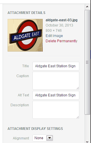
There was some debate in last night’s IRC chat about trac ticket 26270 raised by @yaelkmiller. Her original point was that when adding images to pages and posts, the Alt text box should have more prominence than the Title box – the alt attribute being an important accessibilityAccessibilityAccessibility (commonly shortened to a11y) refers to the design of products, devices, services, or environments for people with disabilities. The concept of accessible design ensures both “direct access” (i.e. unassisted) and “indirect access” meaning compatibility with a person’s assistive technology (for example, computer screen readers). (https://en.wikipedia.org/wiki/Accessibility) feature.
Personally, I think the idea is a good one, but discussion and comments by @helen also revealed some interesting behaviour when inserting images concerning what text ends up in the title attribute of the image, and what text ends up in the alt attribute.
I’ve done a series of tests using different use cases and they are presented in the tables below – including my expected results and the actual results.
Uploading images
Test No.
Use Case
Graham’s Expected Result
Actual Result in Page
1
Upload image, add it to page with no change to Title box or Alt text box
Title attribute set to image name minus suffix
Title attribute absent, alt attribute set to image name minus suffix – ie what the Title box was set to
2
Upload image, add it to page but change Title box, not Alt text box
Title attribute set to amended value
Title attribute absent, alt attribute set to amended Title box value
3
Upload image, add it to page but change Alt text box, not Title box
Title attribute set to image name minus suffix, alt attribute set to amended value
Title attribute absent, alt attribute set to amended Alt text box value
4
Upload image, add it to page but change both Alt text box and Title box
Both title and alt attributes set to amended values
Title attribute absent, alt attribute set to amended Alt text box value
Using images from media library (previously uploaded) without amendment
Test No.
Use Case
Graham’s Expected Result
Actual Result in Page
5
Add image from media library that has Title box set but not Alt text box
Title attribute set but not alt
Title attribute absent, alt attribute set to whatever Title box was before
6
Add image from media library that has Alt text box set but not Title box
Alt attribute set but not title
Alt attribute set but not title
7
Add image from media library that has both Title box and Alt text box set
Both attrubutes set
Title attribute absent, alt attribute set to whatever Alt text box was before
8
Add image from media library that has neither Title box nor Alt text box set
Title attribute absent, alt attribute empty
Title attribute absent, alt attribute empty
Using images from media library (previously uploaded) but making amendments
Test No.
Use Case
Graham’s Expected Result
Actual Result in Page
9
Add image from media library, that has just Title box set, update Title box
Title attribute set but not alt
Title attribute absent, alt attribute set to whatever Title box was amended to
10
Add image from media library, that has just Alt text box set, update Alt text box
Alt attribute set but not title
Title attribute absent, alt attribute set to whatever Alt text box was amended to
11
Add image from media library, that has neither Title box set nor Alt text box set, update Title box
Title attribute set but not alt
Title attribute absent, alt attribute set to whatever Title box was amended to
12
Add image from media library, that has neither Title box set nor Alt text box set, update Alt text box
Alt attribute set, no title attribute
Title attribute absent, alt attribute set to whatever Alt text box was amended to
13
Add image from media library, that has both Title box and Alt text box set, update Alt text box
Both attributes set
Title attribute absent, alt attribute set to whatever Alt text box was amended to
14
Add image from media library, that has both Title box and Alt text box set, update Title box
Both attributes set
Title attribute absent, alt attribute set to whatever Alt text box was originally set to
Looking at the results
The first revealing thing about these tests is that my own view of how I thought WordPress worked is at odds with the actual results in most cases.
The second thing that’s become obvious is that it’s actually impossible to set the title attribute for an image whilst using the Add Media panel. The title attribute never appears in any of the results.
Actually the only way to set a title attribute image within pages and posts is to use the older image edit dialogue box once the image is placed within the page (or to manually update the HTMLHTMLHTML is an acronym for Hyper Text Markup Language. It is a markup language that is used in the development of web pages and websites. obviously).
I think the confusion comes from the labeling of the Title input field in the Add Media Panel. Helen refers to this in her comments on the tracTracTrac is the place where contributors create issues for bugs or feature requests much like GitHub.https://core.trac.wordpress.org/. ticket I believe. Maybe to avoid confusion this box should be given another label – ‘Image name’ maybe. I confess that I hadn’t noticed this change in WordPress behaviour – it did used to be possible to directly influence the title attribute of an image when uploading and adding it to a page/post.
I’m sure that I’m not the only one who didn’t appreciate this situation. There is a pluginPluginA plugin is a piece of software containing a group of functions that can be added to a WordPress website. They can extend functionality or add new features to your WordPress websites. WordPress plugins are written in the PHP programming language and integrate seamlessly with WordPress. These can be free in the WordPress.org Plugin Directory https://wordpress.org/plugins/ or can be cost-based plugin from a third-party called Shutter Reloaded that I’ve seen on a couple of sites, which uses the title attribute from the image to provide a caption beneath the image when the full size is shown. Obviously this plugin is broken if site admins don’t realise the title attributes aren’t being written into the <img> tags – and the plugin author perhaps doesn’t realise either. I can’t comment on other lightbox plugins.
What do you think? Is this what you expected? Is this the right way to go?
Another small but busy IRC meeting on #wordpress-ui where discussion focused on assessing the translate.wordpress.org site for possible accessibilityAccessibilityAccessibility (commonly shortened to a11y) refers to the design of products, devices, services, or environments for people with disabilities. The concept of accessible design ensures both “direct access” (i.e. unassisted) and “indirect access” meaning compatibility with a person’s assistive technology (for example, computer screen readers). (https://en.wikipedia.org/wiki/Accessibility) issues.
If you have a little spare time, please do try to contribute to the site feedback request. Any observation — no matter how small — is valuable. If you need some ideas on what to look for, please check out our Site Feedback Guide.
We have been approached by the folks over at translate.wordpress.org. They are keen to ensure that it is accessible as possible and would like our help to identify any problems with the current site.
So please take a little time, between May 17 & May 31, to have a look at translate.wordpress.org and give us your feedback via comments on this post. In order to support you and provide some structure to the feedback, we’ve prepared a Site Feedback Guide that should help.